
Introduction
Welcome! I am Anaberu and in this tutorial I will explain how to create a dream room. We will use steps, basic and easy concepts for you to learn how to build an original room so that you can take your drawings to another level.
We will use 3d material such as the "primitive" together with the "cube" for the creation of the plan of the room to have a digital construction base, and I will teach you that only with this simple step you can obtain the perspective that you want to represent. I will also indicate what should be taken into account for the creation of a room, including: sketches, use of 3d material, perspective figures, color palette, coloring and more details so that the construction of your room has a good planning.
3 questions that will guide you to create a great room
♦ 1. The space of the room: do you prefer a comfortable, minimalist, aesthetic, natural or fantasy place, perhaps a place to carry out your projects, where you feel calm?
This question will be helpful in choosing your color palette.
♦ 2. Analyze what you like: our room represents our personality, tastes: for example: you are a music lover, a passionate cartoonist, maybe you like crafts or video games, or you are a bookworm or a lover of nature or things of magic.
And this question leads us to the next one:
♦ 3. Looking for great references: no, it's not cheating. It is a great help to get ideas giving your touch of style. You can search the internet, but also observe a moment around you, go out for a moment and clear your mind on things or details that catch your attention and draw them or take a photo.
🌱 Plants can never be missing, they will give life and color to your room. Also take into account the sizes and models of the pot.
🪑 The furniture, apart from the bed, will complement the place by giving it a touch of your personality. You can opt for shelves, bedside or tea tables, or shelves to place plants or books.
😄 Mirrors: they can be long, small, circular, and oval, also add details if you want or you can keep it simple.
✅ Here are other ideas you can consider to make sketches:
🛏 The bed: it is what stands out in the room, you can choose forge or iron beds, with padded headboard, in a manner or without any of these.
🌬 The curtains: they will give a unique appeal to the room. They can be simple, long, with or without lace.
🖼 The paintings: they can be large, small, with a thin or thick frame thickness. You can also choose to place photographs and drawings.
🔸️ 4. What do you want to convey in your illustration?
This question is related to which space in your room will you give your attention to. For example: the bed, apart from sleeping, is the place where you can read a book; the desktop where your creativity soars. Or even a small corner where you exercise or practice meditation. In other words, we have spaces where we feel comfortable and they are destined for specific activities.
This question will be your guide so you don't have to worry about rendering an entire room with super complicated perspectives.
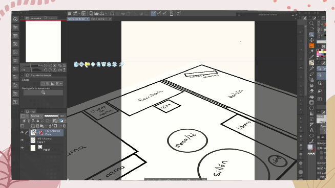
Let's get into practice: First sketches-creation of the plan
You can create a simple plan where you place the designated spaces for each piece of furniture in the form of geometric figures. This serves to establish limits and above all so that the space that we are going to represent has coherence.
1. Use a “vector layer”
2. Use the rectangle shape tool with a thick line so it doesn't get lost when you modify it. Graphically describe what your room would look like from a view from above. Note: you can label each object to identify each thing.
3. We save the file in "clip studio format".
4. We create a new canvas with the measurements 2500 wide x 3000 high, with a resolution of 300.
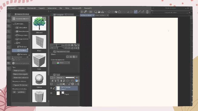
3d materials: primitive.
Let's continue:
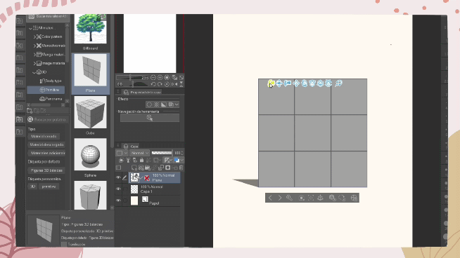
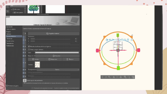
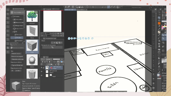
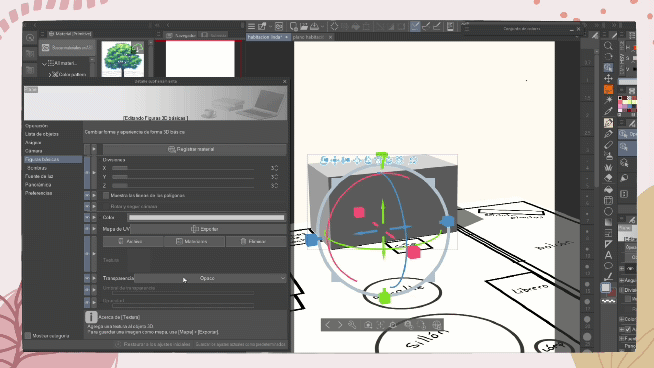
5. Use the "primitive material". Found at: window → material → material (primitive).
• A new window will open and we select “plane” and take it to the canvas.
✅ Note: we are going to work with the first three options to modify the primitive 3d model:
A. Change the observation position on the canvas.
B. Displaces the entire model.
C. Change the distance: moving it up will zoom out, moving it down will zoom in the camera.
• We select the object and with the inner orange circle we are going to lay the plane on the surface.
• Then go to “settings” (wrench at the bottom of the 3d object) → basic shapes → file → we select the room plan document that we created and saved earlier.
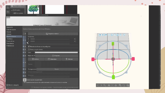
• The primitive 3d model was replaced by the .
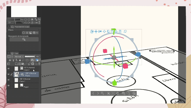
• Now zoom out with the third option (C.).
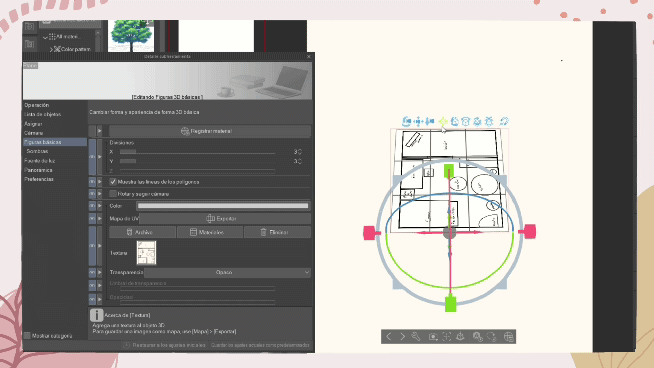
• Here just use the orange circle spikes to enlarge the model, and the blue and red arrows to move it on the surface.
✅ Note: to move the plane on the surface only use the arrows that appear when selecting the object,
🌟 ✅ This is my recommendation to create your room, because you can move the plane in any angle, view and distance from the place you want to represent (question 4). For example: in my room I want the desk to be visible because it is the place where I feel comfortable drawing, doing homework; and the bookshelf because it shows my love for reading; and the balcony (I've always wanted one) to have good lighting and a beautiful sky.
Let's continue:
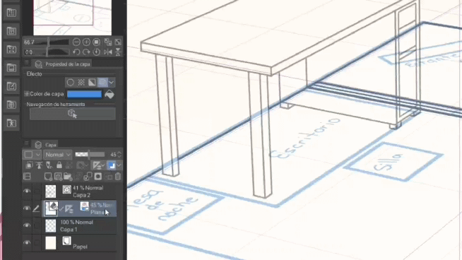
6. Now, go back to the 3d primitive material and select → cube. And add it on the same plane layer.
• And with the arrows locate it in the place where there is a similar figure. You can modify its shape with the squares that appear on the outside of the modification circle that is in the "cube"
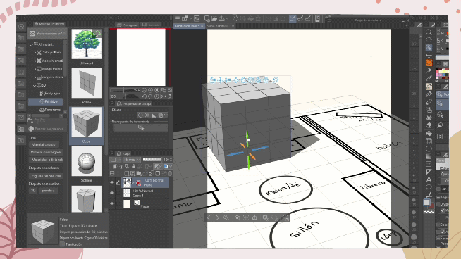
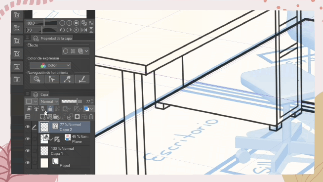
• As can be seen in the 3d figure of the cube, it prevents us from visualizing the lines of our plane, and to hide it we go to: settings → basic figures → deactivate: show the lines of the polygons.
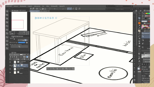
• Then: transparency → we select: semi-transparent → we change to: opacity 0.
🌟 Now comes the part to create the perspective:
7. In the same layer we are going to change in “set ruler display area” → activate: show on all layers.
8. In a new "vector layer" we see that perspective lines have been activated thanks to the cube's 3d model. This is incredible!
If you are a beginner this will help you a lot to represent certain perspectives without any difficulty.
9. Use the “vector eraser” tool with the “vector eraser” option → erase until insert.
• A vector layer blend and a vector eraser are the perfect combination for perspective use, because it will help speed up your work.
Lineart
💡 As we have already asked the questions established above, now we only have to take our notes or sketches and clean them up in this step.
Keep in mind that the brush you choose is going to give a different finish. In my case I am going to use the G pen from Clip Studio Paint, but duplicated and modified:
• Select the “G” brush and go to “Duplicate sub tool”.
• Then to new brush settings G and go to → brush size → and select the three lines down to modify the brush.
The brush has a start and end tip in a round finish, which doesn't affect pressure, and allows me to keep the line in one stroke.
Decoration objects with the use of 3d material
To have more dynamism and avoid errors like a simple chair as seen in the image, we are going to use a different inclination of the material, but respecting the perspective.
• In the layer of the initial plane we select “object” to activate the functions of the 3d mode.
• In downloads we select the model, in this case it is the chair.
• And just modify the position of the chair with the arrows, and if you wish you can modify the size of the object.
• Then the “spatial ruler” found in the upper command bar is deactivated: this will allow you to draw freely without taking perspective lines into account.
• I recommend you do this type of detail in a new vector layer, because when erasing the lines underneath it will be easy and it will save you time.
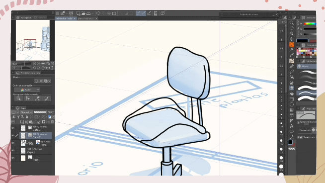
With the "adjust spatial ruler" tool deactivated we can draw decorations in different views, for example, the chair and the armchair, but be careful with the perspective.
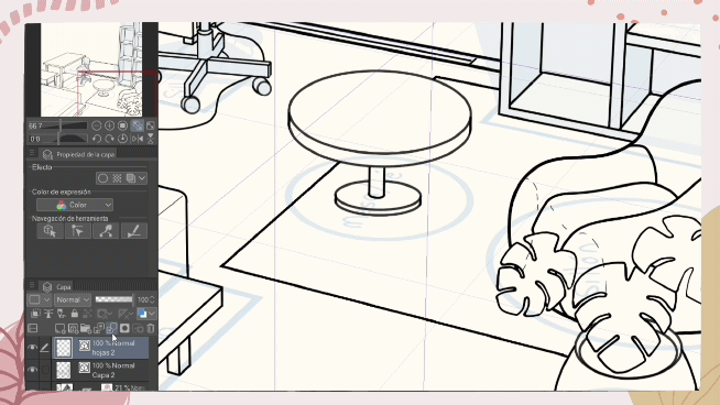
• To add furniture: there are countless models, like this shelf that you can modify to your liking to obtain different results.
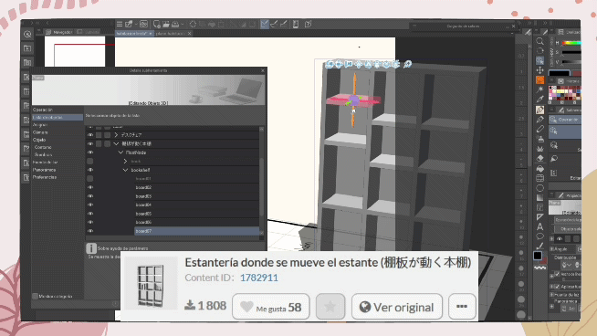
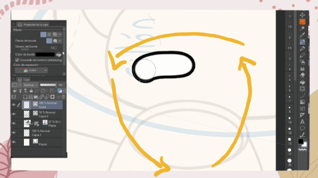
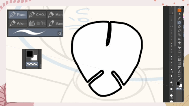
Figure tool to create furniture
Shape tools adapt to perspective when enabled.
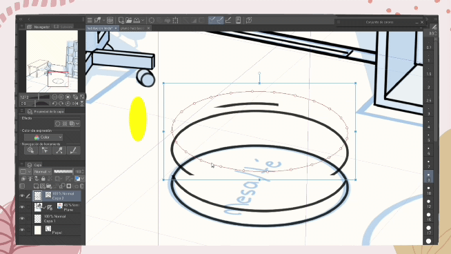
To make a tea table, for example, to save time redrawing the outline, we will do the following:
• We crush the “ctrl” key and select the line of the figure, then without letting go, we crush “ctrl + c” and “ctrl + v”.
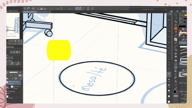
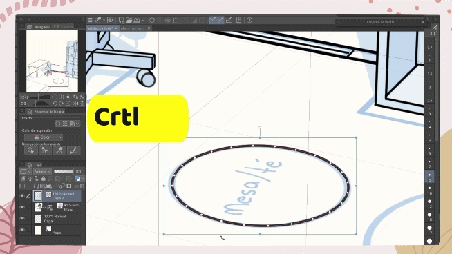
• As you can see no layer has been created, but if you select the figure again with “crtl” and then press “shift” and move it up, you will see that it has been duplicated on the same layer.
Clever! You won't have to worry about making the same figure over and over again until it comes out the same.
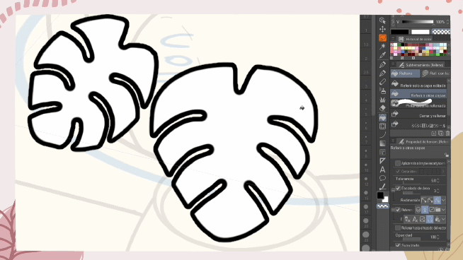
Create Plants with Edge Effect
For plants, a method that helped me create the "Adam's Rib" is the following:
• In a new vector layer (leaves): in “layer properties” → border effect: with a border thickness of 7.0 → border color: black. Finally, the subcolor: white.
• Draw an inverted triangle and fill in all the spaces.
• Then use a brush with pressure, the G brush is an option. And also switch to “transparency” and shape it by erasing from the edges.
• Let's go to “layer” → “rasterize”. Or right click on the layer and select rasterize.
• Then we go to “fill” with the following settings and with the brush set to “transparency”, fill in the white part of the sheet.
I recommend this tutorial that I created so that you can understand better about this part:
♦ Working with different layers can be a bit difficult. The normal layer and the vector layer don't get along and can't be put together. To solve this:
• We are going to transform the normal layer to a vector layer: we right click on the normal layer → convert layer → in type we change to: vector layer.
• The "vector adjustments" function is activated, we select it and another window opens: and in “smoothing” we change to: weak.
Clever! Now you can join the vector layers to continue drawing smoothly.
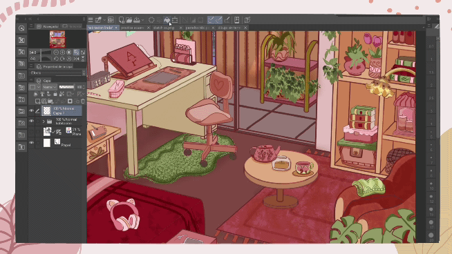
More details in the room
The room looks empty. So I will add more details to give a more harmonious and welcoming environment.
■ With a pencil: HiBipencil (HiBipencil), or any other that you feel comfortable with, add details in the bedroom, these do not need to be perfect. Here you can make use of the references you have taken note of (question 2 and 3).
For example: in my notes I had these objects, but remember that you can increase as well as remove details. Drawing is a process that changes every time :D.
• To finish the lineart, I recommend you to use the G brush (predetermined by Clip Studio Paint), or any other brush depending on the style of your drawing, but insert thin and thick strokes, this will give an incredible touch to the lineart.
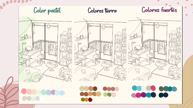
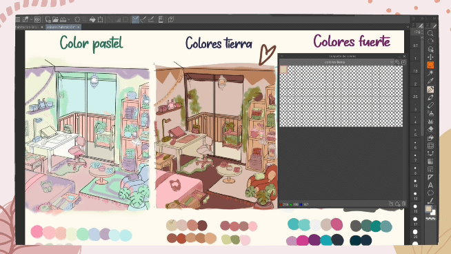
Color palette
Question 1 will help you choose your color palette, here are the colors that I think are the most common:
🔸 ️ Pastel colors: they are good for creating harmony and a cozy atmosphere, they also give warmth and comfort. Pastel colors are shades more inclined to white, among them we have shades such as green, blue, magenta, beige, pink, and white.
🔸 ️ Earth colors: they are generally soft and generate tranquility to the environment, they are related to nature and give that atmosphere to the bedroom. They include shades of red, peach, yellow, orange, brown, and autumnal shades including green.
🔸️ Strong colors: they can represent harmony such as yellow, blue: trust, orange represents creativity and happiness. These colors are vibrant.
✅ I recommend you to make quick sketches also in color. Create several small copies of your room on a canvas to get a better look at how your room will look.
• Depending on what you want to express you can change the values of:
A. The tone: refers to all colors.
B. Saturation: You can increase or decrease the saturation. If you raise the saturation you increase the amount of color, and if you lower the saturation the color of that hue will lose color.
C. Brightness: You can increase or decrease the amount of light.
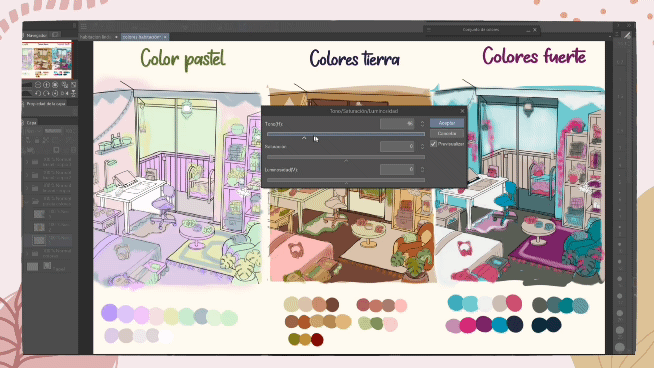
• When you have your color palette you can create a new palette in: window → color set.
• Now go to settings (wrench in the color set) → add new set: give it a name → now with the dropper you select the colors and they are added to the new palette.
colored
For coloring, create different layers in order to be able to add details later, but first use the "set as reference layer" tool (shaped like a lantern) to the layer where the lineart is. And use the "fill" sub tool with the following settings:
In my case create three layers:
1. One layer for the floor, wall and balcony.
2. Another layer for the furniture.
3. And the last layer for the objects.
This step is to be able to shade the things of each layer.
To give an impression of depth and dynamism to the objects in the room, we are going to use new layers with the “blending mode”: multiply with a 70 to 100% opacity percentage, and we adjust each one with “adjust to layer below " so that it doesn't paint beyond what is painted on the bottom layer.
• You can add more details and the decoration brush is a good option to save us a little time.
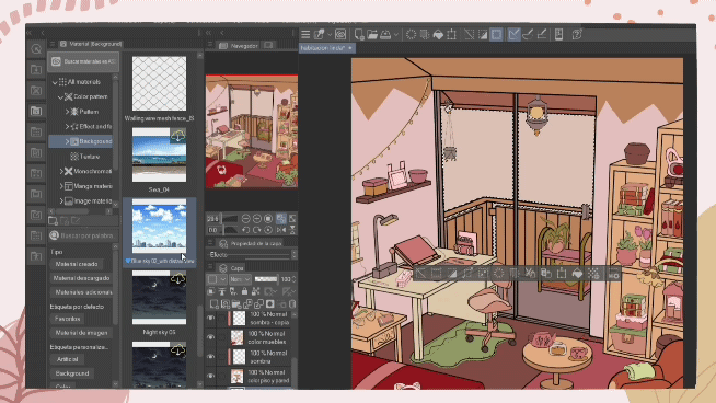
Backgrounds with the use of patterns
You can add patterns to curtains, walls, the mattress on the bed, even the rugs.
• The first thing we are going to do is with the “automatic selection” tool, we select the zones.
• Then we go to “material” → background. The list is huge, in this case I am going to use a sunny day that is predetermined in the program. Make sure to position the pattern layer in the right place and adjust to your liking.
Final details ♡
• The lineart can be too intense for your bedroom and we can correct this with: object → main color. Choose a color that harmonizes the colors.
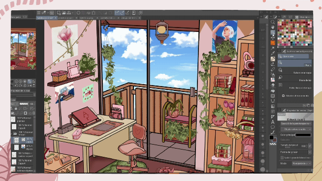
• Add new layers on top of all. I'm going to add a bit of brightness with the "combination mode" in dodge brightness, in the case of reflection in glass it will be more or less 50%. And for light 100%.
I recommend using the airbrush with a medium hardness and density between 40 to 50.
• On top of all the lineart and coloring (you can save it in a single folder). Add a normal layer and fill it with a warm or cool color, with a “blending mode”: dodge-bright, and lower the opacity to 36% or a little less.
• Then add an effect with “monochromatic patten” found in materials. I am going to use the “pencil” effect (material inside clip studio Paint), modify it to your liking and finally adjust to the bottom layer where we color the entire layer in a single color.
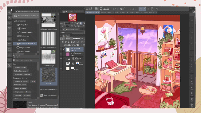
Final result
Thanks for getting here. The use of primitive figures gave us more than one advantage: the first for the correct projection of our plane, the second advantage was that together with the "cube" material perspective lines are obtained, the third advantage is that this option gives us endless of results in perspective for the projection of our room. In addition, together with the other materials of the Clip Studio program, we can have fast and simple results.
If you have any questions feel free to comment.
See you!
Users who liked this post


Comment