
The Youtube video only talks about a part, and the article below explains it in more detail.
⭐Welcome to open cc subtitles⭐ But English subtitles are machine translation
↓ Below is the Shorts I cut later↓
foreword
How to add details to a simple colored drawing, focusing on the faces of the characters.
➜ First add a layer of shadow above the layer, and then open a new layer to draw the bright side.
(This method is mainly used in my understanding of color bar comics (Webtoon))
The subject of this talk is as simple as that.
A part
┗ cheek analysis
In many cases, just adding a layer of shadows or ambient light can make the picture have a different feeling.
But before we start lighting, a brief understanding of the anatomy of a human face is needed.
After understanding, it will be easier to understand why light is drawn in these places.
Although people's cheeks are curved, not angular,
But I simply divided the cheeks into 1~4 blocks.
⭐ ⭐ ⭐Note: This is a simplified and simple positioning, not a precise actual muscle direction.
After all, muscles have radians and thickness.
The intersection of the four areas is where the cheekbones are most prominent.
The dividing line between the cheek and the mouth is the nasolabial folds.
If you still feel that after reading these pictures, you don’t have enough awareness of the three-dimensionality of the face,
You can skip to see the first part of [B part].
Or refer to this Youtube video uploaded by others,
https://www.youtube.com/watch?v=_cgQ0Rl-pF4
Although I don't understand English very well, there are a lot of photos of faces in the film,
It can quickly deepen the impression of the three-dimensional sense of the face.
Block No. 1 should be the most commonly seen part in normal times, and the part where the painter will draw bright light.
Make up some lighting results for other details.
Reduce the scope of Block 1 to make the graph feel more natural.
Next is the 3+4 block.
This lighting method is also very common, but one thing to note is that,
Pay attention to the range of block 2. In many cases, this block does not need to be painted with light.
Sometimes you can try to see only block 3 is lit, it may give you a different feeling.
┗Nose analysis
When drawing two-dimensional characters, it is common to simplify the lines or shadows of the nose, or to draw the nose smaller.
But to better understand why the light is drawn in these places, we need to refer to the more realistic nose.
Nose tip + side of nose bridge.
Compare the two-dimensional drawing method.
You can try drawing semi-arcs and triangles.
(The key point is that the pictures should look good, and it won’t matter if the cartoon-style pictures are a bit unrealistic)
Nose bridge + nose tip.
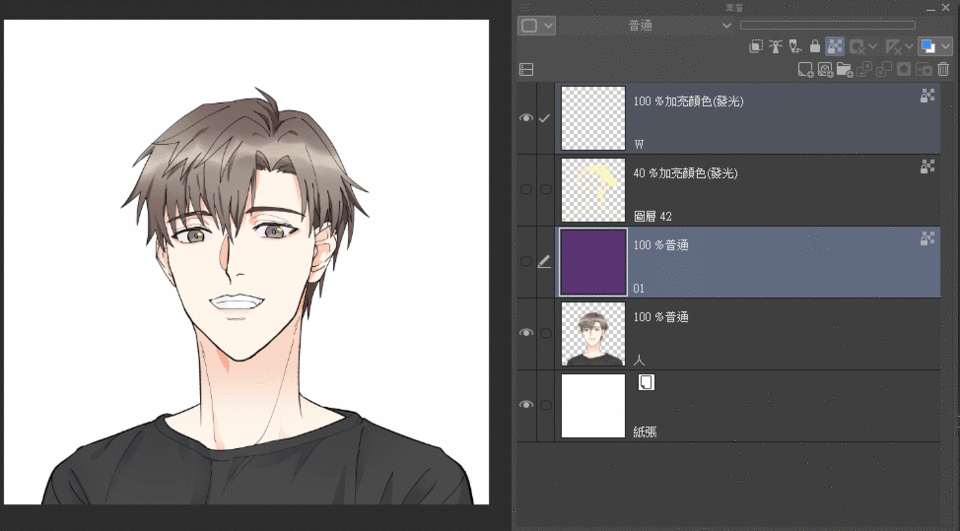
┗Shadow layer and light layer
You don't need many layers to achieve the effect in the article.
From top to bottom are:
eye light spot
bright part
shadow
original image
When making, you can make good use of these two keys.
1 is layer clipping
2 Can lock the coloring range
✨ Shadow layers.
➜ Fill the canvas with purple color chip R 90 G52 B122
(Any color you like is fine, I just give a reference
➜ Layer clipping
➜ Blending modes
- Linear burn
➜ Layer opacity
-20%
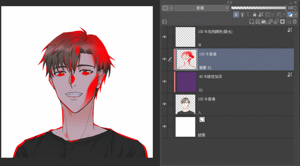
✨ Light layers.
➜ Open a new layer and use layer clipping.
First use a clear color to draw the position that needs to be lit
➜ Change the previously painted light to the desired color
For reference, use Lock transparent primitives on the last layer (key 2)
Tap the correct highlight color
Reference color chip (yellow) R225 G248 B187
Press the Keyboard Fill (Foreground Color) shortcut key
Alt + Backspace←
➜ Blending modes
-Highlight color (glow) (Glow dodge)
➜ Layer opacity
-40%
┗ Examples
After getting a general understanding of where the lighting should be painted, this part will also play with shadows.
very simple,
In order not to confuse you,
[Shadow layer] here
Blending modes are all - Linear burn
Layer opacity (Layer opacity) is also all -20%
You can open multiple layers to try it out.
Actually show it to you.
Two different colors stacked together will also have a good effect.
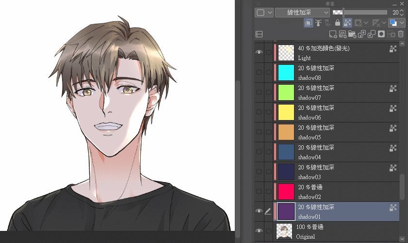
You can try the color by yourself, there is no rigidity in what color you must use.
In addition, the most basic purple layer is recommended. The layer transparency is adjusted to 40%, and the effect is not bad.
Subsequent color matching data are all reference values.
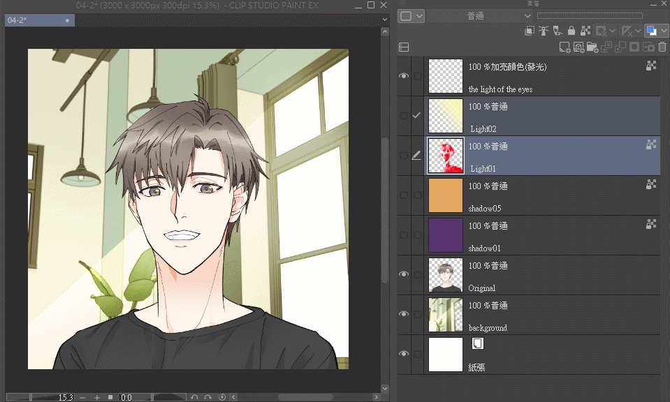
┗ Example - Woods
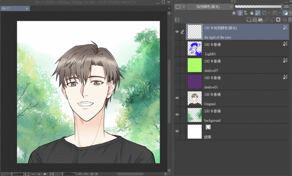
Because it is a pile of green leaves in the background, in order to allow the characters to blend into the environment, the main color of the shadow is green.
The purple is added to make the shadow darker. With only one layer of green, the shadow color will be too bright.
(But you can also look for ways to achieve the same effect with only one layer XD"
✨ Light layers:
Blending modes
-Highlight color (glow) (Glow dodge)
Layer opacity
-40%
yellow
R225 G248 B187
✨ Shadow layer:
Blending modes
- Linear deepening Linear burn
Layer opacity
-20%
green
R173 G255 B103
purple
R90 G52 B112
In order to make it easier to see where the light is drawn, I changed the color to distinguish it.
The material store can find the brush of the light shining through the leaves
complete drawing
Before and after comparison
┗ EXAMPLE - INDOOR DAY
The background is a model obtained from this material store.
Half-black and half-white shadows on the face are also quite common.
So here we use the light coming in through the window to draw a larger area of bright parts.
This time there is an extra layer of gradient light.
✨ Light layers:
Blending modes
-Screen
Layer opacity
-40%
Blending modes
-Highlight color (glow) (Glow dodge)
Layer opacity
-40%
yellow
R225 G248 B187
✨ Shadow layer:
Blending modes
- Linear deepening Linear burn
Layer opacity
-20%
orange
R226 G167 B97
purple
R90 G52 B112
If you are interested, you can also try to see how to draw half of the shadow on the face according to your own method.
complete drawing
Before and after comparison
┗ Example - Indoor evening
Don't ask me why I don't turn on the lights, XD
However, indoors are usually bluish due to fluorescent lamps.
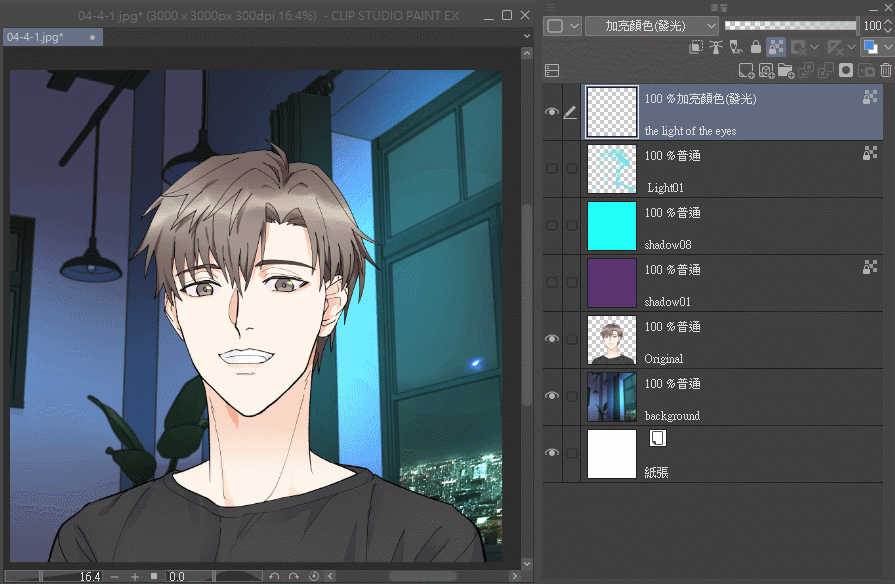
Pay attention this time, the light is not yellow this time, but blue.
✨ Light layers:
Blending modes
-Highlight color (glow) (Glow dodge)
Layer opacity
-40%
blue
R119 G223 B232
✨ Shadow layer:
Blending modes
- Linear deepening Linear burn
Layer opacity
-20%
blue
R34 G255 B250
purple
R90 G52 B112
Although I drew 4 blocks on the face before,
But don't forget this way of lighting along the edge.
↓In fact, the light on the edge of the face is like this↓
[Green line] is where the block has a turning point, so that half of the block is on the side face and front face of the face.
The part where the cheek connects to the chin is basically smooth, so the lighting can be drawn a little further [below the yellow line].
complete drawing
Before and after comparison
┗ EXAMPLE - OUTDOOR EVENING
Is the background this time familiar~ 030+
Use the built-in background material of Clip directly.
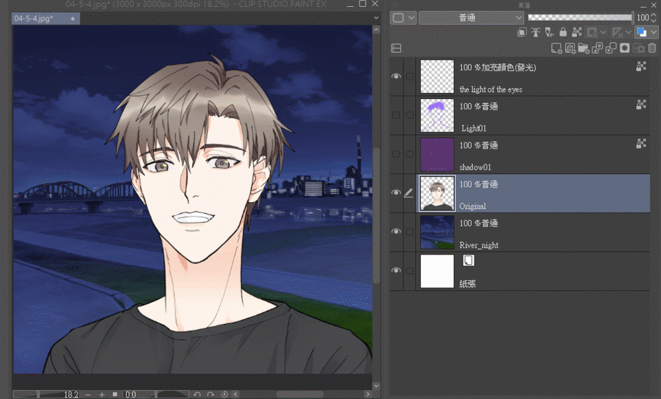
Ambient light at night is suitable for purple.
One thing to note here is that I changed the opacity of the previous purple layer to 40%.
✨ Light layers:
Blending modes
-Highlight color (glow) (Glow dodge)
Layer opacity
-40%
purple
R146 G97 B255
✨ Shadow layer:
Blending modes
- Linear deepening Linear burn
Layer opacity
-40%
purple
R90 G52 B112
I think this kind of undercut method of the chin is more 2-dimensional, (triangular
But still the same sentence, if it looks good, I don't think it's bad.
complete drawing
Before and after comparison
┗ Example - Upper Light
Sometimes the background is just a layer of gradient color, which can add a bit of atmosphere.
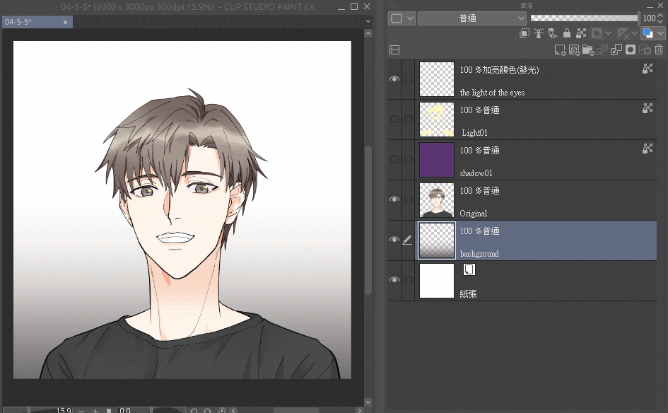
Back to only two layers of purple shadow and yellow light.
✨ Light layers:
Blending modes
-Highlight color (glow) (Glow dodge)
Layer opacity
-40%
yellow
R225 G248 B187
✨ Shadow layer:
Blending modes
- Linear deepening Linear burn
Layer opacity
-20%
purple
R90 G52 B112
If there is a large contrast between light and shadow, remember not to forget to use the shadow of the eyebrows to increase the details of the picture.
complete drawing
Before and after comparison
B part
┗ Profile
In the part of A Part, the character in the sample original picture tends to face up,
Part B will briefly explain the position of the bright side that can be drawn on the side face,
Looking at A and B together can increase the perception of the three-dimensionality of the face.
Changed a sample original picture and characters,
The principle of lighting is the same, let's practice to see different face shapes.
Like the sample picture of Part A, I will simply divide the cheeks of the characters in Part B into four pieces.
However, it is still necessary to remind that this is just a convenient reference method, not that muscles grow like this.
If you want to draw the dividing line in a more realistic way, you can refer to the red line. (But I don't think it makes much sense
Furthermore, the 4th block straddles the front face and the side face, and there will be a more obvious arc at the green line mark.
By the way, if a person has sunken cheeks due to malnutrition or aging, he should refer to the blue line.
That's why I say that this positioning is not accurate, nor can it represent muscles.
But it's still good for a quick reference.
This time, three layers were added to the original image, two shadows and one gradient.
✨ Gradient layers
Blending modes
-Screen
Layer opacity
-40%
yellow
R225 G248 B92
✨ Shadow layer:
Blending modes
- Linear deepening Linear burn
Layer opacity
-20%
orange
R90 G52 B112
magenta
R255 G2 B88
The lighting is still the usual yellow 40% Glow dodge used before
It feels like the part on the cheek, the most common and direct method of application, will look like the above when it comes out.
However, according to the principles learned earlier, the bright light can grow like this in a similar area.
Removed bright light from block 2.
Because the fourth block is at a turning point, only half of the light needs to be painted.
The first block is a very common lighting position. Even a character with a rounder face is versatile.
Then there are the second and third districts.
I won't go into details about the nose.
The following provides a comparison of the two-dimensional drawing.
I can understand why the nose is painted like that because of the wings of the nose (blue line).
But after thinking about it for a long time, I still don't understand why the cheeks are painted like that, but I still think it looks good. XD"
end
Originally, I just wanted to briefly introduce the painting method of overlapping shadows + highlights.
Then change the color of light and shadow, so that the characters that have been assigned with color can quickly blend into the environment or background.
But later I found out that if I didn’t tell where the light should be drawn, the drawing might not look good, so I feel that this article is not very meaningful. So the content of the article is lengthened.
Most of the characters who need to express the three-dimensionality of the face are male, and the female face depends on the situation (usually there will not be too many dark sides.
What kind of pictures need to follow the original color designation of the character, and then add shadows for color adjustment?
As I said at the beginning, I think this method is suitable for color webtoons (Webtoons).
So I'm not sure if this method is used in other places, such as general illustrations, whether the effect is good or not. XD"
At present, due to visual fatigue, I don't know whether the character's face is drawn crookedly or not.
It should be... okay?
Hope this article helps you,
My IG
Users who liked this post


Comment