
A Comprehensive Guide by Manny Guevarra
Introduction
Have you ever wanted to create an epic fantasy scene that tells an entire story through even just one glance? Creating an epic background for your illustration, comic, or animation is a lot easier than you may think!
For this tutorial, I wanted to recreate the scene from my animated music video above as a more dynamic illustration that tells a clearer story even without the music or animation. We will be breaking down the background of the resulting fantasy illustration and using that information to paint a fantastical world for your characters to explore!
All characters and settings in this tutorial are from my webcomic series, EARTHEATERS! If interested, you can read it below!
⬇⬇⬇
Fantasy Elements
First off, let's explore some elements to include in your illustration that will immediately signify a fantasy setting to your audience. Some fun fantasy elements to try out are:
MEGAFLORA 🌸
Megaflora are super-sized plants. Real-life examples of megaflora include redwood forests, and indeed standing under them feels magical. To capture this magical feeling, try pushing the perspective on plants you might find here on Earth. In fantasy works, you can transform an object that would normally fit into the palm of your hand into something gigantic that dwarves your characters!
This works well with not only flowers, but other plants and fungi such as trees and mushrooms - the possibilities are endless!
MEGAFAUNA AND MYTHICAL CREATURES 🐉
Like megaflora, megafauna are super-sized - but this time, we're talking about our animal friends! The term "megafauna" typically refers to large terrestrial animals that weigh over one tonne (1,000 kilos/2,205 lbs). Real-life examples of megafauna include giraffes, elephants, and hippos.
Adding megafauna can instantly add grace, majesty, and whimsy to your illustration - especially if it's a species that you can't find here on Earth. Bonus points for magical creatures like our scaly friend below!
STRUCTURES AND RUINS 🏛
Adding magnificent structures - or the ruins of fallen ones - that tower over your characters can create a sweeping sense of awe and silently tell a story about the people and creatures that inhabit your world.
CELESTIAL BODIES 🌙
Adding celestial bodies such as supersized planets, various moons, and glistening stars along the horizon don't just add beauty to your illustration; they help place your story in a magical new world - an alien planet, an alternate realm, or another fantastical setting!
▶ TIP: Remember that our objective here is to tell a story through a glance. Before you begin drawing, think of what you want that story to be - the meaning behind these fantastical elements and your overall setting. Who is your character? What are they searching for? Where are they searching? Will they fulfill their destiny and complete their quest?
Will they live to tell the tale?
Composition 101: The Rule of Thirds
Next, let's dive into drawing our piece! Here are some compositional tips to consider - starting with the Rule of Thirds, which will help us place our character(s) and the background elements they will be searching for along the horizon.
RULE OF THIRDS 1️⃣2️⃣3️⃣
The Rule of Thirds is a principle of photography that can be applied to illustrations to create balance and storytelling in our compositions. It states that when a canvas is split into thirds, our subject and other important elements of our composition should be placed along the intersection of those thirds.
▶ TIP: You can use the [Grid] and [Ruler Bar] features in Clip Studio Paint to help break up your canvas into quadrants! To show the Ruler Bar, simply press (Ctrl + R) on your keyboard or select the [View] menu > [Ruler Bar]. To open the Grid, simply select the [View] menu > [Grid]:
You can toggle the starting point, width, height, gap, and number of divisions for either tool by selecting [View] menu > [Grid/ruler bar settings]:
In the case of our fantasy illustration, our subject(s) are the character(s) that are peering off into the fantastical world we will be building for them. Let's use the Rule of Thirds to tell our viewers that our characters are preparing to venture off into this world.
We do not want to place our characters on the edges or center of the canvas, as the composition will look unnatural. Instead, place your subject along one of the intersections, making sure to leave negative space in the direction they are facing to imply future movement toward their destination. (In the next section, we will use Leading Lines to reinforce this sense of movement.)
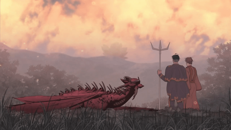
Next, let's place our background elements along these lines to draw attention to them. The two prominent fantasy elements I chose for my illustration were megafauna and megaflora. The giant lotus flower is the focal point of the background, as it is the ultimate destination of my subject. To draw attention to it, I placed it just left of center and along the topmost line - directly following the gazes of my characters.
With that, here is the first iteration of our rough sketch! As you can see, we are starting to tell our story through basic composition alone: a dragon and its riders are surveying the lands before them, bracing for a flight to the giant lotus in the distance!
Composition 101: Leading Lines
Another compositional trick we can use to reinforce the implied sense of movement to our characters' destination is to frame the composition with Leading Lines.
LEADING LINES 📈
Leading Lines are another principle of photography. They are lines that are formed through the shape language of your composition that lead your viewer's eyes on a journey "through" your drawing and direct them toward a desired subject.
In addition to framing our composition, adding purposeful Leading Lines can transform the static nature of otherwise aimless shape language to create a fluid dynamic. To ensure these lines work together in a coherent flow, be sure to add them in the foreground, midground, and background. This will help tie these three areas together. (We will also talk more about the three in the following sections!)
Here I have added more dragons flying toward the destination in the focal point; the flight to the giant lotus is a rescue mission for the characters trapped inside it, and our dragon riders have brought backup. The addition of these subjects not only adds clarification, but also reinforces the implied movement of the piece and helps fill some of the negative space between our subjects in the foreground and the horizon line.
Composition 101: Avoid Mergers
When adding characters or other elements in later iterations of your sketch, be sure not to clutter your original composition; leave enough breathing room to ensure that the path in front of each character is clear.
Additionally, keep an eye out for Mergers - and avoid them if you can!
MERGERS ❌
A Merger happens when two objects in a composition appear to be "merging" together. For example, notice how the outlines of the dragons and mountains seem to blend together below:
This not only looks awkward, but also eliminates some of the depth that we could create if we overlapped the two to further reinforce the three-dimensional feeling of the piece. When placing any characters or key subjects in a composition, try to either (a) overlap or (b) separate them from existing lines.
Keeping this in mind, the sketch on the right shows a much better placement for our friends:
Shape Language
Another important concept to keep in mind when sketching out your piece is Shape Language.
SHAPE LANGUAGE 🔺🟡🟦
Shape Language is the use of familiar shapes such as triangles, circles, and squares to communicate meaning. For example, let's take another look at this illustration from earlier, which depicts a territory border between Human and Drakken lands in my webcomic, EARTHEATERS:
Do you notice any differences between the two sides of the illustration?
Though the cliffsides are the same height, the left side seems more steep and ominous; it is not only darker, but more sheer in its geometry and devoid of the grand Drakken carvings on the right. In fact, everything on the "Human" side of the illustration is rigid and geometric - from the cliffside to the human-built aqueduct, the human figure on the hilltop, and even the trunks of the trees.
Conversely, the "Drakken" side of the illustration is filled with shape language that has an organic curvature often found in nature. Additionally, the shapes all have a loose connection, flowing from the curved silhouette of the Drakken flying overhead, through the cliffside carving, and then down the hillside - all running parallel to the waterfall running flowing down the center, rather than cutting it in half as the human-built aqueduct does.
Combining these juxtaposing shapes creates a balance in the piece and tells the story of two warring tribes that seek to find harmony:
Because the fantasy genre is typically set in the great outdoors, you're going to see a lot of foliage and other natural elements. When painting these shapes, it is best to use the organic, curvy shape language discussed above that consists of circles, spirals, and the lines tangential to them.
In fact, most patterns in nature follow the "Golden Ratio" or "Fibonacci Sequence" depicted below - from the spirals of Nautilus shells to the flight patterns of birds of prey and even the arms of spiral galaxies:
▶ TIP: When you want an element to stand out, try using sharper shape language such as the triangular shape of the mountain below. When you want something to appear reliable and sturdy, try using rectangular shape language such as the cliff in the foreground. When you want something to blend in and feel unassuming and approachable, trying using circular shape language such as the hillside in the midground:
And with that, we have a solid composition for our epic fantasy illustration that will allow us to tell a story at even just one glance! Now, let's start painting!
Foreground, Midground, and Background
As you can see, we've started to divide our piece into three general sections. These sections are the foreground, midground, and background:
The foreground is the area of our composition closest to the "camera" that typically contains our subject. The background is the furthest away from the camera, and the midground is the area between the two. To separate these areas, we are going to want to paint using contrasting Values.
VALUE 💡
Value is the relative "lightness" or "darkness" of a color. In Clip Studio, you can easily check the Value of any layer by navigating to [Expression color] under the [Layer Property] tab.
Next, select the following dropdown menu and switch the property from [Color] > [Gray]. This converts the entire layer to grayscale. This handy layer property can be toggled back and forth between [Gray] > [Color] at any time.
When painting, try using contrasting Values to distinguish your foreground, midground, and background. There can be some sections that dip into similar Values as others, but keeping the overall Value of each area relatively uniform helps compartmentalize these areas and adds to the three-dimensional feel of the piece.
Paint your foreground with a darker shade, moving toward lighter tints as you approach the furthest objects in the background - or, in some cases, you can do the reverse if the background is further away from your light source:
The key here is that light source. In our current illustration, it would make much more sense for a vast, open mountain range to be illuminated by the sun and for our subjects to be canopied by the foliage of trees casting shadows from behind the camera:
▶ TIP: Many artists paint solely in grayscale at first, then add color later in their painting process. If you want to focus on establishing Values first before worrying about color, try this hack!
Color Palettes
The colors you use in your illustration can heavily impact the overall mood of the scene you aim to depict. For instance, using light blues and purples can create an ethereal, dreamlike illustration. Perhaps your character is venturing into a floating kingdom, suspended in the sky and surrounded by wispy clouds.
The blues above are closer to purple than green on the color wheel. By contrast, the following blues are closer to green to create varying shades of teal. A color scheme such as this would be fitting for an underwater scenes with sunken castles and mysterious sea creatures:
Reds and yellows typically feel a little more daring and can represent danger. Perhaps your character is bracing to trek the craggy and treacherous path leading up to a great volcano!
Some of the colors above can also be considered "earthy tones." Indeed nature is mighty and formidable, but it can also be soothing and nurturing. Pairing greens with creams and pinks can also create a warm and beautiful scene:
For this illustration, I have combined several of these palettes:
When you have chosen your desired color palette, you can save it in Clip Studio under the [Color Set] menu depicted below:
If you don't see the [Color Set] menu, navigate to the [Window] menu on the uppermost toolbar and select [Color Set] from the dropdown:
To add colors to your [Color Set], simply right-click any square and select [Replace color]. You can then color pick each swatch by simply clicking it; the [Eyedropper] tool will automatically appear when hovering over it.
Brushes
Another helpful feature in Clip Studio Paint is the wide selection of brushes, stamps, and 3D models it offers to help streamline the painting process and improve artistic workflow.
Below are three of the most helpful brushes that were used in this illustration - all of them default Clip Studio Paint brushes!
For this illustration, I used the middle brush for painting mountains in the midground and background, layering the stamps with several different colors to create a lush forest look along the mountain ridges:
If you want to try out something new, the Clip Studio Assets store has thousands of brushes, pens, 3D models, patterns, and other assets available for download - many of them for free! Other assets can be purchased using either Clip Studio GOLD or Clippy points that can be earned for free through events or by uploading materials of your own.
⬇⬇⬇
To install a desired asset into Clip Studio Paint, simply click the “Download” button at the top right of the asset listing; this will automatically begin the asset download and installation process.
You can then access this material through in the [Material] menu > [Downloads] folder, where you can drag and drop it into a Sub Tool of your choosing. (If you do not see your downloaded asset, try restarting the app!)
Finishing Touches
And now for some finishing touches!
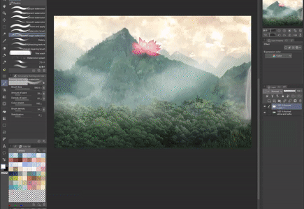
As specified above, the [Running color edge watercolor] brush has a cloudlike texture. This brush is helpful not only for painting actual clouds, but for creating mist to further separate the foreground, midground, and background using something called Atmospheric Perspective.
ATMOSPHERIC PERSPECTIVE ⛅
When looking at photographs - or even just looking at nature through your own eyes - you may notice that far-off elements such as distant mountain ranges become harder to see the further they are from the camera's viewpoint. This is because of components in the atmosphere such as dust, rain, mist, and fog that cloud our view as they compound with distance, creating what is known as Atmospheric Perspective.
To imitate this effect in our illustration, we can place elements like fog, haze, or rainy mist between layers as seen below:
To use the [Running color edge watercolor] brush, navigate to the [Brush] tool > [Watercolor] subtool and select it. You can also access the [Brush] tool menu by pressing (B) once on your keyboard.
Using the [Running color edge watercolor] brush, I chose high-value, desaturated blues for the mist in this illustration:
I then painted on an opaque layer on [Normal] mode to create the mist between the mountain peaks and forests. This effect also works well on the [Screen] layer mode!
▶ TIP: Throughout the painting process, you can also use any brush as an eraser by pressing (X) on your keyboard or selecting the transparent brush option to the bottom left of your color wheel as shown below:
Also keep in mind that, due to the effect of Atmospheric Perspective, objects in the distance may appear not only lighter but more desaturated in color, as well.
▶ TIP: You can always adjust the saturation - as well as the hue and luminosity - of a selection by pressing (Ctrl + U) on your keyboard to bring up the Hue/Saturation/Luminosity slider. If you would like to create a clippable adjustment layer that can be toggled on and off, simply navigate to the [Layer] menu > [New Correction Layer (J)] > [Hue/Saturation/Luminosity].
Conclusion
And that's a wrap! ✨
I hope these tips were helpful to you. If they were, please leave a "❤" and let me know what the most helpful tip was! Also feel free to check out my other tutorials in this series. And if you end up creating an epic fantasy illustration, tag me on social media @mannygart so I can see! Thank you so much for reading!
Users who liked this post


Comment