
A Comprehensive Guide by Manny Guevarra
Introduction
Have you ever wanted to make cute characters based on the designs of animals, foods, or other objects?
In this tutorial, we will be exploring this concept of anthropomorphism and learning how to transform elemental dragons into adorable gijinka chibis based on the colors, shape language, and overall design of our references. These simple yet appealing designs make for great art prints, stickers, keychains, and more!
Finding Inspiration
Anthropomorphism is the attribution of human characteristics to non-human things. Using anthropomorphism, you can transform not only animals - but foods and other objects - into stunning character designs!
First thing's first, we'll need some inspiration. When choosing references, keep an eye out for features that you can exaggerate in your character design to call back to your reference. Some of these features could include:
① Dynamic shape language that can be used throughout our character design!
② Colors that pop and can be used for various elements such as hair, clothing, and accessories!
③ Motifs that can be incorporated into accessories!
④ A clear theme that can be translated into our character's appearance or personality!
It's better to collect multiple references to start and then narrow them down - or mix and match until you find a combo that works best for the theme and overall look you're going for!
BeeRef is a free, helpful, and easy-to-use tool for organizing various references you may come across and want to save for later!
⬇⬇⬇
Dissecting Your References
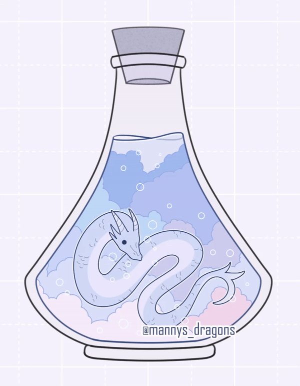
For this tutorial, let's take a closer look at the air dragon potion!
For starters, it has a clear motif of clouds that we will be able to incorporate into various aspects of our drawing such as hair and clothing.
Furthermore, there are a myriad of other motifs such as stars, moons, and suns that we can infer from the overall theme of the design since they also signify the sky. Because of this, including them in our character design will still call back to the reference even though they are not present in the original design.
We are also looking for shape language that can be translated into a human silhouette in some capacity - or, at least to some design elements on our figure. Here, the curved shape language of the dragon's silhouette is perfect for a flowy dress or hair, and we can also use it to guide our line of action when sketching in the next section!
Finally, we are looking for a color palette that will lend itself well to the various colors we will need for things like hair, clothing, and accessories. This palette with icy blues and pastel purples will be perfect for creating flowy and whimsical accessories that tie in to the ethereal nature of the sky.
Now that we have our reference and some ideas inspired by its design, let's organize those design elements into a blueprint for our character design!
Best Canvas Size & Settings
First, let's create a new document by selecting [File] > [New...] or clicking (Ctrl + N) on our keyboard and selecting the Illustration preset.
For this tutorial, we will be working on a 5.0 x 5.0 in canvas at 300 DPI:
This is because chibi character designs like the ones we are going to be making are perfect for small art prints and die-cut stickers! A common small art print size is 5.0 x 5.0 in, and many medium stickers are between 2.5 in to 3.5 in in dimension, so this canvas size lends itself perfectly to both:
Working in higher DPI also increases the dot density and overall resolution of your image. If you indeed are planning on eventually printing your design, I recommend working in at least 300 DPI to ensure quality when printing.
When exporting files for printing, I also recommend choosing the [CMYK color] option under the [Color] > [Expression color] dropdown for a more accurate representation of how colors will appear on your print. This is because printers cannot reproduce all of the colors within the RGB color spectrum that are visible on your screen.
For more information on the ins-and-outs of CMYK versus RGB and print file preparation, I recommend this quick tutorial:
⬇⬇⬇
Now that we have our canvas prepped, let's begin drawing!
Thumbnailing
Before we begin sketching, let's create some thumbnails! These small drawings give you a better feel for your character's gesture and the overall shape language of your piece without having to stress over the fine details such as individual accessories or facial features.
When thumbnailing and sketching, I typically use the [Darker pencil] or [Dense watercolor] because they offer a level of transparency that allows me to draw loosely and overlap lines without cluttering my canvas.
When erasing in the thumbnailing and sketching stages, I typically use a soft eraser such as the [Sub Tool: Eraser] > [Tool property: Soft] to softly feather down the edges of my lines.
Let's refer to our reference when thinking of poses for our anthropomorphic drawing. When drawing a character from an animal, the animal's stance and elements of their surroundings can be translated into various personality traits and posture of your human character.
For instance, our first dragon here seems to be a fierce little fellow. Unlike the other dragons, the fire dragon's stance is upright, alert, and almost majestic-looking as it stands against the jagged lava rocks. If this dragon were a person, they would likely walk with poise, strength, and perhaps a bit of arrogance:
Conversely, the water dragon seems whimsical in nature. It is loosely coiled and surrounded by winding patterns as it happily swims along. Its human counterpart similarly reflects this carefree nature:
The earth dragon is also coiled, but its stance seems to be more defensive. The shape language of the overall design is wide and heavy-bottomed, which gives off an air of sturdiness. The pose of this dragon's human counterpart is likewise sturdy and defensive:
Like the water dragon, the air dragon also seems whimsical in nature - but perhaps even more carefree as it leans back, exposing its belly with no worries as it drifts through the clouds. Its human counterpart floats along with the same whimsical and carefree nature, the flowy fabric of their loose clothing billowing in the wind:
Sketching
Now that we have a thumbnail to give us a rough idea of our concept, let's add some details in the sketching phase!
When adding details to our character art, we can reference the motifs we distilled from our original design:
Motifs like these are perfect for adorning clothing and accessories - for instance, the trim of a garment or the pattern on its fabric. As an additional touch to tie in with the overall theme of this design, we can draw wisps of clouds breaking off from the garment and floating away as if they were real:
When drawing character art in the chibi style, you can play around with head and body proportions and the design will likely still look natural. The bodies of chibi characters are typically 1-1.5 heads tall.
Finally, the line of action through the drawing reflects the curved or bowed shape language of the original dragon design:
Animal Traits
A quick note on adding animal traits and other anthropomorphic features!
In our design above, note that we also added some small horns as a callback to our dragon's design:
Adding head/facial features like horns, animal ears, noses, and teeth to your character's from the animal you are referencing is an easy way to instantly signify the animal in your anthropomorphic drawing:
For the rest of the body, adding features like feathery wings or scaly skin is another great signifier:
There are varying levels of anthropomorphism in anthro drawings. For this design, I have chosen something very close to human, but even something with more dragon traits than human could still be considered "anthro." It really just depends on whatever aesthetic you prefer!
Lining
Clip Studio Paint offers various default [Sub Tool: Pen] presets with varying amounts of taper that are great for lining your drawings! To access the [Pen] tool, simply click (P) on your keyboard. In general, I typically work with the [Turnip pen] and [Felt pen] on a stabilization level of 10-15:
I use the [Sub Tool: Pen] > [Pen] > [Turnip pen] when I need a tapered end to create sharp points as I did with the tips of our character's hair and the moon in this design:
If you would prefer a default pen tool with no taper and a steady, continuous stroke width, the [Sub Tool: Pen] > [Marker] > [Felt pen] tool is a good option!
I always recommend drawing your lineart on a Vector Layer. Unlike Raster Layers, Vector Layers do not lose quality when resized or otherwise transformed. To create a Vector Layer, navigate to the [Layer] menu > [New Layer] > [Vector layer...]. You can also do this by selecting the [New vector layer] icon above your Layers as shown below:
If you would like a full tutorial on how to use vector layers in Clip Studio, feel free to check out my vector layer tutorial below!
⬇⬇⬇
For pointers on how to create smooth, seamless lineart, feel free to check out my newest video! It includes ten tips, including how to optimize pen settings, build line confidence, prep your sketch, draw with lowered stabilization, and more!
⬇⬇⬇
Coloring
Now that we have lined our design, let's add some color and bring the drawing to life!
For this illustration, I created swatches using the original colors from the reference and tweaking them slightly to better fit the various elements of the character design such as hair, horns, skin tone, etc.
If you are having trouble choosing colors from your reference and organizing them into a usable color palette, try the color palette generator below! You can simply upload your image to the generator and it will create a palette for you.
⬇⬇⬇
Once you have your color palette, you can save it in your Clip Studio workspace under the [Color Set] menu depicted below:
If you don't see the [Color Set] menu in your current workspace, make sure it is selected in the [Window] menu. To do this, simply navigate to the [Window] menu on the uppermost toolbar and select [Color Set] from the dropdown:
Then, to add colors to your [Color Set], simply right-click any square and select [Replace color] from the dropdown. You can then eyedrop each color by simply clicking it; the [Eyedropper] tool will automatically appear when hovering over it.
Another useful tool for coloring is this Close and Fill Tool from the Clip Studio Assets store! It is free to download and allows you to fill a selected design by simply lassoing it using the [Sub Tool: Selection] > [Lasso] tool.
⬇⬇⬇
Background
Let's create a simple background with a solid color and a repeating pattern. For small art prints that feature chibis or other simple character designs, adding too much detail to the background may detract from the design in the center. Therefore, it is best to choose colors and patterns that do not draw too much attention away from our focal point!
When choosing a color or gradient, make sure there is a contrast in value between your design and the background so that the former clearly stands out. If your design is "darker" in value, choose a lighter background, and vice versa:
If your background is too similar in hue or value to an element of your design - for instance, the hair and robe in the following images - your character art starts to blend in and become indistinguishable from the background:
Value is the relative "lightness" or "darkness" of a color. Any easy way to check the value of any layer is by navigating to [Expression color] under the [Layer Property] tab, as depicted below:
From here, select the following dropdown menu and switch the property from [Color] > [Gray]. This converts the entire layer to grayscale. This layer property can be toggled back and forth between [Gray] > [Color] at any time as needed!
Finishing Touches
Even on its own, a solid color background can pair well with an attractive design to make a nice small art print, but adding repeating patterns such as grids, polka dots, and simple symbols can add some flair! When choosing patterns, opt for designs that aren't too busy so they won't clutter the background:
For these background patterns, I used an off-white color similar in value to the solid background so as not to distract from the character design in the foreground:
The overlapping crest pattern used above can be found in the [Material] menu under [All materials] > [Monochromatic pattern] > [Pattern] > [Japanese pattern] by selecting [Japanese crest] or typing "Japanese crest" in the search bar:
There are several ways to create a repeating polka dot pattern; one such way is by applying one of the materials found in the [Material] menu under [All materials] > [Monochromatic pattern] > [Basic] > [Dot]:
The grid pattern was created using the [Sub Tool: Figure] > [Straight line] tool for the solid lines and the [Sub Tool: Figure] > [Ruled line] > [Dashed line] tool for the dashed lines in-between:
The lines were placed on a vector so they were able to be easily copied, pasted, and rotated along a grid. To create a grid of your own, navigate to the [View] menu and select [Grid] from the dropdown menu:
To customize the grid, you can toggle the starting point, width, height, gap, and number of divisions for either tool by selecting [View] menu > [Grid/ruler bar settings]:
Clip Studio Paint Ver 2.0 also has a new Align/Distribute feature which can be used to evenly space and arrange objects. This tool would certainly be useful for repeating background patterns! For a full breakdown, check out Clip Studio Official's tutorial on the new feature:
⬇⬇⬇
Conclusion
And that's a wrap! ✨
Thank you so much for reading this tutorial on anthropomorphism- I hope these tips were helpful to you! If they were, please consider leaving a "❤" or a comment letting me know what the most helpful tip was! Also feel free to check out my other tutorials in this series.
For more inspiration, feel free to follow my new Instagram account dedicated to cute designs and fun sticker/print ideas!
⬇⬇⬇
Users who liked this post


Comment