
Intro
Hello everyone, today we are going to see some practical features and effects using the Layer Property palette in Clip Studio Paint version 2.0 that might help you in your design projects, comics or illustrations.
We will start exploring the visible properties that change depending of the layer you select and then we are going to extract lines and black fills from drawings, photos and 3D objects. Also we will add color to tones, objects and create duo-tone images, non destructive double border for texts and use tones with text and fills, superimposing colored tones, apply textures from photos and more.
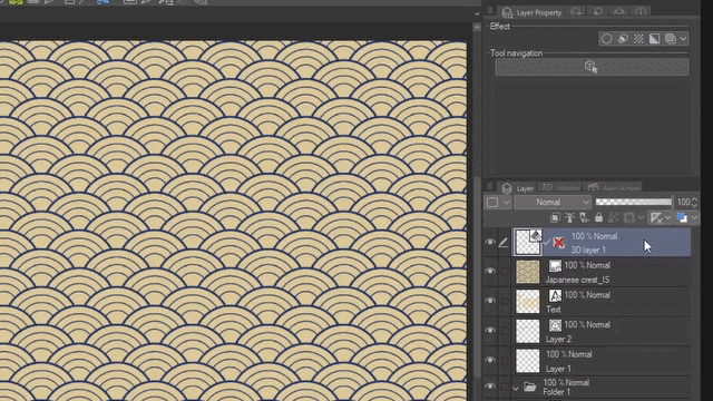
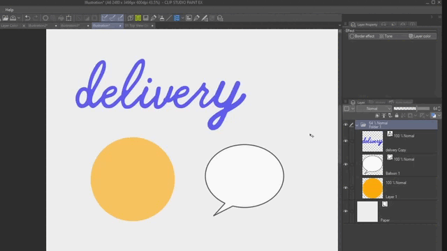
For this tutorial we are going to use the design from the image below as a main example but you can apply all these features and effects in any kind of project. So, let’s begin.
NOTE: If you want to learn more about the basics and settings of the Layer Property palette you can also check the official tips from Clip Studio:
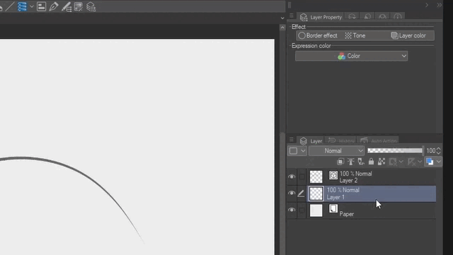
1. Type of Layers and Visible/Usable Properties
The Layer Property palette will introduce you to different non-destructive features, effects, settings and even show you the tools you can use depending of the type of layer you have selected.
It will show you the icon and the name of the effect or just the icon depending of the width of the palette. You can also use the drop menu to expand the options and read the name of the effects.
In addition, on the EX version you will find another effect that you can use to quickly Extract lines from 3D objects and images. You should find it next to or below the Border effect.
NOTE: If for some reason you can’t see the Layer Property palette, go to Window > Layer property. Also you can add it to you Command Bar as a pop-up palette.
1.1 For Clip Studio PRO
Using Clip Studio PRO you will see all the features with the exception of Extract lines. These options are going to change depending of the layer you have select. Some settings will be visible to use and some settings will not. For example for Raster and vector layers it will show you the same three standard effects and expression color options. But for paper it will only show the color of the layer.
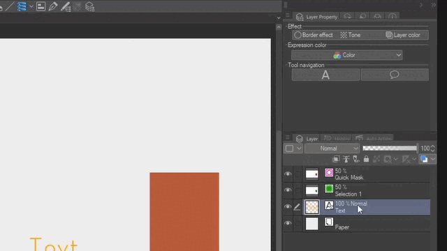
For text layers you can also see the three standard effects and expression colors. But for Quick mask and Selection layers you can only change the color.
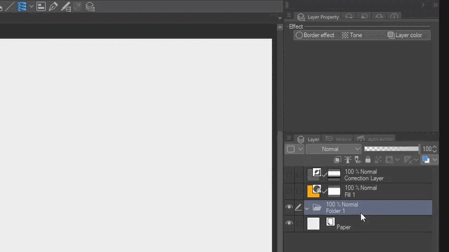
For Folder layers you can only use the three standard effects: Border, Tone and Layer Color. For Fill or Gradient layer you can only use Tone and Layer color. And for Correction layers or layers with mask you can choose to show or not the gradients.
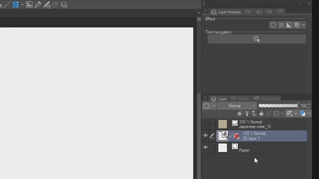
Now for 3D layers and Images or Pattern from images layers you will see two new options. For both Display decrease color and for images Overlay texture.
IMPORTANT: When you import or create File object layers you will see the same options that you can use with Images layers. You can create file objects from png, jpg, psd and clip studio paint files.
To learn more about File Objects you can check:
1.2 For Clip Studio EX (Extract line)
In addition to the options we just saw, in the EX version you can also use the effect Extract line which can work as a preview of the Convert to Lines and Tones feature but without the Tone work. This feature is often used with 3D layer and images.
However you can also use this effect with other type of layers with the exception of folders, fill, gradients and correction layers.
1.3 Multiple Effects (simultaneously)
You can use two or more effects for each layer at the same time. When doing so yo will see the name or icon of the effects that are active highlighted with a light blue.
If you plan to use multiple effects simultaneously you will need to scroll over the Layer property palette to adjust the values and parameters of the effects.
However you can save time moving and increasing the length of the Layer property palette or adding it as a pop-up palette in the Command bar.
Remember that all the effects from the Layer property palette are non destructive so as long as you don’t apply them or rasterize the layer you can always edit the properties or turn them off.
2. Expression Color & Display Decrease Color
Both functions will allow you to visualize layers in Gray scale or Monochrome mode. For 3D and Images layers you will need to click over the Display decrease color effect in order to change the Expression color. However, for Raster, Vector and Text layers you can change the Expression color directly from the Layer property palette without applying any effect first.
NOTE: In addition with raster, vector and text layers you can Apply the Expression color of the preview. Please note that this change is irreversible. So if you are not sure about the change create a duplicate of the layer first.
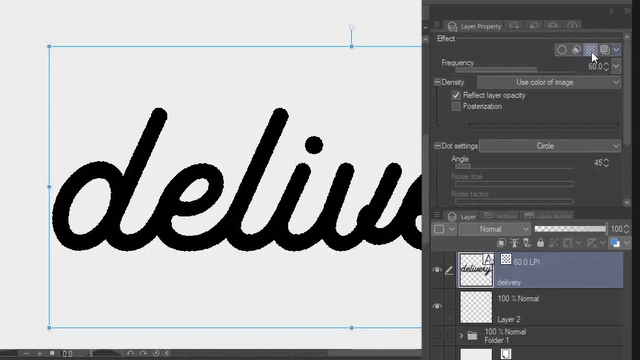
2.1. Monochrome to extract lines from a traditional drawing ink
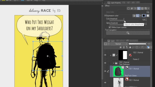
To extract lines from an ink drawing place the scanned drawing in your canvas. Then from the Layer property palette change the Expression color to Monochrome. You will see a small icon next to the layer thumbnail indicating that you are using the Monochrome option.
Then click over the black square. This is going to hide the white or light colors from the image leaving only the dark ink lines. But if you click over the white square it will bring back the white of the image.
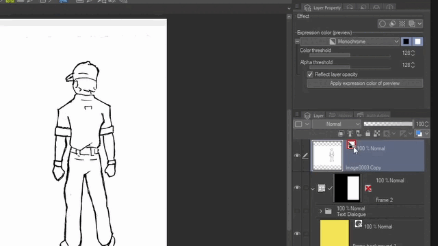
You can also move the Color threshold slider to the left to reduce the density of the lines. Or move it to the right to extract more texture from the lines (ink-pencil) and paper. For this example something around 128 to 144 should work fine.
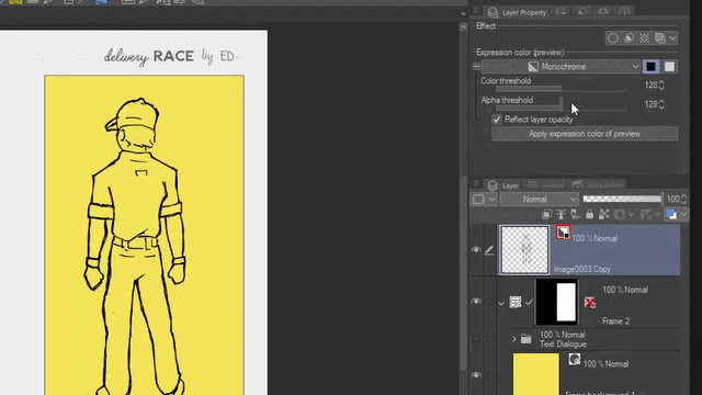
Once you are satisfied with the result you can click on Apply expression color of preview.
Then you can paint over the Monochrome layer to add shadows or details to the drawing.
2.2. Monochrome to extract black fill from Images
You can also extract lines and black fill from images and photos. For this example let’s import a File object from File > Import > Create file object… Then select the file that you want to use. You can use jpg, png, psd and clip studio files to create new File Objects.
You will see a small icon in the Layer palette indicating that is a File Object. Resize the image if necessary from the Tool property palette or with the Operation tool.
In order to change the Expression color of the image, first click over the Display decrease color icon or use the drop down menu from the Layer property palette and choose Monochrome.
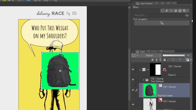
Now click over the black square to hide the white or light colors from the image-file object.
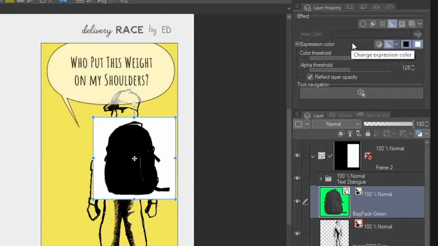
Then move the Threshold color slider until you are satisfied with the result.
You can also use the same process with 3D layers. But to see the effect make sure you are not using the Object tool with the selected layer. You can choose another tool or click over another layer.
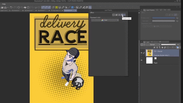
3. Layer color
With the Layer color option you can quickly change the color of a layer. By default when you click over it will change the color to a light blue.
And since is not a permanent change you can always turn the effect off to go back to the original image.
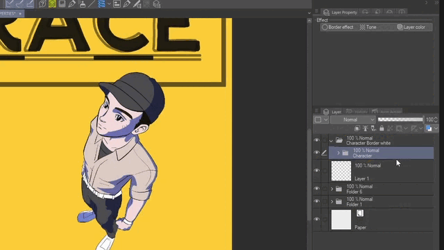
3.1. Draw over the reference
The default light blue color of the Layer color can be helpful for people that are used to sketch with a blue pencil first to later draw or ink over the sketch with a different color or black ink. Also this can be useful in Clip Studio when you use a 3D character and you want to sketch or draw over the reference.
You can also combine Layer color and Monochrome preview to make the process of drawing over the reference easier. Specially if you want to visualize the shadows or dark areas. If necessary you can decrease the opacity too.
Then you can apply the light blue again over the sketch to refine the drawing or inking on a vector layer.
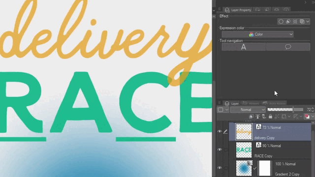
3.2. Add color to tones
When you use the Tone effect from the Layer property palette these always are going to be white or black. Even if you use color in your text or image the effect it always turn the information to black and white. For this example we are going to use the effect over a Folder to affect all the layers inside.
So the quickly and easy way to add color to tones is with the Layer color feature. To change the default light blue color click over the first rectangle next to Layer color and select the color that you want. The color you select it will replace all the dark colors in your image.
You can also change the default white for Sub color which it will affect to all the light colors of the image.
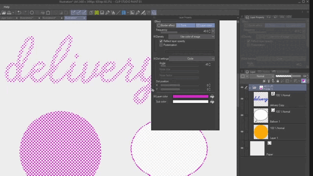
If you click on the bucket icon it will apply the color you currently have selected. You can also use the same color for both Layer and Sub color to get a solid, flat and uniform color for all the tones in the layer.
We are going to see more about Tone functions and features later in this tutorial.
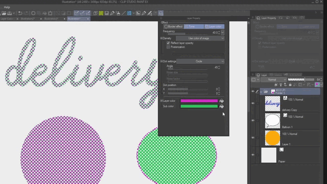
3.3. Duo-tone effect for images
Changing the Main Layer color and Sub color you can get different duo tone effect for images. As we saw in the previous point the first rectangle (Layer color) it will control all the darker colors and the second rectangle (Sub color) it will affect all the light colors or white in the image.
You can try different combinations of color in a similar way that you can try multiple combinations with Gradient maps. But in this case you can only use two colors Layer color for dark values and Sub color for light values. Mid-tones will be the result of the blending of the colors you select.
You can also try to invert the colors choosing a light color for the first rectangle and a dark color to the second one.
Remember this effect is not a permanent or destructive change. So you can always turn the effect off or on depending of what you need.
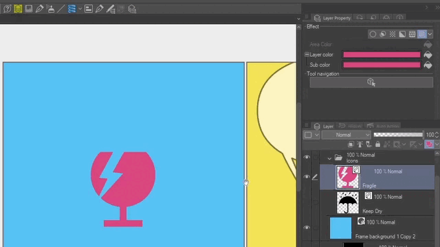
3.4. Color File objects
When you create or import a File object you cannot change its color from the Tool property or Sub tool palettes. Although, you can always open the file of the File object to change it from Layer > File object (X) > Open file of file object.
The faster and easy way to color a File object is to change the color with the Layer color feature. In this case we are going to use flat icons. So if you want to get a flat and uniform color choose the same color for Layer and Sub color. Use the bucket icon to apply the color you currently have selected.
As with the previous examples you can always change the color for a new one or just turn the effect off.
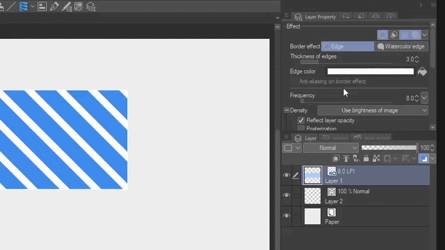
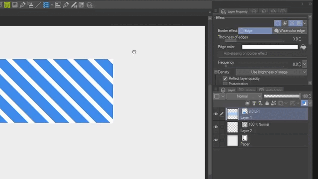
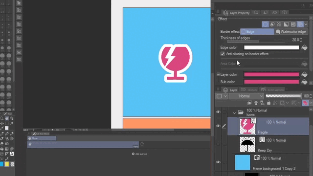
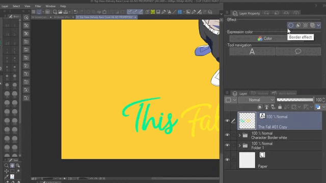
4. Border effect
When you click over The Border effect name or icon by default it will create a white border around the existent pixels in the layer.
You can change the thickness of edges moving the slider or writing a specific number. The maximum number is 250.
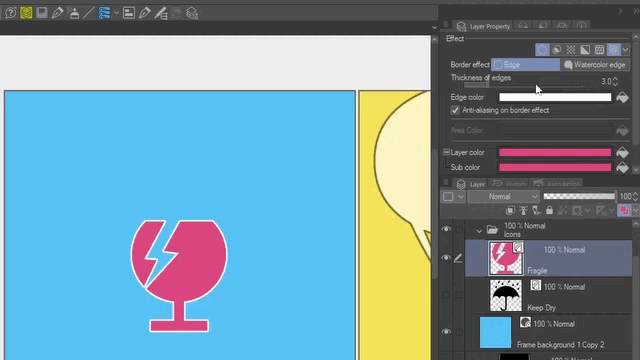
You can also change the Edge color with the bucket icon to apply the color you have selected or click on the rectangle to select a new color.
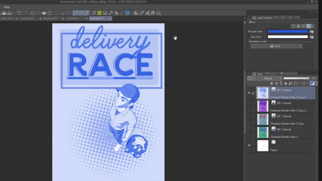
4.1. Multiple-Double border for text and characters
Now let’s say you have a text with a border effect but you want to add more than just one border around it.
You can always use Text Edges and add a Border effect later or vice versa to get a double border.
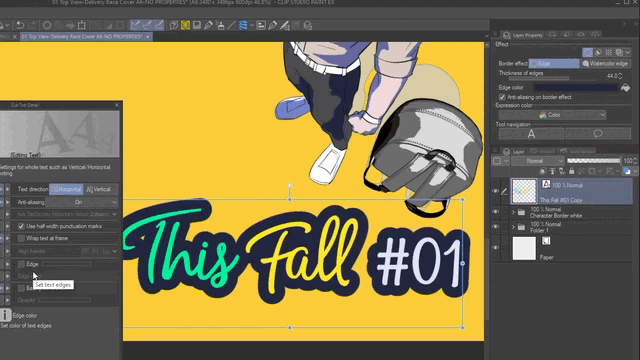
If you want to learn more about text features you can check the link below.
But the fastest and easiest way to add more than one border is to select the layer with the Border effect active and put it inside a Folder. To do that go to Layer > Create folder and insert layer… Then you can apply a new Border effect to the folder.
You can repeat this process as many times as you want and use different thickness and color for each border effect.
And since is a non destructive process you can always go back and edit your text or change the font style, size or color.
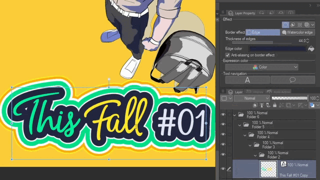
You can also use the same technique for characters or sound effects for comics, covers, posters, postcards or any other design projects.
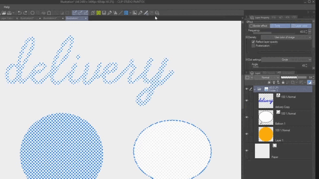
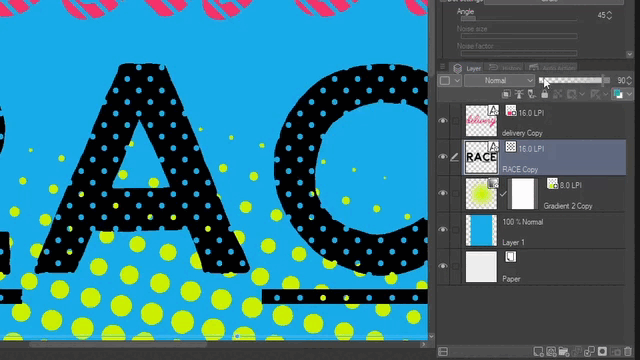
5. Tone
You can convert any text or image to tones or screen-tones by selecting the layer or folder and click over the Tone effect in the Layer property palette. It will represent all the values in an image with shapes or dots in black and white.
But you can always add color to them with the Layer color effect as we saw earlier in the tutorial.
5.1. Tone Size & Density
You can control the size of the Tone with the resolution of the document or DPI and the frequency of the tone per area. Higher resolutions like 350, 600 or 1200 DPI will give bigger tones in contrast to lower resolution such as 72 or 144.
You can choose the resolution when creating a new document. Or you can change the DPI from Edit > Change Image Resolution. If you want to keep the same amount of pixels click over the “Don’t change number of pixels”.
As for the Frequency of the tones, lower numbers will show you larger dots and higher number will give you smaller dots.
Now the amount of dots or shapes will be controlled by the Density. By default you can control this with the layer opacity Slider from 0 to 100 in the Layer palette. To turn this option on or off click over the check box Reflect layer opacity.
Lower values will give you smaller and separate dots to represent lighter colors. And higher values will be give you bigger and closer dots to represent darker colors.
To have full control over the density of the tone from 0 to 100% use pure black. In HEX that would be 000000. Also this will prevent the presence of white borders around the black tones that appears when you use gray or colors to create tones.
Select the text you want to use and change the color to black dragging the point to the lowest corner in the right area.
Then use the opacity slider to control the density from 0 to 100%.
Note: If you prefer to work with white tones then use pure white in HEX FFFFFF.
But if you need or want to use gray or colors you can hide the white of the layer by selecting Use brightness of image in the Density settings.
Remember as we saw in the first part of the tutorial you can apply the Tone effect to different type of layers such as raster, vector, text, folder, 3D, images and file objects.
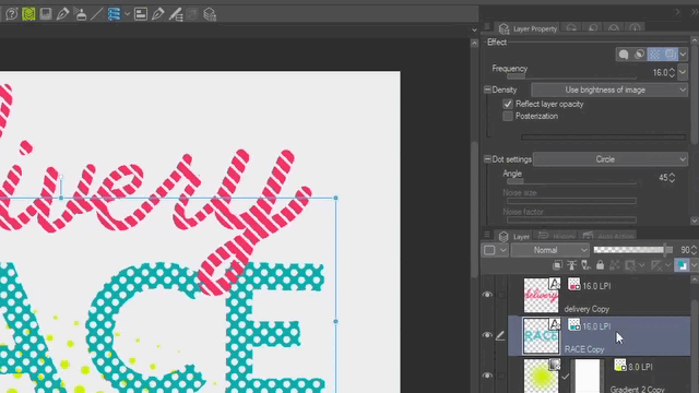
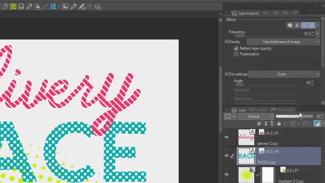
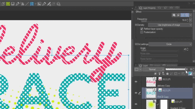
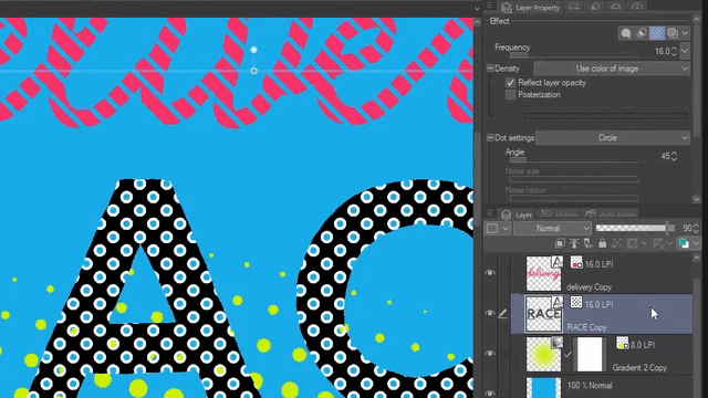
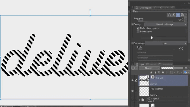
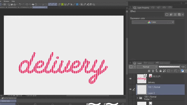
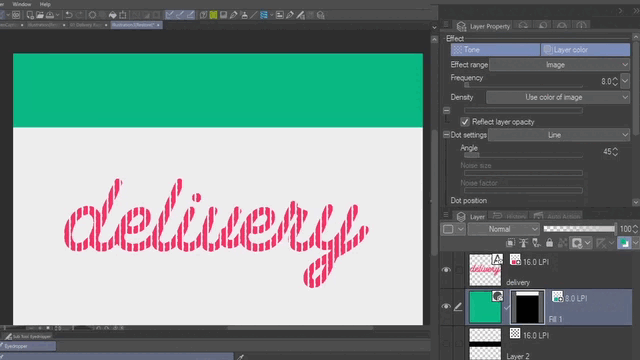
5.2. Tone Lines for Text & Fill
Create a new Text layer with black 000000 and click over the Tone effect in the Layer property palette.
Now go to the Dot settings and select Line. Then reduce the Density with the layer opacity until you see the lines. Remember to adjust the frequency to get bigger tones for this example let’s use 16.
You can also change the angle with the slider or entering a number in Dot settings > Angle.
Then as we saw earlier in the tutorial apply a color using Layer color and Tone at the same time.
You can also create selections to fill them with black in raster layers. You can also create new Tone layers from Layer > New layer > Fill or Tone. Tone layers are Fill layers with the Tone effect already activate.
If you use Tone layers you can also control the Density from the Layer property palette. Go to Density and from the drop menu select Use specified density and use the slider or enter a number to change the density of the layer.
5.3. Gradient to Tone
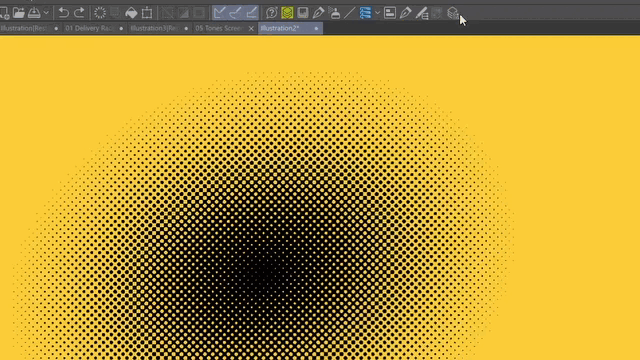
Select the Gradient tool and choose Manga gradient. In the Tool property palette select the type of shape you want to use. For this example let’s use Ellipse.
Drag the cursor over the canvas and apply the Tone effect. And since this gradient give us a pure black to transparency by default we don’t have to worry about getting white around the dots.
Select the Object tool to move the gradient and edit the size with the handles around it.
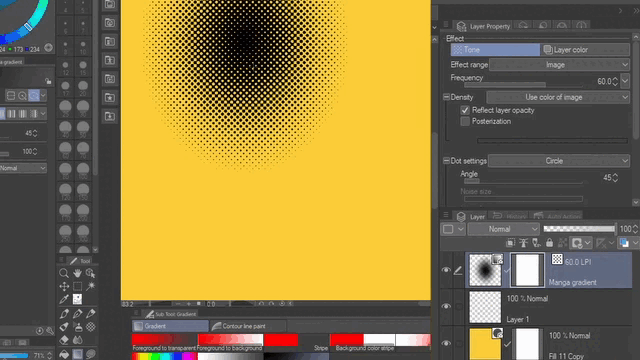
Then adjust the size of the dots and as before and apply color with the Layer color effect.
If you prefer you can also use Airbrush or other type of brush to paint and create the gradient of tones. Just make sure you use pure black to avoid white around the dots.
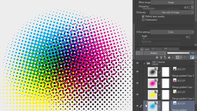
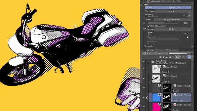
5.4. Superimposing color tones
Now in order to superimposing color tones we need to quickly check how the CMYK printing process works. Every color or ink is printed in a different angle and the combination of these will create the illusion of other colors.
So let’s duplicate the Ellipse gradient we just did and change the color and move the gradient around. The dots will overlap between each other in the same angle. So we need to change the angle taking as reference the CMYK process. By default the tone is set to 45 degrees so change the duplicate layer to any of the other degrees 0, 15 or 75.
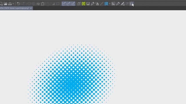
Following this method you can superimpose until 4 different colors. But you can also use Cyan, Magenta, Yellow and Black in different layers and change the Blending Mode to Multiply and combine the colors in the same way that printers do.
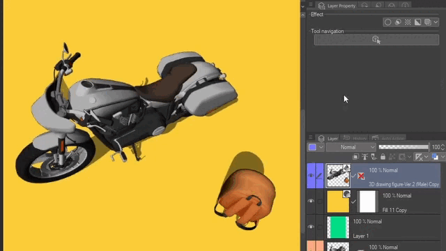
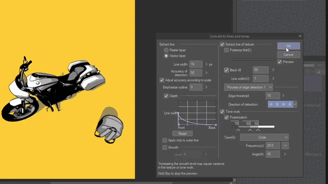
6. Extract Line (EX)
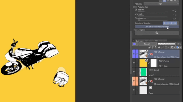
This effect is only available for the EX version. And as non-destructive effect allows you to visualize lines and black fill in a similar way that Monochrome but with more slider controls and options. For this example let’s use a 3D layer and move the slider to increase the Black fill. Then you click over Convert to lines and tones.
Once you click over the button Convert to lines and tones it turns into a powerful combination of Extract lines with Depth, Monochrome black fill and Tones. You can also decide if you want to get your lines in a raster or vector layer which will allow you to edit the lines later if you want. To see the changes click on the Preview check box.
If you want to reduce the levels of color like in “cell shading” style. You can play with the Posterization values and slider under the Tone work section. You can also change the other settings we just review in the previous points such as dot shape and frequency.
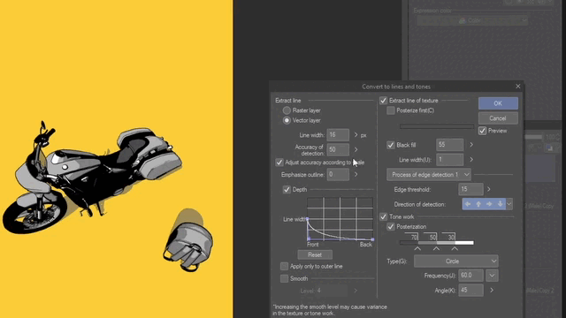
After you click OK you will get a new folder with all the lines, fills and tones separated in different layers.
Then you can edit the Tone layers and change the angle and colors with Layer color to superimpose the dots as we saw earlier. By default tones are set to 45 degrees so change the duplicate layers to any of the other degrees 0, 15 or 75.
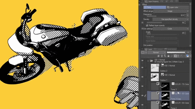
Remember you can also control the density of the tones with the layer opacity from the Layer palette.
This feature can save you a lot of time specially when using 3D layers to make objects, props or environments. However, you can also use it with raster layer in case you computer cannot handle large 3D data. But you will not have all the options to control the Depth of the line or choose if you want a vector layer for the outline.
If you want to learn more about Convert to Lines and tones feature you can also check the links below:
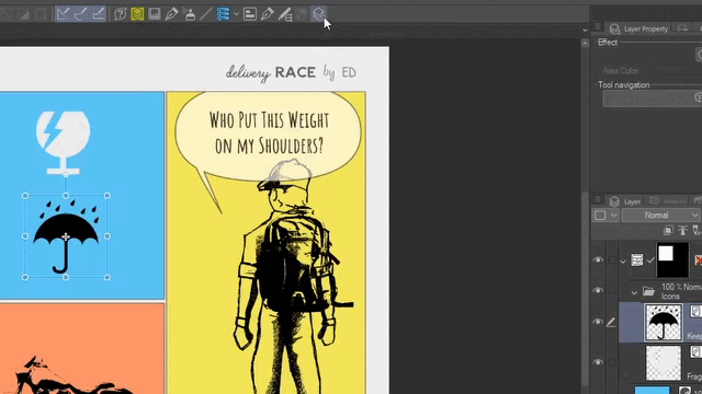
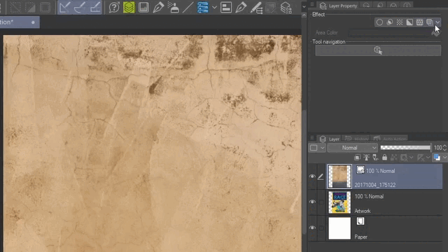
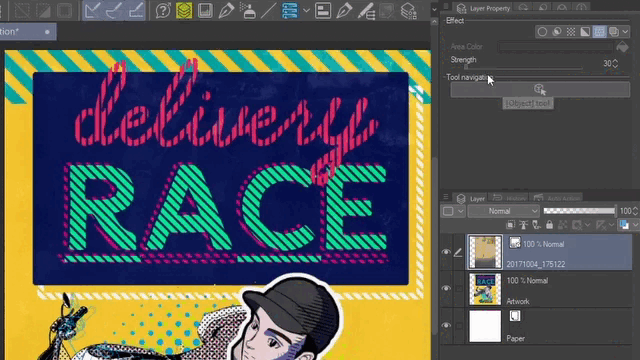
7. Overlay Texture
Now let’s put all the things together. This is how the artwork looks so far using the features from the Layer property we have seen. But we still haven’t see one option the Overlay Texture effect.
If you want to add some texture to your designs or drawings you can import a photo or image from File > Import > Image.
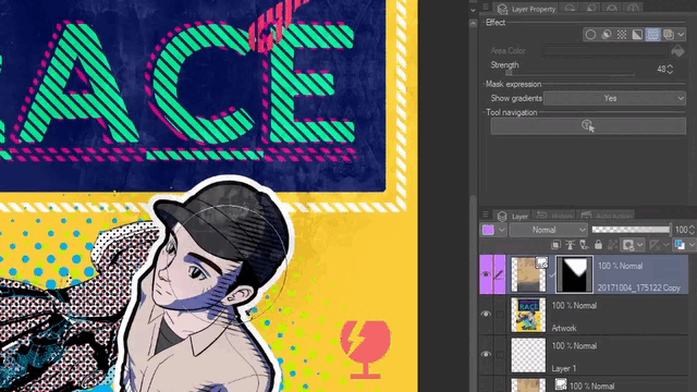
Then select the effect Overlay Texture in the Layer property palette. The image will change and show you only the texture from the photo or image.
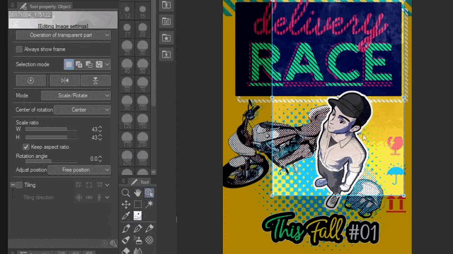
You can reduce or increase the texture with the Strength slider or enter a specific number. If necessary use the Object tool to move or resize the layer.
If your image is smaller that your canvas you will notice that every pixel outside the image is darkened. To avoid this go to the Tool property palette and click on the Tiling check box and from the drop menu choose Reverse.
Then you can use a mask to hide or reduce the effect in some areas of the design or illustration with gradients or using transparency with airbrush.
Summary and Conclusion
In summary, you can use one or multiple combined effects and features simultaneously from the Layer property in different design projects, comics and illustrations. Also, remember that you can stack more effects using folder layers.
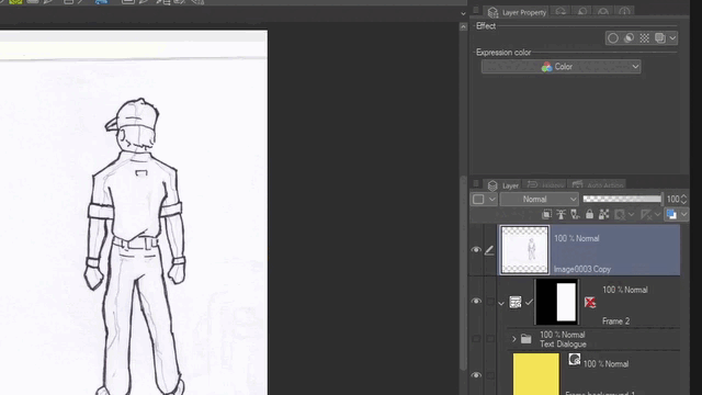
Here we can see the last version for the three comic frames where some of the features we saw were used. Some of them are Double Border effect, Expression color Monochrome to extract lines and black fills and color file objects with Layer color.
And here you can see the design that we use as example to shown most of the features in this tutorial including Border edge, Tone, Layer color, Extract line, Overlay Texture, Display decrease color to Monochrome and more. The first version shows the texture extracted from the photo and the second doesn't have any added texture.
Moreover, here you can also see how it is possible to combine your design with duo-tone images. For these examples the Layer color is applied to a folder layer and outside of it you can place the text with effects of borders and tones.
Note: The colors used in the duo-tone examples are inspired in old comics-manga published in phone-book-size magazines generally printed on cheap newsprint.
So, I hope you have found something useful about using effects and features from the Layer property palette on this tutorial. Feel free to leave a comment or share your thoughts about the subject below. This is Ed saying until the next one.
More tutorials:
Users who liked this post


Comment