
Hello, Danny here, I am just going to be showing to new Clip Studio Paint users, beginners for short, the Ways they can Level-up the composition of their characters and scenes.
————————
Firstly I will like to ask;
————————
▪️ What do we understand by composition of characters?
When I first started designing some of my main characters which I wanted to use as my OC (Original characters) when ever I do some freelance and step by step tutorial, I started of designing my main characters "off hand" and I do tell my self back then that using of reference and imitating of other great artist work makes me not an artist and that it will not make my artwork unique, but in due time I get to learn the hard way that having that kind of mind set is very wrong, take today's tutorial for example " composition of characters" simply meaning:
Composition that are used to emphasize the unique features and personality of the character.
————————
When creating a new character composition, it can also be based on more than one individual form or ideas during their creation or illustration design.
So with that thought, designing of characters do not just mean we should always create our concept characters or OC (Original characters) from just our mind, which is very ok if you have been doing digital artworks for along period of time but not so good for those who just started digital drawing of recent (beginners).
————————
Pointing Out:
If you as an artist is just like me having this idea that unique characters are gotten by just imagining that drawing of Characters with out any references, please I do advise you delete such thought from you mind because uniqueness are not just gotten from new creation but it is easily gotten from one been able to manipulate already existing images and home your creative skills from what are available around us.
————————
Hence, composition exist in two part, the composition elements of the environment and the elements of the point of emphasis (also know as the focal point),
Take the below landscape scene image which is made of various objects such as the rocks -tree -bird and a -single house,
————————
Now take this character below add it onto the scene above,
————————
Thus, we will notice that by placing the character in front of the objects in the scene, we tend to have make it the point of emphasis (focus point) by default with out we doing anything in some way cause the eyes of those viewing the image will first be concern on what is the figure covering the house,
————————
This may sound abstract to the beginners; Yeah, as we have a character in a particular scene, the characters and the scene both have what they are composited of or made up of (which can either be complimentary to each other or not) but the important thing there is that those things which the character and the scene are made of are known as there "Composition".
Like take for example this below image which composed of the -character -object and the -landscape that are all in the scene.
Thus, we will notice that by placing the character in front of the objects in the scene, we tend to have make it the point of emphasis (focus point) by default with out we doing anything in some way cause the eyes of those viewing the image will first be concern on what is the figure covering the house,
Now, for we to be able to easily achieve the above mentioned, we must first understand some simple principles or rules which I do believes govern this concept composition and those are;
- Having a good choice of canvas size
- Elements of composition
- Structuring of subject figure (characters/objects/Focal points).
- Balance
- Final touches: Contrast Simplification
1- Having a good choice of canvas size
Each time I started a new digital painting, I used to basically guess at what size the canvas should be. Sometimes it would work out fine, but other times it would lead me into frustrating issues with the painting further down the road.
Which later makes me ask myself “how do I make a right choice of canvas?” and “how do I better decide on when to use a landscape canvas or portrait canvas?”,
————————
With all this question in my mind I research the more and I learnt that the best thing to do at time as a beginner is to first make myself comfortable with the common size of canvas starting with the using of the perfect square or rectangle size (which for me I set the canvas size to rectangle size,
• Portrait size- widths to 1080px × heights to 820px and for,
• Landscape size widths 820px × heights
1080px).
————————
And when I am to decide on the choice of a canvas size, I just simply think within my self what kind of drawing do I what to draw, is the objects in the image going to be displayed upward- downward or left- right, if upward- downward, I will just stick with portrait size. But if left- right, I will stick with landscape size.
With our choice of canvas made, we can then move on to the next aspect of today's tutorial.
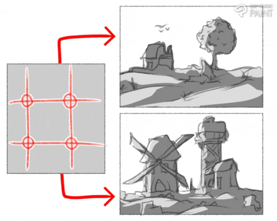
2- Elements of composition (Landscape environmental scenes)
In the above thumbnail images shown about an environmental scene, we saw how the different object or subject in the scene gave the scene it unique appearance which are it composition; but I will like to point out that scene tends to change base on what and where the artist wants the audience or viewers to focus their gaze.
Which then bring us to learning...
————————
How do Composition Vary?
That is a great question cause when we use our camera to take shots of the different environment around us, looking closely at the images taken, we will notice that the each have their composition displayed in different formats with each of the different objects in the images relating, combined or arranged together on/ in scene which are commonly known as either elements or rules or Laws of Composition.
The artist has complete freedom when choosing the composition of their artwork. Elements may all be clustered towards the centre of the canvas or photograph, or spread out in the corners of the piece, and common name for the expression of the objects in the scene and including the characters is known as “rhythm”.
————————
▪️ Rhythm,
As I will like to point it out there that the laying of elements gives our artwork “rhythm” that help to create a sense of life in a piece of artwork. Rhythm can be created by repeating elements in the composition or by using lines and shapes to lead the viewer’s eye around the artwork.
Take the following rules of elements which govern composition;
(i) The rule of thirds
The rule of thirds is a composition guideline that places your subject in the left or right third of an image, leaving the other two thirds more open.
————————
While there are other forms of composition, the rule of thirds generally leads to compelling and well-composed shots.
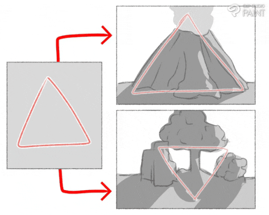
(ii) The "triangular" or "pyramid" rule
Triangular composition involves forming or making use of a triangle within the image. Right-side-up triangles are good for creating stability because of the broad base. The equilateral triangle formed by the tiny cluster of flowers helps to create a well-balanced composition.
When I talk about triangles, I mean two things:
• Having three elements in your frame that create a triangle.
•Placing elements in your frame in such way that it creates lines in a triangular shape
It is pretty straightforward. Three things = triangle. Easy, right?
————————
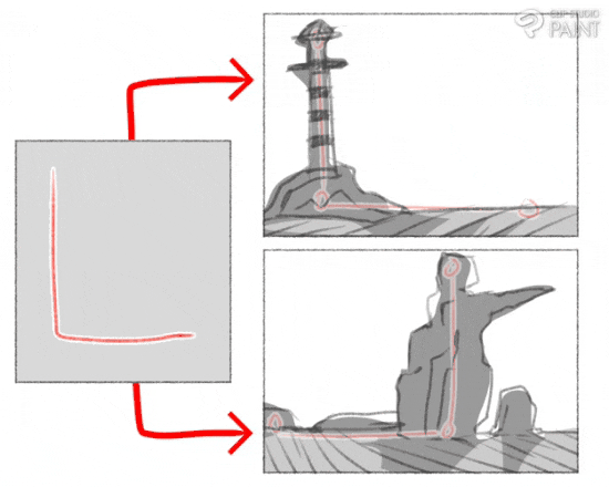
(iii) The "L" rule
When a horizontal and vertical image axis are placed off center, we can recognize a L shape. This is the L composition. Elements in the image are located on these two axis.
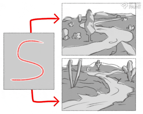
(iv) The "S" rule
Elements does not just lines and shapes alone, letters can also be use like take letter S for example which is a kind of zig zag expression like let's say a viewer viewing a road that are curve.
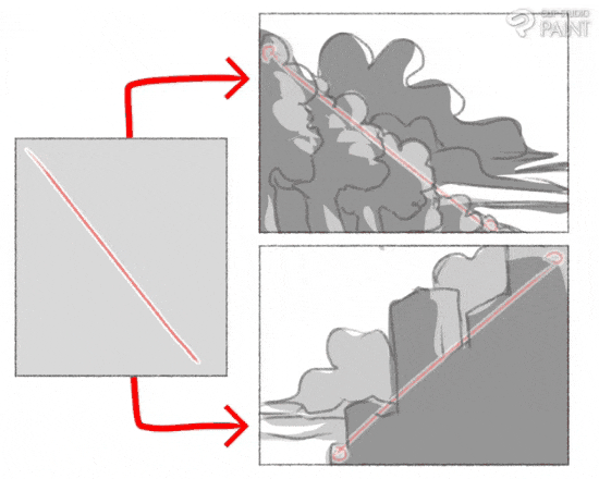
(v) The "diagonal" rule
In diagonal composition, the elements in the image are organize based on a diagonal line. Such a composition can emphasis perspective, give the image a sense of depth, and also add dynamism.
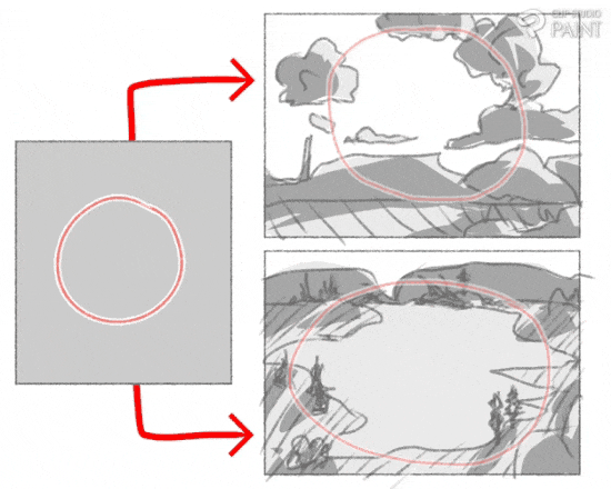
(vi) The "circle" rule
Circular composition is a technique used by master artists to tie together, in a circular fashion, specific elements in a drawing or painting. This design approach is one of the more easily recognized techniques utilized in a work of art.
Where by take the first thumbnail images by the top right corner the clouds coming together forming a circle, always as we can also see the thumbnail images below it is a lake with lands around it makes the lake circular and making it the point of emphasis in the thumbnail images below.
And those mentioned above are some few elements of Composition.
Next,
————————
3- Structuring of subject figure (characters/objects/Focal points)
Some of the way which we can manipulate the composition of our characters to our advantage is by firstly making the decision on the kind of structural blocking we want to give our OC (original character).
————————
▪️ Character Structural Blocking (advantages of shapes),
The structural blocking of our characters is the fundamental foundation which involves we using our regular shapes to give our characters each their unique appearance while keeping in mind the role which we want each of the characters to take on the scene, such as
(i) Blocking the characters in a round form to give them a cute kind of appearance or,
(ii) Blocking the characters in a square form to give them a strong kind of appearance or,
(iii) Blocking the characters in a triangular form to give them a evil or bad kind of appearance.
————————
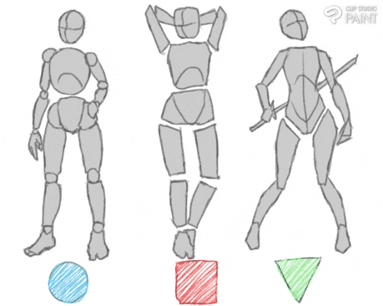
With this part of Compositing using shapes helps artist lay-out their characters in easy ways or forms so as not to bore the audiences (or viewers).
Using of the common shapes also can help the are express the characteristics of the individual characters;
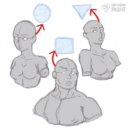
Notice: the female character by the left in the image above which I use the circle shape expressively to frame her, how she appears more cute, free and welcome, those characteristics are there cause of the way I use the circle shape on structuring her.
Next, is the female character by the right in the image above which appears to be evilly cute, strategic and villainous in expression, this is as to the help of the characteristics of the triangular shape.
While the male character in the middle in the image above which appears to be strong, bold and rigid expression thanks to the characteristics of square shape which I use to frame him.
▪️ Character anatomy (straight up body blocking)
Character anatomy is a very complex aspect which beginners tend to find difficult and it has often been covered over and over again but I will just be laying out the common shapes which as a beginner can make construction or drawing of characters easy.
If you are a beginner do Note that “this is no perfect style of draw or frame characters body” so if you find the process I will be showing below difficult I do advice you just don't just force it just try manipulating it to what suits your style of drawing better OK.
a) Torso
Blocking for the male character their torso tend to look like an exclamation mark (which have a big box stack on top of a small box).
While the blocking for the female character their torso tend to look like an hour glass (which have both the top and bottom part pointing out and the middle pointing inward).
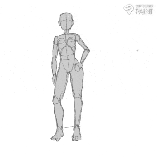
b) Lower limbs (the legs)
The lower limbs are drawn using circle shape which is for the three joint which are located on the leg starting from the pelvic bone downward, and square shape which is use for the big bone parts on the legs, whereas they tend to look structure or frame like a dummy limb to be used as guidelines, as shown below
c) upper limbs (the hands)
The upper limbs are drawn using circle shape which is for the three joint which are located on the hands starting from the chest bone downward to the waist, and square shape which is use for the big bone parts on the hands, whereas they tend to look structure or frame like a dummy limb to be used as guidelines, as shown below
d) Entire body structuring
At this point, bringing the entire body parts we just Structured together, we will tend to now have our created characters for both gender characters (the male and female character).
Now that we now understand how to structure, block-in and give our characters their own different kinds of expression as we create the entire body of our characters, we can then move on to the next aspect.
————————
And if you want to learn how to draw the body in different size or Maybe in different dynamic poses, do check the following course ofine, the links are below.
Any of those above will further help you improve more.
▪️ Usefulness of Perspectives
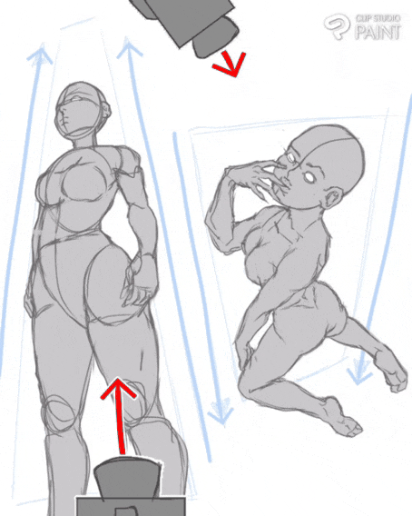
Embracing different perspectives also gives people opportunities to counteract their art styles. It exposes individuals to new information that can challenge their preconceived opinions and notions. This can help them recognize their biases and reconsider their current ways of thinking about groups of characters and ideas which can also add “spontaneous expression” to the pose of the character.
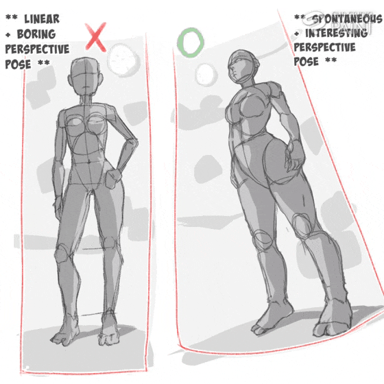
+ **Notice**howintheimage,theoneonthe**left**isjust**vertical**or**linearlyposition**andisviewedfromthefrontwhichmakesitlook**straightup****boring**and**uninteresting,**buttakingtheonebythe**right**whichstandingalsostraightalthoughit's**tilted**and**positioned**atoneofthe**edge**ofthe**canvas**andisviewedfrombelowgivingthe**character**a**spontaneousinterestingdynamic**expression.
Understanding different perspectives sometimes can be hard to do. It can require artists to step out of the mental states or ways of thinking they feel most comfortable in. That takes real effort.
However, a few key strategies which can make the process easier, is to firstly
• Decide on the kind of expression you want you character to have before giving it a perspective,
For example take the two perspective pose below, hence one by the left which base on it perspective is expressing a serious and focus kind of character posing and the one by the right is expressing a kind of free and spontaneous kind of character posing.
• As we can notice in the above image, the left character is drawn having a small upper body with a bigger lower body which is as the result of the camera position from downward up.
• while that of the right character is drawn having a bigger upper body with a small lower body which is as the result of the camera position from up downwards.
Consider the following ways through which we can engaging or captivate viewers using the different perspectives in ways that can also help nurture creativity, understanding, curiosity, and learning into the viewers and in us artists as we progress in the digital art world.
————————
▪️ Manipulation of poses,
I included this aspect “manipulation of poses” because as I previously mentioned above, I want to make it clear that manipulation is not cheating, hence, if you think of it "what is new in this world", show me what are new and different in every way in this world and I will tell you terms and reasons why it can not be new.
Note: that this aspect pose two important to the composition creation of characters,
The first (i) is that we can use manipulation skill in the creation of the characters poses by either recreating our other characters poses or we use that of our reference image poses to make our works easier and quicker as we can see below.
————————
Notice how I use A the lower body parts on both the lower parts of the character B and C this is considered as manipulation.
The second (ii) is that, manipulation skill help makes the designing of our OC (original character) more easier because in the process of which one uses already made thumbnail images as our reference point or image, using different settings of the reference image, learning from already made thumbnail images by great artist and taking to note their art style or precepts which govern their art style which we can then implement or rule out to better help us in the creation of our own types of characters, giving them their own unique appearance in the format of their facial expressions, body blocking, customs and more.
————————
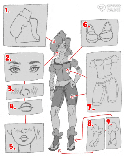
Note: most of the reference images 1- 9 ideas or art style which I make use of as shown above, I got them from studying other great artist and things around me, Like for;
1. I use of block shape to frame the hair (which I got from studying marc burnet).
2. I use anime style of drawing eyes.
3. I just draw the nose to my own liking, trying to build or home my creative skills.
4. I make use of “Steven universe” style of drawing mouth, I do love the way which they do not obey realism.
5. I apply the influence of the round shapes to the chin of my character which I believe do better show the cuteness of the character.
Then for 6, 7, 8 and 9 which are the custom wears, I simply just use some of the clothes which I see people put on around and use them are my reference point.
Whereas as with this various ideal images 1- 9 can also be refer to as the composition elements of the above character which made the creation of the character more faster and easy.
Which with the various above reference image 1- 9, we can create variety of characters by the means of switching, changing or manipulating of any of the above with the various aids of already existing reference image to easily create variety of character.
▪️ Creating movement
Generally, it is thought to be more pleasing to the viewer if the image encourages the eye to move around the image, rather than immediately fixating on a single place or no place in particular. Artists will often strive to avoid creating compositions that feel "static" or "flat" by incorporating movement into the image.
Take Thumbnail image A for example, [the character is jumping something while running through the school hall walkway with a by standard shouting in anger to the running character],
Give the image energy and tense to make it interesting to those who see it.
Whereas in the Thumbnail image B, [the three characters sitting in a stationary or static position with the two in front conversing and the third stalking some boxes].
The image lacks energy cause the characters are sited and stationary.
————————
4- Balance
Balancing a composition involves arranging both positive elements and negative space in such a way that no one area of the design overpowers other areas but if it those should lead the eyes of the viewers to a focus point. Everything works together and fits together in a seamless whole. The individual parts contribute to their sum but don't try to become the sum.
Like take (1.) Symmetrical Balance as shown below which is achieved by giving equal weight to elements across the center-point of a composition. The center-point can be horizontal, vertical, or diagonal.
The result is a repetitive or mirrored (referred to as perfectly symmetrical) image that appears to be completely equally balanced. An example of formal balance, symmetry promotes a highly organized and balanced composition.
While as we can see in that of (2.) above, Asymmetrical balance occurs when the elements on a layout are different, but by being equally weighted still feel balanced. There might be two elements with a similar weight but different shapes, or one larger, heavier element balanced by a couple of lesser focal points.
Compared to symmetry, asymmetrical balance can produce images with varying levels of attractiveness, but generally they make for more interesting, dynamic images. A type of informal balance, asymmetry can take a little practice to get right, but the results are well worth it as shown below.
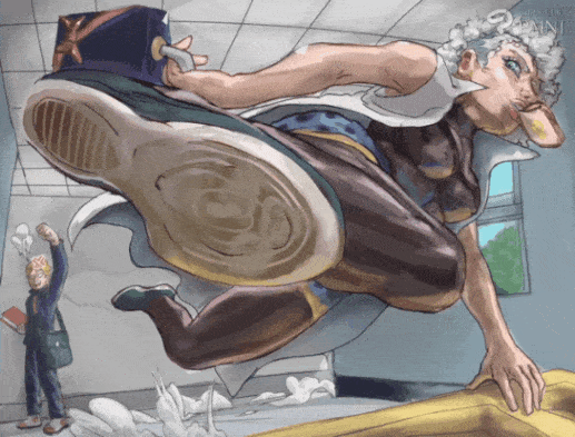
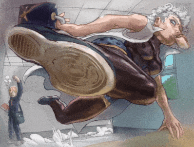
The first character closer to the view point as we can see show a great form of dynamic and that is not all, base on that the character obey the rules of Compositing, when the character is rotated it tend to take any dramatic pose as is below.
Now with those above mentioned out of the way,
Back to the drawing of our character,
With the thumbnail images of the ways which we want the characters to be position properly lay out, we can then add some flat colours and shading to the characters and the scene.
Notice how everything of this character tend to be expression should as her facial expression and perspective pose, it makes the image interesting and not boring.
I will like to point out that I made use of two types of Compositing rule,
The [tunnelling rule] which is the one I used for the background scene.
And the [triangular or pyramid rule] is the elements of Composition which I used for the pose of the foreground character.
Notice that I made use of two sets of triangular compositing, the red triangular marking the extension between the head, hand and right leg, while the blue triangular marking the extension between the bag, left leg and the bread in the mouth of the character.
Note: that it is allowed to use as much compositing elements in an image as there is no rule that hinder such, but also avoid using compositing elements that do not relate well with each other.
For example: take today's tutorial elements are two triangular, “L” rule and tunnelling elements.
5- Final touches: Contrast Simplification
Images with clutter can distract from the main elements within the picture and make it difficult to identify the subject. By decreasing the extraneous content, the viewer is more likely to focus on the primary objects. Clutter can also be reduced through the use of lighting, as the brighter areas of the image tend to draw the eye, as do lines, squares and colour. In painting, the artist may use less detailed and defined brushwork towards the edges of the picture. Removing the elements to the focus of the object, taking only the needed components.
▪️Shallow depth of field
One approach to achieving simplification is to use a wide aperture when shooting to limit the depth of field. When used properly in the right setting, this technique can place everything that is not the subject of the photograph out of focus.
Take the created character for this tutorial which is the image below.
Now apply the principal of adding depth of field to the above image,
Start by creating a new layer as shown above, set the blending mode to [Multiply] and then use the airbrush to add some darker colours to the four corners of the character image.
With that done we can now see the nature of changes that little touches did to the image.
Moving on to the next step which may seem simple, small or irrelevant aspect but tend to play a useful role in enhancing images. And that aspect is,
▪️Adding of Noise monochrome effect
Firstly as a beginner, you need to add the [material] to the pallette bar,
then on the pallette bar, scroll to where the [material: basic] (1) is, click on it and a mini dashboard will appear with the various material (such as the dot, noise and more), then click on the material which for this tutorial I will be making use of the noise material. Select the material and drag the noise material onto the canvas as indicated (2).
The material will create it's on Layer indicated as (2) on the Layer selection indicated as (1).
With the noise layer created, we can now set the blending mode to any of the three mode (opacity, soft lightening and hard lightening) and reduce the opacity to 50% as shown above.
That concludes the process of adding the noise monochrome effect.
Next is the,
▪️ Adding of Gaussian blur effect
The first thing we need to do is to add the [auto action] sub tool to the pallette bar as we did in the depth of field mentioned above,
A mini dashboard will appear, at the top right corner is an icon with a box an an arrow pointing inward symbol on it, click on it.
A new dashboard will appear called “add auto action set”, on it is the material indicated as (1) which I downloaded from the assets store solely for this tutorial, select it and press [add pallette] indicated as (2).
It will be added to the (auto action) selection as shown with the red box, select the type you want indicated as (1) and then click on the play icon to add it to the canvas.
When Gaussian blur is added it will create it's own layer above the original image layer and it will make the original image layer invisible, so make it visible again.
We can then select the Gaussian blur effect layer, use the eraser Sub tools to erase the parts of the image which you do not want to be blur out,
We can erase the Gaussian blur differently to give the viewers expression or make the viewers focus on the parts you want them to see more.
Now with that done it concludes today's tutorial, below is our final character image.
Summary
Let's go over everything one more time by doing a quick recap on what we have learn in tutorial, composition are elements (such as objects and subjects) the can flow in form of a rhythm on a scene.
The different forms of elements composition are rules of third, triangular rule, L rule, S rule etc.
The following steps which you need to take into note is that for we to create an image with a good compositing elements we need know more about
- Having a good choice of canvas size
- Elements of composition
- Structuring of subject figure (characters/objects/Focal points).
- Balance
- Final touches: Contrast Simplification
By do the following and frequently practices you are good to go, so See on the next tutorial bye- byee.
Users who liked this post


Comment