
Mind-Saving Tips for Webtoon Paneling in Clip Studio Paint!
Video version:
Text version:
Hello!
I'm .avi. I work as a professional game illustrator and creating comics and webtoons is my hobby.
A lot of artists may find paneling a tedious or even frustrating task that they just need to get over with somehow, but it can actually be quite fun and quick if you use the right tools!
I enjoy researching the most efficient ways to work and create comics, and in this tutorial, I’d like to share some tips on how to save your time and mental health during the paneling phase of your comic in Clip Studio Paint, using its well-known and not-so-well-known yet surprisingly helpful features.
If you have a question, feel free to ask in the comments below the tutorial! I’ll do my best to answer!
Workspace
Here are a few quick tips for maximizing your view of the canvas.
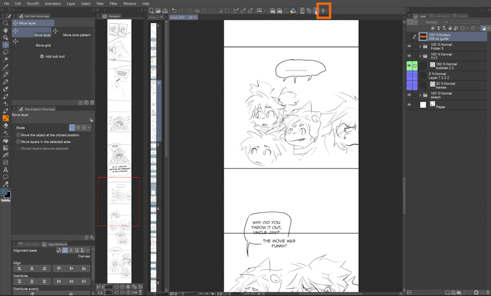
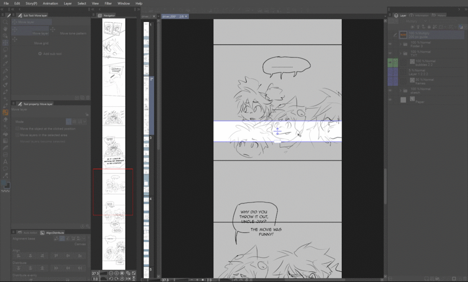
First is the Navigator palette – I keep it docked on the side so I can easily open or collapse it. With it, you can quickly jump from one panel to another without scrolling, as well as keep track of the overall canvas.

Next is a hidden shortcut Shift plus Tab that hides the topbar of the app to give you more vertical space to work with! If you press it a second time, the menu bar gets hidden as well, and with the third, both of these bars return. I keep both bars hidden most of the time, since I use keyboard shortcuts, which is another tip to speed up your workflow.

Vector layers
Before we get to panels, there’s one important thing you can do to save your time later.
From the very beginning, I draw directly on a canvas that is 200% of the final output size.
What about thumbnailing on a small canvas?
When you use vector layers even for sketching, there’s no need to start out on a downsized canvas! Not only can you easily edit and transform your sketches without losing quality, you also save on the file size and the upscaling later!

Since vectors are calculated mathematically, they are independent of the scale or resolution. The text is also vector, so until you start painting and shading, the file size is only for about 1/3 bigger than if the canvas was at the thumbnailing 25% of the output size.
Canvas height note
As a side note, I’d like to mention the height of the canvas. The best would be to have the longest canvas possible, preferably for the whole chapter, however, one has to take into consideration the processing power of the computer, as well as the possibility of adding panels and space between them later, which will increase the canvas height.
Technically, 50 000 pixels is the maximum the app allows, but I rarely get that far since my computer wouldn’t handle it. I arrived at the base height of 20 000 pixels, which allows me to storyboard enough panels while leaving enough buffer for expanding the canvas with additional panels and empty space.
See what base canvas size works best for you!
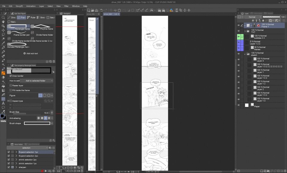
Frame border tool
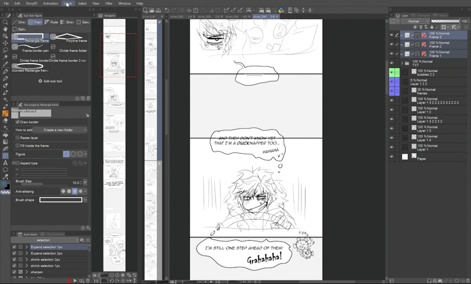
When I’m more or less satisfied with the storyboard, I use the frame tool to define the panels. Since there are many tutorials on this tool, I’ll show you the approach I use, which is probably a little unorthodox :D
By default, the tool always creates a new folder with a mask in which you draw the content of one panel.
However, drawing all frames in one frame folder is the best option for me since I like to draw similar elements like characters, the car, effects, etc. together to keep the colors consistent.
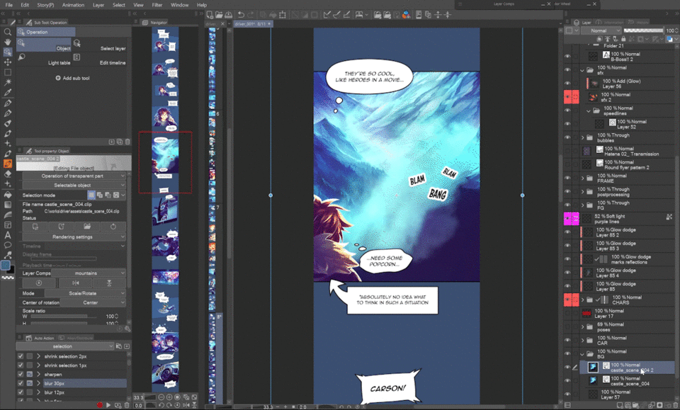
This is an example of my file structure. I put the frame folder containing masks for all panel at the top, just below text and sound effects. Everything else has its own folder throughout all the panels, like post processing, foreground, characters, etc. Thanks to this I can keep colors consistent and changing something, like the light color or the color of the jacket in all panels at once is super easy!


Also, if you want a character to pop out of the frame, you can just make a selection of their layers and delete the area from the mask of the normal folder that contains the frame folder (since it already has its own mask).
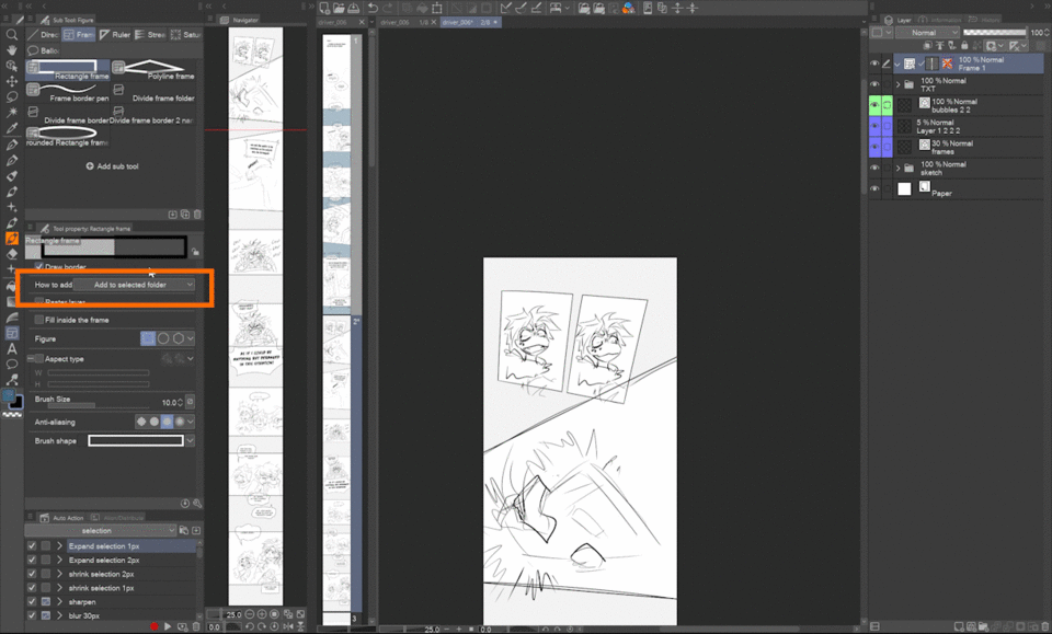
With the Rectangle frame tool set to Add to selected folder and Fill inside frame unchecked, I just pull the rectangle over the area of the future panel.
Notice that I don’t bother with the canvas edges, and even with slanted panels I first use a rectangle.
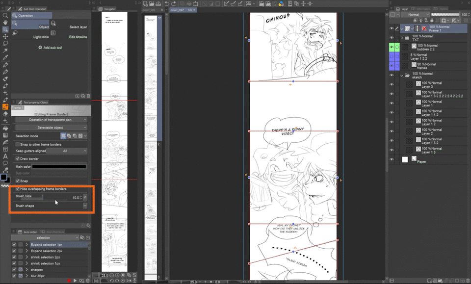
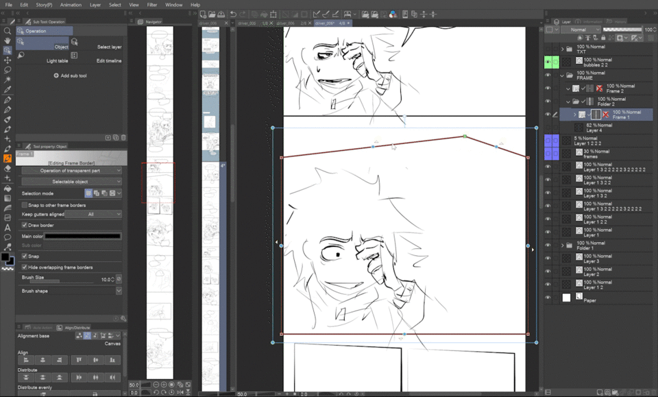
Operation tool
Now we have all panels within one frame folder. If you press Control, the vector shapes should become visible as the tool temporarily changes to Operation tool. If not, select the operation tool from the palette.
With the Operation tool you can further modify the frame shapes, like adding or removing points, etc.
These little yellow arrows are a handy feature since if you click on them, they tend to snap to whatever seems close to what you want them to snap to – be it another panel’s frame or the canvas border.
By dragging the control points, you can change the shape of the panel.

With the same tool on, you can change the color and size of the border, or even the brush used! Like this tire track brush or splatter brush!
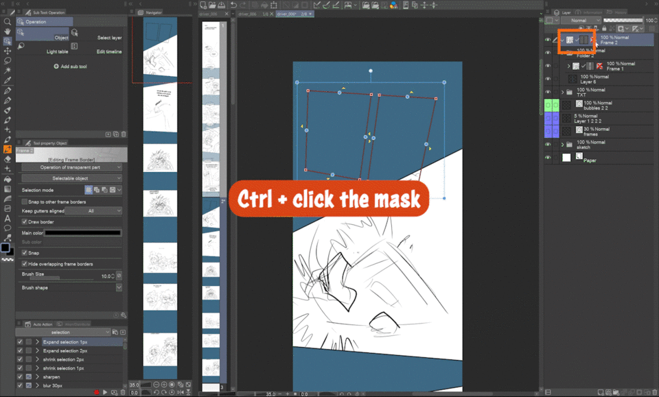
Since there’s no option to fill the outside of the frame, I do this manually by Control-clicking the frame folder mask, inverting it and filling a new layer with color.
That layer needs to be outside the frame folder, I usually put them both into a new normal folder like this.
On this page, there are overlapping panels. I first do the rest of them the same way as in the previous page. When I’m done with them, I change the Frame tool settings to Create a new folder. Now I have two frame folders, the top one containing the overlapping double panel.
Again, with the Operation tool I modify the initial rectangle.
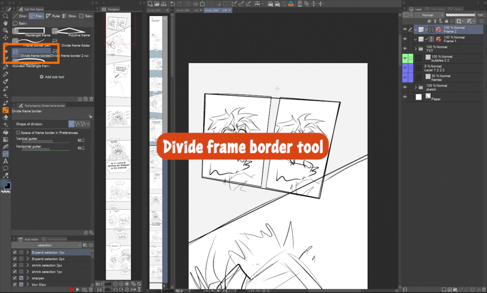
What about the gutter? The Divide frame border tool is great for this! Just drag it to divide the panel!
As you can see, it works pretty smart, since you can still modify the gutter without losing the angles of the double panel!
With overlapping panels, I do the outside fill for the frame folder with the rest of the panels the same way as shown before.
Then I Control-click the overlapping folder mask and use it as a mask of a normal folder containing the other frame folder and the fill.
In case you drew each panel on a separate folder but want them in one folder, you can just select them and merge them by going to Layer > Ruler/Frame > Combine frames.
In the pop-up select Combine only folder, and now you have all panel borders in one frame layer!
You can also use free transform to shear the shape of a panel, or align and distribute them just like any other element!
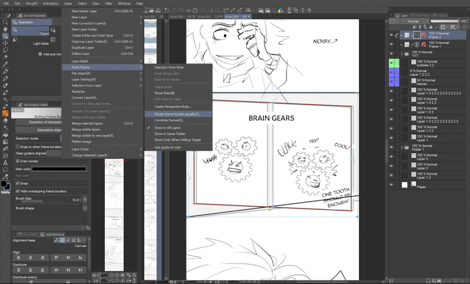
There’s also one more interesting, slightly hidden option, to divide a frame equally! Just go to Layer > Ruler/Frame > Divide frame border equally. In the pop-up, you can set the number of divisions, now we only need two.
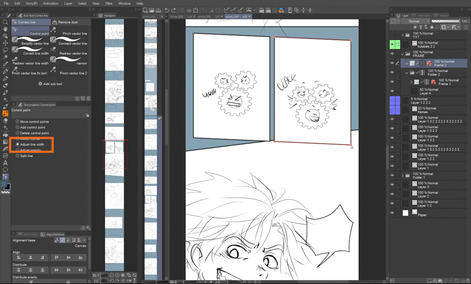
Since frame borders are vector lines, you can also modify them with the Correct line tools!
You can use the Control point with the Adjust line width option to change line thickness! Clicking a control point and dragging to the right makes the line thicker, while dragging to the left makes it thinner. With this tool, you can add a 3d feeling to your panels!
Other tools, like the Pinch vector line, work too!
If you want to change the rectangle into a polygon, just right-click the frame path with the Operation tool and select Add control point.
If a curved shape is what you need, right-click the point again and select Switch corner. This changes the control point into a curve point and vice versa. Of course, you can change and move more points at the same time. By adding ellipses, you can indicate a flashback or a thought!
Connect to smartphone to preview webtoon
My phone is too old for this feature, but I tried it with my friend’s phone and I have to say it seems super-handy since you see the whole webtoon without the seams between each file, which is unfortunately not possible in the desktop version (and is my big wish for a future update ^^ ).
Select File > Connect to smartphone (or click the icon in the control bar, at least in my version it was there by default) and a QR code appears.
In the app on your smartphone, open Settings > Companion mode. It will ask you to scan the QR code on your desktop screen.
In the Companion mode, the Webtoon preview icon is on the bottom right.
The desktop version has this preview where you can define a screen ratio and it masks out the rest of the canvas, simulating what the readers will see, but it only works within one canvas so you can’t check the seams between each part of the chapter.
It is accessible by going to View > On-screen area (webtoon) or an icon on the Command bar.
Extend or Crop Canvas
Here comes my most favorite life-saving tool! In the storyboarding stage I don’t want to distract myself by worrying about the space between panels. And thanks to these two features I can leave that for later!
They’re hidden in Edit > Change canvas height > Extend or Crop, so I strongly recommend putting them in the Quick Access palette or in the Command Bar, like I have here.
I also use this orange rectangle as a basic guide for the panels’ distance. It comes from Webtoon's advice that the minimum distance between panels should be ¼ of the canvas width. I don’t follow it exactly, but it’s a handy thing for starting.
When I want to add more space between two panels, I just click the Extend icon and this rectangle appears. Its height defines the space that will be added between the two parts of the canvas defined by the top line.
If we drag the bottom handle down and enter, see that everything below the top line of the feature’s rectangle has been moved down by the height of the rectangle.
On the contrary, the Crop feature deletes everything within its defined rectangle, and all elements below move up.
Ingenious, right?
Both tools are very easy to work with and everything is undoable, you just have to pay attention not to place the top line of the Extend rectangle where you don’t want things cut, because that’s where the new space is going to be added.
File objects and Layer comps
This tip may seem out of place, but I believe knowing you can make backgrounds much more easily can significantly change your decisions about panel sizes and positions.
If you have recurring elements in your comic, even if they aren’t the same every time, make the most of the Layer comps!
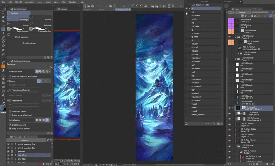
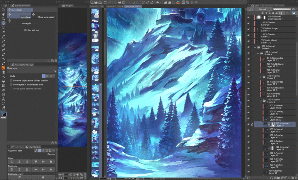
For example, most of this chapter takes place in snowy mountains at night. It would be a pain to copy, paste and modify the background in every panel.
Instead, I first painted this separate File object where I more or less finished all the planes. Notice these three things about this file:
1. I left out moving elements like the falling snow, since it would be weird if the snowflakes were always in one place.
2. The colors are left slightly desaturated, giving me a lot more freedom for color and light adjustments in each panel to fit the exact atmosphere.
3. The canvas size is bigger and the planes are outstretched vertically, meaning I can change the zoom or even perspective by moving and scaling each plane. You can see I initially copied the main panels that used this background from the storyboard and stacked them to figure out the best base layout of the planes and the canvas size.
When I’m finished with the painting, I set up layer comps for each of the planes.
I found it best to set up several groups of layer comps, usually one group with general planes, like the whole sky, background, middle ground and foreground, then another one where each element, like the layers of clouds, moon, or tree groups in the foreground have their own separate layer comp. And last specific layer comps like versions with shadows on and off or what I’m going to use as masks.
Now, you can just link the file as a file object into your panels by going to File > Import > Create file object.
It may look weird at first, because, by default, file objects keep their background color and the last layer comp you left it with.
In the tool property palette, in Rendering settings, uncheck Draw paper, and then in the Layer comps menu select whichever layer comp you want visible. Let’s start with “All” to check the position.
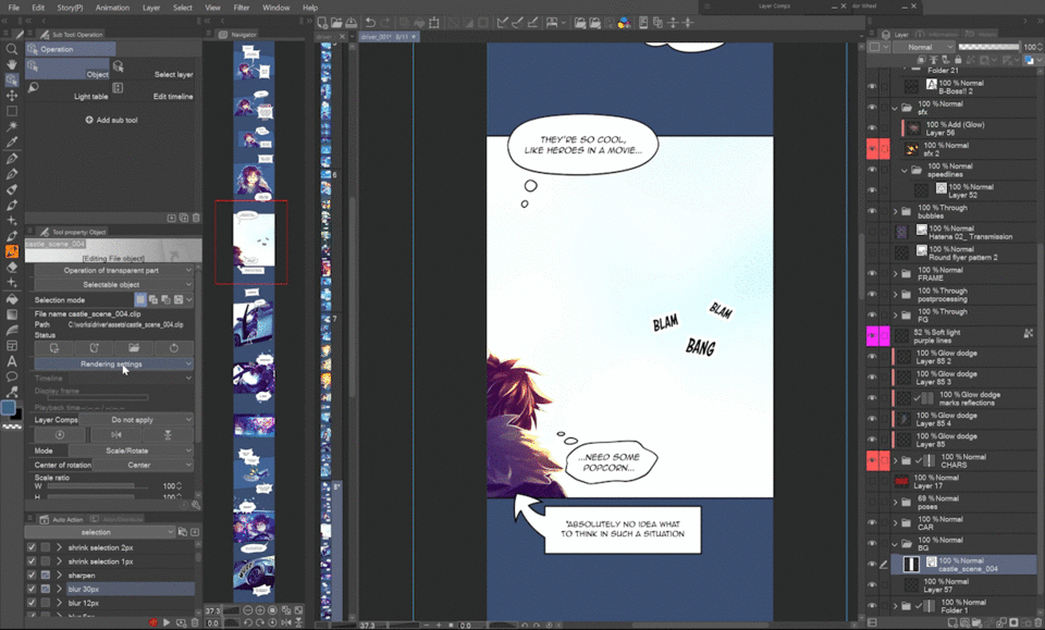
You can see the file object extends way beyond the canvas, which gives me space to play the planes to fit the panel’s needs.
After duplicating the file object layer and setting layer comps for each element you need in the panel, move them around and transform them to fit the perspective of the panel! Since file objects are not raster layers, you can transform them again and again without them losing quality!
As you could see before, most of the backgrounds in this chapter were created transforming the file object’s layer comps, deforming them, duplicating them, etc.
With the addition of snow, mist, colors, slight repainting, etc., the backgrounds feel unique yet unified. Of course, there are panels where the background needs to be dimmed or reduced to color gradients, but thanks to file objects all of our panels can feel rich!
And the best thing is that you can make edits in all panels using the file object in one go!
For example, there was a tree that felt like it was floating, so I just erased it in the original file object and it disappeared in all the places where it was visible!
Thanks for reading and I hope these tips give you a boost to enjoy creating comics even more!
Users who liked this post


Comment