How to make colorful illustrations
Presentation
Hi!
I'm Aria Asimov, a freelance in the field of illustration and character design (character design if you prefer). I mainly publish my creations on X (formerly Twitter).
If you clicked on this tutorial, it’s because you want to make your illustrations more colorful or pop. In this case, let me help you improve your projects!
In order to make this tutorial accessible to beginners, I will show all the steps, from sketch (or drafts) to finishing, including of course line art and coloring. It is important to point out that this is just one method among many, you can change it to adapt it to your way of drawing or take only certain parts that interest you!
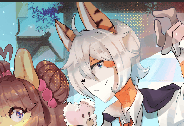
Here is an example of an illustration that I created with this method or a variation of this method! (Can be done on the Pro and Ex Version of Clip Studio Paint)
This article was written in French. However, the screenshots will be in English to make the tutorial easier for non-French speakers to understand.
The preparation
Optional part for those with a minimum of experience
Pay attention to your workspace
For those who are new to digital drawing, this part is for you to pay attention to your health and stay motivated.
To practice digital drawing, it is advisable to be in a workspace where you feel good. Tidy up your desk and decorate it as you wish, I would advise you to always have your keyboard ready to quickly use shortcuts like [Ctrl+Z] to undo your last action, [Alt+X] to use the eyedropper on a source external to your software, or [Ctrl+U] to change the hue, saturation and brightness of the current layer or a selection made.
Make sure you are well seated in your chair, and if you have a screen tablet or iPad, position your drawing monitor as vertically as possible to have a position where you keep your head straight so as not to have neck pain.
Make sure you have time to draw to avoid all sources of stress, and have something to hydrate yourself next to you. Also take breaks for your eyes and for walking so as not to have blood circulation problems; too long a drawing session can cause migraines and discomfort in the legs. Health before all !
Find inspiration/take references
Before starting to draw, it is advisable to choose your subject and find references in terms of graphic style.
You can choose to make fanart or an original creation. The main thing is to love what you are going to draw!
Take references
You can take anything that you like visually to include in your illustration. The references can also help you know which color choice you are going to start with, in order to better visualize how to draw a complicated part of the body or a piece of clothing.
Professionals bring together all their references in a moodboard. You can do this in Clip Studio Paint or software that looks PureRef. It’s your choice!
The Sketch (or Draft)
Once you have chosen what you want to draw and taken your references, a blank page stands in front of you! It’s the sketch stage!
I would advise you to do several of them and then choose the elements that you like about each of them to bring them together in a single sketch.
If you are using traditional drawing for this step, I strongly invite you to take a photo or scan the sketch you have chosen to put it in your software. Use the selection tools then press the [Delete] key on your keyboard to remove unwanted parts of your photo. You can adjust contrasts with a correction layer. You go to the [Layer] part and select [New Correction Layer], my advice would be to start with a [Level Correction] or \ layer. [Tone Curve] for more accurate calibration results.
To apply the correction layer to your layer where you have your draft, you can [Right Click] on it then [Merge with layer below] or [Ctrl+E ]. Then you will go to [Edit] → [Convert brightness to opacity]
Whether you made your sketch on CSP (Clip studio Paint) or traditional and then imported into CSP. You should arrive at this stage, your sketch transparent on a white background.
In order to better visualize the final result, I suggest you color the sketch!
Color your sketch
If the character (it is possible to have several like the example illustration) have predefined colors, it is advisable to keep their reference color on the colored sketches by putting their color on a layer different from the scenery.
In the example the characters are very colorful, so I limit my choice of color to 2 colors for the background. If the character you have chosen has very little color, you can add more colors to the background.
It will be wise to always have a dominant color in order to bring out the minority colors.
You can try several times to see what looks best!
For this illustration, I chose version 3 of the colorful sketch because the last character of the trio stood out better in addition to approaching a summer and daytime atmosphere which better transcribes the context of an outing with friends.
Line and solid color
We all have a different way of line. My way is to have a fairly thin line for fine or unimportant elements and thicker for more substantial and important elements.
I tend to close my lineart to make my flat colors with a paint can, but if you prefer a line with holes, you can make your flat colors with the lasso tool.
Separate the layers well and make folders

Here is the organization of the recommended layers if you want to find your way around your file. Each color in the drawing is on a different layer to be easily retouched.
You may have noticed that I added plants to the decor even though I had chosen to only have 2 colors in the background on my sketch. Green is a mixture of yellow and blue so the color remains in the chosen shades in addition to bringing even more color.
Line Art Black Versus Line Art Colorful
It doesn't matter if you have a completely closed line or with spacing between the lines, I suggest you see the difference between black line art and colored line art by making a list of the advantages of each type of line art.
Line Art Black
The advantages of Line Art Noir are:
- Easier to do
- Makes it easier to see variations in line thickness
- The color comes out more easily
- The character stands out clearly in the illustration
Colorful Line Art
The advantages of Colorful Line Art are:
- Make the object/character integrated into the illustration
- Allows you to better understand the texture of certain fine elements (like hair)
- More discreet and cleaner
I hope that the advantages mentioned will help you choose whether or not you want to color your Line Art!
Shadow and light
In this part, we will have two ways to add shadows and lights.
The first will be one suitable for beginners because it is very simple but very effective: Cell Shading.
The second will be for the bravest who want a more realistic result and want to have fun with light. A technique using gray values that we will then color.
I invite you to read both techniques and try them in order to select the one that suits you best!
Reminder of the basics for light and shadow
(This is an optional part)
In this part we will review certain fundamental notions to understand and achieve light and shadow effects regardless of the technique you choose in the future.
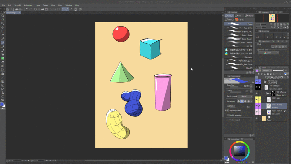
Shadows and lights are used to better read the volumes of your drawing. It would therefore be necessary to see the elements that you wish to highlight in simple volume such as cubes, spheres, cylinders and pyramids.
Translation into French:
- CellShading
— Easy visibility
— Hard side
- More realistic shading
— Lights and shadows can be softer.
— Shadows are not uniform because light bounces off the surface, creating a slight gradient in the shadows.
An example is worth a thousand words. If you have more complex shapes than basic solids, you can grid them like I did for the “Potatoes” on a layer separate from your solid colors.
I invite you to observe the organization of the layers to reproduce it.
Cell Shading
What is “Cell Shading”?
Cell Shading is a shading technique inherited from cartoons. It is recognizable by these fairly hard shadows and lights (non-degraded and non-blurred) imposed by a technical constraint from the time when we had to do animation on celluloid (which is abbreviated by “Cell”) where each image had to be painted with gouache.
Although the technical constraints of the original support no longer exist, animation studios have for the most part kept this aspect of shadows and harsh lights because it is easier and quicker to produce.
Illustrators have adopted this technique because it allows them to stylize the effects of light and shadow in addition to recalling animated productions.
How to do Cell Shading?
In illustration, nothing is simpler than creating Cell Shading! Just use a [Multiply] layer for the shadows and a [Add] layer for the light and use the tools like the lasso or the G-Pen to place the color to achieve this technique.
However, together we will see a way to make Cell Shading more “Pop” by using Screentones inside the shadows!

Here's what happens in the GIF, step by step.
①- My layer [Multiply] used gray. So I locked the opacity to use other colors for my shadows without overflowing.
②- I duplicated my [Multiply] layer by doing [Ctrl+C] and [Ctrl+V]. You can also drag the layer you want to duplicate onto the “Create new layer” icon or you can do [Right Click]→ [Duplicate Layer].
③- I hide the duplicate on the first shadow layer by pressing this icon then I changed its blending mode to [Overlay]. If you want to have a different Screentones effect you can choose other blending modes.
④- I converted the layer color to Screentone by pressing this button. Make sure you are in [Density]→[Use brightness of image] as in the image below. You can choose different types of [Dot Settings] according to your preferences. Here I chose “Circle”.
(The Frequency parameter will vary the size of your Screentone effect. You can change it to your liking.)
- Once you have the result you want, you can [Rateize] your layer where your Screentone effect is located.
- You can color your effect by locking the layer opacity*.
*Review step ① to see the icon to lock the opacity.
And for the light?
You repeat the steps above, except that the layer mode will be [Add] and not [Multiply].
Shadow and light + complexes
Translation into French:
— Step 1: The draft
— Step 2: the Line
— Step 3: Flat color
— Step 4: Make a solid gray. After add a layer **[Multiply]**and make the shadows
— Step 5: Continue to use the solid gray. Add a layer [Add] then make the lights.
— Step 6: Remove the solid gray. Color the shadows and lights.
For those who want to have more complex shading. I invite you to follow the tutorial in the image just above. This technique can be used in all professional drawing software. To color the shadow and light layer, I advise you to put a layer above and hide** it on your shadow or light layers. I will advise you to use [Linear Light] blending mode for this task.
**See step ③ of the tutorial for Cell Shading.
Finishes
Have you managed to follow this far? I hope you like the results of the previous steps! Now we will move on to the last step to make your illustration colorful and sparkling. Finishes !
I don't find my image colorful enough, what should I do?
You may have chosen colors that are too dull. Don’t worry, you don’t need to completely redo your coloring by following the technique below!

Here are the steps shown in the GIF above, one by one:
- To avoid taking all my layers, I [Right Click] on the highest layer in the hierarchy and I select [Merge visible to new layer].
- Once this new layer is created, you will duplicate it. The copy must be put in [Soft Light] merge mode.
- Still on the copy, you will apply a Gaussian blur. You will find this effect in [Filter]→[Blur]→[Gaussian Blur].
- Press [Ctrl+U] to open the [Hue/Saturation/Luminosity] window. If you find that your drawing lacks vibrant colors, increase the saturation.
The example lacked bright colors but also contrast so I also lowered the brightness.
Now, have fun with the [Overlay], [Add] or [Multiply] layers until you have a result that you like!
Little tips in bulk
Colorful Hightlight and Sticker
I put them together because it’s the same technique. You draw the shape you want in the color you have chosen and press the button to choose the thickness of the outline as well as its color.
Colorful and stylized geometric shapes


For stylized geometric shapes, you must draw a shape that you will convert into a screentone as in step ④ of the part related to Cell Shading. If you don't want to go back that far, we'll do it together and specifically for this part.

As you can see, one layer is enough to achieve these simple but effective effects! The thickness of the screentone varies depending on the gray value, the lighter the gray, the thinner the screentone will be.
This is why I lightened certain geometries in order to have an interesting effect.
Afterwards I did [Right Click]→[Raterize] on the layer then lock the opacity to color them.
Thanks
Thank you for reading until the end! I hope that my tutorial will be useful for your next illustrations and if you use one of its techniques do not hesitate to mention me on Twitter where I invite you to follow me if you appreciate my work!
I also want to thank my friends and clients for letting me use some projects made for them in this tutorial.
If you found it useful, please share and like it!
This was my first written article, I will try this exercise again if I think I can help on my own scale!


Comment