
Hello
Hello there! 🌟 This is Tamil. Welcome to this tutorial on creating a vibrant, colorful illustration in Clip Studio Paint. In this guide, we’ll dive into the techniques and creative processes to bring a pop art-inspired piece to life, full of bold colors and dynamic energy.
By the end of this article, you'll see how I transform my digital canvas into a striking pop art illustration of a girl. I hope it inspires you to create your own vibrant masterpieces!
My video focuses on going over my illustration process, but in this article I will focus a lot of fundamentals of color theory! It will help you prepare for dynamic colors and go wild with your art.
What are color schemes?
Color schemes refer to the specific arrangements or combinations of colors used in design and illustration. In design, these schemes typically describe the natural colors of objects or materials under neutral lighting conditions. However, in illustrations, color schemes play a crucial role in conveying mood or ambiance. It's important to note that local colors in an illustration are influenced by the surrounding ambient colors.
^ my old painting I made with pink colors for clouds :)
As digital artists, we have the advantage of thousands of colors at our fingertips, just a click away. Plus, adjustment layers are often seen as a quick fix for any coloring issues. While it’s useful to leverage these tools for efficiency, there are certain principles you should be aware of—and sometimes break. In this section, I’ll share some essential color theory tips to help you choose more effective color schemes for your artwork.
Harmonious color schemes allow us to create visually pleasing combinations of colors. They also play a key role in conveying a specific mood or feeling to the viewer.
Do you feel the mood difference when looking at a more green focused colors?
Color theory
Color theory helps us understand how different color combinations work and how colors aren’t always what they seem at first glance.
When colors are placed next to each other, they interact in various ways. Some colors complement each other, making them stand out, while others can clash, causing both to look dull. Color theory teaches us that certain arrangements on the color wheel can create harmony when used together in an artwork or design. Below is a well-known graphic that illustrates harmonious color combinations based on these principles.
Harmonious color combinations might seem limited, with six main arrangements: monochromatic, analogous, complementary, split complementary, triadic, and tetradic. Each offers a unique way to balance and contrast colors, providing a solid foundation for creating visually pleasing artwork.
Different Types of Harmonies
Complementary - two colors that sit opposite each other on the color wheel create a high-contrast, high-impact combination. When used together, these colors appear brighter and more prominent, making them stand out effectively.
Monochromatic - three shades, tones, and tints of a single base color create a subtle and conservative combination. This versatile approach is easy to apply in design projects, offering a harmonious and balanced look.
Analogous - three colors side by side on the color wheel form an analogous color scheme. While this combination is versatile, it can be overwhelming if not balanced. To achieve harmony, select one dominant color and use the others as accents.
Triadic - Three evenly spaced colors on the color wheel create a triadic color scheme. It offers high contrast, though less intense than a complementary scheme, making it more versatile. This combination results in bold, vibrant color palettes.
Tetradic - Four evenly spaced colors on the color wheel create a tetradic color scheme. This bold combination works best when one color is dominant, with the others used as accents. The more colors in your palette, the harder it is to achieve balance.
I used a tetradic color scheme for my illustration. It helped me keep the colors limited while also challenging my art skills.
There are many websites available to help you choose great colors, and many of them are free!
I personally used Paletton, but it is not the only way you can make color combinations. Don’t hesitate to experiment and make your own.
Remember, color schemes involve more than just combinations of hues; they also include variations in value and intensity. These three factors—hue, value, and intensity—are known as the three properties of color.
HUE - refers to the traditional color names, like 'blue' or 'yellow.' In the spectrum, hues are typically listed as ROYGBIV (red, orange, yellow, green, blue, indigo, violet).
INTENSITY - also known as saturation or chroma, refers to the purity of a hue. It determines how vivid or muted the color appears.
VALUE - indicates the lightness or darkness of a color. For example, a high-value red appears as bright red or pink when its intensity is reduced.
Examples of Color Combinations
While these three variables offer a vast range of possibilities for color schemes, the question remains—are there truly limitless options?
Below are some color schemes I applied in my illustration, showcasing various harmonious combinations inspired by the color theory graphic above.
Generally speaking, something might still feel off, even if the colors follow the rules. (examples above) They may not be working as effectively as you'd like. What are some ways to refine these combinations and improve the overall impact?
1 - Although it's optional, I always arrange my color scheme based on their value levels. This approach makes it easier to apply the colors to an illustration or design. For instance, dark accent colors can be used for line art, while lighter colors work well for highlights, sky elements, or light sources.
2 - I usually decrease the saturation of colors as they shift towards lighter or darker tones. This method helps keep the most saturated colors for the midtones, ensuring they stand out in the color scheme.
3 - When you adjust the value, also shift the hue (temperature)!
For example, here is my old vs new monochromatic colors.
Whenever you shift the hue, ensure that the direction of light and shadow are opposite. If you move the hue to the right for a higher value, shift it to the left for a lower value, and vice versa.
In this case you can see that I started with green as my mid point - grey color. Then I shifted towards yellow/red for brighter parts of the image. I went towards cyan/blue for shadow parts and anything darker.
The variety gave it way more life and contrast. You can always do the opposite if you really want to. Go towards blue for brightness, and go towards red for shadows. Once you starts, just make sure to follow through with the idea.
Cool vs Warm
When working with colors, it's helpful to understand the distinction between warm and cool tones. The color wheel is generally divided into two halves: warm colors like red, orange, and yellow, and cool colors like green, blue, and violet. Warm colors evoke feelings of heat and sunlight, often creating a sense of energy and warmth.
In contrast, cool colors remind us of the sky, water, and other cool or serene environments, bringing a sense of calmness and tranquility. Warm colors tend to draw attention and can feel more inviting, while cool colors are often more soothing and restful. Understanding these characteristics allows you to set the tone and mood of your painting effectively.
^ left is cool and right is warm color tones
So we had the frog illustration with only green right? It is monochromatic color combination. Let’s see if we can add one color to make it complementary. Opposite of green on the wheel is purple and red. Let’s see what result we get if we mix it.
Just by adding one additional color, we made it so much more interesting to look at. Working with limited colors really helps with keeping everything cohesive and ease on the eyes.
Color Ratio
Avoid using colors (hues) in equal amounts; instead, pick one color as the dominant tone and use the others as accents or complementary colors. Many people make the mistake of dividing colors equally, like using 4 colors at 25% each, but this can lead to a flat, uninteresting image. The same goes for composition or any other design principle—when everything is equal, it becomes less engaging. Following the 'big, medium, small' rule creates more visual interest and balance.
In this example, there are plenty of colors, but it's easy to spot the dominance. The orange of the pumpkin stands out as the most dominant color, followed by the skeleton’s color. Pink is used for small highlights, and green appears subtly at the top of the pumpkin.
This older sketch also highlights how important saturation can be. The orange and pink are highly saturated, while the bone color and green are more muted. I wanted the focus to be on the eyes, so I used the most saturated color there to draw attention.
Imagine colors as instruments in an orchestra. If every instrument plays at full volume, the sound becomes chaotic. Instead, let most colors play softly, with one or two taking the lead like a solo, creating a balanced and harmonious composition.
This might be a blunt example, but it effectively shows how simple it is to guide the viewer's eye to the right subject. On the right side, all the shapes have the same saturation, making it difficult to know where to focus. On the left, there are three distinct saturation levels, allowing your eye to naturally settle on the most prominent shape instead of being distracted by all three at once.
Hue vs Value
Hue and value are two of the core components of color, and understanding the difference is key to creating balanced and effective artwork.
                 + **Hue**referstothecoloritself—whetherit'sred,blue,yellow,etc.It’swhatweusuallythinkofwhenwetalkabout"color."

                                   + **Value**,ontheotherhand,describesthelightnessordarknessofacolor.Everyhuehasavaluethatcanbeseenifyouconverttheimagetograyscale.Ithelpsdefinetheform,depth,andcontrastwithinapiece.
Even with vibrant or unconventional hues, maintaining strong values is crucial. If all your colors have similar values (lightness or darkness), the piece can look flat or chaotic, because the eye has no clear focus. By varying the values—even in bright or "crazy" colors—you create contrast and guide the viewer's eye to the most important areas of the artwork.
In short, you can have the wildest hues, but ensuring that their values work together will give your piece depth, clarity, and a strong visual impact.
In the example above I made sure to double check with black and white when working on it. It’s super easy to do in Clip Studio Paint and other software.
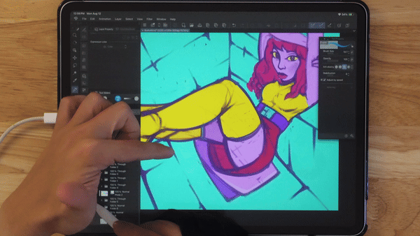
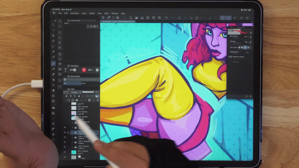
Main Illustration Process
We are finally getting to the illustration I made for this tutorial. It was a lot of fun using bright saturated colors. I decided to go with a pop art style for this one.
Pop Art, which gained momentum in the 1950s and '60s, drew from everyday visuals like ads, comics, and consumer goods. Known for its bold lines and vivid colors, it transformed ordinary objects into eye-catching art.
I will put the timelapse at the very end if you wanted more than just screenshots.
Sketch
I started by roughly blocking in her pose with loose lines. Focus on capturing the overall gesture—her back straight, legs bent or crossed, and face turned toward the viewer. Keep things fluid and relaxed. Next, sketch basic proportions using simple shapes like circles and ovals to build out the head, torso, and limbs. Keep the lines light and adjust as needed.
When sketching the face, lightly mark guidelines to help place the eyes, nose, and mouth. Since she’s looking straight on, symmetry is important. Keep the body and clothing simple at first, blocking in the major areas before worrying about details.
General tip: don't overthink details early on—focus on the overall flow and structure. Keep your lines loose and fluid, and refine only once the form feels right.
For the brush as always, I used regular hard round mixer brush. I kept it big to not get into details. Also I started off with a gray background to make sure it is not too strong on the eyes.
Next, I chose a triadic color scheme because it allows me to work with just three main colors while still offering great contrast. I opted for purple, yellow, and cyan—classic colors often seen in Pop Art, which really give the piece that vibrant, bold look.
To add color underneath your sketch layer in Clip Studio Paint, start by ensuring your sketch layer is on top. Create a new layer below it for coloring. Select your brush or fill tool and begin applying color on this new layer. The colors will appear beneath the sketch lines, which remain visible. To prevent accidental drawing on the sketch, lock the sketch layer. Continue refining the colors on your new layer until you achieve the desired look. This method allows you to keep your sketch intact while experimenting with colors.
Refining Refining Refining!
Examine aspects you might want to enhance. Reflect on what you appreciate about the image and identify areas that might need improvement. Consider adding shadows or other details to elevate the artwork. This is where your creativity can really shine. Ask yourself various questions to guide your process. I often continue painting and adjusting until I feel the image is getting better.
Adding a bright outline around the character can significantly enhance contrast and give the image a more graphic quality. This technique helps the character stand out more prominently against the background, creating a clear distinction and drawing the viewer’s eye directly to the subject. The bold outline not only boosts visual impact but also adds a stylized, cohesive look to the artwork, emphasizing the character's shape and form.
Incorporating halftone patterns can add a striking graphic quality to your image. Halftones use dots or other patterns to simulate shading and gradients, giving your artwork a distinctive, retro-inspired look reminiscent of classic comic books and print media. By varying the size and density of the dots, you can create the illusion of depth and texture while maintaining a clean, stylized appearance. This technique not only enhances the graphic feel but also adds visual interest and a sense of dynamic contrast, making your image both eye-catching and visually engaging.
It is very easy to add it in clip studio paint! There are many settings in Clip Studio Paint, but for this specific illustration I decided to go with a very simple one.
To quickly add halftone effects in Clip Studio Paint using layer properties, start by creating a new layer above the area where you want to apply the halftone effect. You can do this by selecting Layer from the top menu and choosing New Layer or by clicking the new layer icon in the Layers panel.
With the new layer selected, go to the Layer Property panel. If you don’t see it, open it from Window > Layer Property. In the Layer Property panel, look for the option labeled Effect. Click on it and select Halftone from the drop-down menu. This will apply a default halftone pattern to the layer.
Just to let you know, that using airbrush is amazing when it comes to half tone. That way you can control where the half tone will be strong and where it will be light.
Customize the halftone effect by adjusting the settings in the Layer Property panel. You can modify the dot size, spacing, and pattern type to achieve the desired look. Experiment with these settings until you get the effect that fits your artwork.
As you can see using airbrush gives a nice effect going from big dots to small. I love that effect!
I used Frequency of 5 to show how the dots on the image, but the number will depend on your canvas and how big do you want them as well. I like lower numbers to keep it visible. I know other artists like to show it a lot more.
If needed, adjust the layer’s opacity or blend mode to integrate the halftone effect seamlessly into your artwork. You can do this in the Layers panel by selecting the layer and modifying its properties.
The way I achieved my effect is through Overlay. Sometime I also love using soft light or multiply. If the effect is too strong you can always lower the opacity.
In this example I decided to check for the shape of the character. That is the first thing people see and read. I felt like the legs merge together too much, so it feels like it’s one big leg. It does not feel like they are separated enough, so there is no clear read.
By shifting the leg a little bit and adding a small space in the center, it gives more power to the readability and improves the composition. Small things like that go a long way to improve the artwork!
I also added highlights to the clothing and hair! In this case to implement the colors better, I added blue/cyan highlights from the walls. The light will reflect from the environment, so in this case it helps too because the colors are more cohesive :)
Let’s add some subsurface scattering! It’s a really fancy term for light going through objects. If it is skin, the light will turn orange and red due to blood. It’s a simple trick to make your illustration pop!
On the left side I added a nice saturated highlight between the shadow and light part. I will admit, I use it way too much for my art, but I just love the effect so much.
I added some for clothing, arms, face, and a few other spots. A very simple way to do this is to make a new layer. Set it to saturation mode, and pick the most bright/saturated color. This way the layer will only affect saturation.
If the effect is too strong, you can always just lower the opacity.
As a mentioned before, it’s important to check the image for black and white when making the artwork. It’s is very simple do to so. Just make a new layer, set it to Color mode, and then add pure black or white fill.
This will turn your image into black and white and show if you have any contrast issues. In this case there is some blending happening with the belt and the skirt. I changed the colors a little bit and also added a separation line between the two for that reason.
Making sure the face and the hair stand out is important as well! When using super bright colors it might not be the most important part because all the colors will separate with each other anyways. Though it is still good to check yourself.
Some finishing touches for me are Sharpen and Noise filters.
I made a separate tutorial on new filters that were added in clip studio paint. I highly recommend checking out if you haven’t already.
The filters are not the most important part of the painting, but it helps a lot to make the final result so much better.
Goodbye
Thank you so much for reading and following my journey. Here is the timelapse video for the painting;
If you want to see more and check out my art, here are my link :)
Usuarios a los que les gustó esta publicación


Comentario