
🐀 🐃 🐅 🐇 🐉 🐍 🐎 🐐 🐒 🐓 🐕 🐖
In this tutorial you'll learn the basics of drawing delightful animals in Clip Studio Paint, from sketch studies to simplifying anatomy and exaggerating characteristics to create a charming 12 Japanese zodiac animals. You'll also learn to color, pose, and even render some of the chosen animals with their unique features!
⛔ 𝐖𝐀𝐑𝐍𝐈𝐍𝐆 ⛔
𝐓𝐇𝐈𝐒 𝐓𝐔𝐓𝐎𝐑𝐈𝐀𝐋 𝐂𝐎𝐍𝐓𝐀𝐈𝐍𝐒 𝐋𝐎𝐓 𝐎𝐅 𝐆𝐈𝐅 𝐈𝐌𝐀𝐆𝐄𝐒. 𝐈𝐅 𝐘𝐎𝐔 𝐇𝐀𝐕𝐄 𝐒𝐋𝐎𝐖 𝐈𝐍𝐓𝐄𝐑𝐍𝐄𝐓 𝐂𝐎𝐍𝐍𝐄𝐂𝐓𝐈𝐎𝐍 / 𝐁𝐑𝐎𝐖𝐒𝐈𝐍𝐆 𝐖𝐈𝐓𝐇𝐎𝐔𝐓 𝐖𝐈-𝐅𝐈; 𝐏𝐋𝐄𝐀𝐒𝐄 𝐆𝐎 𝐁𝐀𝐂𝐊.
Beyond this line you're agree with above statements:
🗹 I'm an artist and you don't know anything else about me.
☐ I'm scared please go with me...
𝐼𝑓 𝑦𝑜𝑢 𝑢𝑛𝑑𝑒𝑟𝑠𝑡𝑎𝑛𝑑 𝑜𝑟 𝑑𝑜𝑛'𝑡 𝑒𝑣𝑒𝑛 𝑐𝑎𝑟𝑒 𝑎𝑛𝑑 ℎ𝑎𝑣𝑒 𝑎 𝑡ℎ𝑖𝑟𝑠𝑡 𝑜𝑓 𝑘𝑛𝑜𝑤𝑙𝑒𝑑𝑔𝑒 𝑡𝑜 𝑝𝑟𝑜𝑐𝑒𝑒𝑑; 𝑦𝑜𝑢 𝑚𝑎𝑦 𝑠𝑐𝑟𝑜𝑙𝑙 𝑡ℎ𝑟𝑜𝑢𝑔ℎ. 𝐺𝑜𝑜𝑑 𝑙𝑢𝑐𝑘, ℎ𝑎𝑝𝑝𝑦 𝑙𝑒𝑎𝑟𝑛𝑖𝑛𝑔, 𝑎𝑛𝑑 𝐺𝑜𝑑 𝑏𝑙𝑒𝑠𝑠 𝑦𝑜𝑢.
🔰 - 紹介 - Introduction
The Japanese zodiac (Juunishi) is divided into 12 blocks with each block containing a group of years. The years in each block are 12 years apart from the previous or following year (in that block only). Each block is given a name of an animal based on the ancient Chinese concept that all time shifts are based on these twelve units. In Japan, the adoption of the twelve-year cycle, with a different animal representing each block, is fairly common.
Those individuals born during a particular year were said to inherit some of the personalities of that year's animal. Have a look below to see what year and animal you are.
💡 The Japanese zodiac includes the Sheep (hitsuji) instead of the Goat (which would be yagi), and the Wild boar (inoshishi, i) instead of the Pig (buta). Since 1873, the Japanese have celebrated the beginning of the new year on January 1 as per the Gregorian calendar.
As Visual Art Teacher, I will try my best to draw animals according to their traits which will reflect to Japanese Zodiac Signs to my fellow Visual Art class where I teach. As for you, my fellow digital artists; you can jump into blocks of 12 animals drawn from scratch using default brushes and tools with some custom brushes you can get for FREE through Clip Studio Assets.
🐀 - Rat – 鼠
👶 Born 2008, 1996, 1984, 1972, 1960, 1948, 1936, 1924, 1912.
People born in the year of the Rat are 𝐜𝐡𝐚𝐫𝐦𝐢𝐧𝐠, 𝐡𝐨𝐧𝐞𝐬𝐭, 𝐚𝐦𝐛𝐢𝐭𝐢𝐨𝐮𝐬, and 𝐡𝐚𝐯𝐞 𝐚 𝐭𝐫𝐞𝐦𝐞𝐧𝐝𝐨𝐮𝐬 𝐜𝐚𝐩𝐚𝐜𝐢𝐭𝐲 for 𝐩𝐮𝐫𝐬𝐮𝐢𝐧𝐠 𝐚 𝐜𝐨𝐮𝐫𝐬𝐞 𝐭𝐨 𝐢𝐭𝐬 𝐞𝐧𝐝. They will work hard for their goals. They are easily angered but maintain an outward show of control.
❖ 𝐁𝐀𝐒𝐈𝐂 𝐒𝐇𝐀𝐏𝐄 :
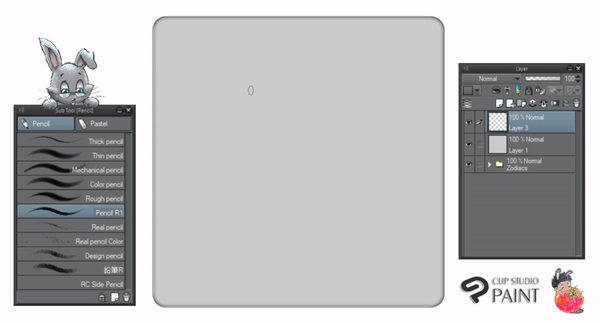
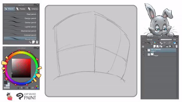
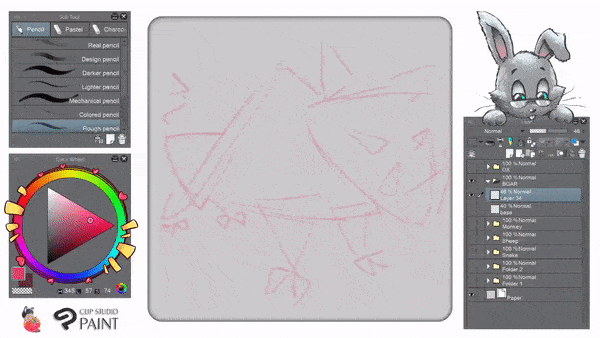
▲ Start with 𝐬𝐢𝐦𝐩𝐥𝐞 𝐬𝐡𝐚𝐩𝐞𝐬; using circle for most of the drawing lines (𝑐𝑢𝑟𝑣𝑒𝑠). I'm using 𝐏𝐞𝐧𝐜𝐢𝐥 𝐑𝟏 to create my rough sketch. Pencil drawing is FREE from our great CSP community! If you're unable to get it, you can download a similar looking one here:
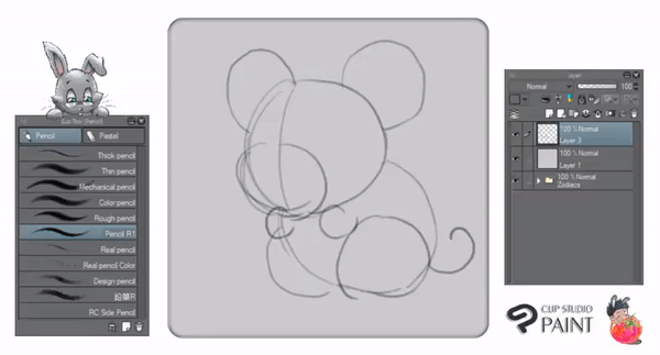
▲ I lower the opacity of my rough sketch layer (𝑎𝑟𝑜𝑢𝑛𝑑 30%). Then create another layer on top of my rough sketch layer. Using what we call 'basic shape construction', I begin to add some sketchy details before going to digitally ink the artwork.
❖ 𝐎𝐔𝐓𝐋𝐈𝐍𝐄 :
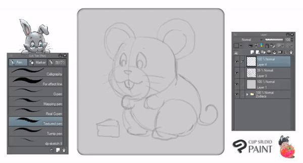
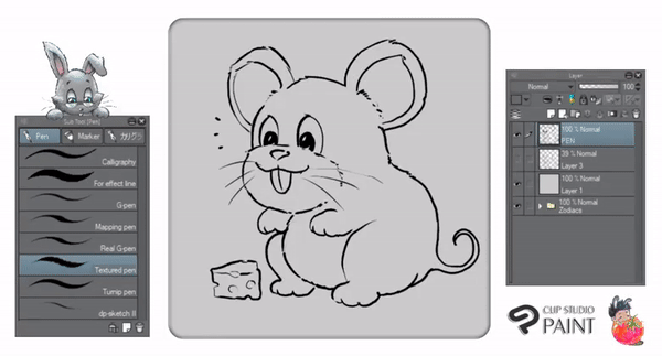
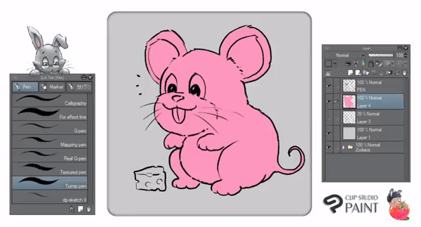
▲ With the new layer rename it to 𝐏𝐄𝐍, I'm using default 𝐓𝐞𝐱𝐭𝐮𝐫𝐞𝐝 𝐏𝐞𝐧 inking the entire image including the 🧀 cheese!
💬 : Notice that I make the pupils larger to make it 𝑙𝑜𝑜𝑘𝑠 𝑐𝑢𝑡𝑒𝑟-! You can try to define many characteristics of your drawing to be interesting to look at. Larger ear, larger belly, smaller hands, etc.
❖ 𝐂𝐎𝐋𝐎𝐑 𝐁𝐋𝐎𝐂𝐊𝐈𝐍𝐆 :
▲ Now for the coloring step. I create another layer on top of my Layer 3 (𝑟𝑜𝑢𝑔ℎ 𝑠𝑘𝑒𝑡𝑐ℎ) and below PEN tool layer (𝑖𝑛𝑘 𝑜𝑢𝑡𝑙𝑖𝑛𝑒). Using highlighted colors, such as pink; then I use 𝐓𝐮𝐫𝐧𝐢𝐩 𝐏𝐞𝐧; for every edges of the Rat before dropping the paint using 𝐅𝐢𝐥𝐥 tool, just to make sure if there are no gaps, I lower the opacity of PEN tool.
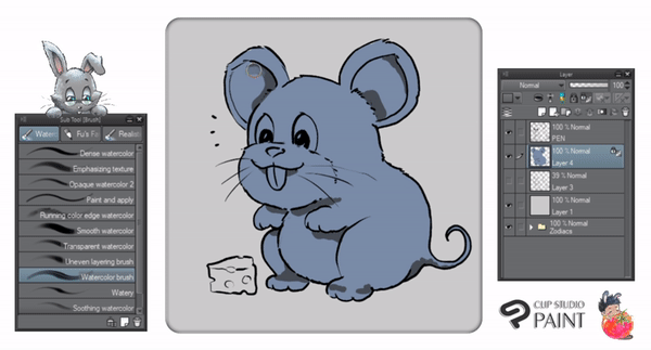
❖ 𝐅𝐔𝐑 𝐑𝐄𝐍𝐃𝐄𝐑𝐈𝐍𝐆 - 𝐈 :
▲ As for the nearest color for the Rat, I suggest to pick the bluish gray with the following color hex. 🅷 : 217 🆂 : 28% 🆅 : 66%
🔔 Just don't forget to use 𝐋𝐨𝐜𝐤 𝐓𝐫𝐚𝐧𝐬𝐩𝐚𝐫𝐞𝐧𝐭 𝐏𝐢𝐱𝐞𝐥𝐬 before changing the color with a combination of Alt + Backspace (Auto Fill Color).
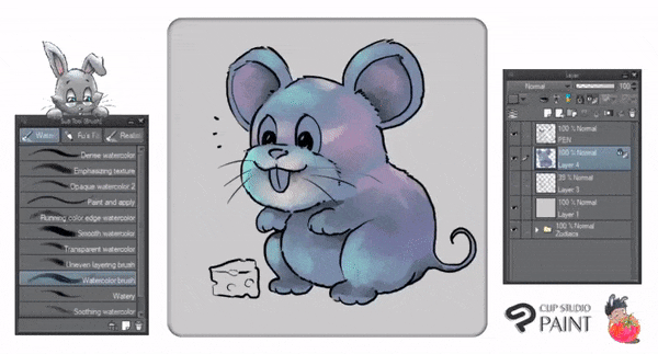
❖ 𝐅𝐔𝐑 𝐑𝐄𝐍𝐃𝐄𝐑𝐈𝐍𝐆 - 𝐈𝐈 :
▲ Using 𝐖𝐚𝐭𝐞𝐫𝐜𝐨𝐥𝐨𝐫 𝐁𝐫𝐮𝐬𝐡 from 𝐖𝐚𝐭𝐞𝐫𝐜𝐨𝐥𝐨𝐫 brush set, I blend the hard-shaped shadows. And add several brushes to give the basic short furs. Of course you can try anything with other brushes such as 𝐏𝐚𝐢𝐧𝐭 𝐚𝐧𝐝 𝐚𝐩𝐩𝐥𝐲 brush, 𝐃𝐞𝐧𝐬𝐞 𝐰𝐚𝐭𝐞𝐫𝐜𝐨𝐥𝐨𝐫, and even 𝐖𝐚𝐭𝐞𝐫𝐲.
❖ 𝐅𝐔𝐑 𝐑𝐄𝐍𝐃𝐄𝐑𝐈𝐍𝐆 - 𝐈𝐈𝐈 :
▲ 𝐖𝐚𝐭𝐞𝐫𝐜𝐨𝐥𝐨𝐫 𝐁𝐫𝐮𝐬𝐡 can be applied with many colorful choices. As the start, I pick my pink color again, then blend the colors using only the brush but changing its size sometimes to fit my desire. Add some purple and light blue to bring richer color then finalize the blend with some pale yellow (or skin color).
❖ 𝐅𝐔𝐑 𝐑𝐄𝐍𝐃𝐄𝐑𝐈𝐍𝐆 - 𝐈𝐕 :
▲ Now to give the mouse more details, I use 𝐏𝐞𝐧𝐜𝐢𝐥 𝐑𝟏 again with some highlights of colors.
A combination between mid tones, lighter tones, as well as darker tones will be a good method to blend range of colors to achieve a bit realistic outcome - although in a cartoon style.
❖ 𝐅𝐔𝐑 𝐑𝐄𝐍𝐃𝐄𝐑𝐈𝐍𝐆 - 𝐕 :
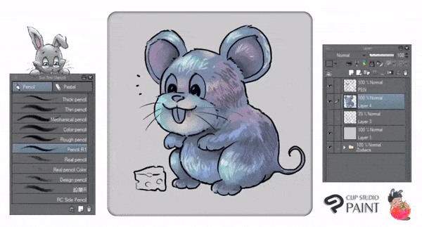
▲ After I completely using 𝐏𝐞𝐧𝐜𝐢𝐥 𝐑𝟏 to add some furs, with 𝐋𝐨𝐜𝐤 𝐓𝐫𝐚𝐧𝐬𝐩𝐚𝐫𝐞𝐧𝐭 𝐏𝐢𝐱𝐞𝐥𝐬 turned off; I do it again with the 🧀 cheese, teeth, nose, and the eyes.
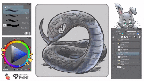
It's just my habit to use 𝐖𝐚𝐭𝐞𝐫𝐜𝐨𝐥𝐨𝐫 𝐁𝐫𝐮𝐬𝐡 once again to color and blend some small parts; especially the eyes and the teeth. You can also use 𝐁𝐥𝐞𝐧𝐝 then choose 𝐅𝐢𝐧𝐠𝐞𝐫 𝐭𝐢𝐩 to smooth everything out. As seen from GIF above (𝐼'𝑚 𝑠𝑜𝑟𝑟𝑦 𝑖𝑓 𝑖𝑡'𝑠 𝑡𝑜𝑜 𝑓𝑎𝑠𝑡 𝑓𝑜𝑟 𝑦𝑜𝑢) that furs blended beautifully between its dark and light colors.
❖ 𝐆𝐑𝐎𝐔𝐍𝐃 𝐒𝐇𝐀𝐃𝐎𝐖 :

▲ As for the shadow, with 𝐂𝐡𝐢𝐧𝐞𝐬𝐞/𝐈𝐧𝐝𝐢𝐚 𝐈𝐧𝐤 and choose 𝐋𝐢𝐠𝐡𝐭𝐞𝐫 𝐈𝐧𝐤, I paint it lightly below the mouse's feet, tail, as well as cheese.
💬 : Notice that I move the layer from on top of my color layer (Layer 4) from above to below.
❖ 𝐎𝐔𝐓𝐋𝐈𝐍𝐄 𝐂𝐎𝐋𝐎𝐑𝐈𝐍𝐆 :
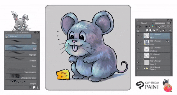
▲ This technique has been used by many people simply to 'blend' the outline. Start with 𝐋𝐨𝐜𝐤 𝐓𝐫𝐚𝐧𝐬𝐩𝐚𝐫𝐞𝐧𝐭 𝐏𝐢𝐱𝐞𝐥𝐬 on your PEN layer. Then you can use 𝐖𝐚𝐭𝐞𝐫𝐜𝐨𝐥𝐨𝐫 𝐁𝐫𝐮𝐬𝐡 or with 𝐂𝐡𝐢𝐧𝐞𝐬𝐞/𝐈𝐧𝐝𝐢𝐚 𝐈𝐧𝐤 and choose 𝐋𝐢𝐠𝐡𝐭𝐞𝐫 𝐈𝐧𝐤, paint it on any areas of ink that you wish with different choice of colors. Even for the cheese!
💬 : You either do the technique to make the furs less distracting (if it's a solid black one) and make it more realistic, or just leave it be so it's like a 100% cartoon one. Just a matter of taste, in my opinion.
🐃 - Ox - 牛
👶 Born 2009, 1997, 1985, 1973, 1961, 1949, 1937, 1925, 1913.
People born in the year of the Ox are 𝐩𝐚𝐭𝐢𝐞𝐧𝐭, 𝐦𝐞𝐧𝐭𝐚𝐥𝐥𝐲 𝐚𝐥𝐞𝐫𝐭 and 𝐰𝐡𝐞𝐧 𝐫𝐞𝐪𝐮𝐢𝐫𝐞𝐝 𝐭𝐨 𝐬𝐩𝐞𝐚𝐤 are 𝐬𝐤𝐢𝐥𝐥𝐟𝐮𝐥. They have a gift for 𝐢𝐧𝐬𝐩𝐢𝐫𝐢𝐧𝐠 𝐜𝐨𝐧𝐟𝐢𝐝𝐞𝐧𝐜𝐞 𝐢𝐧 𝐨𝐭𝐡𝐞𝐫𝐬. This allows them to achieve a great deal of success.
❖ 𝐁𝐀𝐒𝐈𝐂 𝐒𝐇𝐀𝐏𝐄 :

▲ Using simple shapes in 3D form. I use standard (CSP EX 1.9.4) 𝐑𝐨𝐮𝐠𝐡 𝐏𝐞𝐧𝐜𝐢𝐥, I begin to define the form of my Ox. Keep in mind that you don't always to start with a complete 3D box to start your shaping. Later on, I will also start with defining the shape with action lines.
💬 : Ox is 𝐬𝐭𝐫𝐨𝐧𝐠 𝐢𝐧 𝐧𝐚𝐭𝐮𝐫𝐞, so using squared-shape sketch is a good start to develop the 'strong' muscles to draw, you can make the ox looks intimidating or hilarious if you change the perspective way of 3D box.
❖ 𝐒𝐓𝐑𝐔𝐂𝐓𝐔𝐑𝐄 :
▲ Now with basic shape applied it's time to give more details, you can see how I define many interesting features of the Ox such as its head, horns, even muscles easily by sticking my mind to draw within the box and its structure.
💬 : To make the Ox looks less-intimidating, I add a bird! Also it will be a size comparison as well by adding other animals into your drawing.
❖ 𝐈𝐍𝐓𝐈𝐌𝐈𝐃𝐀𝐓𝐈𝐍𝐆 𝐒𝐇𝐀𝐏𝐄 :
▲ To turn the Ox looks more-intimidating, I create the "A" shape structure! Also there will be a size comparison with the little critter on the ground later.
❖ 𝐈𝐍𝐓𝐈𝐌𝐈𝐃𝐀𝐓𝐈𝐍𝐆 𝐒𝐓𝐑𝐔𝐂𝐓𝐔𝐑𝐄 :

▲ Now you can see by the end of GIF above, that the structure of "A" will be useful to create the intimidating scene especially in the cartoon style.
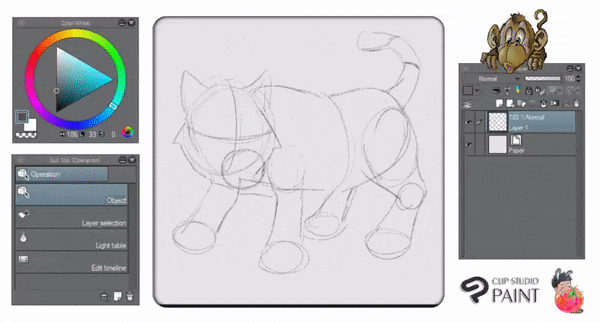
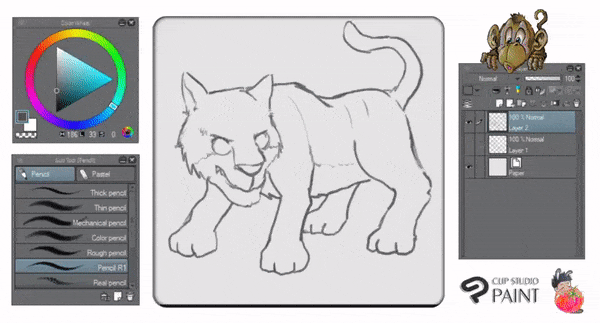
🐅 - Tiger – 虎
👶 Born 1998, 1986, 1974, 1962, 1950, 1938, 1926, 1914.
People born in the year of the Tiger are 𝐬𝐞𝐧𝐬𝐢𝐭𝐢𝐯𝐞, 𝐬𝐭𝐮𝐛𝐛𝐨𝐫𝐧, 𝐬𝐡𝐨𝐫𝐭-𝐭𝐞𝐦𝐩𝐞𝐫𝐞𝐝, 𝐜𝐨𝐮𝐫𝐚𝐠𝐞𝐨𝐮𝐬, 𝐬𝐞𝐥𝐟𝐢𝐬𝐡 and 𝑠𝑙𝑖𝑔ℎ𝑡𝑙𝑦 𝐦𝐞𝐚𝐧... Yet they are 𝐝𝐞𝐞𝐩 𝐭𝐡𝐢𝐧𝐤𝐞𝐫𝐬 and are 𝐜𝐚𝐩𝐚𝐛𝐥𝐞 𝐨𝐟 𝐠𝐫𝐞𝐚𝐭 𝐬𝐲𝐦𝐩𝐚𝐭𝐡𝐲 for those they are close to and love.
❖ 𝐁𝐀𝐒𝐈𝐂 𝐒𝐇𝐀𝐏𝐄 :
▲ We'll start with a sketch, a set of guide lines that will become a base for the final lines. The sketch should be drawn in a way that allows you to discard it later—with very light lines, changing its opacity, or on a separate layer.
Draw simple circles with some 'tubes' or cylinders. It doesn't need to be perfect or drawn with a continuous line, so don't worry if it turns out wobbly. Those parts will be the essential structures of the tiger anatomy made easy.
❖𝐃𝐄𝐅𝐈𝐍𝐈𝐍𝐆 𝐒𝐈𝐌𝐏𝐋𝐄 𝐒𝐇𝐀𝐏𝐄𝐒 :
▲ You'll probably getting used to this stage, the other animals already had the same treatment when defining simple shapes with new layer and pencil brush. There are no secret tricks on GIF above, just make sure to define the rough sketch on the separate layer so you can edit or remove unwanted lines easily without deconstruct the whole basic shape.
❖𝐃𝐄𝐅𝐈𝐍𝐈𝐍𝐆 𝐒𝐓𝐑𝐈𝐏𝐄𝐒 :
▲ To draw stripes, simply go along the way of tiger's cylindrical shapes. You don't have to think it's gonna be complicated or anything. Just look at the GIF above and practice to get it right.
💬 : I deeply apologize due to short-circuit at my place; I'm unable to save my recording and upload it here, so there will be no step-by-step coloring process. However, I wish to retry from 0 whenever it's possible but since I'm behind the deadline of submission this tutorial, I really can't do it right now.
Once again, really sorry about this. 😞
🐇 - Rabbit - 兎
👶 Born 1999, 1987, 1975, 1963, 1951, 1939, 1927, 1915.
People born in the year of the Rabbit are 𝐭𝐡𝐞 𝐦𝐨𝐬𝐭 𝐟𝐨𝐫𝐭𝐮𝐧𝐚𝐭𝐞. They are 𝐬𝐦𝐨𝐨𝐭𝐡 𝐭𝐚𝐥𝐤𝐞𝐫𝐬, 𝐭𝐚𝐥𝐞𝐧𝐭𝐞𝐝, 𝐚𝐦𝐛𝐢𝐭𝐢𝐨𝐮𝐬, 𝐯𝐢𝐫𝐭𝐮𝐨𝐮𝐬 and 𝐫𝐞𝐬𝐞𝐫𝐯𝐞𝐝. They have 𝐞𝐱𝐜𝐞𝐞𝐝𝐢𝐧𝐠𝐥𝐲 𝐟𝐢𝐧𝐞 𝐭𝐚𝐬𝐭𝐞 and are 𝐫𝐞𝐠𝐚𝐫𝐝𝐞𝐝 𝐰𝐢𝐭𝐡 𝐚𝐝𝐦𝐢𝐫𝐚𝐭𝐢𝐨𝐧 and 𝐭𝐫𝐮𝐬𝐭.
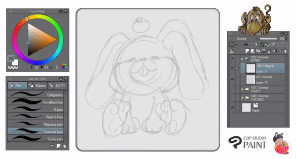
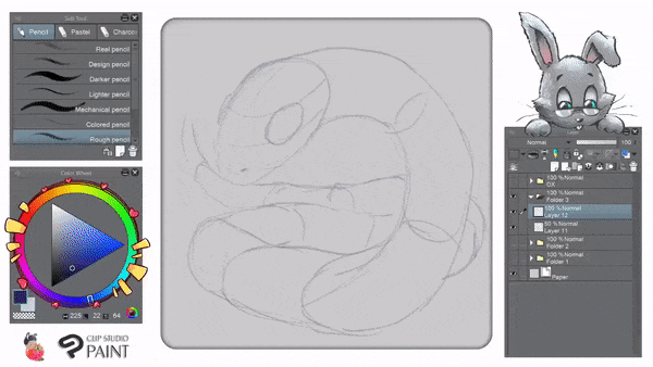
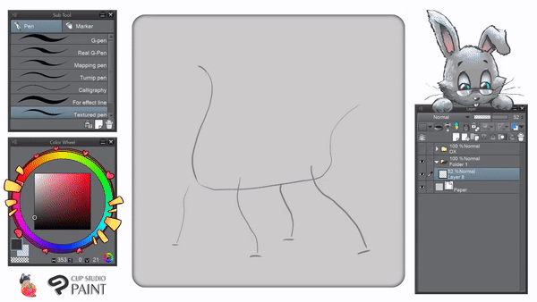
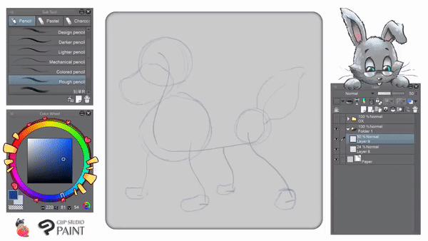
❖ 𝐁𝐀𝐒𝐈𝐂 𝐒𝐇𝐀𝐏𝐄 :
▲ I start to define the structured shapes with rough sketch - try to draw with light strokes of simple shapes like circle, oval, then add some features of the rabbit. Using only 𝐑𝐨𝐮𝐠𝐡 𝐏𝐞𝐧𝐜𝐢𝐥, as you can see from GIF above; I try not to define detailed rabbit's furs as it will be similar to paint the rat's. Instead in this simple rabbit's how to - you'll find another tips rather than detailing furs.
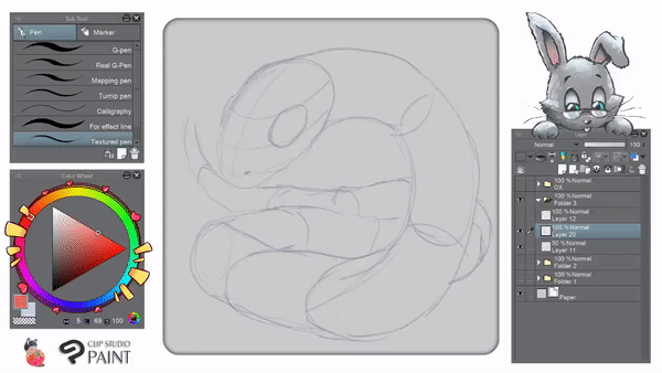
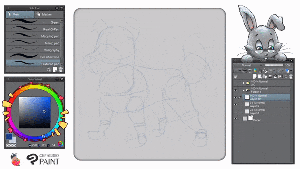
❖ 𝐃𝐄𝐓𝐀𝐈𝐋𝐈𝐍𝐆 𝐒𝐓𝐑𝐔𝐂𝐓𝐔𝐑𝐄 𝐒𝐇𝐀𝐏𝐄𝐒 :
▲ With new layer, I begin to add form of my rabbit. At this stage, I'm using 𝐓𝐞𝐱𝐭𝐮𝐫𝐞𝐝 𝐏𝐞𝐧 to give my bunny cheerful and adorable look. If you wish to try using another pen, go ahead. But textured pen in my opinion is the best way to achieve some simple strokes as it has quiet good variety of pressure outcome.
❖ 𝐂𝐎𝐋𝐎𝐑 𝐁𝐋𝐎𝐂𝐊𝐈𝐍𝐆 + 𝐅𝐔𝐑 𝐑𝐄𝐍𝐃𝐄𝐑𝐈𝐍𝐆 - 𝐈 :
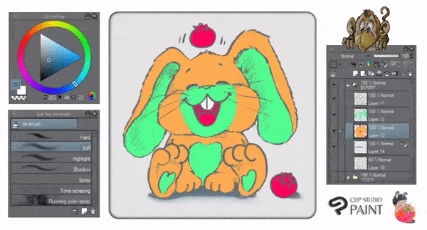
▲ Now let's try to do the very basic mode in color techniques! Don't mind the weird colors that I put into the rabbit (light orange & light green). It's just my way to show you that I separate colors with two different layers as well and remember to 𝐋𝐨𝐜𝐤 𝐓𝐫𝐚𝐧𝐬𝐩𝐚𝐫𝐞𝐧𝐭 𝐏𝐢𝐱𝐞𝐥𝐬 before air-brushing; turn it on-off to check if there's any holes that I miss with 𝐓𝐮𝐫𝐧𝐢𝐩 𝐏𝐞𝐧.
💬 : Using 𝐀𝐢𝐫 𝐁𝐫𝐮𝐬𝐡 - 𝐒𝐨𝐟𝐭 is my main point here. I rarely using this brush to paint furs since it will become so easy and unnatural; I prefer brush-stroked ones, but as you can see from GIF above; after I've done with my brushing; sometimes, I add little details of furs with turnip pen again.
❖ 𝐅𝐔𝐑 𝐑𝐄𝐍𝐃𝐄𝐑𝐈𝐍𝐆 - 𝐈𝐈 :
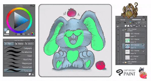
▲ Another method for adding shadow and highlight. I'm using 𝐀𝐢𝐫 𝐁𝐫𝐮𝐬𝐡 - 𝐒𝐨𝐟𝐭 and pick darker and lighter tones from its color base to achieve the 3D form by coloring style. Sometimes I will use another brushes like 𝐑𝐮𝐧𝐧𝐢𝐧𝐠 𝐂𝐨𝐥𝐨𝐫 𝐒𝐩𝐫𝐚𝐲 to add little furs.
💬 : Lastly, if you notice on the centre of rabbit's mouse, I'm using 𝐂𝐨𝐥𝐨𝐫 𝐌𝐢𝐱𝐢𝐧𝐠 - 𝐁𝐥𝐞𝐧𝐝 to mix between gray and pink colors altogether. You can also blend manually with 𝐖𝐚𝐭𝐞𝐫𝐜𝐨𝐥𝐨𝐫 𝐁𝐫𝐮𝐬𝐡 or 𝐎𝐢𝐥 𝐏𝐚𝐢𝐧𝐭 𝐅𝐥𝐚𝐭 𝐁𝐫𝐮𝐬𝐡.
🐉 - Dragon – 竜
👶 Born 2000, 1988, 1976, 1964, 1952, 1940, 1928, 1916.
People born in the year of the Dragon are 𝐡𝐞𝐚𝐥𝐭𝐡𝐲, 𝐞𝐧𝐞𝐫𝐠𝐞𝐭𝐢𝐜, 𝐞𝐱𝐜𝐢𝐭𝐚𝐛𝐥𝐞, 𝐬𝐡𝐨𝐫𝐭-𝐭𝐞𝐦𝐩𝐞𝐫𝐞𝐝 and 𝐬𝐭𝐮𝐛𝐛𝐨𝐫𝐧. However, they are 𝐡𝐨𝐧𝐞𝐬𝐭, 𝐬𝐞𝐧𝐬𝐢𝐭𝐢𝐯𝐞, 𝐛𝐫𝐚𝐯𝐞 and 𝐜𝐚𝐧 𝐢𝐧𝐬𝐩𝐢𝐫𝐞 𝐭𝐫𝐮𝐬𝐭 𝐢𝐧 𝐦𝐨𝐬𝐭 𝐚𝐧𝐲𝐨𝐧𝐞.
They are the 𝐦𝐨𝐬𝐭 𝐩𝐞𝐜𝐮𝐥𝐢𝐚𝐫 of the 12 signs of the Zodiac cycle.
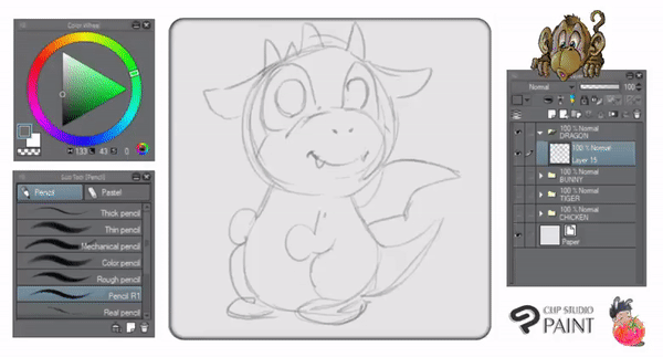
❖ 𝐁𝐀𝐒𝐈𝐂 𝐒𝐇𝐀𝐏𝐄 :
▲ I start to define the structured shapes with rough sketch. Using only 𝐏𝐞𝐧𝐜𝐢𝐥 𝐑𝟏, as you can see from GIF above; I don't want to create a four legged dragon instead a standing with two feet with fully happy face of it.
❖ 𝐃𝐄𝐓𝐀𝐈𝐋𝐈𝐍𝐆 𝐒𝐓𝐑𝐔𝐂𝐓𝐔𝐑𝐄 𝐒𝐇𝐀𝐏𝐄𝐒 :
▲ With new layer, I begin to add form of the dragon. I'm using 𝐓𝐞𝐱𝐭𝐮𝐫𝐞𝐝 𝐏𝐞𝐧 to define every dragon's features. From the horns, wings, tails, even the dragon's little 'mustache'. Actually, you don't need to design your dragon exactly like mine nor you should doing the details with its scales at this stage; all you need is the knowledge to put everything in nice order so you'll not wasting more time & effort into unseen details.
❖ 𝐂𝐎𝐋𝐎𝐑 𝐑𝐄𝐍𝐃𝐄𝐑𝐈𝐍𝐆 :
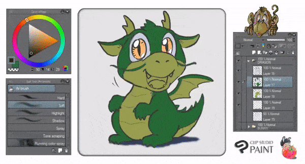
▲ The key to color our cute dragon is understanding where to put the shadows and highlights. Obviously, in order to make something looks like in a 3D form, you have to understand the basics of coloring (whether it's traditionally or digitally). Please take a look on GIF above, especially the leg and head of my dragon, it shows you how the rounded shapes build upon brushing dark and light colors.
💬 : 𝐀𝐢𝐫 𝐁𝐫𝐮𝐬𝐡 - 𝐒𝐨𝐟𝐭 is one of my old-time favorite brushing tool, sometimes it's versatile to quick brush entire artwork with it but I found it's kinda too easy and too plain simple for a piece of final artwork; has less rich detailed textures, or simply saying 'too digital to look at'.
❖ 𝐂𝐎𝐋𝐎𝐑 𝐃𝐄𝐓𝐀𝐈𝐋𝐈𝐍𝐆 :
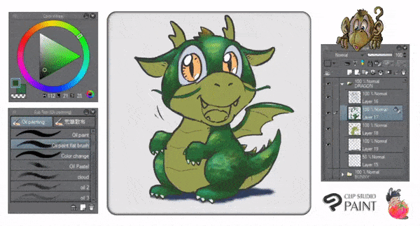
▲ Last but not least, GIF above shows you how I simply use of 𝐎𝐢𝐥 𝐏𝐚𝐢𝐧𝐭 then choose 𝐎𝐢𝐥 𝐏𝐚𝐢𝐧𝐭 𝐅𝐥𝐚𝐭 𝐁𝐫𝐮𝐬𝐡 to add some 'frictions' of dragon scale - I mean frictions because you don't have to render one by one for the scales but still can be seen as the dragon's scales. Also for its belly, some touch-ups of with 𝐎𝐯𝐞𝐫𝐥𝐚𝐲 mode using 𝐀𝐢𝐫 𝐁𝐫𝐮𝐬𝐡 - 𝐒𝐨𝐟𝐭 will give a color boost or variation.
💬 : That's how I try to get rid the 'too much digital to look at' vibe if you can slightly add some textured brushes; you can choose among pencil tools too; use BIG size of if for getting larger textures.
🐍 - Snake – 蛇
👶 Born 2001, 1989, 1977, 1965, 1953, 1941, 1929, 1917.
People born in the year of the Snake are 𝐝𝐞𝐞𝐩 𝐭𝐡𝐢𝐧𝐤𝐞𝐫𝐬, 𝐬𝐩𝐞𝐚𝐤 𝐯𝐞𝐫𝐲 𝐥𝐢𝐭𝐭𝐥𝐞 and 𝐩𝐨𝐬𝐬𝐞𝐬𝐬 𝐭𝐫𝐞𝐦𝐞𝐧𝐝𝐨𝐮𝐬 𝐰𝐢𝐬𝐝𝐨𝐦. They are fortunate in money matters and will always be able to obtain it. They are determined in what they do and hate to fail.
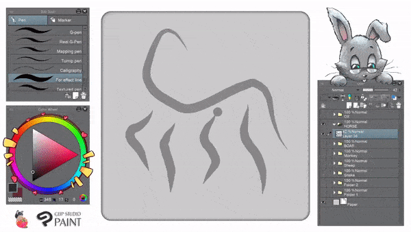
❖ 𝐃𝐘𝐍𝐀𝐌𝐈𝐂 𝐈𝐍 𝐒𝐇𝐀𝐏𝐄𝐒 :
▲ Dynamic movement in shapes is characterized by movement of the eye that flows smoothly from one area of the composition to another, guided by continuations of line or form, and by gradations of color or form. Dynamic movement in shapes is characterized by open shapes or shapes that closely relate to adjacent shapes.
💬 : For more idea about dynamic in shapes and rhythm in composition, you could see my other tutorial with this link below :
❖ 𝐑𝐇𝐘𝐓𝐇𝐌 𝐈𝐍 𝐂𝐎𝐌𝐏𝐎𝐒𝐈𝐓𝐈𝐎𝐍 :
〚 Rhythm 〛= creating a visual tempo through the use of repetitive elements.
▲ Take a look at the snake above, it has a body composition of 12 cylinders; and those are what I called rhythm elements. Because they're representing the repetitiveness of shapes.
💬 : When drawing complicated animals (reptiles) like snake; think about the dynamic composition as well as the basic cylinder shape.
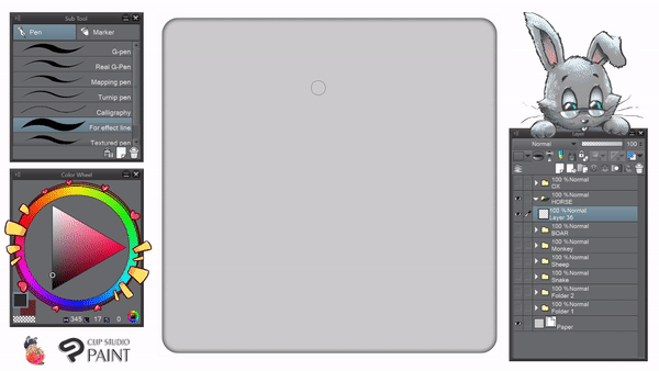
❖ 𝐎𝐔𝐓𝐋𝐈𝐍𝐄 :
▲ With the new layer, I'm using default 𝐓𝐞𝐱𝐭𝐮𝐫𝐞𝐝 𝐏𝐞𝐧 inking the entire image including the shadow. There are a tiny bit of scales to point out where the direction of it to be drawn later.
💬 : 𝐻𝑖𝑖𝑖𝑠𝑠ℎℎℎℎℎ... (𝑊𝑒𝑙𝑙, 𝐼 ℎ𝑎𝑣𝑒 𝑛𝑜 𝑐𝑜𝑚𝑚𝑒𝑛𝑡 𝑜𝑛 𝑡ℎ𝑖𝑠 𝑦𝑒𝑡 - 𝑝𝑙𝑒𝑎𝑠𝑒 𝑝𝑟𝑜𝑐𝑒𝑒𝑑 𝑡𝑜 𝑡ℎ𝑒 𝑠𝑒𝑐𝑡𝑖𝑜𝑛 𝑏𝑒𝑙𝑜𝑤, 𝑏𝑒𝑐𝑎𝑢𝑠𝑒 𝑤𝑒'𝑙𝑙 𝑑𝑜𝑖𝑛𝑔 𝑡ℎ𝑒 𝑠𝑐𝑎𝑙𝑒!)
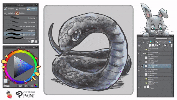
❖ 𝐒𝐂𝐀𝐋𝐄𝐒 :
▲ Using 𝐎𝐢𝐥 𝐏𝐚𝐢𝐧𝐭 then choose 𝐎𝐢𝐥 𝐏𝐚𝐢𝐧𝐭 𝐅𝐥𝐚𝐭 𝐁𝐫𝐮𝐬𝐡, I decide to add scales for the snake. But in order to do so, we need to use the logic of 'arrows facing the same direction'.
💬 : Scales can be fully drawn to the entire body of the snake if you're a detailed person. But, because 𝐼'𝑚 𝑎 𝑠𝑖𝑚𝑝𝑙𝑒 𝑚𝑎𝑛 𝑜𝑓 𝑐𝑢𝑙𝑡𝑢𝑟𝑒; I only drew some and let the hue/saturation/color do the rest of the job.
❖ 𝐀𝐃𝐃𝐈𝐍𝐆 𝐕𝐀𝐋𝐔𝐄𝐒 :
▲ I often use repetitive brush strokes to generate weight and visual interest in clean and flat areas. I have a big collection of different brush strokes created by hand on textured papers, which I have built up over time and scanned ready for use during the digital process.
However, sometimes you don't have enough time to search on the internet, or even on your own library of textures - so for my case; I only depend on traditional way of texturing with brushes provided by Clip Studio Paint rather than having tons of textures to be applied like most of the artists either using multiply or overlay blending mode.
💬 : For more idea about 𝐭𝐞𝐱𝐭𝐮𝐫𝐢𝐧𝐠 𝐰𝐢𝐭𝐡 𝐝𝐞𝐟𝐚𝐮𝐥𝐭 𝐛𝐫𝐮𝐬𝐡𝐞𝐬 (𝑤ℎ𝑖𝑐ℎ 𝑟𝑒𝑞𝑢𝑖𝑟𝑒𝑠 𝑛𝑜 𝑛𝑒𝑒𝑑 𝑡𝑜 𝑑𝑜𝑤𝑛𝑙𝑜𝑎𝑑 𝑓𝑜𝑟 𝑜𝑣𝑒𝑟𝑙𝑎𝑦 𝑡𝑒𝑥𝑡𝑢𝑟𝑒𝑠), you could see my unusual tutorial with this link below :
▲ Lastly, I use 𝐂𝐥𝐢𝐩 𝐭𝐨 𝐋𝐚𝐲𝐞𝐫 𝐁𝐞𝐥𝐨𝐰 then choose 𝐎𝐯𝐞𝐫𝐥𝐚𝐲 before drop my colors on top of value layer. Then I will choose slightly bluish-green colors to color the scale and slightly yellow to highlight some parts (eyes, some reflected scales).
💬 : For the shadow on the ground, I don't need to use Clip to Layer Below because I will just paint it directly below the value layer.
🐎 - Horse - 马/馬
👶 Born 2002, 1990, 1978, 1966, 1954, 1942, 1930, 1918, 1906.
People born in the year of the Horse are 𝐬𝐤𝐢𝐥𝐥𝐟𝐮𝐥 𝐢𝐧 𝐩𝐚𝐲𝐢𝐧𝐠 𝐜𝐨𝐦𝐩𝐥𝐢𝐦𝐞𝐧𝐭𝐬 and 𝐭𝐚𝐥𝐤 𝐭𝐨𝐨 𝐦𝐮𝐜𝐡. They are 𝐬𝐤𝐢𝐥𝐥𝐟𝐮𝐥 𝐰𝐢𝐭𝐡 𝐦𝐨𝐧𝐞𝐲 and 𝐡𝐚𝐧𝐝𝐥𝐞 𝐟𝐢𝐧𝐚𝐧𝐜𝐞𝐬 𝐰𝐞𝐥𝐥.
They are 𝐪𝐮𝐢𝐜𝐤 𝐭𝐡𝐢𝐧𝐤𝐞𝐫𝐬, 𝐰𝐢𝐬𝐞 and 𝐭𝐚𝐥𝐞𝐧𝐭𝐞𝐝. Horse people 𝐚𝐧𝐠𝐞𝐫 𝐞𝐚𝐬𝐢𝐥𝐲 and 𝐚𝐫𝐞 𝐯𝐞𝐫𝐲 𝐢𝐦𝐩𝐚𝐭𝐢𝐞𝐧𝐭.
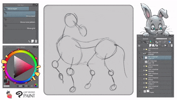
❖ 𝐅𝐋𝐎𝐖 𝐈𝐍 𝐒𝐇𝐀𝐏𝐄𝐒 :
▲ With the new layer, I'm using default 𝐏𝐞𝐧: 𝐅𝐨𝐫 𝐄𝐟𝐟𝐞𝐜𝐭 𝐋𝐢𝐧𝐞 to create some lines. You could try many lines (as much as 5 lines) to create the flow in shapes. It's what we called biometric lines in other word.
💬 : Using biometric lines, we can get the viewer’s eye moving using an active progression of visual elements. By doing so, you'll create an interesting flow in design, character's dynamic movement although it's a static artwork.
❖ 𝐏𝐑𝐎𝐆𝐑𝐄𝐒𝐒𝐈𝐎𝐍 𝐎𝐅 𝐄𝐋𝐄𝐌𝐄𝐍𝐓𝐒 :
▲ The key to any successful composition is to get the eye moving, and to keep it engaged within the image frame using the biometric lines. Skillful placement of multiple elements can facilitate visual movement throughout the image, enticing the viewer to study important and relevant aspects of the animal's features such as muscles, head rotation, etc.
💬 : Essentially, try to lead the viewer through the composition using a progression of elements, for the GIF above, I used the progression of multiple elements—starting with the rapids creation of different size in circle shapes, moving next to the small circles, leading to the horse's tail, and finally ending with smaller circles for horse's legs—to encourage the viewer to study the entire composition easily.
❖ 𝐃𝐘𝐍𝐀𝐌𝐈𝐂 𝐕𝐈𝐒𝐔𝐀𝐋 𝐑𝐄𝐋𝐀𝐓𝐈𝐎𝐍𝐒𝐇𝐈𝐏𝐒 :
▲ When you take a photograph, you squish our vibrant, energetic three dimensional world into a two-dimensional static rectangle. When you create dynamic visual relationships between multiple elements, you essentially breathe energy, movement, and vitality back into your photographs, bringing them to life.
💬 : Personally, I like to juxtapose elements which are opposing one another to create this visual energy. The subsequent visual tug-of-war traps the viewer, engaging more than just short-term interest. For example, with the GIF above, the relative positioning of the 'small muscles' represent by small circles and the bigger circles creates a dynamic relationship, one that is further underscored by the biometric (curve) lines connecting the two elements.
❖𝐒𝐈𝐌𝐏𝐋𝐈𝐅𝐘 𝐑𝐄𝐒𝐔𝐋𝐓 :
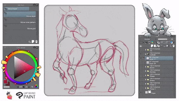
▲ Personally, I think that the best compositions are the ones which manage to successfully tie together multiple, chaotic, and complex subjects into a simple one. In doing so, however, you must find a way to extract order from chaos, and to create meaningful relationships between elements.
💬 : Find ways to give your horse some extra visual attention. For the GIF above, the chaos of this unruly shapes of 'muscles' was quelled by the simplified shapes emerging from the bigger circles and the small ones then rendered with simplify 𝐑𝐨𝐮𝐠𝐡 𝐏𝐞𝐧𝐜𝐢𝐥 sketch.
🐐 - Goat / Sheep / Ram – 羊
👶 Born 2003, 1991, 1979, 1967, 1955, 1943, 1931, 1919, 1907.
People born in the year of the Sheep are 𝐞𝐥𝐞𝐠𝐚𝐧𝐭, 𝐡𝐢𝐠𝐡𝐥𝐲 𝐚𝐜𝐜𝐨𝐦𝐩𝐥𝐢𝐬𝐡𝐞𝐝 𝐢𝐧 𝐭𝐡𝐞 𝐚𝐫𝐭𝐬, and 𝐩𝐚𝐬𝐬𝐢𝐨𝐧𝐚𝐭𝐞 𝐚𝐛𝐨𝐮𝐭 𝐧𝐚𝐭𝐮𝐫𝐞. At first glance, they seem to be better off than the people born in other years.
They are 𝐝𝐞𝐞𝐩𝐥𝐲 𝐫𝐞𝐥𝐢𝐠𝐢𝐨𝐮𝐬 and 𝐩𝐚𝐬𝐬𝐢𝐨𝐧𝐚𝐭𝐞 in whatever they do and believe in.
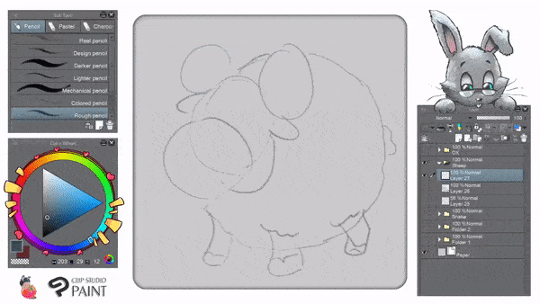
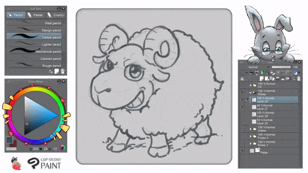
❖ 𝐁𝐀𝐒𝐈𝐂 𝐒𝐇𝐀𝐏𝐄 :

▲ Start with lots of circles or ovals to achieve basic shape of the ram drawing. It's how I simply create an animal, especially a sheep or ram with a fluffy wool. Don't get discouraged if your circle is not rounded enough. Try to lightly doing it again and again with undo; you'll be alright.
❖𝐃𝐄𝐅𝐈𝐍𝐈𝐍𝐆 𝐒𝐈𝐌𝐏𝐋𝐄 𝐒𝐇𝐀𝐏𝐄𝐒 :
▲ Another way to create an interesting features of the ram. Just draw some simple yet adorable (𝑖𝑛 𝑚𝑦 𝑜𝑝𝑖𝑛𝑖𝑜𝑛 𝑜𝑓 𝑐𝑜𝑢𝑟𝑠𝑒) shapes of ram's eyes, its smiling teeth, chubby feet, even with the spiral horns!
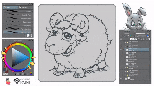
❖ 𝐆𝐈𝐕𝐈𝐍𝐆 𝐒𝐎𝐌𝐄 𝐏𝐄𝐑𝐒𝐎𝐍𝐀𝐋𝐈𝐓𝐘 :
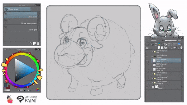
▲ Every time that you define something while inking, whether it's a drawing of human characters or animals; there is one golden rule to make it interesting; give them personality! It can be the naughty eyebrow, the cunning smile, or also warmth smile, you name it! Try it yourself, it's fun!
❖ 𝐂𝐋𝐄𝐀𝐍𝐈𝐍𝐆 𝐎𝐔𝐓𝐋𝐈𝐍𝐄 :
▲ Depends on what kind of pen tool that you wish to use or favorite the most, most of my creation were inked by 𝐓𝐞𝐱𝐭𝐮𝐫𝐞𝐝 𝐏𝐞𝐧. However you could also try other pen tools to suit your needs.
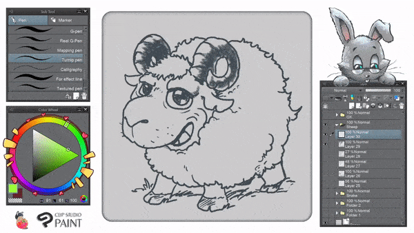
❖ 𝐀𝐃𝐃𝐈𝐍𝐆 𝐕𝐀𝐋𝐔𝐄𝐒 :
▲ Some area, like the sheep's horns will be good to add some values before moving to the next blocking part. For this illustration, I will not use too much time adding values since other parts will be more important to learn with other techniques.
❖ 𝐅𝐈𝐋𝐋 𝐈𝐍 𝐓𝐇𝐄 𝐁𝐋𝐀𝐍𝐊𝐒 :
▲ First, forgive my color choice; I pick strong and vivid colors to show you the difference area for dropping 𝐅𝐢𝐥𝐥 tool. Green basically for skins and orange for the wool.
💬 : Please notice that I use 𝐓𝐮𝐫𝐧𝐢𝐩 𝐏𝐞𝐧 before filling the color. And also I move the layer below ink/outline after I fill the whole parts of it.
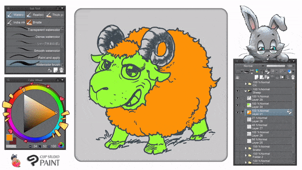
▲ For this stage, I use 𝐅𝐢𝐥𝐥 tool again and change the colors into appropriate ones for the sheep so she will not feel ashamed with the dorky color choice I made before. 😅
❖ 𝐖𝐎𝐎𝐋 𝐁𝐔𝐒𝐈𝐍𝐄𝐒𝐒 :
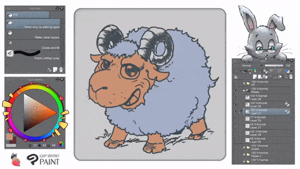
▲ This is the part to render the fluffy wool! I use 𝐃𝐞𝐜𝐨𝐫𝐚𝐭𝐢𝐨𝐧 𝐓𝐨𝐨𝐥 and choose 𝐒𝐡𝐚𝐝𝐞, after that I pick 𝐆𝐚𝐮𝐳𝐞 𝐂𝐥𝐨𝐮𝐝 to color around the wool-kinda way. Of course this is not the only way to make the wool looks fluffy; you can also use 𝐀𝐢𝐫𝐛𝐫𝐮𝐬𝐡 𝐓𝐨𝐨𝐥 to finalize everything in between the wool business.
🐒 - Monkey – 猴
👶 Born 2004, 1992, 1980, 1968, 1956, 1944, 1932, 1920, 1908.
People born in the year of the Monkey are the 𝐞𝐫𝐫𝐚𝐭𝐢𝐜 𝐠𝐞𝐧𝐢𝐮𝐬𝐞𝐬 of the Zodiac cycle. They are 𝐜𝐥𝐞𝐯𝐞𝐫 𝐚𝐧𝐝 𝐬𝐤𝐢𝐥𝐥𝐟𝐮𝐥 𝐢𝐧 𝐠𝐫𝐚𝐧𝐝-𝐬𝐜𝐚𝐥𝐞 𝐨𝐩𝐞𝐫𝐚𝐭𝐢𝐨𝐧𝐬 and are 𝐬𝐦𝐚𝐫𝐭 𝐰𝐡𝐞𝐧 𝐦𝐚𝐤𝐢𝐧𝐠 𝐟𝐢𝐧𝐚𝐧𝐜𝐢𝐚𝐥 𝐝𝐞𝐚𝐥𝐬.
They are 𝐢𝐧𝐯𝐞𝐧𝐭𝐢𝐯𝐞, 𝐨𝐫𝐢𝐠𝐢𝐧𝐚𝐥 and are 𝐚𝐛𝐥𝐞 𝐭𝐨 𝐬𝐨𝐥𝐯𝐞 𝐭𝐡𝐞 𝐦𝐨𝐬𝐭 𝐝𝐢𝐟𝐟𝐢𝐜𝐮𝐥𝐭 𝐩𝐫𝐨𝐛𝐥𝐞𝐦𝐬 𝐰𝐢𝐭𝐡 𝐞𝐚𝐬𝐞.
❖ 𝐁𝐀𝐒𝐈𝐂 𝐒𝐇𝐀𝐏𝐄 :
▲ Drawing a monkey is a combination of some simple shapes; start from oval, rectangle, and cylinder. GIF above shows you how I simply start everything only with strokes of 𝐑𝐨𝐮𝐠𝐡 𝐏𝐞𝐧𝐜𝐢𝐥. As you go along my tutorial, you'll find it's easier if you always keep in mind not to see things or subjects from difficult aspects. But always narrow it down to a simple approach.
❖ 𝐆𝐈𝐕𝐈𝐍𝐆 𝐒𝐎𝐌𝐄 𝐏𝐄𝐑𝐒𝐎𝐍𝐀𝐋𝐈𝐓𝐘 :
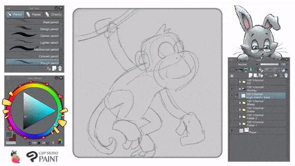
▲ I'd love to say that I always try to add some personality to my drawing will boost the mood for the viewer as well as myself.
🐓 - Rooster – おんどり
👶 Born 2005, 1981, 1969, 1957, 1945, 1933, 1921, 1909.
People born in the year of the Rooster are 𝐝𝐞𝐞𝐩 𝐭𝐡𝐢𝐧𝐤𝐞𝐫𝐬 and are always 𝐛𝐮𝐬𝐲 and 𝐝𝐞𝐯𝐨𝐭𝐞𝐝 to 𝐭𝐡𝐞𝐢𝐫 𝐰𝐨𝐫𝐤.
They always want to 𝐝𝐨 𝐦𝐨𝐫𝐞 𝐭𝐡𝐚𝐧 𝐭𝐡𝐞𝐲 𝐚𝐫𝐞 𝐚𝐛𝐥𝐞, and if they 𝐮𝐧𝐝𝐞𝐫𝐭𝐚𝐤𝐞 𝐚 𝐭𝐚𝐬𝐤 𝐛𝐞𝐲𝐨𝐧𝐝 𝐭𝐡𝐞𝐢𝐫 𝐚𝐛𝐢𝐥𝐢𝐭𝐢𝐞𝐬, they are 𝑑𝑖𝑠𝑎𝑝𝑝𝑜𝑖𝑛𝑡𝑒𝑑. Rooster people have a habit of 𝐬𝐩𝐞𝐚𝐤𝐢𝐧𝐠 𝐨𝐮𝐭 𝐝𝐢𝐫𝐞𝐜𝐭𝐥𝐲 whenever they have something on their minds.
❖ 𝐁𝐀𝐒𝐈𝐂 𝐒𝐇𝐀𝐏𝐄 :
▲ Start as simple as possible using 𝐏𝐞𝐧𝐜𝐢𝐥 𝐑𝟏. Use big shapes of oval, rectangle, and anything you think it's possible to create interesting chicken features from its comb, wattles, beak, feathers, even to its claws.
💬 : We will render chicken's feathers and other details later. For this one, try to think everything as simple as possible.
❖ 𝐒𝐓𝐑𝐔𝐂𝐓𝐔𝐑𝐄 𝐒𝐇𝐀𝐏𝐄𝐒 :
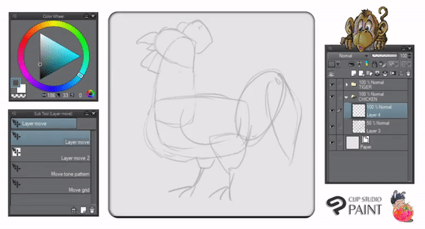
▲ With 𝐏𝐞𝐧𝐜𝐢𝐥 𝐑𝟏 and another new layer. I define the chicken's structure from their initial shapes. After done with the rough sketches, I add some layered feathers to our rooster illustration so it looks better than flat for the color guideline.
❖ 𝟏𝟎 𝐌𝐈𝐍𝐔𝐓𝐄𝐒 𝐋𝐀𝐓𝐄𝐑 :
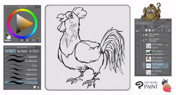
▲ Well, because time is running short when making this tutorial. So I skip into showing you separated layers for color blocking. Using only 𝐓𝐮𝐫𝐧𝐢𝐩 𝐏𝐞𝐧, as you can see from GIF above; I giving a proper outline and choose some basic colors for a rooster: dark green, dark brown, orange, and red. Plus bluish gray for the shadow.
❖ 𝐂𝐎𝐋𝐎𝐑 𝐑𝐄𝐍𝐃𝐄𝐑𝐈𝐍𝐆 - 𝐈 :
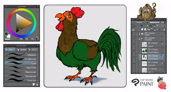
▲ With everything set right and don't forget to 𝐋𝐨𝐜𝐤 𝐓𝐫𝐚𝐧𝐬𝐩𝐚𝐫𝐞𝐧𝐭 𝐏𝐢𝐱𝐞𝐥𝐬, I choose between 𝐆-𝐏𝐞𝐧 and my favorite 𝐓𝐞𝐱𝐭𝐮𝐫𝐞𝐝 𝐏𝐞𝐧 to give some variation of light colors on rooster's feathers and so on.
💬 : At this stage, I don't plan to blend everything just yet. Focus on drop some colors to blend later is my key elements here. So rather than using too much energy on creating detailed feathers one by one; choose K.I.S.S method. (Keep It So Simple).
❖ 𝐂𝐎𝐋𝐎𝐑 𝐑𝐄𝐍𝐃𝐄𝐑𝐈𝐍𝐆 - 𝐈𝐈 :
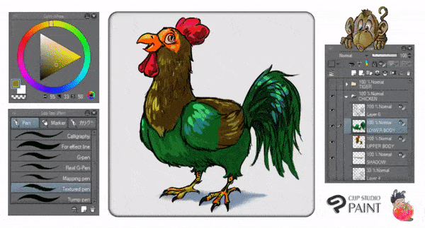
▲ Now after I'm done with K.I.S.S method, I begin to move into M.I.S.S (Make It Sounds Simple) by using standard brushes from Clip Studio Paint! You can rely on 𝐎𝐢𝐥 𝐏𝐚𝐢𝐧𝐭 then choose 𝐎𝐢𝐥 𝐏𝐚𝐢𝐧𝐭 𝐅𝐥𝐚𝐭 𝐁𝐫𝐮𝐬𝐡 to blend almost everything! And that's all the techniques behind KISS + MISS.
💬 : That's why, dropping variety of colors will be blended smoothly and nicely. You just need to control your pressure while doing it, as for mine; I don't need to press too much because some graphic tablets will be having different outcomes when pressing gently with tilt ability.
🐕 - Dog – 狗
👶 Born 2006, 1982, 1970, 1958, 1946, 1934, 1922, 1910.
People born in the year of the Dog have all the fine qualities of 𝐡𝐮𝐦𝐚𝐧 𝐧𝐚𝐭𝐮𝐫𝐞. They have a sense of 𝐝𝐮𝐭𝐲 and 𝐥𝐨𝐲𝐚𝐥𝐭𝐲, they are 𝐞𝐱𝐭𝐫𝐞𝐦𝐞𝐥𝐲 𝐡𝐨𝐧𝐞𝐬𝐭 and always do their best in their relationship with other people. Dog people inspire confidence in others and know how to keep secrets.
❖ 𝐋𝐈𝐍𝐄 𝐎𝐅 𝐀𝐂𝐓𝐈𝐎𝐍 :
▲ The line of action is a 𝑐𝑢𝑟𝑣𝑒𝑑 𝑙𝑖𝑛𝑒. Making the line of action curved, as opposed to drawing it as a straight line, gives your character's pose (for this is the Dog) 𝐦𝐨𝐫𝐞 𝐟𝐨𝐫𝐜𝐞 and 𝐚𝐭𝐭𝐢𝐭𝐮𝐝𝐞 which, in turn, aids in making your animal's poses 𝐦𝐨𝐫𝐞 𝐯𝐢𝐬𝐮𝐚𝐥𝐥𝐲 𝐢𝐧𝐭𝐞𝐫𝐞𝐬𝐭𝐢𝐧𝐠 to the viewer.
Using 𝐓𝐞𝐱𝐭𝐮𝐫𝐞𝐝 𝐏𝐞𝐧, I simply draw some lines of action to create the interesting parts of the dog's structures; then lower the opacity about 50% before adding the shapes.
❖ 𝐒𝐓𝐑𝐔𝐂𝐓𝐔𝐑𝐄 𝐒𝐇𝐀𝐏𝐄𝐒 :
▲ The line of action is a key ingredient to making your animal's poses look more dynamic. In this quick tutorial, you see what the line of action is and how it can be used to make your animal poses come alive by adding structures with basic shapes: circle and oval.
After creating a new layer, I use standard 𝐑𝐨𝐮𝐠𝐡 𝐏𝐞𝐧𝐜𝐢𝐥 with blue color on top of my Lines layer (with 50% Opacity) to make the structural shapes easier to be seen when detailing later.
❖ 𝐃𝐄𝐓𝐀𝐈𝐋𝐈𝐍𝐆 𝐒𝐓𝐑𝐔𝐂𝐓𝐔𝐑𝐄 𝐒𝐇𝐀𝐏𝐄𝐒 :
▲ The line of action is a simple curved line that evokes movement. It's better to make your line of action S-shaped rather than just a straight - it will hinder the overall force and make the resulting pose look less dynamic.
Combining the line of action with basic shapes will make you think the shapes like 3D when drawing/designing. With detailed structure of shapes, you'll be able to define the overall picture way more easier and counter the artist's block as well.
❖ 𝐈𝐍𝐊𝐈𝐍𝐆 𝐎𝐕𝐄𝐑𝐀𝐋𝐋 𝐒𝐇𝐀𝐏𝐄𝐒 :
▲ Above is my example of poses utilizing a strong line of action. Note that even though the dog may be standing "still", there is still an attitude being projected, simply by having the torso coincide with the line of action.
💬 : When drawing from life, find the line of action - note it down, and then proceed to exaggerate it. It'll make the resulting pose feel more "alive" and less stiff. Please note that for dog's colors; it's the same technique with the rat. So I'll just skip it because of nothing fancy to talk about. 😋
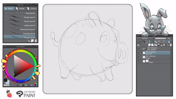
🐖 - Pig / Boar – 猪 / イノシシ
👶 Born 2007, 1983, 1971, 1959, 1947, 1935, 1923, 1911.
People born in the year of the Boar are 𝐛𝐫𝐚𝐯𝐞. They have 𝐭𝐫𝐞𝐦𝐞𝐧𝐝𝐨𝐮𝐬 𝐢𝐧𝐧𝐞𝐫 𝐬𝐭𝐫𝐞𝐧𝐠𝐭𝐡 which no one can overcome. They display 𝐠𝐫𝐞𝐚𝐭 𝐡𝐨𝐧𝐞𝐬𝐭𝐲.
They are 𝐬𝐡𝐨𝐫𝐭-𝐭𝐞𝐦𝐩𝐞𝐫𝐞𝐝, yet 𝐡𝐚𝐭𝐞 𝐭𝐨 𝐪𝐮𝐚𝐫𝐫𝐞𝐥 or have arguments. They are 𝐚𝐟𝐟𝐞𝐜𝐭𝐢𝐨𝐧𝐚𝐭𝐞 and 𝐤𝐢𝐧𝐝 𝐭𝐨 𝐭𝐡𝐞𝐢𝐫 𝐥𝐨𝐯𝐞𝐝 𝐨𝐧𝐞𝐬.
❖ 𝐁𝐀𝐒𝐈𝐂 𝐒𝐇𝐀𝐏𝐄 :
▲ Start as simple as possible. Use big shapes of circle and others to create interesting pig features such as ear, especially nose!
💬 : Most people will draw pig's tail with a spiral shape, while I am not most of the people. Haha! So I just draw it as simple as possible.
❖ 𝐈𝐍𝐊𝐈𝐍𝐆 𝐒𝐇𝐀𝐏𝐄𝐒 :
▲ Well, I have no secret tricks here, just directly inking my pig with 𝐓𝐞𝐱𝐭𝐮𝐫𝐞𝐝 𝐏𝐞𝐧 nonetheless.
💬 : You can either draw the eyebrows for your pig if you wish to give some personality or just simply make it looks a bit lazy with the eyelids half-closed.
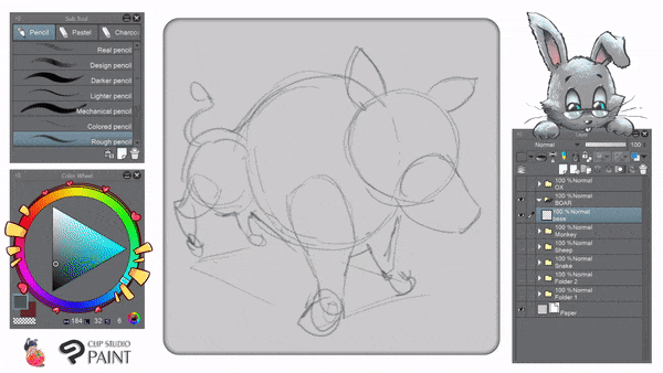
𝑊𝐴𝐼𝑇 𝐴 𝑀𝐼𝑁𝑈𝑇𝐸... 𝑊ℎ𝑎𝑡 ℎ𝑎𝑣𝑒 𝐼 𝑑𝑜𝑛𝑒? 𝐼'𝑚 𝑑𝑟𝑎𝑤𝑖𝑛𝑔 𝑝𝑖𝑔! 𝐼𝑡'𝑠 𝑠𝑢𝑝𝑝𝑜𝑠𝑒𝑑 𝑡𝑜 𝑏𝑒 𝑡ℎ𝑒 𝑤𝑖𝑙𝑑 𝑏𝑜𝑎𝑟!!
𝔭𝔞𝔲𝔰𝔢 𝔞 𝔰𝔢𝔠...
🐽 𝐖𝐈𝐋𝐃 𝐁𝐎𝐀𝐑 𝐀𝐏𝐏𝐄𝐀𝐑𝐒 🐽
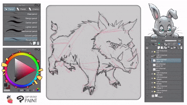
▲ Now let's try to do the different in shapes! Once again start the sketch as simple as possible. Then add more shapes to create the complex structures. We're trying to differentiate the shapes (Pig is rounded, Boar is oval) to achieve different results of characteristics.
💬 : Many people will point out that a Wild Boar is an extremely dangerous animal, unlike domestic pig that looks lazy and friendly. In response to that, let's take a look with our design below.
❖ 𝐏𝐎𝐈𝐍𝐓𝐘 / 𝐒𝐇𝐀𝐑𝐏 𝐄𝐃𝐆𝐄 𝐒𝐇𝐀𝐏𝐄𝐒 :
▲ I use this theory when i learned to draw anything based on the collection of animation or motion picture art book. Inside the book, it's written clearly that to define shape of characters whether it's good or bad (nasty) in attitude; it starts with round and sharp.
💬 : Wild boar considered as nasty animal, wild in nature, sometimes frenzy. So with triangle shapes which represent as sharp edges; I show you how that analogy fits into characters or creatures from many films, animations, even manga.
❖ 𝐃𝐄𝐓𝐀𝐈𝐋𝐈𝐍𝐆 𝐒𝐓𝐑𝐔𝐂𝐓𝐔𝐑𝐄 𝐒𝐇𝐀𝐏𝐄𝐒 - 𝐈 :
▲ With new layer, I start to define the structured shapes with rough sketch. Using only 𝐑𝐨𝐮𝐠𝐡 𝐏𝐞𝐧𝐜𝐢𝐥, as you can see from GIF above; I try not to define detailed boar's furs as it will be the same as how to paint the rat from our first chapter.
❖ 𝐃𝐄𝐓𝐀𝐈𝐋𝐈𝐍𝐆 𝐒𝐓𝐑𝐔𝐂𝐓𝐔𝐑𝐄 𝐒𝐇𝐀𝐏𝐄𝐒 - 𝐈𝐈 :
▲ Again, for the last time I'm using 𝐑𝐨𝐮𝐠𝐡 𝐏𝐞𝐧𝐜𝐢𝐥, as you can see from GIF above; to give more details. Adding some shadows on its face brings the wild side of it. As for the color, I think I'll just leave it to you to practice for what you've been learning along the way.
💬 : Yes, you can call me lazy or whatever, but seriously you need to apply colors on the boar with your own knowledge and understanding so far. I'll give my comments, even special guide to you if you can directly message to me and request anything as long as it's part of the tutorial, 😘
🌐 - 最後の声明 - Closing Statement
On behalf of the organizing committee for Clip Studio Paint, other Visual Artists, and Visual Art Teachers, I would like to take this opportunity to express my sincerest gratitude to all of our aspiring CSP mentors and virtual attendees who helped to make this tutorial an outstanding success.
Although the theme animal drawing is as old as forest itself, digital art is a field still in its infancy throughout much of the academic world: an interdisciplinary existing between the cracks of the traditional arts and the sciences of digital media.
Yet this twilight existence has not prevented it from flourishing in recent years. As the innovative description featured at each of this month’s twelve animals zodiac has illustrated, animals are a topos that has ever permeated the arts and sciences and one that continues to play an important role in maintaining society's point of view: perhaps now more than ever before, confronted with an increasingly globalized and interconnected world that asks us to re-evaluate longstanding assumptions about animal's protection.
You must be thinking: "what's the meaning of all these rambling all about?! Come on get to the point..." Bottom line, I'd like to share you my affection for the animals and how we can express our heart-content with digital art using Clip Studio Paint. Think about this: you have an animal instinct inside, whether you believe it or not. Just don't kill it. Embrace it, my professor once said: we're nothing but social animals anyway.
この投稿を「いいね!」したユーザー


コメント