
Magazines still can not be replaced as the media evolves constantly. From paper to digital, people are motivated to buy magazines with attractive covers even if they're buying them from app that sells magazine online. Since the magazine cover counts a lot, designers exert all their energies to get some eye-catching cover designs.
How to make a magazine cover creatively is a great challenge, especially for those who are not skilled in graphic design. Fortunately, this month; I will assist you in creating delicate design even if you are just an absolute beginner, an artist or hobbyist using Clip Studio Paint.
If anyone asking this; "why not using Adobe Photoshop or Adobe Illustrator instead?" Well, of course I can - well obviously this is a website for Clip Studio though. But believe me, it's better for me to create amazing concepts in my mind using Clip Studio Paint rather than using those well-known apps to create graphic design elements and here are some tips you should know to create a creative magazine cover:
1. Keep target audiences in mind
There is no possible to let everyone interested in your magazines. So a good designer always take target audiences into account. Think about who will read the particular magazine (whether it's physical or PDF) and what they want to see, then you can come up with some ideas that will attract those target audiences.
For example, Arts or Digital Arts magazines aim at people who take an interest in illustration. Therefore, magazine cover designs that keep art lovers in mind should be very helpful.
I will create an example of 'Unofficial' Clip Studio Digital Art & Illustration Magazine. Please note that Celcys, Inc nor Clip Studio Paint affiliate with my creation. This is purely a 'fan-made' magazine which I had in mind to show you my design thinking process.
/// But first, create your preferred canvas:
[ 1 ] - I choose Comic layout for use of work.
[ 2 ] - I type down the ( Clip Studio Magz ) for the file name and choose A4 Color (350dpi) from the available preset. If you wish to have a black & white, just choose the A4 Monochromatic.
[ 3 ] - Manga draft settings: by default it will be A4 size, since I chose the preset for it.
/// Click OK and you will get the canvas shows as seen from image above:
[ 4 ] - This is the area that you can work with, later on when saving to JPG, TIFF, or PNG or anything for the print, it will be cropped into size of A4.
[ 5 ] - Bleed size so that your artwork can be safely cut and leave no white borders for the printing purposes only (if available by your printing places, because in Indonesia; we print by using PDF and never use .clip file from Clip Studio Paint).
[ 6 ] - Safe size to make your artworks even safer for printing purposes. I apologize if I am unable to discuss about bleed and safe size furthermore, since I am not an expert myself for offset printing. Most of my artworks being edited by the operator of my digital print media.
2. Reasonable placement and typography
As I mentioned before and above, based from Clip Studio Newsletter, this tutorial was born.
Celcys, inc & Clip Studio TIPS, website, and any social media related to the official Clip Studio Paint not endorsing this tips. Thus I write the title 'Unofficial' so you will notice it right away.
As additional info: images I will be using (or reuse) in this tutorial will be part of all my tutorials that I've been creating until now. Any elements such as divider, final result, and those PNG images scattered across the tutorials were created using Clip Studio Paint
Some logos, graphic elements, that I will be using here were taken from clip-studio.com and I've read the guidelines that I may not use them for any other purposes except for the tutorial. I made this concept using only Design Pencil and Text tool to rough out my initial idea and...
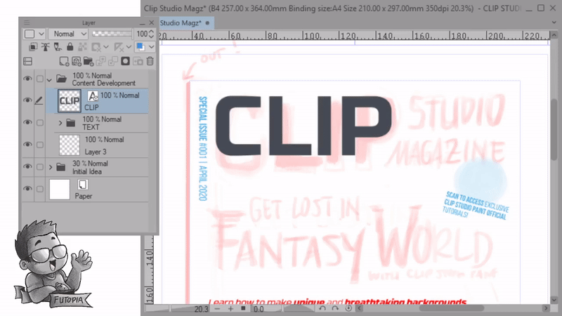
/// Here's the layout of magazine cover breakdown:
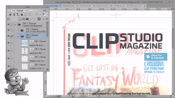
[ 0 ] - Issue number:
It's an optional place to make it read from top to bottom (vertically), but playing with the reasonable elements like that will make the design appear more dynamic and not flat. Just make sure that your design do not across the bold red line over there (blue circle).
[ 1 ] - Magazine name is the brand:
Put the magazine name in the most obvious place, the general layout of the magazine cover should be organized around your magazine's name. The name is what makes your magazine instantly recognizable, so it needs to be the most prominent feature or the cover. All professional designers will follow this rule when designing the cover.
[ 2 ] - Digital 'sticker':
There are some words that usually appear in headlines, because they attract readers: “New”, “Free”, “Gifts” and “Exclusive”. We recommend emphasizing them simply because they proved they work. Later you'll see how we develop the 'sticker' with typography elements.
[ 3 ] - Header Title with modified typography:
It will come as no surprise that typographic is extremely important as well as the placement on the magazine covers. It is the case of creating the most visible and harmonious combination of image, text, and background. Using modified typography will be explained in details on the later chapter to bring you into focus by partaking each section of tutorial meticulously.
[ 4 ] - Subtitle after Header:
And it is important to show the reader the more important content than others in a showy way and create a readable structure with the help of typographic hierarchy. For example, the title will be styled in a bigger font than the rest part such as subtitle and other details will have to go smaller but having enough information so people could actually get what the contents will be.
[ 5 ] - Illustrations or photos or any stunning images here:
It's also recommended that the model (or any photos/illustrations) on the cover is on transparent or solid color background. It will be really hard to make the headlines stand out if they are placed on top of a patterned or mixed-color background.
[ 6 & 7 ] - Additional information with little clip-arts:
Adding more information to grab attention or make the reader quite get the idea of what the contents going to be is always welcome. You'll see the process later when it's done part by part, right now these are just concepts that I need you to digest first.
[ 8 ] - Catchy phrase or static 'running letter' style:
This is just my idea to make the reader's attention still on the cover, it's what marketing or promotional words took a place on the cover. It's truly optional, you can either have it or not.
Now that you're beginning to get the idea, we'll be going into another in depth case. Feel free to scroll through first, but if you wish to learn step by step; I'd suggest you need to be patience with me, as this tutorial intentionally will cover basic techniques before go into intermediate ones of even advance typography modification.
3. Be careful with the text
Most magazine covers feature the headlines of the most important stories on the cover. To be able to attract the reader's eye to them, emphasize them using bold, italics, sizes and colors.
The use of color for the text on covers is extremely important. It will affect the tone and overall feeling of the cover. When thinking about text colors for subtitles and other smaller text, black and white are always be selected. But for the bigger title, you can choose some bright colors.
Make sure your text representative and attractive. Take some advice from the magazine editors about the text since they are more familiar with the content. Don't place very long sentences on the cover with simplex format. Readers will get bored if the text doesn't have proper and attractive format. Numbering and alignment should be used in such a way that it would get more attention.
But before going into that way, here's the settings that you need to know.
[ 1 ] - Sub tool Text, choose this (obviously) for placing your typography.
[ 2 ] - Tool property [ Text ] will be needed, click on Font. As you can see, you will be having the font list after you click on that drop-down menu.
[ 3 ] - This is going to be your first list of fonts if you haven't change it. On the image, I circle out the corner of the list, left click on it and drag to make it larger.
[ 4 ] - Now you're having the bigger, better to see, larger list. If you're having more than 500 fonts (just like me above: 588 / 588) you'll have a difficulty to scroll. But because now you're having larger list, it's time to use another strategy for efficiency.
[ 1 ] - Click on the gear icon to open the settings of font list.
[ 2 ] - Now click on the circle icon over there, then type any name that you wish. For me; I am using (Poster Design) because I'll be using for designing poster for later. Then you can check (tick or left click) onto fonts that you wish from your font list.
[ 3 ] - After you're done, you can access your chosen font. Click (All fonts) and change into (Poster Design) fonts that I made. Of course you will have your personalized list name.
[ 4 ] - Now you're having the set of chosen fonts especially for creating your personal projects. From poster design, comic/manga, even anything you wish to separate your fonts from those all fonts display.
[ ! ! ! ] Attention:
Not all the fonts can be displayed on your font list, it's because some of them can't be rendered into Clip Studio Paint system. It could be a restricted, corrupted, or simply not supported by the system (as far as I know because it seems I'm unable to locate my other fonts myself). Anyway, let's move on:
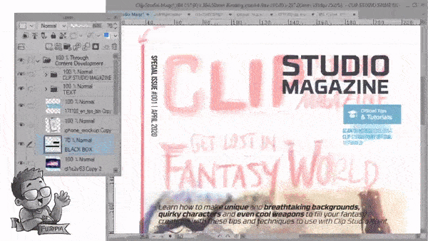
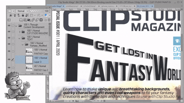
/// Organizing Layers:
I create a new folder, rename it into Content Development. Then place all the text into the folder (red circle) that obviously will be a place to editing text or backup them whenever I wish to modify or rasterize the font before modify it.
However I put all my rough ideas (which has several layers) into another folder, rename it to Initial Idea and lower the group opacity to 30%. By doing so, I can easily see my initial concept, then using Text tool to 'retrace' with Font that I have.
/// Tracing concept with Text:
{ GIF }
Please pay an extra attention although I speed it up to 10 times, I try to give some explanations here (to the best of my abilities):
[ 1 ] Holding [ Shift ] with [ Alt ] on your keyboard then drag it somewhere on the canvas - will give you another copy of current layer that you're having; whether it's text layer or any other type of layers. But text layer will be much more important! Here's why:
( ! ! ! ) Do not using copy & paste method with [ Ctrl + C ] and [ Ctrl + V ]; it will be a terrible experience. You'll need to experience it by yourself but you've been warned, especially when you wish to edit the copied font. It's so much horrible in the end.
[ 2 ] You must holding [ Shift ] while transforming your fonts into smaller or larger with transform command [ Ctrl + T ]. Shift key is the best way to prevent any disorientation of shape from the font or any other objects. If you're not using Shift, you'll face a terrible consequences of weird looking fonts and even dissatisfied rage (that might be just me).
[ 3 ] After had some experiments during the transformation of the text, I change the size of 'CLIP' to fit the 'STUDIO' and 'MAGAZINE'. This has to be done in order to balance the composition, honestly; I am too perfectionist for this and sometimes I hate it; that's why I've been trying my best to adjust the words size & position on the same level or alignment of its top and bottom.
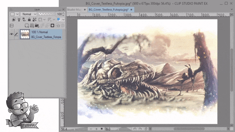
Image above is the background image I did for my old Clip Studio Tutorial cover image (officially requested for their first Newsletter publication without the 'Essential Guide for the Fantasy Backgrounds' cover text! What an honor!) As well as part of my work in progress from the tutorial itself. You can see the complete tutorial below:
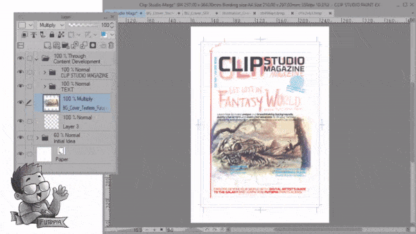
Now let's work with adding the image onto the magazine to determine the better looks of it (whole composition will be much better to visualize with the main image). You probably not really understand what's going on from the GIF; there's no drag and drop only copy and paste. I need to open the image first, then using [ Ctrl + A ] then [ Ctrl + C ] before going into the magazine then pressing [ Ctrl + V ] to paste the image.
After that, as you can see: I need to transform [ Ctrl + T ] and make the image bigger to fit the cover, using shift button before dragging from the corner left of the image and fit into the middle - but make it slightly over the bleed area.
Last but not least, I open the text folder, changing the position of the subtitle (text in the middle) and the color of it from red into dark grey.
/// Image distortion techniques:
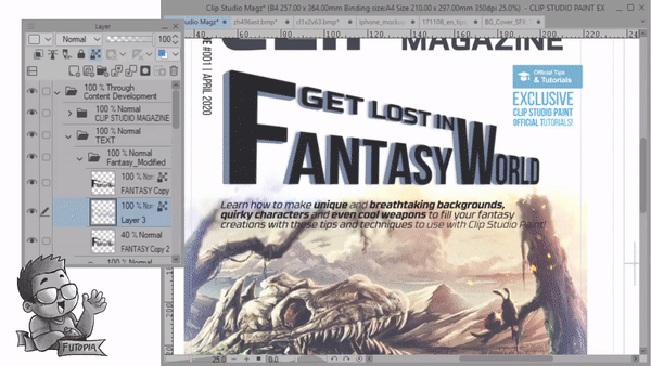
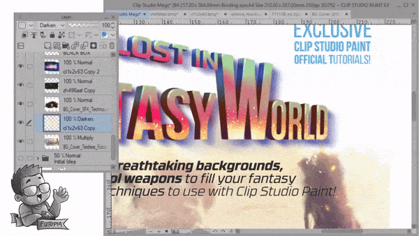
Now at this point, you'll need several images to work with. The method will be the same, copy and paste from images that I had from one document to the main project: magazine cover. Now to 'blend' them into the cover: I set different blending modes. For the image with the volcano mountain, the mode set to [ Darken ] as for the fairy image [ Normal ] and put it at the back of the mechanical chameleon that sets to [ Multiply ] and finally for the galaxy image: [ Darken ] mode.
Now from the fairy to mechanical chameleon to galaxy images, I adjust the image position with 'perspective' transform. Use [ Ctrl + Shift + T ] to access the [ Free Transform ] mode. Then drag the corner point of your images without any keyboard combination to achieve 'angled' or 'distorted' pictures - the rotation will also help to get dynamic composition.
/// Black box effects to enhance the text:
To make your white text visible, we need to add the black box effects behind it. That's just my made-up definition of something you put below the text. I create a new layer, rename it to 'Black Box' and using [ Rectangle Selection ] first to cover up the text at the bottom, after that hold down [ Alt ] and hit [ Backspace ] keyboard to fill it up with any color that you pick (as for me it's black, hence the name black box). To make it less dark, lower its opacity around 60%-75% depending on your desired result.
You can also use any brush you'd like to create the dynamic shape.
4. Choice for photo and background
I have to admit, I put too much fancy photos to accommodate my cover. And I was wrong, after talking with my former professor of Visual Communication Design, he points out about the 'messy' design I put together with distortion photos. He also reminds me about:
Mostly the photo takes up the largest space of the layout and it is the spotlight of the magazine cover. So the importance of picking a catchy photo should be emphasized and he adds, "the image of skeleton cave was a good one but put too much other pictures on the bottom of it distracts everything and not really necessary".
If you feature a person's portrait on the cover, just let it look at the camera. The photo with eye-contact will be even better to draw the attention of the readers.
These will be his concerns, I put those in order to share you my mistakes as well as what I've been corrected so far:
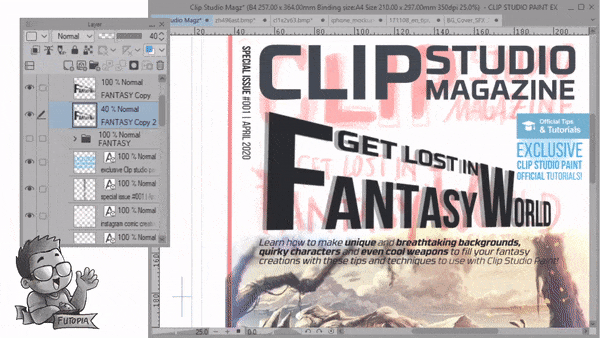
[ 1 ] - The color too eye distracting compared to the CLIP word. Try to change that with normal or neutral color like a bit grey or even black.
[ 2 ] - This line already good, try not to put anything. But if you have a slogan, you can put it here. But remember to make it smaller but readable and the color should be neutral as well.
[ 3 ] - Enhance the image will never hurt the entire composition. It is also recommended to put the photo on transparent or solid color background, which can help the text and photo stand out. It will be a little troublesome to make people recognize the headline and titles from a mixed-color background.
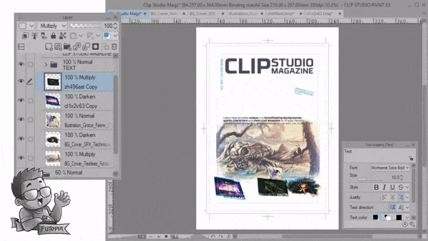
[ 4 ] - These line up of photos have been perfected. With balance of composition, you don't have to be over creative to make it nice, simple, and clean to look at. I add the iPhone mock-up there in corporate with the articles about 'Instagram comic creation with Clip Studio Paint' to have a different and make it looks 3D against those flat 2D images.
Overall, this is also my personal experience to 'design with feels' and put myself as a potential buyer who will get irritated with messy images placement. Thank you, Professor Yang-!
5. Get magazine cover ideas from everything
The inspiration does not spring up all the time. Sometimes designers are stuck of special ideas because they can not free themselves from the shackles of the design which they have used earlier. The best solution is to keep mind open and then you will find that inspiration may turn up from everything. Take notes when you get some good ideas before they vanish.
Following tutorials will be based on things that I approach as an experimental or personal experiences, there might be something you wouldn't agree (for example: composition, color, or even structures for the magazine's cover) however, feel free to get something you really need and leave the rest. There's no pressure or mandatory steps, just enjoy the process:
Polishing the images on the cover, as well as the other elements should come into creativity from yourself within. It's based on your own taste, as well as your freedom to create. Gif above (I apologize for the dithering quality) shows you how I did things. Placement and modification of typography, creating the 'blue ribbon' to wrap articles highlights or separate them with the main image (skeleton cave) and finalize with the ribbon's shadows and sparkling details.
6. Visual hierarchy in typography
The best way to get attention is to use the correct letters. It is difficult not to recognize any brand thanks to the letters of its name. We see it in rock bands, in technology companies, and in general, in all types of advertising, invitation to events, cards, and much more.
These evoke different emotions, and, for example, if we use floral fonts, we will feel all the power of the nature of the words that are written.
Using the right font is the first step in writing. The traditional Arial does not have the same feeling as using a more stylized font. The good thing is that thanks to the wonders of the internet, getting free fonts is very easy, so it will only depend on our imagination. But this chapter will share more about visual hierarchy and how to create those feelings into our magazine cover. Here's the process:
/// Creating the Headline:
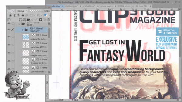
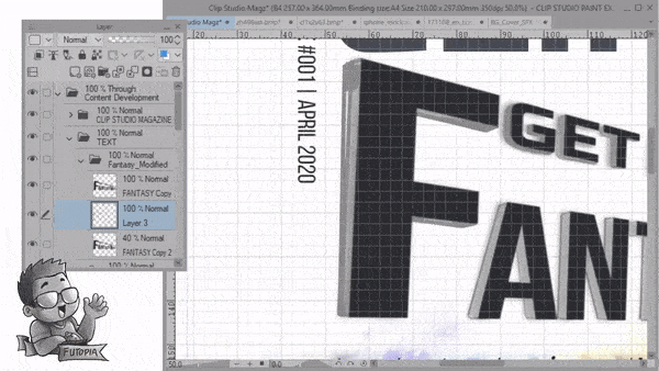
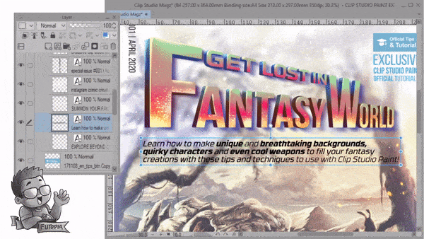
Adding the fonts with separated alphabets will also be a unique approach. From the GIF, you'll notice that I'm typing the 'Get Lost In' then holding [ Alt ] before dragging it to copy the word/layer automatically and change it to 'antasy' while the 'F' was coming from the copy version of 'antasy' as well. The 'W' and 'orld' too.
Please note: fonts that I've been using between 'Get lost in' and 'Fantasy World' are different type but with the same sans serif style. 'Fantasy World' has the larger and taller compared to 'Get Lost In' to make the visual hierarchy clear which one will be getting your attention first before you read the whole sentence about 'Get Lost In Fantasy World'.
/// Visual Distortion Typography:
I'll be honest with you, after my (failed) attempt to distort the images, I carefully distort the Title her: as it will be the first people going to see or the Headline of the entire magazine cover's typography. But before doing the [ Free Transform ] - first we need to:
1. Create a folder which has the backup of our fonts inside it.
2. Copy the folder, turn off the ones with fonts inside.
3. Right click the copied folder and choose [ Rasterize ] to make the font rasterized.
4. With [ Ctrl + Shift + T ] to access the [ Free Transform ] and start playing with the corners of the rasterized font to make the distortion seems like a perspective.
5. Make a copy of the distorted font or layer with [ Alt ] drag, lower its opacity around 70-80% and use [ Filter ] -> [ Gaussian Blur: 30 ] to make a blurred shadow.
/// Creating a 3D Illusion Typography:
Now we had a layer with distorted typography and the other layer below it will be the blurred one to create an illusion of shadow. I adjust the size of Here's another trick:
1. I turned off the initial idea folder so you could clearly see the whole thing.
2. With the help of [ Airbrush: soft ] and [ Turnip Pen ]; I create a new layer in between the distorted font and blurred ones to brush a depth of whole sentence or the side of typography to make them looks like a 3D text.
3. My old and cheap trick going to be: just follow the shadows created by blurred font. And add strong lines to determine the side and make it bolder.
/// Straighten & Fill the gap:
Using [ Shift ] before clicking on [ Left click ] will make a solid straight line, especially if you're using bold and solid brushes such as [ Turnip Pen ] or [ Mapping Pen ] then you'll be able to fill the side of your typography easily by using [ Fill ] tool after you're sure about closing the gaps between the lines. Be patience, and you'll be having a great result in no time.
/// Grid System:
This part will be my first time to tell you about [ Grid ] - I know that I haven't talk about this from the beginning, since all we've been busy through; was adjusting composition with 'feelings' and to make your sense of art sharper, you need to forget the grids for a while.
But when it comes to better visual arranging and balancing the whole layout altogether, you need to turn on the grid system. As you can see from the GIF image above; specifically side part of the word 'F', it's become clear that I wasn't aware too much for weird distortion, then I fix those mistakes by creating another straight line (with Shift) and adjust the distortion much better with [ Free Transform ] tool once again-!
7. A B C Rule to be remembered
Try to stick to the A B C rule—stick to one (A) heading (the magazine title), one solid (B) sub-heading or headline (bring out one article to be the central focus), and a wider selection of shorter (C) sub-headings. Nearly every creative magazine cover designs practice the A B C rule to improve the layout balance.
Combine these headings with a clear, simple photo and lots of white space (where you put no images or busy text), and you will have a magazine cover layout that’s both graphically very bold and pleasant to look at.
/// Headline fonts colorization:
Basically these following guides just a bunch of tricks to colorize the fonts. But before anything, you'd need to backup every-time. Just [ Alt ] dragging the whole folder to create backup of it. Then go to the first layer to color the 'face' of fonts. The middle layer will be the side of the fonts. Adding various color contrast will be your personal judgements here. The way I color this will be super weird (that's why I told you before, you might not agree with me) because it will represent the 'fantasy' elements.
Just remember one thing before coloring, [ Lock Transparent ] layers.
Default brushes that I use:
1. Airbrush: Soft.
2. Airbrush: Droplets (for the scattering effects).
/// Adjusting Drop-shadow:
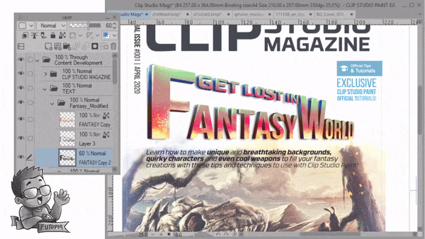
I felt the shadows below the fonts was off a bit, so I adjust the position of the drop shadows and give them more depth and longer result with copy the layer 2 times and merge them. This was purely unintentional at first, adding shadow like that will emphasize the whole Headline for the final outcome. Just, try not to give the shadows with black: even I make them a bit purplish - or any fancy colors that you'd think might be good to display.
/// Reshaping the Background:
This part, truly experimental. As I've been trying to finish the whole magazine composition, I've found it: the image was too bright and too much white at the top of the magazine, since I don't bother to make the image larger (that will cut the two characters sitting on the branch at the right) - so I use default brush: [ Airbrush: soft ] to add whole thing of 'blurry' backgrounds. It was lucky of me, that I used to make the top and bottom image a bit out of focus.
Plus adding small particles of what I call: 'pixie dust' with [ Airbrush: Droplets ] helped me a lot to enhance the whole image altogether to fit into my desired result.
/// Drop Shadows with Fancy Colors:
Last but not least, this is the technique I found quite useful, since [ Layer Property ] can only make the outline, not the drop shadow. So once again, this is what I'd find the best; you might have your own way to have a drop shadow on your text. Please give me your comments if you have any other quicker tricks.
First, always backup the text with holding [ Alt ] then drag, after that the one I dragged usually have to be rasterized before I choose [ Filter ] -> [ Gaussian Blur: 30 ] to get the 'shadow'. I duplicate again to have the shadow deeper then [ Merge ] the first and second shadows.
Finally, using [ Lock Transparent ] and default [ Airbrush: Soft ] to brush the entire shadow to have a fancy colors that make the sub-headings pop-out from hazy background.
Final words to live by
In a word, the tutorials above give a designer or artist like you plenty of room to get creative magazine cover ideas, but there are still many more techniques waiting to be explored. It may seem simple at first, but creating magazine covers needs a lot of efforts. It's a matter of keep trying, over and over again, until you find more tips on how to make a magazine cover and get the right result. Technically and experimentally.
Here's my final design, cropped according to the bleed:
Some of the best magazines cover ideas are using colors more sparingly as to prove that a single pop of vivid color can be more attractive than using a palette of many bright colors.
Combining one vivid color with black & white photography and text will look fantastic for technology titles and sports magazines, but not so much for a fashion magazine cover design. Bright banners, typography, and dividers lend a masculine, sporty edge to layouts.
This can be achieved in a very easy way and it is an excellent way of bringing the entire magazine cover ideas together. You can try a hot orange or acid yellow for a cheerful color pop that will look awesome on travel magazines and extreme sports headlines, or you can simply try a sky blue for a fresher look.
Also, using a vivid red will look really powerful and will add some modern touch to the old-fashioned monochrome photography. For a school magazine cover design, you better keep a lot of pictures and a joyful typography.
この投稿を「いいね!」したユーザー


コメント