
Intro
Hello and welcome to the ultimate lazy guide to coloring skin!
I know how it sounds - lazy painting? Absurd! Well, yeah, a little bit, but sometimes you need a quick and dirty way to just finish your drawing, right? So I'm here to impart all of my super swift tips and tricks on coloring some nice skin!
Base Colors
Assuming you have your line art all crisp and ready to go, we're going to start with some base colors. Now would be the last LAST minute time to check that you've got the appropriate size for your piece, and proper DPI. Rule of thumb is minimum of 300 - just so you have a nice, clean image.
Here's my starting image, on a 2815 x 3185 px canvas, with a DPI of 350.
Keep your lines on the top layer, we're coloring on layers below that.
Now you want to pick your base color(s). There's a few ways to go about this! Clip Studio's Standard Color Set has a range of decent skin colors, you can go to your favorite search engine and find a reference photo (pro tip: foundation makeup photoshoots and promo images usually have a wide range of skin colors that are very pigmented! great to use for reference!), or just pick a color from your color wheel and roll with it.
We'll work on a few different skin tones for reference! Here's my set up for base colors.
Another tip: don't work on a plain white background. I've seen others who do blue/green/etc because it shows easier where they haven't colored, but that can cause eye fatigue. A greyscale color, that contrasts enough you can see where you haven't colored, but not so contrasting that it hurts your eyes is the sweet spot.
Shadows
We're going into the next section doing shadows first. This, as most things, works best if you have a reference, and know where your light source is coming from. We're picking our next colors from the color wheel. Here's some 'Do's and Don'ts':
DON'T: Just move straight up and down when picking shading/lighting colors. It's not realistic, looks flat, and really just doesn't give any depth of color.
DO: Slide your wheel around to different hues - picking more colors in an arch on the square. More towards yellow for lighter colors and highlights, and more towards purple for those rich shadows.
This gives more depth and a far richer outcome.
So now lets put our color picking skills to the test! We're going in for shadows, and this is the lazy coloring tutorial is it not? We're doing quick and easy!
Start by creating a clipping layer above your base skin. Clipping layers are now your best friends, because we don't want to mess up anything and be unable to fix it on that base layer. And just in case you don't know how to clip a layer:
Okay! We've picked our color value, we've clipped our layer, now we slap on the first shadows! This is going to be the slightly darker color, not our darkest. And for this method, when I say slap it on, I mean it. This does NOT need to look pretty, just get color on canvas.
Next, you're gonna hit that clipping layer with a Filter>Blur>Gaussian Blur. The strength can be fiddled with, keep your preview on and just keep an eye on it. If you're doing full body, or a smaller image, it doesn't need to be that strong. For this large headshot, we're cranking it all the way to 200.
Another tip: keep swatches of the colors you're using as you're going through the shading process. You can keep them on a separate layer, just so if you see something you wanna add more shade or highlight to, you can go back with the same color and build up.
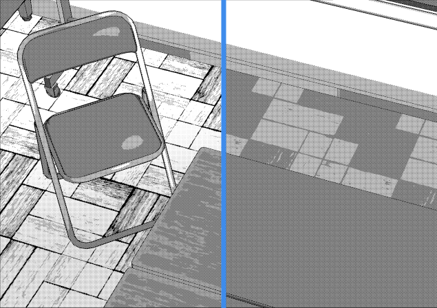
Note: for Gaussian Blur, image size really does matter! This row of three pictures is a condensed 2112 x 796 (where if these were all strung together at their original size it would be 8445 x 3185). If I did 200% Gaussian Blur on these smaller images I get this instead:
Practically the starting colors. So just gauge how hard you want your shadows, and keep an eye on it, Numerics aren't important.
Next thing you're gonna do is 1 of two things: Repeat the last step, or move on to your next darkest color.
If you aren't quite satisfied with your lightest shadows, or need to get a few more areas, repeat the last step. New clip layer and all. I feel like there are a few places I could get finer shadows, so I'm going to go in and block out new shadows and blur them at a less intense number.
Now that I'm satisfied with that base shadow, we move on to the next step! Which is essentially the same exact thing, just with darker colors. Clipping layer, slap on colors (in smaller, darker locations), and blur. Easy peasy!
And blur
Now you can repeat this process as many times with as many shades as you want. Once you're done, clean it up however you so choose: make places softer by erasing with a less opaque soft brush, fill in some shadows with your pen of choice, etc. Once you're done there, we move on to highlights.
Highlights
I'd be lying if I said we were doing anything different at this step. Same concept, but lighter. First color should only be slightly lighter than the base, slap that on wherever you want light to hit.
And blur.
Do the process again with lighter colors.
And as many levels beyond that that you want to do.
Finishing touches
So that's the basic technique for shadows/highlights. You can totally stop here if you so choose. But we want to spice it up a bit, right? So let's get some texture in here!
Since this is the comprehensive lazy guide, we're going to use the quick and easy way! Create a new layer, then go to Filter>Render>Perlin Noise. You're going to get this screen:
You're going to set the scale to 1. Amplitude is up to personal preference - the higher the Amplitude, the more contrast the bumps and noise have. We don't want it to be excessive, so I've set mine to 0.20. Attenuation is similar, it makes more contrast in the noise, except the higher the number the less contrast. I've set my Attenuation to 0.50. Repetition and Offsets don't really matter on this scale.
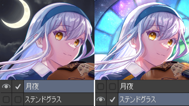
Set the layer to Multiply or Overlay then clip that to the layer below. Change the opacity - it's going to be different for each skin color. Here's a swatch of the outcome (the result is a bit harder to see on my thumbnails)
For the darkest skin, I've got the noise layer set on Multiply at 100%. I felt like Overlay muddled it more than anything, and I like the rich color it brought out on Multiply. For the lightest skin Multiply wouldn't have worked at all - it grayed the skin straight to zombification. So the lightest is set on Overlay at 100%. The medium skin was a toss up - for this situation I've set it on Overlay at 70%.
Here's where I like to throw blush in. You can either do it the Gaussian Blur way, or with an Airbrush for a bit more control. All on a new clipping layer, of course. I like to use the color #FF9891 - it works for most/all skin colors, you might just have to fiddle with the layer type.
For the darkest skin, I have the setting as Soft Light at 20%. For the medium skin, I set it to Linear Burn at 30%. For the lightest, I've set it to Linear Burn on 50%. You get this outcome:
A couple of poppy highlights with a Color Dodge and the Tone Scraping airbrush, then again but on a Glow Dodge layer
And you're done coloring the skin! To make it pop, edit your line colors by going back to your line layer and selecting 'Lock Transparent Pixels'. Finish out eyes and hair, maybe add some makeup and you're done!
Hope a few of these tricks helped you out, thanks for reading!
この投稿を「いいね!」したユーザー


コメント