
Video version:
Text version:
Hello!
I’m .avi. I work as a professional game illustrator and creating comics and webtoons is my hobby.
This tutorial isn’t about fashion trends or what your characters should wear, it focuses on practical tips and tricks about how to design outfits that you, the characters of your comic (webtoon, cartoon…) as well as the readers of your comic will like!
A well-designed comic character outfit:
★ Is easy for you to draw over and over
★ Underlines the character’s traits, background and personality
★ Helps the reader tell characters apart easily, as well as hints on the character’s quirks
★ Contributes to the overall enjoyment and immersion in the work that both you and your readers feel!
Finally, the second part contains tips for effective work, like using layer modes to easily change colors, and using brushes, 3D models and stamps for accessories.
If you have any questions, feel free to ask in the comments :)
For demonstration I’ll use characters from a webtoon I’ve been working on since they came about as a result of my previous experience with creating characters.
CHARACTER DESIGN
Setting
The comic takes place in snowy mountains, therefore the characters are mostly shown in winter clothes.
It’s a modern-day setting, so if you aren’t into fashion, like me, the best place for references are online stores for outdoor wear :D
Silhouettes
This is often overlooked, but a comic reader mainly distinguishes characters by their silhouettes. Even in a full-color comic where everybody wears distinctive colors, there are scenes where colors are significantly affected by the light conditions, effectively making the silhouette the first and last means of identifying a character.

For this purpose, it’s good to think up some distinctive features that each character has – from body shape and size and their typical postures, to types of clothes they like to wear, to their hairstyle and typical accessories.
It helps to break down your characters to simple sketches to see how easy it is to tell them apart.
Clothes defined by story
When deciding colors and accessories of a character, it’s important to go through the story to see if there are situations where certain elements are necessary.
For example, this boy’s hat was adapted to how he often pops up from somewhere and scares the main character – the first thing one sees of him in a dark scene are the eyes of the monster-like hat!
Another example is this guy’s black jacket – it’s black mainly because I don’t like drawing certain stuff and the jacket being black helps a little...
Clothes defined by personality
This is probably the most well-known tip, but colors and clothes of a character help the readers get to know their personality without having to read any of their lines. The use of dark, light, desaturated, bold, warm or cold colors as well as the type of clothes and accessories give away a lot about a character.

There are just as many ways to approach this as there are types of personalities, so I’ll briefly go through each of these characters as examples.
Can you guess their personalities without looking ahead?
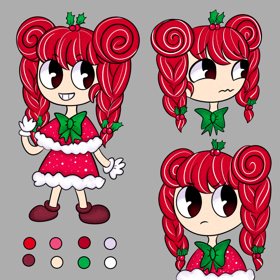
The main characters are usually the most complicated. This guy was supposed to be the very definition of a super-generic guy, except the part that he’s very expressive (big mouth and prominent eyebrows) and a former rockstar-wannabe (the hairstyle, dog-tag-like pendant and fur-rimmed black jacket).
Insert... A funny story about shoes
Although I had already decided on the colors, in the storyboarding stage I drew them in a style I was used to with the intention of changing them later to something more realistic.
After getting down to properly design the characters, I really searched for references and even diligently prepared brushes for the shoelaces and markings…
However, upon starting inking the sketches, I realized that these new realistic shoes were just no fun to draw! That’s why in the character sheet he has such design trekking shoes, while in the actual comic he’s back to his old cartoonish skateboarding shoes simply because the artist had much more fun drawing them! :D
Long story short, always pick what you like to draw, not what you think it’s expected :)
The youngest of the kids group is supposed to be what people call “little angel” - kind, responsible and sympathetic – light blonde hair, clothes in the colors of his eyes - heavenly blue, combined with similar calm colors.
The most mischievous, energetic and loudest kid is dressed in the most saturated colors – red and orange complemented with greens. He’s always in the front so he has to be the most visible!
On the contrary, the oldest boy with the usually stoic face is always in the background, like a dependable pillar that everybody runs to – in the story he’s described as a “mother hen” :D
His colors are the least saturated, but the combination of these shades of blue, grayish violet and mint green symbolize stability.
The younger girl is supposed to be cute, but has a mischievous side and joins every fun the red boy comes up with.
The older girl is the leader of the pack, smart and always speaks her mind.
Her colors are distinct, but the hue and saturation lean more towards purple, rather than fierce orange, which gives off the feeling of calmness and stability.
Lastly, the grandma character – she’s dressed purely practically, no unnecessary fashion accessories, uses colors that indicate dependability and authority.
Character’s typical color
Notice how each character has one basic color typical for them and the rest of their outfit is in variations of the basic color or complements it to some degree.
Character changing colors
Over the course of the story, if a character goes through a major change, you can emphasize that in their outfit, like adding a bolder or grayish color, or shift the colors slightly.
However, it’s good to keep the basic colors the same or very similar, otherwise the change may be too drastic and the reader can feel they’ve been introduced to a stranger.
For example, in the beginning the main character’s colors are grayish blue, only accented by the orange markings on his shoes and the pendant, indicating he’s simply driving through life without a real purpose.
After he meets the kids, his world broadens and literally gets more colorful. With that level-up, he gets a reward in the shape of the greenish hoodie! It is more saturated than most of his colors, but still harmonious with the rest. The zipper slider refers to the pendant as a distinctive feature of the character.
★ QUICK TIP #1! Drawing the storyboard first helps shape character design ★
This may sound like putting the cart before the horse, but from my experience, it’s the most efficient course of action.
As you sketch the characters over and over, you become familiar with their distinctive features and can simplify their design to the optimum that’s easy for you to draw while keeping each character easily distinguishable.
As an example, the twin tail girl had a much bigger hairdo, but I quickly found out it was taking up too much space :D
Moreover, you can come up with ideas along the way that you wouldn’t have thought of before!
It’s nothing grand, but for example, as I kept scribbling the main character, I noticed that the outline of his hair in certain angles looked as if he had cat ears pointing back… I went along with it and used it in several comedic scenes where the children have fun with their imagination :D
★ QUICK TIP #2! Keep your characters as symmetrical as possible ★
It’s fun to give characters an asymmetrical hairstyle, colors of clothes or accessories… but to save your mind later, try to keep your characters as symmetrical as possible.
It may sound unimportant, but believe me, even after having drawn many comics where I learned my lesson about asymmetrical design, I still naively thought that having only three characters with asymmetrical elements would be fine… But no! I still find it hard to keep track of on which side the fringe goes or which hand has the watch!
(っ﹏< ‘)
But that doesn’t mean I would go back and change that – even though I have to be extra careful with these things, I decided they were worth it, not only because having all characters completely symmetrical would be boring.
It’s entirely up to you whether to give up on an element that may cause you trouble in the long run or keep it for the sake of the character design.
TIPS FOR EFFICIENCY
Drawing lights on separate layers from base colors
When preparing a character sheet, it’s good to draw lights (or shadows, depending on your technique) on separate layers from the base colors, and, even better, have each base color on its own layer as well. That way you can freely adjust the colors of each part of the design while seeing what it will look like with lights and shadows.

I also recommend using the same lights in the character sheet as in the main scenes of your comic – you can set up each light condition as a layer comp.
In my comic, there are two main light conditions – day and night. This way, I can check if the chosen colors still work in different lighting.

Easy accessories – brushes, 3D models, etc.
Don’t give up on an accessory or a detail of your characters’ clothes just because it’s complicated and you don’t want to draw it over and over in every panel! Clip Studio Paint has many features that will help you with that!
• Brushes
In the Assets, there are many decoration brushes for download.
For example, the chain is a full-color brush that I use on a vector layer – it allows me to further modify the path, thickness, etc. with the many vector editing tools that CSP offers!
By clipping raster layers in various blending modes on it, you can easily add highlights or shadows.

• Image materials
In the case of the pendant, I drew the front side as a rectangle, registered it as an image material and now I can just drag-and-drop it into each panel!
The 3D feel is created by free-transforming the rectangle into perspective, moving a duplicate of the layer to where the back side should be, and darkening the duplicate.
Only when it’s zoomed in I draw the sides and polish it more.

• 3D models
From the beginning I knew I wanted the main character to have this generic silver wristwatch, but it’s such a pain to draw!
Fortunately, working with 3D models in CSP is pretty easy, from transforming the models and camera to setting up lights, and they mostly only need minor final touches.

If you aren’t good at drawing technical stuff, like me, I recommend searching for 3D models to help you. I learned my lesson when I thought I could just draw this transmitter earpiece by hand, since it was simple…
Then a friend (who saw it in progress without lighting and the blue circle) said that it looked like a band-aid covering a shaving cut…
Oh well… That made me realize that using 3D models even for such simple things is the better way to go for me! :D
There are many 3D models optimized for use in CSP in the Assets (usually there are many free and paid alternatives), or if I can’t find what I need there, I search Sketchfab, where there are many models in various formats for free download. The only downside is that textures may not be imported correctly (.glb is the format that worked for me) or that the models can be heavy on your computer (the watch is the case).
Conclusion
These are the tips I learned mostly by trial and error and wanted to add to the pool of knowledge. Thanks for watching this tutorial and I hope it helps you to have even more fun designing your characters for your comic and other works!
對此投稿按「讚!」的用戶


留言