
On this occasion I will teach you a technique that I learned some time ago I have been perfecting for several years and that I use to give final touches to my illustrations so that they look like a movie poster or anime type and that is very easy and quick to do when mastered.
Creating our workspace
The first thing we will do will be to create our workspace of the measure that we need although at a larger size and resolution it will require that the values also be larger so we have to take that into account.
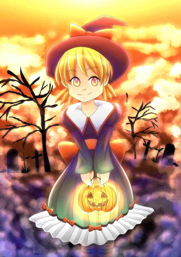
On this occasion I will use one of the first drawings I made in digital when I used Illustudio and this has a measurement of 2480x3508
Creating the Orton effect
I will then duplicate the layer and use the Gaussian blur filter with a value of 50 percent.
In illustrations of less than 2000 pixels, a value of 35 percent can be used although this is something to prove as seen with different values.
Now we will change the layer blending mode in my case I will use sub-expose color although the way to burn color can also be used and I will lower the opacity to 35 percent.
And now we will duplicate this layer and change the mode of fusion to frame and depending on the brightness we will lower or increase the opacity of the layer.
With this, the Orton effect is ready since it only consists of using the Gaussian blur filter and the layer and color and raster layer modes although we can also duplicate one more layer and use the color overlay mode or any other as it also depending on How dark or clear our image is, the effect can be more or less noticeable.
Adding light and shadows
Now we have to give more enhancement to our image through lights for this we will create a new layer and change the blending mode in "Add brightness"
In general I usually use a skin color that is under the black and red inside the palette that brings default clip studio to make the lights although I also usually use the colors that the illustration brings to give greater contrast.
Having decided the point of light of my image, which in this case is exactly above, I will start using the gradient tool to begin to shine.
To make the other lights I usually use the air brush tool by passing it through the lights or light colors in this case starting with the clothes, the bows, dress, socks after the clouds and other background details and finally I detail the brightness of the eyes all in the same layer and with the same color.

Then I will create a new layer under the layer where I made the lights and use a dark color, in this case the blue to make shadows and give more contrast. As I did with the lights, I first use the gradient tool to start making the shadows and then use the Air brush tool.
Unlike the lights I start adding the shadows in the background and then add the shadows in my character since the latter should be lighter than the background.

Additionally, if the shadows darken my image again, I add another layer in fusion mode to add brightness and add more lights.
Color correction
Now it's time to correct the color and for this I will create a new color correction layer and choose the color balance option.
Now I will play with the controls until I get something that I like and after this I will create a new color correction layer to modify the brightness and contrast.
Usually in case of brightness and contrast always low by no more than -5 the value of the contrast while the brightness can be raised or lowered freely depending on the image.
Final processing
Now we are going to put all the layers exceeding the original in a folder and in doing so our image will be out of focus and we will combine the layers in the layer shown.
Once this is done, we will hide that layer and we will change the fusion mode of the entire folder to see our image with the effects that we did previously and, as in the previous step, we will combine the layers shown so we will obtain 2 copies one of the image with the orton and the lights and another out of focus.
After lowering the opacity to my layers I will add another layer in which I will make a gradient and put it under them.
We will add more lights in another layer with option to add light if our gradient darkens our image.

Now we will add more lights with this special brush.
Since it was not so bright, duplicate the layer 3 times and merge them into a single layer to make it brighter. Additionally, double the layer and blur it to 50 percent and change the blending mode to add brightness to achieve this effect.

As a final touch I will add a layer with a dark color and on top of it I will add the same gradient and through a mask I will merge it so that it has the effect of sunset and I will add more lights with the special brush on these layers to give more light to my image.

Finally our image is ready.
Although I wanted to make this tutorial shorter I thought it was better to show an example of an image that would need more steps to teach what to do in those cases, although in most cases after making the color correction the images always remain without having to follow so many steps since the base is the orton effect and the lights.
In this case by not carrying so many elements or colors the image was corrected after just adding the lights and I do not even need color correction or brightness.
Originally this image was made on open canvas and illustudio in 2013.
In this case only the color and brightness correction was reached.
The girl was drawn in illustudio in 2014 and the background is added with the default clip studio.
In this case, in addition to the correction of color and brightness and contrast, the color saturation had to be increased.
This image was made completely in illustudio.
Like the tutorial image, a copy and mixture of the final images had to be made and more lights had to be added after this step.
This other image was also made completely in illustudio in 2013.
In this one only reached the correction of color and brightness and additionally more lights were added.
This image was made completely in Clip studio for one of the contests of the same clip studio in December 2016 so it is evident how I had progressed in my processes and techniques and therefore there is not a big difference between the image without correction and with the lights.

Although it seems somewhat complicated and it takes many steps in fairly simple and fast when you get used to the process. All the images I showed were edited in 2 hours including the tutorial and the main reason why I had not done this process before was because only in a studio clip can this effect be done since it is the only program that has the option "Add brightness" layer fusion, which is what gives it that magic, because even if photoshop or other programs have the fusion of the plot layer, the effect is not the same.
If you have any questions feel free to ask to answer what is not clear. ;)
Users who liked this post


Comment