
Hi and welcome to December’s tip, this time the subject is Gradients, a powerful tool available in Clip Studio Paint. Let’s divide it in two parts: The Gradient Tool and The Contour Line Tool. So, let's do it!!
Getting Ready
Before we start, there’s something important that you need to know. Gradients can accelerate the creative process a lot and some quick adjustments will grant you a better performance with this tool.
Look at this image. We got 2 circles that, apparently, looks the same. However they aren’t. Anti alias is turned off in the left one and this will give you a jagged line, which is easier to be filled with color and gradients! It’s perfect to make masks and you’ll see the difference as we go.
Also, try to keep each element in a separated layer. You can merge some of them later, but it helps a lot to have it separated. As we do for masks, inking and sketching, have one layer for gradients.
The Gradient Tool
Starting with Gradients, you can quickly add an initial visual interest by clicking and dragging your mouse through the canvas. Different settings can provide different results. For example, the circle was filled with the first option, “Foreground to Transparency” and by holding the Shift Key, you'll make straight lines.
Notice that the two squares below the color wheel are going to show which color, or tone, is in the foreground.
If you chose the “Foreground to Background” option, you’ll use the two colors. By modifying some settings, like changing the “Not Repeat” to “Repeat”, the final result will turn into something completely different.
Here’s some examples of the gradient tool in action. The more you drag, more you change the blend. There’s no difference between the two spheres (anti alias on or off), so you can stick around with your favorite setting.
I like to use gradients to display an initial idea of lighting or even to show the mood of the drawing. By having it’s own layer, we can easily modify the Layer Mode (Multiply, Overlay and so forth). It’s perfect to use in thumbnails as well.
You can use clipping masks too and the Soft Brush to add more details and this is a nice moment to start adding tones and colors.
Contour Line Tool
We saw the idea behind the gradient tool. You click, drag and the software makes all the math based on the settings that you chose. The Contour line also works with the idea of making a transition of one or more colors, BUT here you can have more control on the range. We are going to use the same circles with different alias settings.
With a default setting, the gradient will not cover the black color and will identify borders by reading the information in all layers. So, we got circles in one layer, and a three levels of gray on its own layer as well. Each closed gap will get a gradient between the two colors or tones in the specific area.
The thinner line softens the transition. You can later delete or hide in a layer mask all the parts that you don’t want in the final image.
And now we see the difference between these circles. There’s a white border on the version with anti alias on and this happens, because this feature helps to soften the line. The more rigid one has some white dots too, but it’s easily fixed by clicking on them with the same Contour Line Tool.
As in the gradient tool, if you change some settings, like “Replace Black With Drawing Color”, the ending effect will look totally different. By clicking in the dark line, it will replace it with color and you can make all the cleaning later.
And once again, by having all the elements in separated layers, you'll have more control to apply and modify Layer Modes and Filters, like Hue Saturation. By Selecting the line and inverting the selection, you'll end with a new final result.
You can use this tool in a raster layer and change its property to Screentones, like we see in our favorite mangas! I'll leave a quick video showing how this images were made. You can check it out if you want :)
Extras I: Choosing Your Colors
If you are using the Gradient Tool, foreground to background, Complementary Colors are going to work really well! The idea is to choose opposite colors in the wheel.
There are many options, both colors can be with high saturation or you can pick a bright color and a low saturated (more closer to gray) as its complementary. There are many Color Wheels images on the internet, you can stick around with your favorite one!
You can also rely on presets of the software, by clicking in Window – Color Set or Window – Intermediate Color. The first option will open a box where you can choose between groups of colors, like Soft Tones, Bright Tones, Default Color Set and so forth.
The Intermediate Color is very interesting, because you can put the colors that you want to use and the software will display options that you can pick to finish your project.
To the Contour Line Tool, you can pick more colors. Analogous and Triadic Colors are going to shine here! And you can play with the hue saturation after choosing your combinations. By the way, the feature can be found at Layer – New Correction Layer – Hue Saturation Luminosity.
In both tools, you can start with graytones and then add colors on top later, modifying the Layer modes (overlay, color, color dodge and so forth). It is a nice way to start and you will get three ending versions of the same drawing: Lineart, Grays and Colors.
Extra 2: The Gradient Map
Following the idea of getting your gray values first, then add colors later, the gradient map can be a great first step to place your colors. You can also use different Layer Modes, and play with the opacity of the layer. It replaces the black and white with the colors that you chose.
You also can add your own gradients and save them to be used later. When you are facing a deadline, every second that you save can make a huge difference.
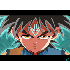
By adding more colors on top, you can get surprised with the final result. Notice that in the layers there is a color for each part of the character (clothes, hair, skin, accessories).
Thank you for reading, I really hope this tutorial can help you and try to use gradients as well. You can download the file with all the drawings here and this video shows how to do the background used in this drawing. Once again, thank you and take care!
Users who liked this post


Comment