
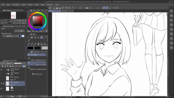
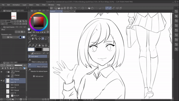
Hey guys , In this tutorial I'm gonna talk about tones from preparing your canvas to exporting . I will talk about everything up to my knowledge .
Watch the video for visual explanation
--------------------------------
PREPARING YOUR CANVAS
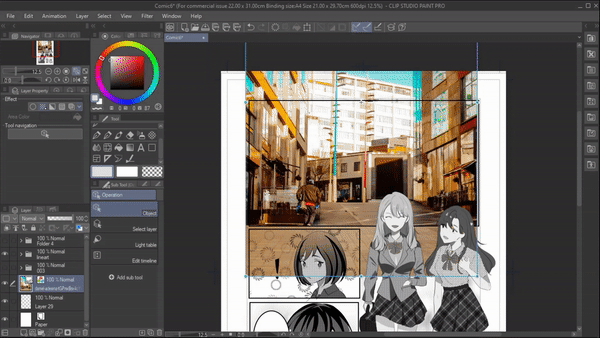
We’re going to start by creating a new canvas for the manga . If you have a plan to print out your comic in the future or even if you’re posting your comic online , ensure you use a good resolution for your canvas. So, when your screentones are printed they don't come out blotchy . For that
- Go to file > new . A dialogue box will appear
1. In which , under “use of work “ select “ show all comic settings “ .
2. Under “preset” select “ a4 monochrome (600 dpi) “ .([NOTE : you can choose whatever size you prefer but make sure the resolution at least 350 dpi ]
4 . Now under canvas change the “basic expression color “ from monochrome to gray
5. Set the frequency to anywhere between 50 lpi - 60 lpi . [ 50-60 lpi is the standard frequency for manga ]
6. Click ok
With that our canvas is ready !
-----------------------------
WAYS TO ACCESS SCREENTONES
1st way
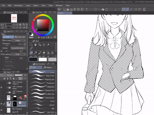
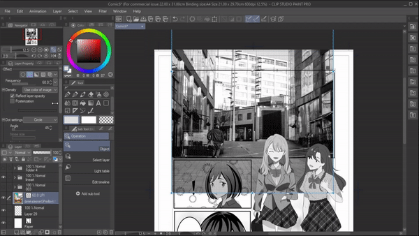
1. In layer property , under “ effect “ click on the highlighted icon in the pic . It will apply screentone to the layer you’re on .
Once you click on the screentone icon , a bunch of property settings will pop up
1. Frequency - controls the distance between the dots . the higher the frequency the closer the dots are and lower the frequency the dots are far from each other .
2. Density - is used to specify the density of tone
a. >use color of image - tone density is constructed based on image color
>use brightness - tone density is constructed based on brightness of the image .
b. Reflect layer opacity - When enabled , opacity of the layer can be used as increase or decrease the value of density
c. Posterization - when enabled , we can modify density using posterization control .
3. Dot settings - under this we're provided with various types of halftones to choose from .
4.Angle - using this we can change the angle of the tone
[note : The above setting option appears only after applying a mask to the tone layer ]
5 . Mask expression [show gradient ] - if you select yes , it will show gradient and if none is select it will not allow any gradient
-----------2nd way
1. Goto menu[layer] > new layer > tone
2. A simple tone setting dialogue box will appear [ which has similar settings that we saw above ] edit your settings and then click on ok
3. Tone will be applied to the whole canvas with a layer mask
---------
3rd way
1. This way of accessing screentone can be considered as a shortcut way
2 . Using selection tool select any particular area
3. Under the options available select the " New tone " icon .
4. A tone dialogue box will appear to edit tone settings . Once you're done click on ok . The tone pattern will be applied on the selected area .
-------------------4th way
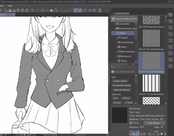
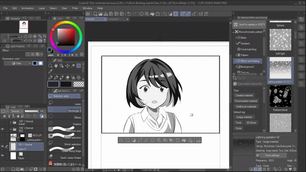
1. In material under monochrome pattern we have a sub title called “ basic “ where various screentones with different lpi are available
2. We can just select any tone, drag and drop it on the canvas
3. Or just click on any screentone and and click on the icon “paste selected material to canvas “ and it will be applied
4. We can also search the tones by its lpi and percentage . for ex : if you select 60.0line and 5% all the tones with this property will be filtered and shown .
-----------------------------------------------
5th way
Accessing tone in mobile / tablet version
Select n area using selection tool . Then select "selection launcher setting "
"Selection launcher Settings "will appear. In which select Layer > new layer > Tone
Now click this add icon ,it will add tone icon as a shortcut here .
Now that we have added tone as shortcut it will be easier to access . >Now select the tone icon that we just added , " . A " simple tone setting " dialogue box will appear where you adjust your tones and then click on ok
Screen tone will be applied to the selected area
---------------------------------------------------------------------------------------------------------------
MOVE , ERASE , REPLACE SCREENTONE
MOVE
1. To move only the screentone without moving the layer itself go to toolbar
2.Under the sub tool ' move 'select “ move tone pattern “. Now you can move your tone pattern .
ERASE
Obviously we can erase the screentone using the eraser tool but we can also erase it using any pen by setting its color to transparent which helps us to get different effects like scraping .
REPLACE
If you have already applied your screentone but you do not like it and want to replace it there are two ways to do it
1. Under layer property use the dot settings to change/replace your tone with newly selected screentone .
2. Under material > monochrome pattern > basic. Select any tone and then click on the “replace editing layer “ icon and it will replace the current tone with the selected tone .
------------------------
IMAGE MATERIAL TO TONE :
First learn to identify an image material from a screentone. Click on any material and a detailed information about that particular layer appears as shown down below
• When screentone has toning enabled, it has type as ” layer” .
• While as image material it has type as “image material “ and the toning is disabled.
--------
1. To convert a image material into a tone under the information section enable the toning by clicking on it
2 . Once enabled , tone effect will be applied to that particular pattern and tone settings will appear where we can do the setting according to however we want . With that we have converted the image to tone. You can drag and drop it to use.
[ note : if you cant see the detailed information of the material section , click on this icon ]
----------------------------------
CREATING CUSTOMIZED TONEPEN
1.In a new canvas , apply any tone of your preference . it can just be a single tone or multiple tones .
[note: if you have multiple screentone layers make sure to combine them into a single layer because you cannot a register an image with multiple layers ]
2. Now go to [menu] edit > register material > image .
3. A “material property “ dialogue box will appear
a. name your material
b. enable tiling
c. enable use for paper texture
d. under choose save location choose your desired location to save your material
e. then click on ok
We have now successfully registered the tone pattern as a material.
4 . Make a duplicate of any of your favorite pens by clicking on “ create copy of currently selected sub tool” icon
5. A “duplicate sub tool “ dialogue box will appear where we are only gonna change the name and then click ok . A copy of the pen is now created.
6. Now go to the [tool property] of the newly recreated pen and click on its “ settings “
7.A subtool detail dialogue box will appear in which under texture click on the “ none ‘ an another dialogue box will appear where you have to search and select your registered material
8. Now in “ sub tool detail “ dialogue box increase the “texture density “ up to 100 with that close the sub tool
9. Your customized screetone pen is ready.
------------------------------------------------------------
WAYS TO USE A SCREENTONE :
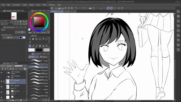
1. DARK SKIN TONE :
Skintones of your characters can play a major role in defining their identity. If you have tan or dark skinned characters in your manga comic it can be much more challenging to render them compared to light or white skinned characters. This is a time when screentones can make it easy for you .
>Begin by simply selecting the skin area using the ‘ auto select “ tool .
now fill it with any dark skin color and then enable the tone effect under the layer property .
You can definitely choose whichever dot setting you prefer circle , square etc but i personally prefer to use noise or circle for skin tones so i’ll be using circle here and lower its opacity abit
It might look a bit messy in your monitor but it will turn out good when printed .
{Note : you're using noise for skintone make sure to rasterize it by going to (menu) Layer > rasterize }
-------------------
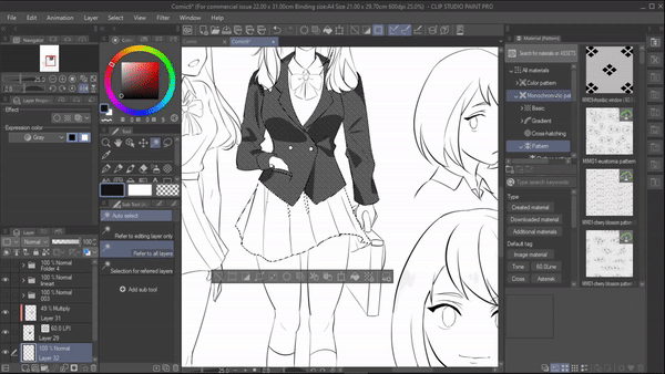
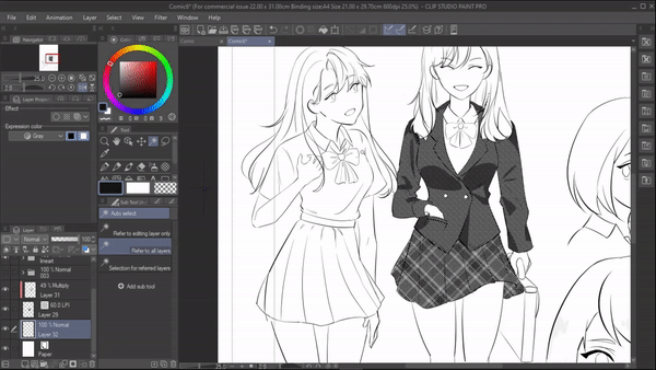
2. CLOTHING :
Interesting patterns and textures can be given to clothings using screentones. Drawing designs on clothing is an intricate process and demands a lot of time. But you can quickly give prefered clothings to your characters with screentones since there is a wide variety of tones to pick from.
If you're new to the topic of screentone , coloring while tone being enabled might be a bit intimidating so just start coloring without any effect on . Once you’re done, enable the tone effect

As when it comes to coloring the shadow/dark areas of the clothing I would recommend to draw them with a darker color in a new layer and convert the layer mode to multiply . i won't recommend applying a tone effect on shadow areas too cause when zoomed in they might look a bit messy but if you want to you can definitely do that .
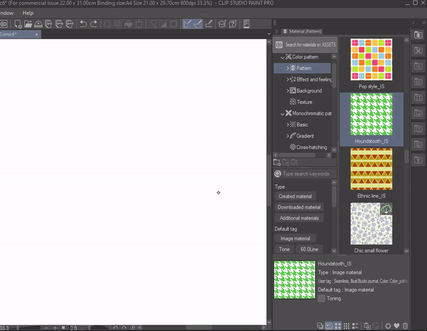
We can give pattern to the clothes there are two ways to do that
① FROM MATERIAL
>™Select the area where you want to apply the pattern using “ auto select “ and then goto material and choose any pattern and convert them to tone by enabling the “toning “ . finally drag and drop them
we can also adjust the pattern by going to [menu] edit > transform > mesh transform
② FROM LAYER PROPERTY
Select the area where you want to apply the pattern using “ auto select “ and fill in with any shade .
enable the tone effect under layer property , choose any dot settings . Here im using the line Now lower the value of frequency to get patterns like this .
------------------
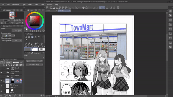
3. PICTURE TO MANGA BG
Creating BGs for your manga from scratch can be tedious and time consuming. Imagine how exhausting it could be to find reference images, do sketching and block colors for every BG. Instead, use pictures and edit them with screen tones
> First we will import the image. To do that go to [menu] file > import > select your image . Selected ones will be imported to the canvas . >Now adjust and size the image according to your panel
Now simply by clicking the tone icon under layer property , the image will be converted to a toned image .
For further editing , we will enable " posterization " which is available under the density . Adjust the settings as you like .
RESULT
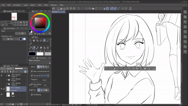
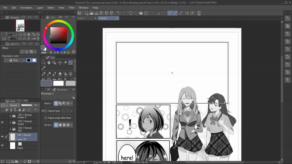
4. EXPRESSING FEELINGS
Is your character moody, Frozen from shock, Scared, or is it a moment of confession? Now, you might have drawn the appropriate expression on your character but to emphasize the feeling more you can apply screentones. Screentones exaggerate the character's current emotions. This way readers grasp the situation better. We can use tones to portray the feeling of your characters
For example : let's say here the character just heard some shocking news to showcase much more emotion in this scene we're gonna use some patterns . Begin by
Using the selection tool , select the area of your panel Now go to all material > monochrome pattern > effect and feelings . Here we are provided with various patterns especially for expressing emotions
From here I'm gonna use the " lightning pattern " and apply the tone effect by enabling the "TONING". >Drag and drop the pattern and adjust it according to your will.
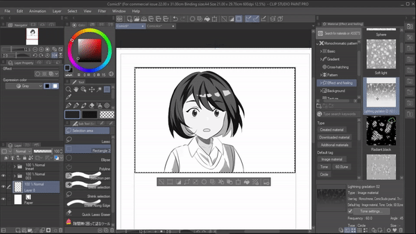
Now as you can see the expression is much clear sing screentone patterns .
Now let's change the situation abit and let's say the character just say some spooky to emphasize that emotion of her face . I'm gonna use gradient tool and turn on tone effect
Now if you look at panel the emotion is stronger . There are many interesting patterns available do try them yourself .
-------------------
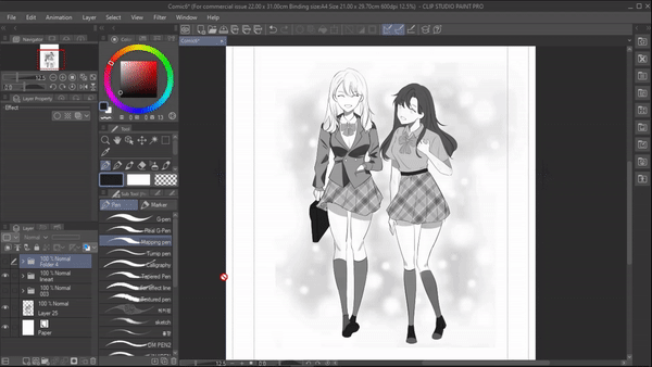
5. HAIR
Hair is a key element to a character and their role. The color, length and type of hair, can make different impressions about your characters, on the readers. Screentones can help you achieve amazing hair textures suitable to your character!!
Start by coloring the dark areas of the hair with a black pen .I like to use a mapping pen since it has a sharp tip enabling me to easily block in the core shadows. Typically,these dark tones lay near the hair partition and the ends.
>Your second step is to fill in the mid tones. Mid values make up the majority of the hair. So applying screentones in this layer is the best way to incorporate textures to hair for your manga characters.
Lastly draw some highlights.
>(extra) consider this as another method to color the hair especially if you’re in a hurry to complete your work. Simply use gradients without even drawing the shadows of the hair. Gradient effect alone does the job!
------------------
6. SPEECH BUBBLE
Using just words in speech bubbles is not enough to make the reader comprehend the emotions behind the dialogues, especially in crucial and intense scenes. Hence use screentones to convey emotions visually paired with your great dialogue script!
For example : Here the character just saw some really scary to showcase the same fear she has on her face on the bubble too.
I firstly created a new layer below the speech bubble and enabled the tone effect .
Then using the "gauze pen " from decoration tool I'm gonna apply it surrounding the speech bubble .
result
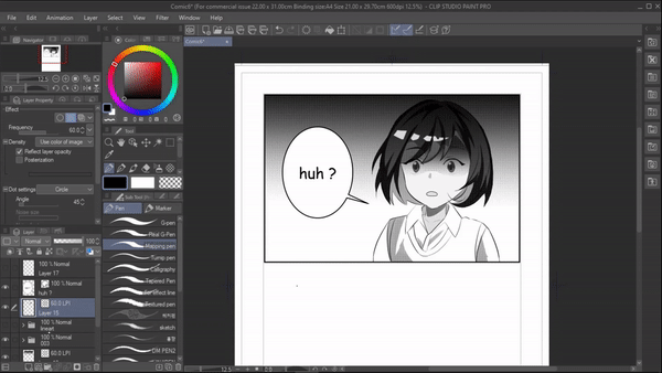
Let's try a different situation . Lets say someone just confessed their feeling to the character , to add that light and soft effect on the word "huh?" .I'm this material and enable tone effect .
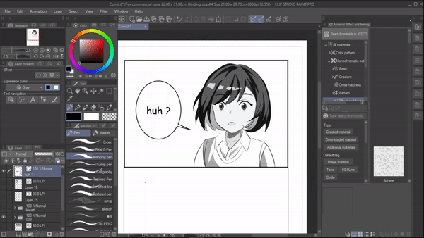
>RESULT
There are many tools available to help you creating different types of speech bubbles so do try them out
----------------------------
7. 3D BG TO TONED BG
3D materials are a convenient way to make backgrounds as you can add as many elements as you want to it without worrying about the laborious process of drawing it with your own hands. But for your manga, 3d material can look absurd and out of place. So,you can modify a 3d material to a 2d in seconds , add screentones to it and blend it with the atmosphere of your manga.
select the area where you want the bg to be by using selection tool . Now in materials under “3d” select any 3d material . Drag and drop it onto the canvas .
>Adjust and set your 3d material using the available options >Once you’re done, diable the light source for the material
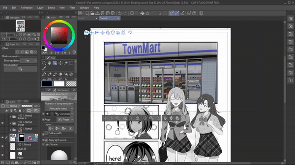
now rasterize the image by going to [menu] layer > rasterize . After rasterizing , it is no longer a 3d material but an image material .
Now under layer property , change its expression color to monochrome . adjust the color threshold till you get your desired visual . Then click on " apply expression color of preview "
once you're done go to [Menu] edit > convert brightness to opacity . This will convert the white and bright areas to transparent
now make a new layer below and enable the tone effect and start coloring your background .

with that we have successfully created a toned manga background from a 3d material.
>Result :
---------------
AVOIDING MOIRE
What is moire ?
Moire occurs when a set of lines or dots overspread another set of lines or dots even though these are just two patterns overlapping each other but it can be considered as undesirable visually and quite straining to the eyes . moire can be more easily spotted when printed so its better to avoid it
One of the ways moire appears is when two screentones with different density and frequency overlap each other
Which can be seen easily on the work of someone who is new to using moire so the best way to avoid it , is to tone it together
For tat make sure you all the areas you want to apply the screentone to in a single layer
now simply apply the tone effect
As you can see since its a single tone with similar property all over so there is no chance of overlaying which will helps us avoid moire when printed
Obviously this not a compulsory step that you must . Just consider this as one of the ways to avoid moire .
----------------------
EXPORTING for printing
There are many ways to export but this way of exporting is based on the fact that you intend to print your manuscript .
1. Preview rendering result on output :
When enabled , a preview dialog box will appear while exporting.
2. Output image
You get to select whether you want to export your manuscript with drafts , crop marks, default border, text, story information, folio, camera paths, and safety margins. But I’ll only enable “text “ since i only want the characters entered using text tool to be printed
[note : you might have to also enable “crop mark “ if it is required for your printer ]
3. Expression color
Yu have set this according to your printer but I would recommend it to be set as gray or duotone[threshold]
4. Advanced color setting
a. Crop mark/Default border: You can select the color in which you want to export your crop marks, default border, and safety margins. If you're printing your comic in gray or duotone then set it to “ export in black “
b. Frequency :
Depend on export scale :The frequency will be adjusted to the out size of the exporting settings
Follow layer settings : the original frequency will be set for each layer and will be exported according to that .
c. Enable tone effect : when enabled tones will be exported as tones
When disabled the tones will be exported as grayscale .
[so make sure it is enabled ]
5. Scale ratio from original data : you might have to scale down a bit according to your printing method
6. For comic : when enabled you’re given two options to rasterize, prefer quality or fast .
Then finally click on ok
EXPORTING FOR POSTING ONLINE
We have fewer settings to deal with compared to exporting for printing
Once you have saved the file and export settings dialogue box has opened
1. expression color : set it to gray
2. in advanced settings make sure you disable the “tone effect for layer “ . Once you disable it, the tone will be exported as grayscale, which is more suitable for posting online .
[note: if you dont want certain tone layers to be turned to grayscale , you can rasterize that particular tone layer before export . that way it will not be converted to grayscale whale exporting ]
3. outpt size : since this canvas is larger to post online we can change its output size without altering the original size of the canvas .
>>for that select “specify output size “ and change its unit to px .
>>change its height to 1000 the width will change according to that [ 1000 px height is the standard pixel size for posting comics online . you can definitely change it according to which platform you’re posting ]
4. For comic : when enabled you’re given two options to rasterize, prefer quality or fast .
Then finally click on ok
--------------
THANK YOU FOR READING !
Users who liked this post


Comment