
Intro to Creating Light Rays
In this tutorial I outline a very simple technique for painting straight beams of light. This effect can be used for environments, magical attack affects, and I've even used it in graphic design elements.
I'll be teaching this technique using a background I had painted, but that I wanted to add a more serene mood too.
Using the Polyline Lasso Tool to Paint Light
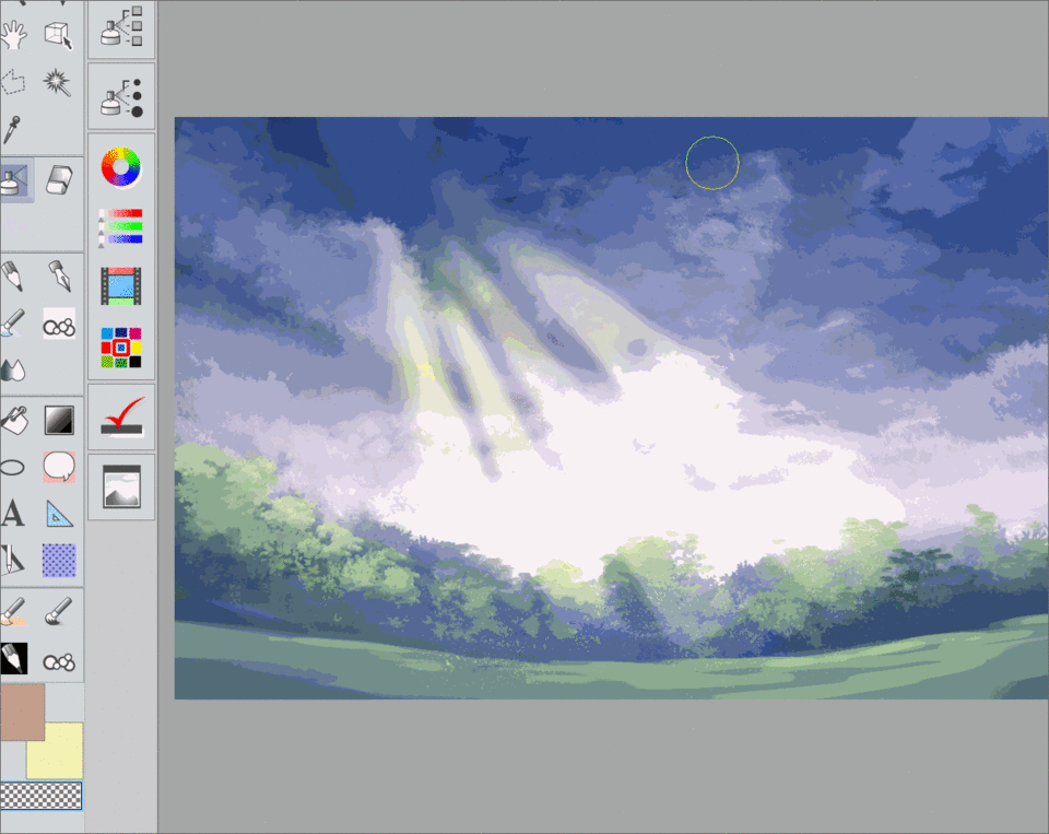
Create a new layer. For now I have mine set to "normal" so that I can see my light beams more easily.
Select the polyline lasso tool and select a triangular "beam" shape that is slightly more rounded at the bottom. Try to radiate outward from a single point of origin. Unless affected by something like a lampshade or something similar, light usually travels in all directions. We do have something clipping our light in this scene, however. The clouds are what separate our individual beams here, but they also keep them from reaching too far.
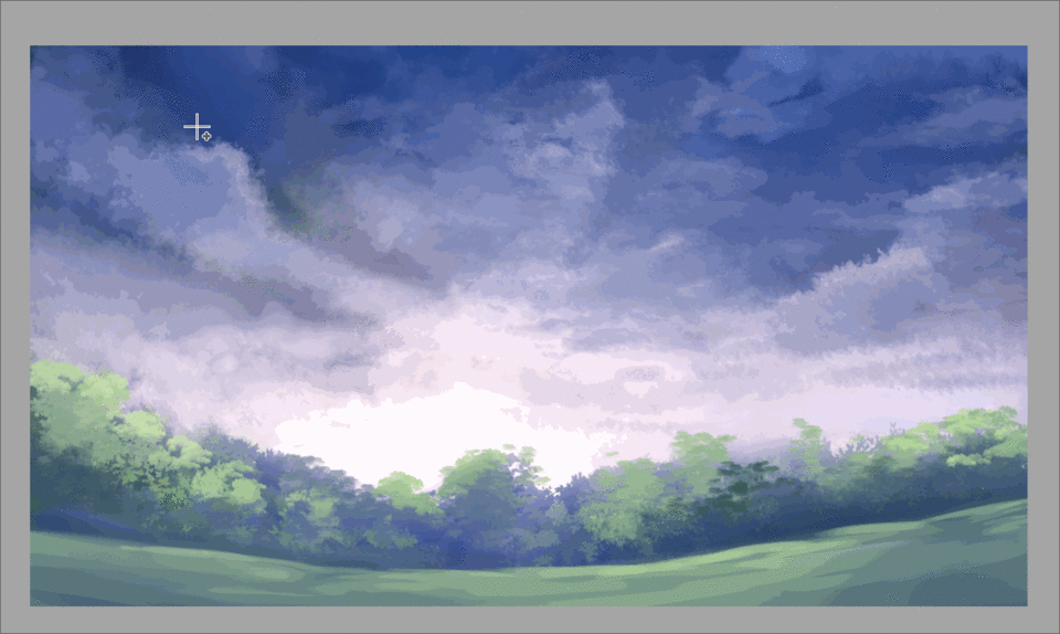
Now that you have the shapes of your beams marked out, select a large soft airbrush and paint in a local color that you'd like your light to be.
I paint mostly at the light's point of origin and let the rest of the color soften toward the bottom.
For this I also used my "soft" brush found in my the link below. This is just a modified default airbrush though, and is not necessary to this tutorial.
You can deselect your beam now. It might become more apparent that you want more or less rays of light at this point. I decided to stick with my initial 4 but feel free to select some and clear it, redraw some with the lasso tool, or add more at this step.
Once you are satisfied with your beams' look, it's time to change the layer mode. I switch mine from "normal" to "overlay" because I wanted the light to affect the value of the colors it intersected with, but not completely white everything out. If I had painted with a darker yellow or orange color here, a different mode would have not been quite so harsh.
Soften the Edges of Your Light
Mouse up to the Filter tab, hover over "Blur", then select "Gaussian Blur".
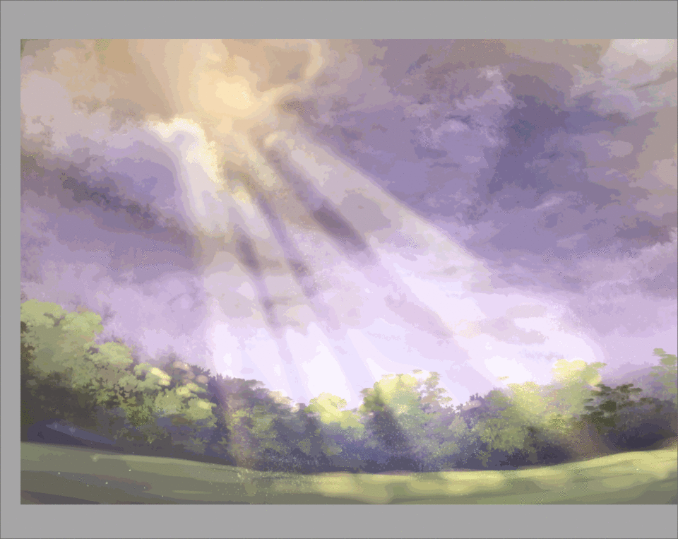
Here I blurred my rays to about 44.84. You can use different values, depending on how soft you want the light to be in general.
Next I go in with the "blur" blending brush and stroke out areas I want to be even softer. I mostly soften the origin and another other parts I feel are still too crisp.

Much better!
My light looked too "solid" here so using the same soft airbrush, I lightly erased the middle of the beams. It's very useful to erase by painting with a transparent color. You can achieve a lot of cool effects this way and you don't have to create a custom eraser for each brush "tip".
That's it! This is the technique that I use for creating beams of light.
You can stop here if you like, or you can keep reading for some extra tips on making your lighting fit better within your environment.
Add the Environmental Affects of Your Light
After painting and softening the rays of light, I speckle in some dust particles. These tend to show up near rays of sunlight.
Below are the settings for the "Spray" brush I used for the light dust. This is also another default Clip Studio Brush brush and is normally located with the airbrushes.
If you are worried about damaging your current light beams, create another layer to paint your dust particles on. I created another overlay layer using the same sunshine yellow color for my specks.
A good reason to paint your dust on a new layer is so that you can erase it, or move it around. I decided that my dust didn't actually look as good "within" the rays of light, but rather at the sides of the canvas where the specks could be seen better.
Another brush I used here was the "droplet" brush, but I used it much more sparsely because the marks it made were much stronger than the spray brush. I didn't want the specks to become distracting.
To show where the light "touched" the environment, I created a new layer and set the mode to "add glow". I changed the opacity to 46%
Using my "digital sketch" brush, and a medium orange color, I add light on the tops of the trees, and along the ground where the rays hit directly. For spots that ended up too hard, I blend them out with the blur tool.
In the sky I use the soft airbrush and lightly brighten some of the darker areas with the same medium orange color.
I repeat this with another add glow layer, and the airbrush, and brighten up the sky, painting where the sunlight is most dense in the clouds.
Now that I've done this, things look too bright in places and are a little washed out. In general I try to avoid this happening in my work.
To fix this, I hide all of the light effect layers, and "copy merge" my original background to a single layer. I reduce the contrast and brightness, then turn on all of the light effect layers.
I think it looks much better now!
I "copy merge" my layers again. This time I merge on top off all of my layers so that I have an editable flat version of my painting.
I go to "edit" "tone and color correction" and choose "color balance". From here I adjust the overall color of my painting each each area has a similar range of colors. With the added yellow/orange light, I felt a more pink sky, similar to a sunset, helped balance the environment out.
The rays of light seemed to be coming from above the canvas instead of in the break in the clouds I created so I needed to paint the fluffy cloud edges where the light hit.
Since the clouds are particularly soft here, the soft airbrush was perfect when set to a smaller size. I try to pick out where the shapes might be since the clouds were not clearly defined. This rim lighting is all painted on the previous add glow layer with the medium orange color.
Closing Thoughts
This technique is pretty simple and can be applied by artists of all levels. It's particularly enchanting in night scenes. I recommend using a blue or green color for the light in this case.
I remember using this technique when I was a fledgling artist, but I worried less about the effects the light beams had on the surfaces it fell upon, than actually just showing a beam coming down through a window. Hence my older work had a disconnect that I try to avoid now. It looked more "pasted together" back then.
I hope you enjoyed my tutorial~! I'd love to see your work if you use any of my tips!
Feel free to message me on social media, or leave a comment below.
Thanks so much for reading!
Les utilisateurs qui ont aimé cette publication


Commentaire