Birthday Card with a pattern design!
Hello! In this tutorial I’ll be teaching you how to create a seamless repeating pattern that you can use on a Birthday Card for a loved one. Since it repeats endlessly, you can also print it out on some lightweight paper and use it as wrapping paper for a gift!
Let’s start!
Drawing the elements
For this card, I wanted the theme to be “presents”, and I also wanted to make something where I wouldn’t have to plan it all ahead of time. I wanted to just have fun drawing, and put things together freely along the way.
I started by collecting pictures of different gifts and wrappings I liked, and created a moodboard. From there I sketched a handful of different presents for my pattern, trying to get some variety in shapes and sizes.
I find that one of the only things you really need to make sure it will all fit together nicely later on is a cohesive color palette, so I selected that from the start.
I knew I wanted a lot of pinks and yellows, and I thought blue and red would compliment that duo nicely. You can base your selection off of your loved one’s favourite colors, for example.
I like to go back and forth in my process a lot, so even before giving each present a base color, I decided to move on and experiment with the final painting style. I picked the pink box with a blue ribbon to start with.
I merged the lines layer with the layer I had underneath for the base colors, and began painting on top of everything.
To ensure the box looked simple but still appealing and convincing, I chose a side of the box to darken (as if it were in shadow), and I added some stripes to the ribbon.
I still felt it wasn’t enough. Big areas without any texture can end up looking a bit dull or boring, and my pink box was a large flat-coloured box, so I decided to add a checkered pattern to it.
I added a new layer on top, and added horizontal white stripes to it, following, of course, the contour and form of the box. On yet another layer added on top, I drew vertical white stripes. I didn’t want my stripes fully white, so I lowered the opacity on both layers to 60%.
If you’re going for this style of checkered pattern, make sure you add the vertical and horizontal stripes on different layers, so they’ll give you that brighter square in the places where they overlap.
I sampled the colors from the completed gift to create my other elements, to ensure my palette remained consistent. I also used the same white low-opacity layer tricks to create different patterns for each one, and I overlayed multiply layers for the shadow areas.
In the end I separated each present into its own layer (or its own layer folder, if you’re not keen on merging down the painting layers for each one) and organised them neatly around the center of the canvas, changing sizes and positions as I saw fit. At this stage, make sure nothing is touching the edges of your canvas!
From here things get a little bit more technical in nature: we’ll learn how to turn these elements into a repeating, seamless pattern.
Creating the seamless pattern
Start by organising all of your elements into a layer folder, like this.
Now right-click the folder, go to file object and select Convert Layer to File Object.
A menu will open up. By default, the Area option will be set to Canvas Size. Don’t change that. After clicking ok, a window will pop up for you to name and save your file. Let’s name it Elements, and click to save.
Now let’s save and close the file we’re currently on. From here we’ll be working with 2 files simultaneously, so it’s important to close anything we don’t need, or it can get confusing to keep track of the canvasses.
Open up your newly-created Elements file. You should be greeted with an exact copy of the layer folder you had on the other file.
Let’s also create a new canvas, with the size you want to print your birthday card on. For me, I created an A4 (21x29.7cm) sized canvas, since that’s the standard paper size for my printer. Let’s name it Card.
Put both canvasses side by side, like this:
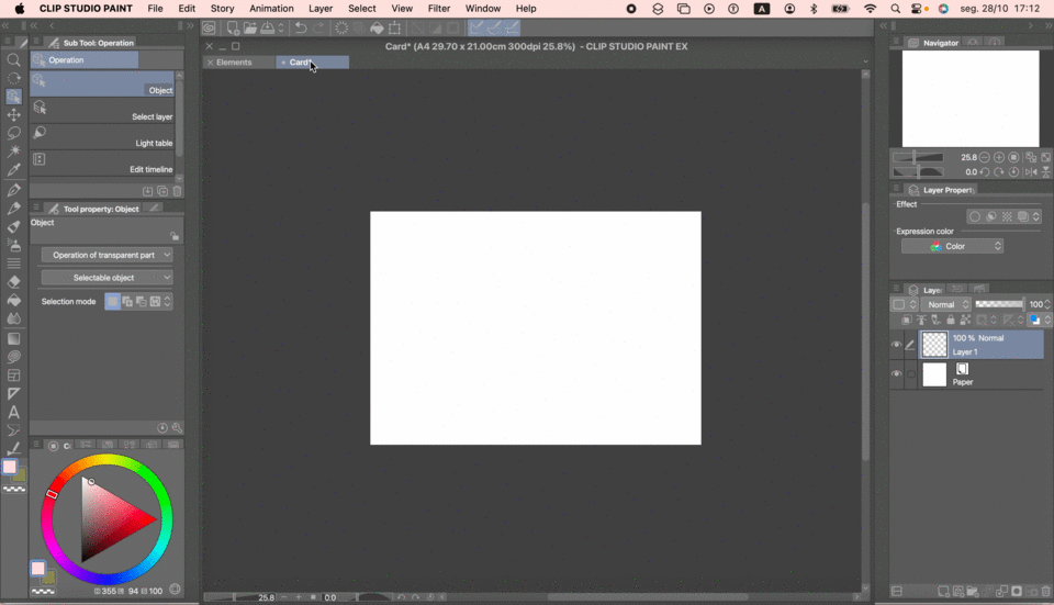
On the Card file, go to File > Import > Create File Object. Select Elements.
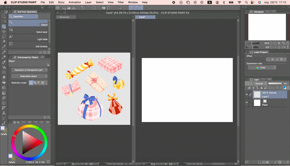
A file object in Clip Studio is a file that can be opened and updated in real-time inside of other files. So any changes you make on the Elements file, will be reflected, whenever you save it, on the Card file.
So we’ll go and create the pattern on the Elements file, and we’ll be constantly checking to see how it looks on the right side, on our Card canvas.
On the Card canvas, go to the Operation tool, and in the Tool Property palette, check Tiling. You’ll be able to see your elements turning into a pattern already.
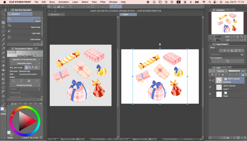
But we’re not done yet. See how there’s a blank space in between each set of elements? That’s because of the blank corners we had to keep in our initial arrangement. Let’s fill it in.
On the Elements file, click Ctrl-A (Cmmd-A if you’re on a Mac), to select the entire canvas. If for some reason the shortcut doesn’t work for you, you can go to Select > Select All, on the top bar. Make sure not to skip this step, or it won’t work correctly!
With the entire canvas selected, right-click the Layer Folder with all of the presents, and select Convert Layer…
A menu will open up. Change the Type from the default Raster Layer, to Image Material Layer, and make sure the Keep original layer box on the lower left corner is ticked. Then click Ok.
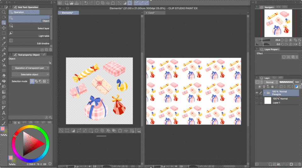
Repeating the process from earlier (but on the Elements file this time), go to the Operation tool, and check Tiling.
Now move your layer until the blank area is around the center of your canvas.
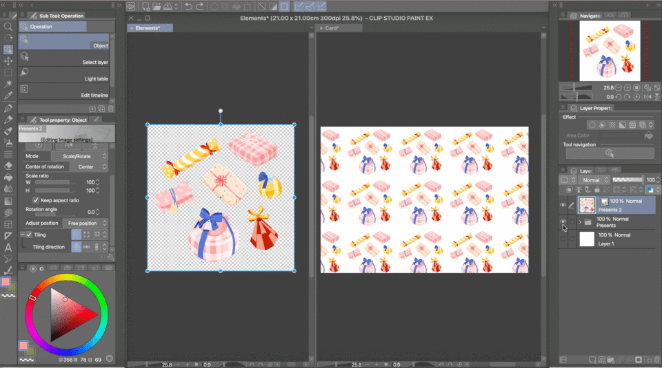
Now copy and paste presents from your original folder to fill up that blank space. Resize and rotate as you need, and remember to keep saving the file to get an updated view on the Card canvas.
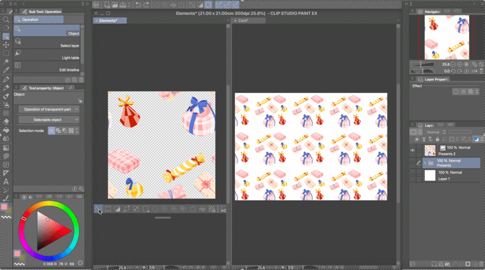
Once you’re satisfied with how it looks, your pattern is ready.
Now all that’s left to do is to save it so you can use it anywhere you want.
Merge the new layers you created to fill the blank space into the layer with the rest of the presents. Now, for one last time, let’s repeat the process from earlier: Ctrl/Cmmd-A - Convert Layer… - Tiling.
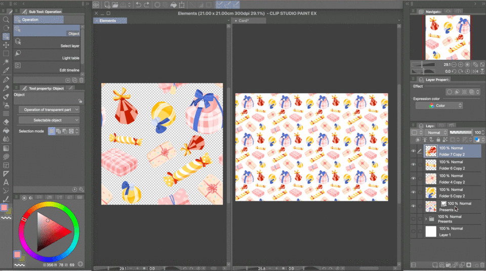
Now deselect everything (make sure not to skip deselecting), name the resulting layer whichever name you’d like for your pattern, and drag and drop it into the Materials palette.
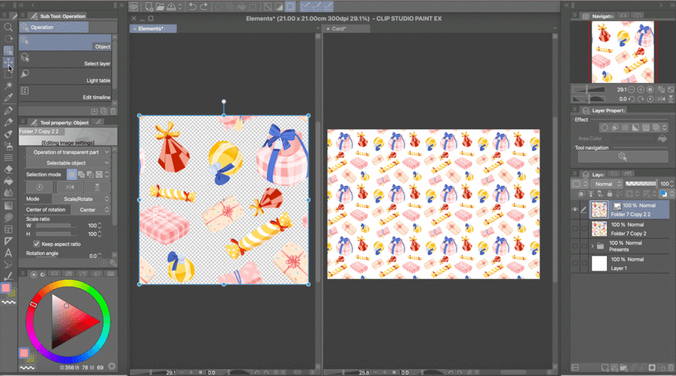
Your pattern is now permanently saved to your Materials palette!
You can drag and drop it onto any file you create, and mess around with its size and rotation. Since we did all of this with a transparent background, you can also change its background anytime by simply putting a coloured layer underneath it.
To finish our birthday card, let’s go to the Card file. We no longer need the Elements file, so we can save and close it, and either delete it or make it invisible within the Card file.
With a blank slate, drag and drop your pattern from the Materials palette into the canvas.
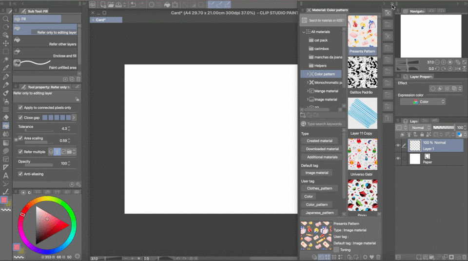
Resize and rotate the pattern to your liking.
We need to figure out what space we have to write out our Happy Birthday! message. We’ll turn on Clip Studio’s grid, so we can visualize where the center of the card is, and therefore where it will fold.
Turn on the grid by going to View > Grid.
Odds are your grid will look something like this:
For our case, that’s not very useful. Go to View > Grid > Grid/Ruler Bar Settings… Change the start point of the grid to Center, and input a higher number on Gap. That way you won’t have as many divisions, and it will be very clear where the center of your card is.
With View > Snap to Grid enabled, create a new layer above your pattern and draw a line down the center. Disable the grid once again, so you can get a clear view of the layout of your card.
From here it’s up to you to try out different lettering styles for the message you want to write. Keep it enclosed within the right side of the card, so that it will fold properly when you print it.
For my card, I ended up changing the pattern a little bit to add some confetti-like colourful dots. As for adding the letters, here’s a final tip.
I lowered the opacity on the pattern layer and sketched out how I wanted my letters to look. I then created a layer in between the pattern and the lettering, and painted a white shape to cover whichever elements of my pattern were interfering with the readability of my message. That way, if I decided later on that I wanted to change my letters, I just had to edit or delete the white middle layer; the pattern layer stayed intact all along.
I went with some bubbly yellow letters for my card.
That’s it! There’s a lot of steps involved in the process of making patterns, but the more you do it, the easier it becomes.
I hope this tutorial was helpful to you, and happy drawing!




コメント