
The layer keyframe featured in Clip studio has always been my favorite and there can be an infinite amount of ideas to create art. In this tutorial, I will show you how to create an animated gothic lolita style paper doll that gives life to plain inking art. A Good idea for the traditionally styled card to post on social networks/community or for storytelling videos.

This tutorial is also compatible with Clip Studio Pro and Ex version. If you have not got used to the animation feature of Clip studio, you can give it a try.
The process is also adaptable to be animated in Live2D.
Video tutorial
check the video to see the process in action
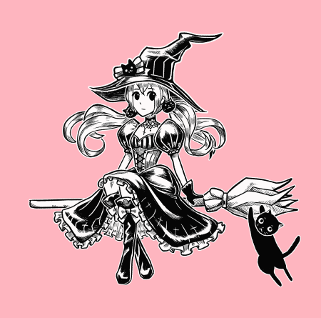
The design element
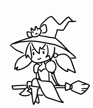
I simply design the sketch pose of a witch in gothic-lolita dress, riding a magical bloom
The gothic lolita is the fashion inspired by the western crinoline dress during the 19th century.
Some iconic features of the gothic lolita style are the dark shade of cloth, some mystery or religious symbol, skull, lace, and frills.
Try to mix and match things together until you have a design that you like. You may need to find references from the internet.
For the background I will add a bit of gothic architecture, you can draw it from references or download from clip studio asset under the keyword ‘Gothic’
Digital inking in traditional style
To make the ink look traditional, I use the textured pen in Pen subtool.
You can config the pressure in brush size dynamics pop-up.
The ink adjustment for digital paintings mainly depends on the pressure of the stylus tip.
Simply click on the graph line to adjust it
Some examples of settings for the pen pressure graph
A good configuration on the pen pressure will make you less tired of controlling the hand with pressure on drawing in a full ink job (which needs a lot of strokes and pressure control) and will also save on the lifespan of your stylus tip.
However, the pressure setting depends on the person, some people have harder stroke pressure hands and some have lighter hands. To find your own configuration, try inking some basic shape.
This is my configuration. I have a hard stroke pressure when I hold the stylus pen, so I set the output a bit less than usual, so it will be easier to draw the thin lines for me.
You can also have another config in advance, by clicking on the checkbox to enable the config.
And also the stabilization will add a bit of delay on your stokes to make the ink smooth
And if you make a mess on trying, you can start over by clicking the reset config icon >_<”
Now you get the favorite pen that works like a traditional pen, time to start the inking process!!
Step 1 : Inking the outline
For the outline, I work on the Vector layer so that it is easier to edit later (and also good for part separations in the animation)
Dye the sketch line with layer colors and reduce the opacity.
Then create the vector layer
Start drawing the outline, in the traditional inking style we must control the ink neatly on each line which takes time to finish, but with the vector layer, we can roughly do the outline and edit it later.
Make sure you enable the vector eraser for the line cleanup process
Adjust the ink weight with [Adjust line width] in [Correct line] subtool
Add the thickness to the border of outlines
I also painted the thick spots where it is supposed to have some drop shadows.
And thinner lines on some details such as folding of clothes.
On the navigator and lower edges of the canvas, you may use the canvas rotation to fit the angle of your hands as if rotating the paper when inking traditionally
I always finish the overall outline first and then fill the details in later, this will make shapes such as anatomy or clothes look clear and make it easier to see mistakes before adding the details.
Fixing the shape at this step will be easier than after details are added
For the details, create a new layer and sketch the details, such as frills.
Then create a new vector layer and ink it.
Tip: set the layer color to the outline layer for less confusion
Erase the overlapped parts from the outline layer.
When it’s done, move the detail layer to above the outline layer, then select both layers and merge it (hold shift and click both layer, then right click and > Merge selected layers)
Note that the menu will not be able to click if the layer is not in connected order.
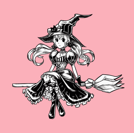
The finished outline.
For more detail about drawing frills and cloth details, I recommend this tutorial by Mortinfamia. The step is very easy to follow ^ ^
Step 2 : Ink shading
In the color artwork, we can simply add dimensions to the drawing by applying light and shadows.
But in plain ink art, the thickness of the outline ink and details will help with the dimension.
The very basic style for shading is parallel ink in the area. This will simply make dimensions to the ink art
To keep the ink neat and clean, you must pay attention to the ink direction and gaps in between lines. Reference the direction to the shapes, or keep all lines in the same direction.
Note: you can split the line when the area is too large to comfortably drag the parallel line. Just make sure the density and direction of the line are in good control.
The ink size and density are also used to shade the light and shadow amount.
(the high contrast between light and dark area will also create a shiny look ^_^)
The other objects may also have a different ink direction and style, for example, clothes or armor.
For a more advanced options: crosshatch line, just make sure it goes in the same direction in all areas.
Let’s shade our doll with the parallel inking style.
Create a new raster layer under the ink layer and shade the shadow areas to use as a reference for the shadow.
Create a new layer above and start to ink, it can be a raster or a vector layer, in the end, we will rasterize it anyway.
Leave some bordered areas to make the area look separated. (not blended to other areas)
Draw the closed areas where it’s needed to be color filled, then fill the gap with the [Close and fill] tool
Pay attention to fabric fold directions and shape
For the hair, I add the high-density ink where it is supposed to drop shadows to overlapped parts. The rest is added by the direction of the hair
The leather boots have a high contrast of shading on the helm of folds to make them look shiny.
I don’t put shading details on the face to make it pop out and clean
delete/hide the gray shading layer and it’s done!
Step 3 : Preparing for animation
We must first design the overall movement of the doll
The little witch will float up and down on her bloom in one loop, then repeat it forever.

This looks solid because there is no other movement other than the position of the witch.
The additional keyframe on the down movement will help it look more natural, for example, the hair will flow up when the bloom is on the down motion.
More lively~ ( ‘ w ’ )/
We will separate the doll into separate parts for making this animation
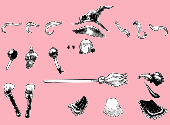
Prepare the layers for part separation, one vector layer of the outline, and one raster layer of the shading. If you have more, just merge it together to have only 2.
Set the paper color to something other than white, this is to detect the white areas of the parts.
Toggle the layer color for the ink
(I always separate the face layer from ink, for emotion edits later)
Use the lasso tool and make selections to the part that we’re going to separate
Copy and paste it into a new layer
[Ctrl+C] > [Ctrl+V]
The new layer will also have the layer effect, click the icon to toggle it off
Hide the ink layer and now you can remove the unwanted lines with the eraser tool.
Erase the part from the original ink layer too. (vector eraser makes it easy like magic!)
Put the cut part into a folder, give the folder a name and create a new raster layer below
Use the [Close and fill] tool to apply white color to the parts
Hold [Ctrl] and click on the layer thumbnail to make a selection from the filled area.
(Note: you can also right-click on the layer > Selection from layer > Create selection)
Then select the shading layer and cut/copy the shading on the selection area
And paste it in the part folder and the first part is done!!
There will be some part that makes a large open gap after the cleanup process,
Draw additional lines to complete the shape. Then repeat the process of filling and cropping the tone.
You also need to add more shading on missing parts too
For some parts on the back, add more area to allow it to move without any gap appearing
(use the pinch tool to easily adjust the line)
In some complicated parts such as the skirt, separating it with the black area will make it easy to design the movement and to keep the seamless look.
When finished, you will have a stack of part folders.
Right click on the folder and [File object] > [Convert layer to file object]
Set the area to drawing area only
Then save it into one folder, you will have a folder of parts like this
You can open the file object to edit by right click on the object layer
The file will contain the whole folder that we converted, you can edit the part or paint more details.
The parts are ready to be animated!!
Step 4 : Loop animation
The animation of the doll will move in 2 steps, upwards then downward. Like this

So the end keyframe will move in 2 steps, up and down.
I put the reference on the canvas for the adjustments
Create new timeline, go to Animation > Timeline > New timeline
Set the timeline with framerate 8 and playback time to 24.
This setting is also good for Clip studio Paint Pro version.
8 frames per second can extend the limitation of 24 framed to 3 seconds and still smooth loop.
If the timeline panel is missing, go to window > timeline
Create the initial frame for the loop.
Select all the objects then enable the layer keyframe.
At the first frame and last frame, create the new keyframe (all layers still selected)
In the concept of loop animations the first frame will be the frame next to the last frame, this will make sure the last frame is the same as the first frame.
Create a new frame in the middle of the timeline.
And move the object positions up.
Then adjust the position of objects, with the object tool.
The first and last frame
The middle frame
With 2 steps keyframes, you can simply give the movements to the doll!
If you notice, there will be a short stop on the last keyframe, that’s because the first frame and the last frame show the same.
To fix this, on the last frame, right-click and [Delete frame] and delete only 1 frame
Now there will be no more overlapping frames. (you can also add more frames to the timeline with the menu [Insert frame])
Adding more frames to make another step of movement will make the doll look more lively.

As you can see, the frame no longer has the slight pause.
However, the timing for the movement is still not smooth. Adjust the keyframe positions without touching the start and end frames to fix it.
For the eyes, use the animation folder to make the blink
Create a new animation folder
Then draw the face with the eyes closed and open. Then put in the animation folder
Right-click on the timeline of the animation folder, then set which frame to show up at the clicked position
This will make the eyes blink, but the position does not yet follow the body movement
Enable the keyframe and adjust to the body movement
To make it look like the paper doll, apply the border effect to each object.
For some parts that are composed of many objects, place them into a folder before setting the border effect, the effect will show only on the outside edge.
You can also add more characters with these steps
Also, make sure that the movement is related to the other character.
The character is done!
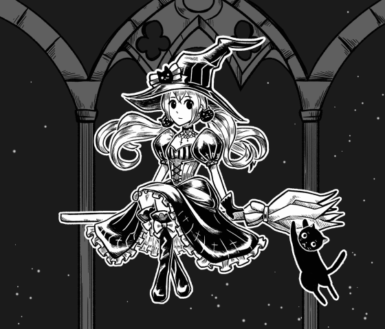
Step 5 : Finishing with background
For the background, I drew some gothic structures in another file
(I referenced from the gothic architecture photos.^ ^)
Use the symmetrical ruler with this setting in the ruler subtool to create the symmetrical drawing.
You can find more tips on using the ruler in my September tutorial :
And for the long area ink shading, use the parallel ruler in the special ruler subtool
I’ve made the small tip video on using the parallel ruler to create hatching ink, check it here.
Here is the easy version of some gothic style pillars for the background.
Create the new timeline with the same settings as the paper doll file
Then import the doll file to the canvas [File > Import > Create file object]
The file object may contain the background color, delete the background in the object file.
You can also paint the stars on a new layer with the spray tool.
Adjust the opacity with the layer keyframe to make the stars shine.
I hope this tutorial helps you with some ideas on your work!!
Happy Inking and Happy Animating!
この投稿を「いいね!」したユーザー


コメント