10 Coloring Tips for Manga and Comics in Clip Studio Paint!
Introduction
Hello everybody, welcome to yet another Clip Studio Paint tutorial from yours truly, the shadow lurker teacher herself, professor Crimsy!
In today’s class I will teach you 10 tips and tricks to improve your speed and efficiency when coloring manga pages!
We all know comics and manga are very ambitious and time consuming projects to take on in the first place and while art is in no way a race, every opportunity to save a bit of time becomes crucial and adds up quickly if you’re going to make dozens, if not hundreds of pages for a single project alone.
In order to cover everything in a way that is clear and concise, this video will be split into two parts: In the first part, we will go over a few tips and Clip Studio Paint features that will make your coloring process faster even before you get to the coloring itself and in the second part we will cover coloring tips and tools themselves, such as how to efficiently create flat colors, shading, lighting and special effects in your manga.
To get the full experience, make sure to watch the video below!
For this special occasion I sketched and lined a manga page of my own so I can demonstrate all the tips I want to show you!
Below is the sketch.
And here is the linework!
PART 01 - Tips to make your coloring process faster at the start of your project!
TIP 01 – Keep your references close with the Sub View window!
This is a quick one, but if you’re going to be drawing a character over and over hundreds of times, a good thing to have nearby is a reference sheet of the said character or at the very least a colored illustration that you can use as a general reference. Ref sheets are great to help keep your characters appearance consistent in every panel, but they also serve as a guide for colors, which is something you should always have figured out when starting this kind of project.
Now, I don’t have a proper ref sheet for this specific character since this is an example page made specifically for this video, but I’ve drawn the character enough to gather some style and color references.
Next, what you’ll want to do is keep your ref sheet close by to speed things up as you work.
Of course, you could open your images in different project windows and go back and forth between projects to pick your colors or add them as an extra layer in your current project and do the same thing, but doing this gets tedious fast, and having to keep extra layers around for multiple character adds to the general clutter of your project and wastes precious time.
So the best way to proceed is to add your ref sheets to your sub view window.
The sub view window is basically a thumbnail window that allows you to shuffle through images, zoom in and out and color pick everything you need in one click.
1. To be able to view your sub view window you may have to head over to the ‘’Window’’ menu and activate ‘’Sub view’’.
2. You should see a new window pop up in your workspace. In this window, you can click on the folder icon, select as many images as you desire and use the arrows to navigate between your references.
3. The next best thing about this window is if you click on this color picker icon, your mouse will automatically turn into the color picker tool whenever you go back to the window area, which makes picking flat colors faster than ever!
TIP 02 – Create a color set for each ot your recurring characters
With your ref sheets close by, now is the time to save some more time! and a great way to save time is to create color sets for each of your main and side recurring characters.
A color set is essentially a catalogue of color swatches used to quickly color your character without having to color pick from a reference every time you need to color one specific character, which saves alot of time in the long run, believe me.
1. To create a color set, simply head over to the sub menu where the color wheel is, click on the color set menu (this will display a bunch of random colors) then click on ‘’edit color set’’
2. Then, click on ‘’add new settings’’and name the new color set using your chosen character’s name, mine will be called ‘’Gabby’’, press enter and finally press ‘’Ok’’.
Now all you will get is this blank slate of color swatches which you can now fill with your color presets. But first, let’s make this easier on us by displaying the colors in a way that will make us easy to remember which is what.
Simply click on the menu bar icon, go to ‘’View’’ and choose either ‘’List small’’ or ‘’List medium’’. This will display your color, but also allow you to name each of them in relation to what they are referring to.
The color sets are especially efficient when used along with the sub view window we set up earlier.
All you need to do is go to you sub view window, color pick something, got back to your color set, click on ‘’add color’’ and give it a name. Do this for each of your characters and I promise you it will save you alot of time in the long run.
TIP 03 – Learn to use Hotkeys
This tip might be a bit obvious to some, but we have to cover it nonetheless because believe it or not, not everyone knows about hotkeys and how to set them up, which has to be one of the biggest long term time saver there is to use once you get used to them.
Hotkeys are simply shortcuts for tools or actions you can quickly use by only pressing a key or a combination of keys on your keyboard so you don’t have to go to a menu with your mouse every time you want to do anything. You don’t need hotkeys for everything of course, but they’re especially efficient to quickly access the tools you use the most or to execute very repetitive actions that require you to go to a menu over and over.
You can access your hotkey menu by going to ‘’File’’, then ‘’Shortcut Settings’’.
A new window will open and by default it should show you the tool shortcuts. You should try to memorize they keys attached to the tools you use the most, such as P for the pen tool, E for the eraser, B for brushes, G for the bucket tool, Ctrl + T for transformations, etc.
Should you require the use of a specific tool or action that is not already attached to a key yet, know that you can always set your own hotkey. For instance, I could:
1. Go to Crimsy’s homemade brushes, which we created in this previous tutorial and click on the ‘’Evil Thorns’’ brush.
2. then click on ‘’Edit shortcut’’ and press Q then Enter
Now every time I will press the letter Q, my brush will be selected. This can be used on any tools or any feature within Clip Studio Paint, even auto-action, which in turn can kick start a whole series of pre determined quick actions, but I digress.
TIP 04 – Keep your project organized
Last, but not least, another great way to save time is to learn how to keep your project organized.
This is as easy as renaming your folders and layers accordingly and making sure everything is separated into its own folder, such as your sketch, your lineart and your different coloring stages. I know it’s tempting to work quickly and not rename layers, but having to toggle layers on and off to see which is what wastes alot more time than you might think.
Another great tip to improve your overall organization is to get used to color coding your folders, which is really easy to do.
1. Simply click on a folder, go to ‘’change palette color’’ and choose the color you want. A good trick is to always use the same color for the same types of folder so your brain gets used to it to the point of not needing to read folder names anymore.
2. Feel free to also select a custom color if you’d like, for example here I’m using black as the color for the general page folder.
Part 02 - Tips and Tools to make Digital Coloring Faster!
TIP 05 – How to create quick flat colors using the bucket tool
So let’s start with flat colors. I’ve often seen people, including my past self fill in colors by hand using a brush and this is such a huge waste of time, do not do it like that! There are so much better ways to go through the process of doing flat colors and the best method of all is by far the bucket tool. This tool has useful, if not essential features that will allow you to create your flat colors in record time, so let’s see what they are!
There’s the ‘’refer only to editing layer’’ option, which is pretty self explanatory. It means that the only layer the bucket tools considers when filling in something is the one you are currently working on and that’s it.
But the ‘’refer to other layer’’ option is where things truly get interesting.
The ‘’apply to connected pixels’’ should typically remain active, but if you deactivate it, you can then pick any other color and change your entire layer to that color in one click.
The ‘’Close gap’’ option though is very important. This allows you to control the sensitivity of your bucket fill when it comes to dealing with gaps in your lineart. As you can see here, the lower the sensitivity, the more gaps the bucket will ignore, but the higher it gets, the more it will stop the color from spilling over gaps. Higher values can be quite useful if your lineart style is more loose, but if your lineart is very clean, a lower value will fill in your area more throughly.
Next there is the ‘’Color margins’’ option, which globally affects the amount of similar colored pixels that will be caught by the bucket in one fill. A low value such as 5 will result in more white unfilled spots in your filled area, especially near narrow spaces where lines intersect. A higher value, such as 80 will catch most of these spaces and fill them in, which is preferable, but make sure not to put the value too high or you might end up filling in parts of the lineart you do not want.
This is what happens when the value is too high
The ‘’Area scaling’’ option is also pretty important since it serves as bleed between your flat colors and your lineart. For instance, if you put it at zero, the filled pixels will cover exactly the area up to the lineart, which is not exactly great in most cases. If you give it a value of let’s say 1 and use the round scaling mode, your fill area will slightly bleed over you lineart. Giving it a higher value might cause your flat colors to spill over your lineart though so be mindful of that and experiment with what looks best for you. I personally found that keeping mine at a value of 5 with the scaling mode ‘’to darkest pixel’’gave me the best results.
I will go over the other options quickly, but basically ‘’Refer multiple’’ determines which layers the bucket tool will consider when filling in colors, so you can choose all of them, only a reference layer and you can also exclude layers like text or locked layers.
‘’Fill up to vextor path’’ is something you can use to fill in specific vector lines and as for opacity and anti-aliasing, it’s best to just leave those at default value all the time.
Now that we went over the bucket tool features and figured which settings work best for our project, it’s finally time to fill in those flat colors! When doing this, remember that you can always go with a darker temporary color so you don’t miss white spots in your lineart.
But wait, there is one last very useful feature that the bucket tool has which I believe is unique to Clip Studio Paint and its that you are not required to click every single area you want to fill in, you can simply drag your bucket tool over multiple areas at once and they will all fill in automatically! How cool is that!
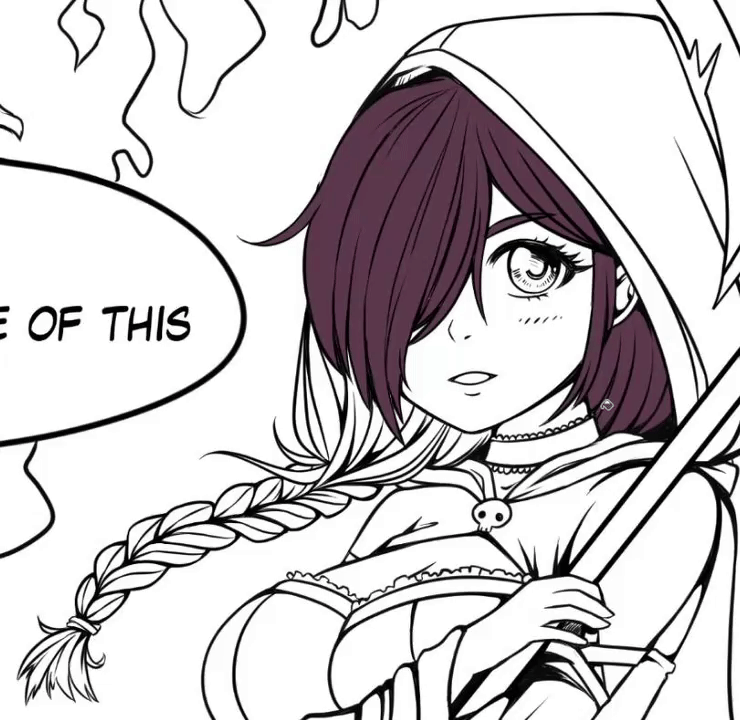
Here are the finished flat colors!
Before you start shading
Now that our flat colors are done, let’s get into the shading of our page. the first thing you should do before starting to shade your page is to pick your lighting scenario and quickly draft your background to set the mood of your page. Is it day time, nighttime, is the sun setting, is your light natural or artificial and most of all, what angle does it come from? In this case, I drew some flames behind my character and went with a simple night sky because I want the main source of lighting to be the purple flames around my character, so my main light source will actually come from behind the character. It’s important to figure out these details before committing to shading because this type of information is what will drive your entire shading process.
With our light source in mind, now is the time to start shading our scene and characters. Typically, you will want to apply shading before working on highlights, but as a general tip, I always found that when coloring a dark scene like the one we’re working on now, it is sometimes better to actually start with highlights before getting to the shading because it helps setting up the mood of the panel right away.
Tip 06 - Clipping layers
The first feature you will need to learn when starting this process is the clipping layer feature. Clipping layers mean you create a layer right above your flat color layer and click on the ‘’clip to layer below’’ icon. Now, when you will draw on this new layer, your pen strokes will always be limited to the pixels present in the layer below.
Clipped layers can also be stacked on top of each other, so the best thing to do is to create a new clipped layer every time you want to add something to your flat color layer, like shading, highlights, soft shadows, glow and textures. You can even clip a folder or layer to another folder if you want your layer to affect the entirety of the layers within that folder.
Tip 07 - Blending modes
The layer blending modes features is probably the second most important one to learn when creating shadows and highlights. This feature allows you to change how colors are interpreted by your layer when stacked above another layer. For example, putting your layer on multiply will take the dark values of your layer and add them to the layer below, which is perfect for creating shadows that will adapt to any color they are laid on.
The ‘’Screen’’ mode is my personal favourite for creating highlights because it does the exact opposite of ‘’multiply’’ and only combines the lighter values of your layer to the one below it.
''add glow'' is good for, well adding glow.
‘’soft light’’ is good for adding textures.
‘’overlay’’ is good for for adding accents of color with a soft brush.
But my best advice regarding blending modes would be to try each and every one of them and see what results they give you so you can use them to the best of their potential later on in your art projects.
Tip 07 - Lock pixel opacity
Last, but not least, the third feature that is essential to learn when shading digital art is the preserve opacity feature. Preserving opacity means that the pixels within your layer will not be able to gain or lose opacity when painted over. To do this, simply select your layer and click the ‘’lock transparent pixels’’ icon. This is a feature that makes it incredibly fast to change a layer’s colors, which is something you will find yourself doing alot when coloring anything.
These three features used together are really what makes the difference between bland and rich colors.
My shading process using these 3 techniques
As you can see here, I started by creating my highlights using the same purple as the flame behind my character, but using the blending mode ‘’add glow’’.
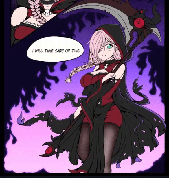
Once the higlights were done, I started adding some soft shadows using the soft brush on ‘’multiply’’. With only those two layers you can already give your page a pretty solid appearance and to be honest, you could already stop there if you felt like it, but I personally like to add a bit more nuance to my shadows.
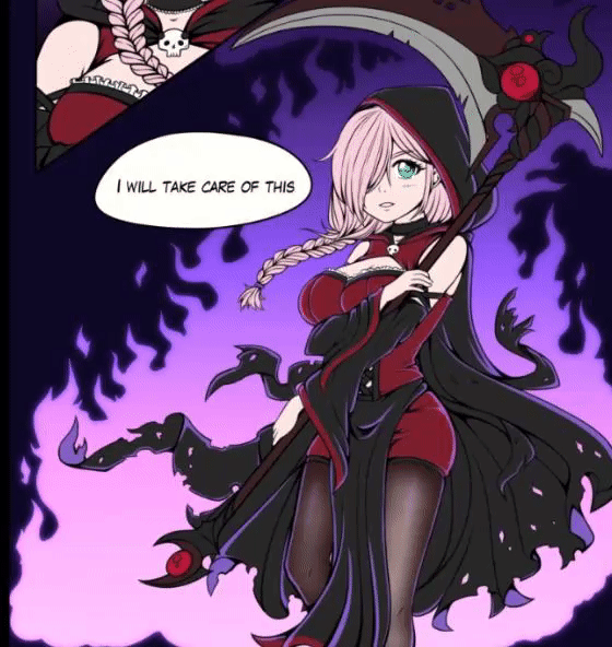
So next what I did is create a new layer on ‘’multiply, picked a dark and light purple color and with the gradient tool I created another shadow layer to make the lighting a bit more dramatic and help my character blend better in the scene. I lowered the opacity of the layer a bit to make the shadows look softer and that was it. As a last optional step, I went back to my main character’s hair and added further shadows to give it more volume, but giving further shading passes to a manga page is not something I would recommend doing all the time since it’s more time consumming, but sometimes it can help if used sparingly.

TIP 09 – How to quickly add special effects
Special effects is something that can definitely add punch to a manga page. This includes effects like particles, glow, bloom and noise, among many others.
PARTICLE EFFECTS
Particle effects are best made through the use of the airbrush tool, but know that you can also download a ton of unique special effects brushes by going to the Clip Studio Asset store. Alot of these resources are free too, so definitely go check them out if you haven’t yet. All the dowloaded assets will be kept right here in your download folder and all you need to do to use them is drag and drop them in a folder of your choice.
GLOW EFFECT
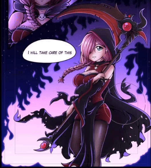
Then, the next step was to add glow behind and on my characters since they are all affected by the same light source. Glow is essentially made using the soft brush and the blending mode ''add glow''. Near the end I even added a bit of glow as a new layer on top of all the folders so it would create this nice effect that makes the character interact with the lighting.
BLOOM EFFECT
Another type of glow effect that sometimes brings a really nice soft feeling to your art is called ‘’bloom’’. Bloom is done by basically taking your entire page folder, duplicating it and merging all the files into one image. Then all you need to do is go to the filter menu -> blur -> gaussian blur and input a low or high value depending on how strong you want the effect to be. Then simply put your layer on the blending mode ‘’screen’’, lower its opacity and voilà, now everything looks a bit lighter and softer.
NOISE EFFECT
Lastly, to give a more retro graphic novel feel to your page, you can also add a bit of noise texture to it. To do this, head to the filter menu, click on ‘’render’’ and then ‘’perlin noise’’. Play with the settings a bit and once you’re happy with the noise density, press okay. Then, put your layer on the blending mode ‘’soft light’’ and reduce its opacity a bit. I personally really like adding texture to my manga, but of course this is purely a matter of tastes and is by all means optional.
Tip 10 - Correction layers
In the very last stage of your manga page creation, never shy away from using correction layers to perfect the look and overall mood of your panels. Correction layers are special effect layer than can influence coloring aspects like values, contrasts, hue and saturation, color balance and much more.
When I was done with my page, I was feeling like everything was a bit too dark, so I went to layer -> correction layer -> and created a new level correction and brightness layer. I played around with them a bit and used them to lighten the overall page.
Then I felt like my night scene lacked a bit of blue, so I went back to layer -> correction layer and this time I chose to create a new color balance layer and play with the blue values until I was happy with it.
I generally use these three the most, but the hue/saturation layer is also extremely useful for managing how saturated your colors are, or changing the hue of a color if you feel it’s not quite right.
Extra tip - Time management
As the very last tip, this might sound a bit odd and quite frankly, all the previous tips can do wonders to save you time, but at the end of the day, I think the tip that will save you the most time is ‘’keep things simple and manageable’’.
Comics and manga are this strange middle ground between illustrations, novels and animation and thus have all the pros and cons of the three formats. They can often be lengthy stories featuring polished artwork, but also require you to draw the same characters and environments over and over from different angles.
So really, if there’s one last tip I can offer you, it’s that, while designing your characters, choosing your color palettes and defining your overall coloring style, keep in mind what your end goal is, how many pages you will need to produce in total, how much time you can allow yourself to spend on each page and how you can simplify what you got to make the entire process faster.
A good thing you can do is simply make one single page and time yourself, then use that time to scope your entire project. If you realise the amount of time necessary is ridiculous and it will take you forever to complete it, then simplify your methods. It can be as easy as removing some accessories on your character, limiting yourself to 3 or 4 colors per characters, not adding line weight to your lineart or removing extra passes of shadows and higlights, etc. Any extra step you can remove that does not greatly affect the final product is something that will save you an incredible amount of time, trust me.
Final words
And here's the final result!
So these were the best 10 tips I know to help you become faster and more efficient at coloring your manga pages. I really hope this video helped you in some ways and if it did, please consider liking and subscribing, this really helps the channel and your support keeps me motivated to make even more tutorials in the future.
But that will be it for me, time to crawl back into my crypt and dream about layer blending modes, that’s all I can see when I close my eyes now, see you in the next one! :)
Best wishes,
-Crimsy


コメント