𝐃𝐞𝐬𝐢𝐠𝐧 𝐚 𝐂𝐨𝐳𝐲 𝒂𝒓𝒄𝒂𝒏𝒆 𝐑𝐨𝐨𝐦! 🧙
Hi, Today I am going to draw a cozy witch or wizard-inspired room to spend time in!
So we can build up from this boring simple gray background to slowly but surely a cool awesome cozy room as a background!
And while doing so, I’ll go ahead and teach you how to draw your own cozy rooms using Clip Studio Paint, So stick with me for the full process and tutorial =)
𝗙𝗼𝗿 𝘁𝗵𝗲 𝗩𝗶𝗱𝗲𝗼 𝗩𝗲𝗿𝘀𝗶𝗼𝗻 𝗼𝗳 𝘁𝗵𝗶𝘀 𝗧𝘂𝘁𝗼𝗿𝗶𝗮𝗹 𝗼𝘃𝗲𝗿 𝗼𝗻 𝗬𝗼𝘂𝗧𝘂𝗯𝗲, 𝗖𝗹𝗶𝗰𝗸 𝗵𝗲𝗿𝗲:
Prep Work!
Drawing a cozy room will require you to get some reference pictures to find different furniture designs and layouts that you like, so I’d recommend browsing different art locations from DeviantART, Pinterest, or maybe even Twitter.
To get some inspiration for the style and vibe of the room, you are going for.
Thumbnailing
After you assemble a nice mood board for yourself with the vibe and design, you can start making a few squares using the square tool in Clip Studio Paint and sketch inside them.
These squares will simulate a rough ratio of our canvas-our paper.
And then we’ll start rough sketching some ideas and shapes of how we’d imagine our room to be, without worrying too much about getting the perspective right, since we will worry about that later!
First, we want to let our creativity loose in the sketches while also
keeping in mind, that there are a few things that make a room feel cozier
Such as Clutter, a healthy amount of clutter can make a room feel cozy and not dirty.
Usually stern about books, CDs, Plush or Pillows.
Also a small yet not suffocating space, large spaces feel a bit less intimate
so having a nicely sized space like an attic, a bedroom or even a tiny spaceship tends to work best!
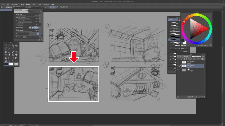
Now that we have four different rough sketches, we can choose which one to develop!
I
personally liked sketch number 3 the most, so I’ll copy it to a new layer and enlarge it to fit our entire canvas.
Rulers and Planning!
Then I’ll make a new layer and plan out a more precise version of the artwork. You don't have to be lineart accurate, but keeping things clear will go a long way.
After I have a better idea of everything I want in the room, I will be making a new Perspective ruler layer to make sure all of my lines are correct with the rules of Perspective.
Initially, I wanted to go for a 2-point perspective. However, I went with a 1 point perspective to make a slightly easier to draw room.
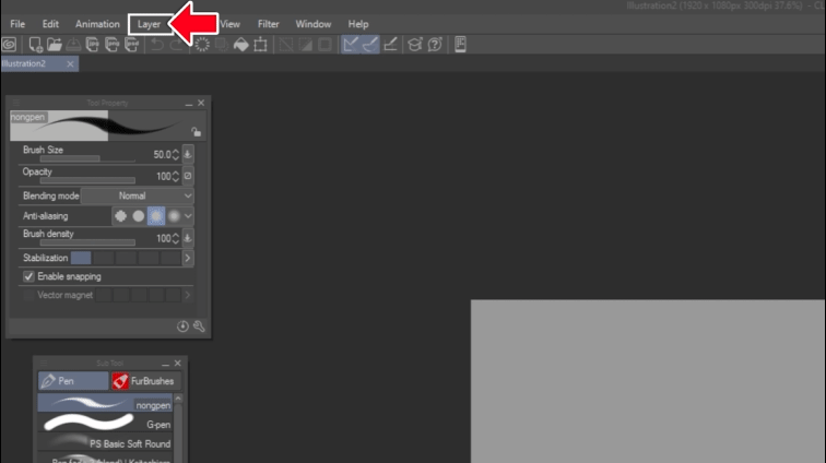
Go to the top left tab, under Layer, Ruler/Frame. Choose the ‘Create Perspective Ruler…” Option, and choose ‘1 Point Perspective.
After you have created your ruler, you’ll notice it has a bunch of widgets and colored lines, and if you don't see any of these widgets, you might have to click this ‘Operation’ Tool prior and click the lines.
These widgets are as follows:
This central Blue line is the horizon line, where your eyes look.
The two purple lines are the guidelines for the perspective we’ll use to draw.
They converge on the vanishing point in the middle. We can move.
The circle with arrows inside of it is used to move the entire ruler.
The smaller circle next to it is used to move the widget without the ruler.
The full small circles next to each line are used to tilt the ruler, from the horizon line to the perspective guides.
The diamond-shaped widget disables the snapping on that specific ruler line.
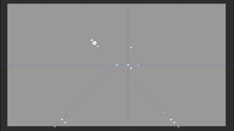
Then after drawing imaginary lines from the existing lines, i can determine where the vanishing point should be, and I’ll move the ruler around to fit our scene.
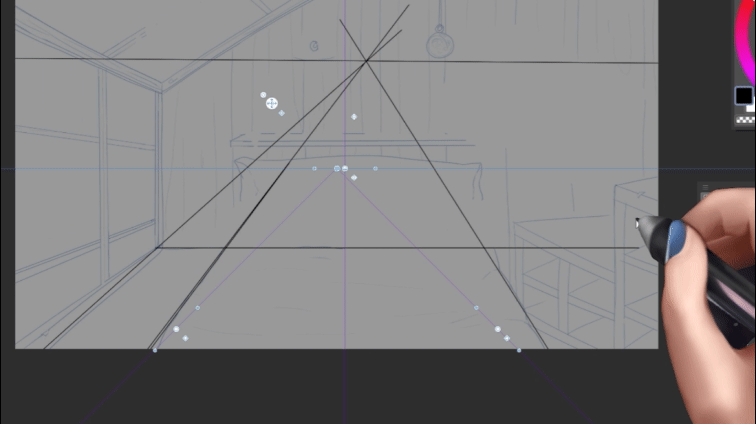
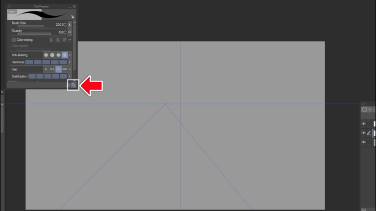
It's also important to make sure you have snapping enabled for the rulers to work with your brush,
the Wrench icon on our brush window will open up the ‘sub tool detail’ window where the tab ‘correction’ has the option for ‘enable snapping’ that we need to have checked!
Base Colors and Sketching!
After lowering the opacity of some of the previous layers, I’ll go ahead and just make sure all of my lines are in proportion to the perspective ruler and fix what’s needed,
in my example, the dresser to our right was completely off.
So I just re-drew it using the ruler to fit our perspective ruler, and then add some clutter and other objects to make it feel more lived.
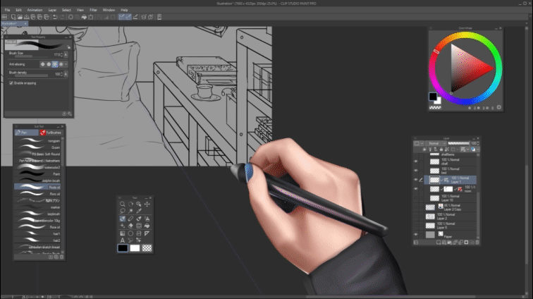
And I’ll do the same to the rest of the room while utilizing our perspective guidelines to ensure everything fits our 1 point perspective!
I even went ahead and used earlier sketches and artworks of mine and put them on posters that I have added to the wall to help populate the room, and you can do the same with your own artwork, be it sketches or full illustrations.
Now I’ll group all of our sketch layers into a single folder and click on the ‘Set as a Reference Layer Icon’ so I can start painting on a layer below some base colors for our room!
Keep in mind you’ll have to make sure that your eraser has the Do not Cross Lines of Reference Layer option turned on’ So you can easily clean up a color spill!
Shadows and Post Process!
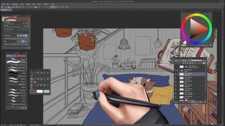
After I have added all of the base colors underneath the lineart,
I’ll make a new layer above each one of the base colors and
use a multiply layer to shade the furniture slightly,
assuming the light will come from the windows.
I also personally come from a painting background, so I like including an optional step
Where after we establish some basic shading to our drawing, we will create a new normal layer above.
And just pretty much paint over some of our drawing, especially blurring out some of the lineart, and creating some edges to our shelves.
Then I tend to make a multiply layer and color filling the entire canvas a dark blue with the fill tool,
and lower the opacity to about 40%, then erase the middle part with a soft eraser, to allow me to have some more shadow and create a sort of vignette effect,
The vignette effect will really help boost the room’s coziness as it focuses everything in the middle. And make it seems a bit smaller and tight-knit.
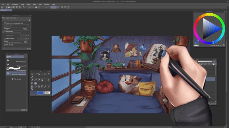
Afterward, we need to make an overlay layer on top to use it to draw the cast shadows.
The shadows will indicate where the light comes from and tends to be less sharp further from the light source.
And then similarly, we can use an overlay or Color Dodge layer to create some highlights in the scene.
Of course, this will depend on what light sources you have in your drawing, but I recommend having fun with it and trying to keep the edges of the canvas darker to keep things cozy.
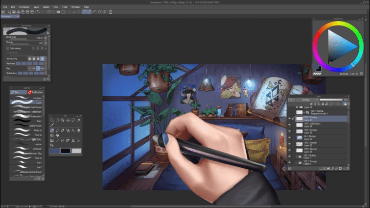
After doing all that, you can add whatever flourishes you want to your artwork, be it rain on your windows or even adding some dust particles in the air on a new normal layer.
Then I’ll go ahead and in the Layer Tab, under New Correction Layer will choose a Gradient map. And set it to color while also lowering its opacity to about 20 to 30%.
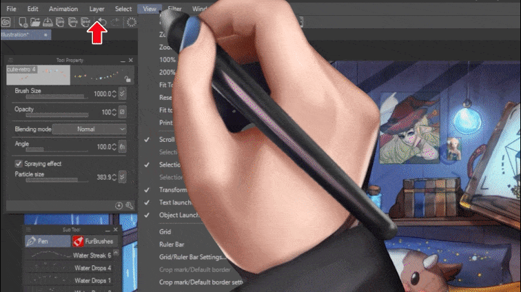
and if you dont have many gradient maps to browse from, You can make your own gradient maps or download one from the Clip Studio Assets Like i have.
After I find something, I like I close the gradient window and adjust the opacity again to taste. A gradient map on top will help us unify the colors and go for various vibes.
We can also go choose other adjustment layers like Levels or Color Balance to further fine tune or drawing.
But keep in mind what I find cozy might differ from what you find cozy, so do what you find most pleasing to you. And I hope you found this tutorial helpful.


コメント