
Presentation
Hello!!! Welcome once again with another TIPS, this time creating a landscape using gradient maps. You can create the most beautiful landscapes using only gradients. It is a simple method, very easy to execute; We will only use three tools, the shapes, the simple gradients and the gradient maps. I hope this TIPS is useful to you, so let's get started.
► Basic preparations
We will start by making a sketch of the landscape that we want, this will be useful for us to have as a reference when placing the gradients. Next I leave another tutorial where I explain some composition concepts for landscapes.
For the realization of this sketch I used the vector layers, in this other tutorial that I leave below I talk more about this function.
What vector layers allow us is the possibility of modifying the line width, scaling without losing resolution, among many others. I use vectors because it makes it easier for me to sketch, but this layer will only be for reference. I divided the elements that make up the illustration into different layers so that it would be easier for me to apply the gradients in the future. For example, the circles are on one layer, the clouds are on another, and the planet ring is on another.
To apply the gradient maps it is necessary to have an illustration with the lights and shadows already defined, either with colors or in a gray scale. Up to now we only have the sketch, so next we will apply the volumes of the figures using only simple gradients in grayscale.
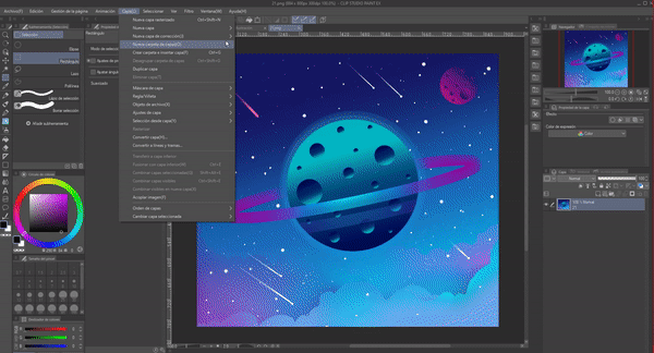
First, we will go to the toolbar, once there we will enter the gradient tool.
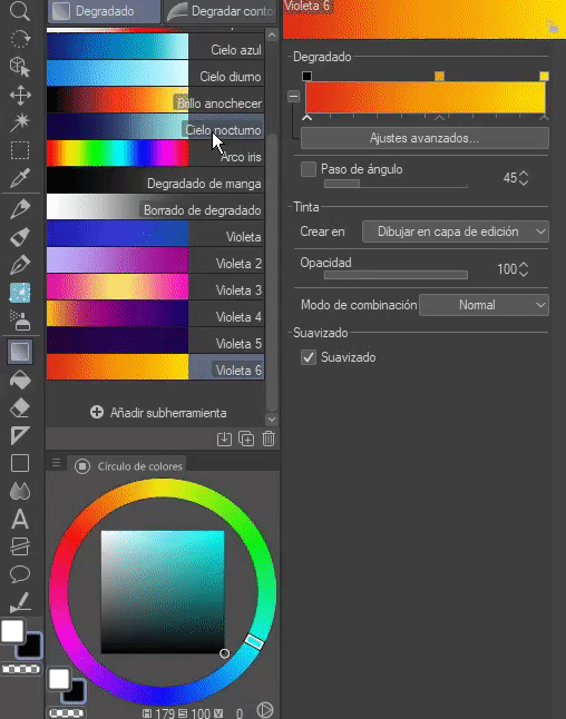
We will select any existing gradient except for "Manga gradient" and "Gradient erase", these have different settings than a normal gradient, so they are not useful for us. Once we have selected the gradient we will right click on it, a pop-up menu will appear where we will select the option "Duplicate sub tool", we will click on that option.
A dialog box will appear where we can choose the name and icon of the material; this can be modified as they wish; Once the changes have been made, they accept and a copy of the material will be created. We will modify the color of this material, we will generate a gray scale. It should be said that you can generate as many nodes as you want, but none of them should have a pure white because when applying the gradient map the color will be cut when it reaches pure white. So, the nodes have to be black and gray.
The colors are changed by clicking on the squares that appear at the top of the gradient bar (Nodes) that is located in the tool properties. New squares can be created to add more colors by clicking on the bottom of the bar between the arrows with which the color level moves.
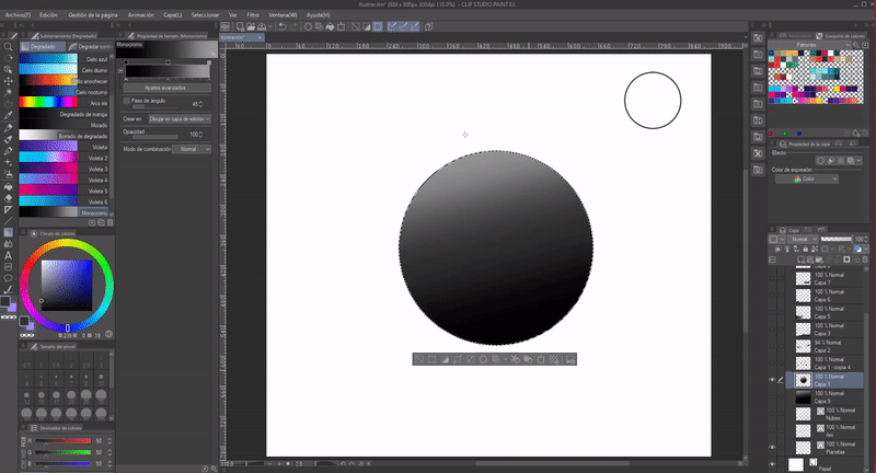
Now we are ready to give volume to the illustration. We'll start by hiding all the layers except the one containing the circles; I will start by giving the volume to the planets.
We will select the surface of the circles with the "Auto Select" tool, this allows us to apply the gradient only on the part of the circle. We can apply the gradients in any direction, I will apply them diagonally in such a way that the light sees the upper part and the shadow in the lower part. I applied the gradients on a new layer above the sketch. Once finished you have to hide the sketch layer so that the lines are not seen.
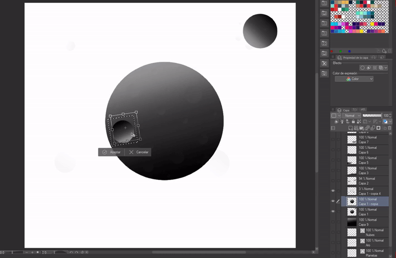
I wanted my planet to have some craters, for that duplicate the gradient layer, then applying "Control + T" with the keyboard scale the figure to a smaller one and rotate it so that the shadow was in the direction of the light, this gives it a volume like a crater. In the end I decided to add more planets, just take the ones I already had and scale them to smaller ones.
Update: In the end I removed the mini planets, I didn't like the image so saturated.
For the ring that surrounds the central planet, what I did was select it the same as with the planet and apply a gradient that had black on the edges, gray following the black on each side and a gray near the white in the center, then the palette :
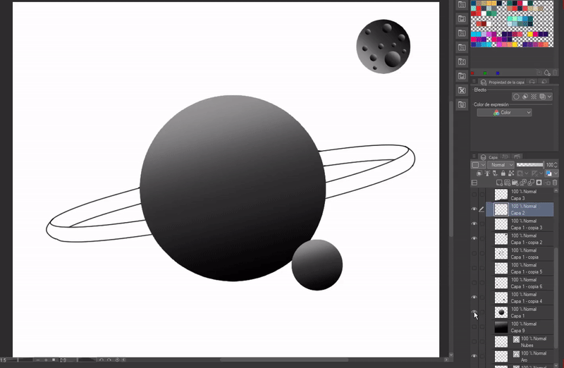
Now it's the turn of the clouds, it's simple, you just have to follow the steps mentioned above. You have to place the gradients as appropriate to the light.
Finally, we have the background, a gradient to taste.
► Colors for a gradient map
Next, I will leave another tutorial where I explain how to choose colors for the illustrations. One piece of advice that I can give you for this type of illustration is to avoid colors that tend to be gray or grey.
► Creation of gradient maps
I will start by explaining how to create a gradient, for this we will choose a color or colors that will make up the gradient. The palette shown below is the one that I will use in general for the entire illustration, combining them and starting from them to make sub gradients.
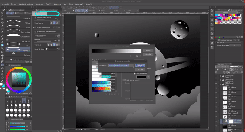
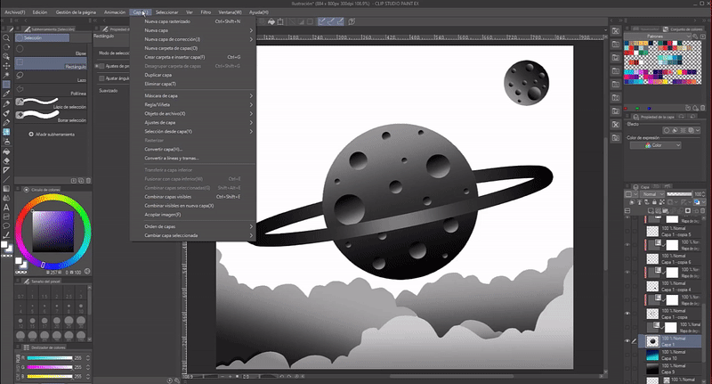
Once the colors are selected we will open the gradient menu. For that, we will click on "Layer" > "New correction layer" > "Gradient map".
A layer will be created above the currently selected layer along with the window shown in the image below. In this window we will go to the "Gradient set" section and we will click on the wrench that is there, this in order to create a new set (a set is a folder where we can store several that can belong to the same category, for example, I create a set called Planets, there I can store all the gradients I need to color the planets).
In the menu that will appear we will choose "Create new set".
A window will appear where we can choose the name of the set, once created we will click on "Create new gradient". A generic gradient will be created that we can modify using the dropper found in that same window as seen in the GIF.
In this window you have the following functions that can be done to modify the gradients.
1- Change the saved gradient: Change the gradient that is selected with the one found in the gradient bar (this is the bar you find at the top of the window, where you can see the colors).
2- Add to the gradient bar.
3- Duplicate gradient.
4- Create gradient.
5- Delete gradient.
6- Modify the mixing levels between the colors.
7- It is the tool where we can select the colors for the gradient. Double-clicking the box will bring up a color palette and with the eyedropper you can choose any color found anywhere in the program.
8- Change the position of the nodes.
It should be noted that here you can also find the simple gradients that are created from the toolbar, just as we created the monochrome gradient at the beginning of the tutorial, in the scrollable menu you can find them as "Tool (read only)".
This last function "Invert Delayed" inverts the gradient.
1. Gradient Maps App
Applying them is easy, what you have to do is locate yourself on the layer to which you want to apply the gradient, then open a new layer for the gradient as explained in the previous step, this will be created above the layer you have currently selected. In the dialog box that will appear when the layer is generated, the gradient will be chosen by double-clicking on it, with the functions that exist within that same window you can modify the levels of each color, soften the edges.
As seen in the GIF below, I selected a blue gradient, and modified this so that the lighter blue would take up most of the gradient.
Once accepting, you have to couple the gradient layer to the layer of the planet that is in grayscale, in this case it would be the one immediately below, it is the layer with which we start to apply the gradient map.
This is how the layers have to be, first the layer of gray and above it coupled to the one below the gradient. If the gradient layer is not attached to its corresponding layer, it ends up interfering with the other layers, altering their color, so anchoring it limits it to only that layer with no possibility of affecting the others. This process is the same for everything.
Double-clicking the box on the gradient layer opens the settings to modify the gradient or change it to another color. The good thing about this method is that we can try as many colors as we want without wasting time and without damaging the drawing. Gradient maps are best for color proofing.
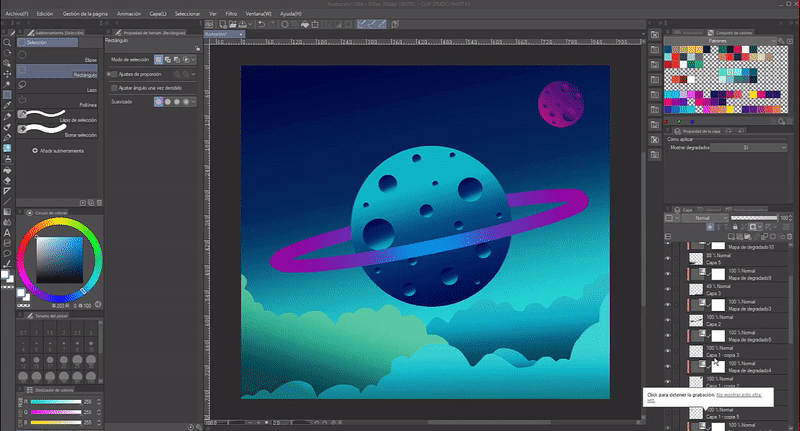
This is a GIF with the process we have carried out up to now, and as you can see, I changed the colors several times without damaging the illustration.
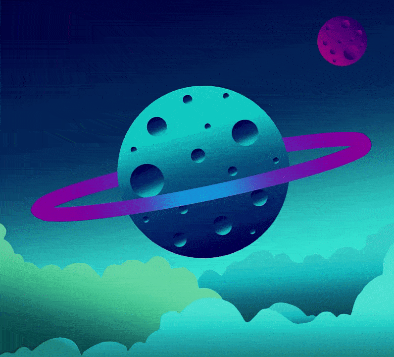
This is the result of applying the gradient maps to each figure in the illustration. Now, only the decorations that give it more life are missing.
► Decorated
As the last step I will add the details that will give life to the illustration, this part is no longer directly related to the gradient maps, but they are a complement for this style that is based solely on shapes and gradients.
First, duplicate the ring and from this duplication I erased the ends that protruded from the planet, just leave the frank one that is on the planet, I lowered the opacity of this strip so that it looked like the shadow of the planet.
Two, with the "Soft Eraser" tool at a medium opacity I erased part of the clouds to make them look hazier, with some translucent. I did the same with the ring that surrounds the planet, softly erase some parts to make it blend with the background.
Three, place stars in the background and a couple of small white comets.
Four, duplicate the planet, place this copy behind the original layer, increase the size of the planet and lower the opacity to make it look like the planet is emitting light. I did this process three times each copy with a different size.
2. Gradient Maps Application
This application is used to change the atmosphere of the illustration. To do so, we must place ourselves in the layer that is above all the others and open a new gradient map layer, choose the color and that's it. This layer does not have to be attached to the lower one for the layer to affect all the others.
I chose a red gradient and its derivatives. The result was this. Although it doesn't look bad, some details are lost, so we can also color this gradient using the "Blend Modes". In this image the blend mode is set to "Normal", but in the next image you'll see a change by applying a different blend mode to the gradient layer.
Now change the combination mode to "Hard Light". The difference is noticeable, it gives you a totally different look.
By applying different gradients you can create different looks, here is another view of the same illustration applying a different gradient.
farewell
I hope that what you have seen in this tutorial is to your liking. I hope it helps. Well, nothing to say. Thanks for coming this far! ପ(๑•̀ुᴗ•̀ु) ॣ৳৸ᵃᵑᵏ Ꮍ৹੫ᵎ ॣ
Vibrate high!!! We don't see each other another time ( •⌄• ू ) ✧
Users who liked this post


Comment