Learn the use of Tone and Focus lines in manga with CSP
Hello dear,
It's the one and only Ado_draw, here again with article tutorial on self preservation.. hahaha that's not it, today I just like for us to quickly brush through the topic titled:
Learn the use of Tone and Focus lines in manga with CSP.
🍿🍿🍿
◾The term TONE: What is it [?]
If you're a ever gone through a manga collection before, you may have probably noticed that Japan manga's style of comic design tend to slightly differ from that of western Europe comic design...Why is that[?],
🔸🔸🔸
You may say it is because mangaka's tend to solely make their color values comprise of black and white, and they also make use of mandarin symbols,
I can agree with that fact but I also disagree with it as well cause sure mangaka tend to make the various above mentioned in the various creation of scenes or characters, but that's not what often makes the style unique and interesting, there is something there also there is something their also add to their comic style that makes them unique and different,
if you look more closely at each of the manga panels you will notice some effects added to them one of which effects are called TONE.
________…
In the past manga creation process done traditional by hand but due to the digital age now, manga can now be digital with the of software like CLIP STUDIO PAINT and more and in today's tutorial I will for us to see how we can add “Tone” to our manga comic to give it an emotional atmosphere.
> Locating the Tones effect on CSP
In the CLIP STUDIO PAINT software, There are several variations of TONEs which are makeup of dozen of tiny dots tones with design which can be used to represent woods textured, clothes texture and many more in a manga.
🔸🔸🔸
They are two way to locate or get a screen tone onto your manga panels in CLIP STUDIO PAINT,
> The first and my favorite way is through the [Layer property] box and,
> The second way is through the [Material] box.
• adding of tone from the [Layer property] box,
In CSP, the variety of tones which plays their different important roles in detailing a manga scenes or characters can be located in the following steps.
> Go to [Window]>[Layer property]
🔸🔸🔸
> In the [Layer property]> enable [Tone] effect,
🔸🔸🔸
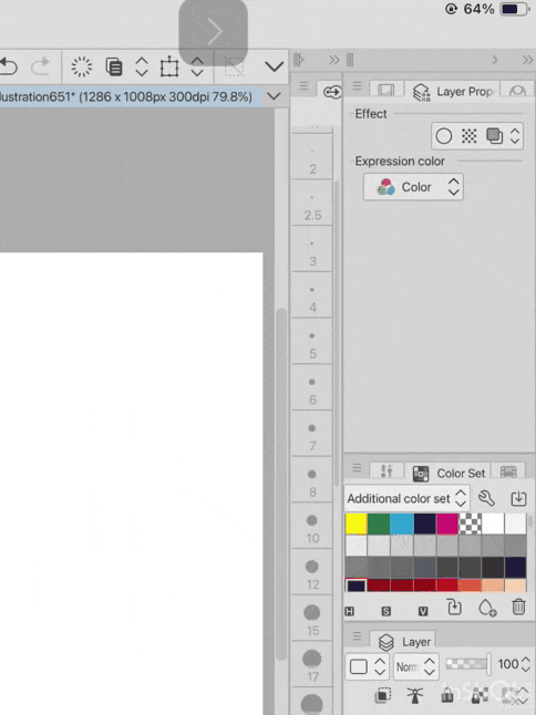
Look closely at the bottom of [Layer property] when the tone effect is enabled we will see the [dot settings], we can easy change our tones by > clicking on [dot settings] to give the tones our desire style appearance.
(For this tutorial I set the [dot settings] to [Star] effect)
🔸🔸🔸
For the right settings,
Set the Layer [blending mode] to [Multiply]>select the nature of color which is slightly grey.
________…
For the left settings,
Use the [bucket sub tool] in the [selected Sub tool]> Fill in the entire character with the to by clicking on the character.
🔸🔸🔸
By reducing or increasing the [Tone frequency] determines how thick or thin tones turns out.
▪️ Adjusting the tone frequency to 25.0% it will make the tone thicker on appearance.
▪️ Adjusting the tone frequency to 42.0% it will make the tone thicker on appearance.
▪️ Adjusting the tone frequency to 85.0% it will make the tone thicker on appearance.
🔸🔸🔸
The size of the dot in the tone big when the dot frequency has a smaller value (25.0%) while when the size of the dot in the tone big when the dot frequency has a smaller value (85.0%).
________…
Next, it the second way to which tone can be used in CSP.
• Use of tone from the [Material] box,
For the right settings,
Create a new [Raster layer] and click on the [reference] button.
________…
For the left settings,
Use the [shrink selection sub tool] from the [selected Sub tool] draw a round circle around the character to select the character,
🔸🔸🔸
After the [selection sub tool] has used to select the character, click on the [mask icon] to make sure that they transparent background remains transparent.
🔸🔸🔸
Next, Drag the [drawing paper C] tone material onto the selected character.
🔸🔸🔸
Use the [Object] Sub tool to drag the control point of the imported tone material by shrinking it's size small.
🔸🔸🔸
ELABORATION🔹for the above mentioned
The above process I just mentioned is break down into three stages which is necessary for adding of tones to a character;
▪️ Stage 1 is to define the character whereby we select the character outline,
▪️ Whereas stage 2 is Masking the outline of that character (by clicking on the [Mask icon]) ,
▪️Hence in stage 3 every thing outside the selected character remains transparent or unaffected when tone effect is added the character which is the selected area.
🔸🔸🔸
Afterwards, reduce the [Opacity] of imported material to half [50%],
🔸🔸🔸
And with that we have successfully added tone to our manga character.
🔸🔸🔸
This same above process can be repeated for the different sets of tone material in the [material] box.
🔸🔸🔸🔸
Now, when using the material location for adding your tone, you may notice that you can't increase or reduce the size of some of the material in it, but you may notice that those which their size can not be adjusted already have multiple sets of materials with their size different as shown in the three image (which size is 32.5%, 55.0% and 65.0%) above.
◾ How to easily and properly add tone to your manga
For those who are thinking “I want to start creating a manga!” and “I’m not sure where to add tones…”, I am here to show you the effective ways of using tones.
🔸🔸🔸
1] Adding of screen tone to character
SCREEN TONES can be used mangaka’s to add dramatically there by enhancing the visual impact of your characters in a comic or manga. Here's a breakdown of how to use them effectively:
• Tones use to represent characters skin color
In manga, Tones can simply be used to represent tell viewers the kind or nature of skin appearance the character have.
Like take for example:
Adjusting the density of the tone [screen tone] to different respective density gives the difference characters their different unique appearance such as fair or slightly darker or very dark skin completions.
🔸🔸🔸
To achieve the above mentioned, using the image below of my OC (original character).
🔸🔸🔸
Let's start by creating the character with a fair skin appearance.
~ Characters with a fair completions: can represented with a very finer dot [screen tone effect].
Using the [bucket sub tool] in the [selected Sub tool] to simply fill in the a basic flat colors of the character on a Raster layer.
🔸🔸🔸
Switch to the [Lasso fill Sub tool] also located in the [selected Sub tool], on a newly created Raster layer with the [Tone effect] feature enable onto that new layer, also [clip] the newly created layer by clicking the [clip button] onto the skin areas of the character like in this character's case her Face, Hands and Stomach.
🔸🔸🔸
And with the above mentioned done one has successfully given the character a fair skin completion.
🔸🔸🔸
Next, to give our character a slightly dark skin appearance, all we need do is as follows;
~ Character with a slightly fair completions: can be represented with a slightly finer dot [screen tone effect].
🔸🔸🔸
And with the above mentioned done one has successfully given the character a slightly darker skin completion.
🔸🔸🔸
Meanwhile, to give our character a very dark skin appearance, all we need do is as follows;
~ Character with a darker completion: can be represented with a very thicker dot [screen tone effect].
🔸🔸🔸
And with the above mentioned done one has successfully given the character a very dark skin completion.
🔸🔸🔸
Note: However, not to use colors that are too dark, as they may make the line drawing less noticeable.
🔸🔸🔸
• To represent the shadow areas of subject skin
Use darker tones on the opposite side of a light source to create shadows.
When adding the tones to you characters, place it at the position where the shadows are to be in respect to the direction of the light source.
Before anything I do advise you pick out your color palette which I do by firstly creating a gradient palette with both black and white color values using the [foreground to transparent] gradient sub tool.
🔸🔸🔸
Next, go to [Edit]>[Final correction]>[Posterization]
🔸🔸🔸
A mini dashboard will appear with a settings option called the [Levels] setting which when the dashboard is first open will appear with [8] different values, but in this particular tutorial I simply want to make use of [4] values so I set the [Levels] settings to [4] values.
🔸🔸🔸
Go-to the right of canvas, Create a new [Raster] layer, set the [tone effect] of the layer with the [frequency] setting to 42.5%, select the second valve of the color palette using the [soft airbrush] sub tool to add shadows to the character with respect to the direction of the light.
🔸🔸🔸
To make the added [Tone] shadows to the character more darker or thicker, enable the [Posterization] setting, adding 2 sets of control point to the Posterization bar will slightly make the added tone shadows more darker.
________…
And making the control point 3 sets with their values different will make the added Tone shadows very more darker and thicker.
🔸🔸🔸
Note: that the [Opacity] of each of the control points can be easily adjusted to either increase or reduce their value.
Also considering the balance between your own drawing style and the amount of shadows.
Note: that the more shadows you add, the more realistic the illustration will appear.
• To relate the emotions of character’s in a scene
Tone often refers to the overall action event, mood and atmosphere of the story. It's how the artists uses visual emotional elements like when a character is feeling the following:
• Action events:
- Tone is often use to tell viewers intense and focus a character take interest in a action.
• Health events:
- Tone can be used to show the degrading in character's health like when they are sick.
• Emotional events:
- Tone are most often time used by mangaka's to the emotions the character is feeling at that particular time like when the feel angry/ depressed etc.
🔸🔸🔸
Steps to create the above:
▪️Step 1 select the areas you want the to apply the tone,
▪️Step 2 enable the tone to layer,
▪️Step 3 add the tone to the selected area.
This process has already been discussed previously in the above mentioned.
• adding of tones to character clothes
Using the appropriate tones one can give character clothes a realistic textures appearance like fabric or even the hair of characters using the previous above mentioned process solely on the character's clothes avoiding their face and skin.
🔸🔸🔸
2] Tone used as a background
In some manga screen tones are often used to add details to background and making the eyes of the viewers Focus more on the on affected spaces which may be the character in the scene.
Like take the below character with no background for example,
🔸🔸🔸
To make the focus be on the character let's give it a tone background by creating a new Raster layer below the character layer, use the [foreground to transparent] sub tool grade in a white and grayish color value to the background,
🔸🔸🔸
Next create in another new layer above the previous layer set the [tone effect] and the [frequency] to 42.5%.
Using the [Lasso fill sub tool] located in the [selected sub tool] fill the entire background with tone effect.
🔸🔸🔸
Using the [foreground to transparency sub tool] to add a darker Grayish color value to the bottom of the scene to create a sense of depth below the character.
🔸🔸🔸
And wallah… our work is done
🔸🔸🔸
3] Tone used to create a better compositions
Like take the two image for example,
The image on the left shows viewers that all the characters are balanced in scene but without emotion or depth.
________…
Meanwhile, the image on the right shows use of Tone on the background characters to tell the viewers the deceptive or gossiping habit of the characters under the shadows whereas that of the characters in the light show to the viewers a cherry demeanor and joyful atmosphere.
🔸🔸🔸
To achieve the right above scenario on CLIP STUDIO PAINT [CSP],
On the right side of the canvas start by first creating a new [Raster] layer, set the Blending mode the layer to [Multiply]> enable [Tone effect] on that layer.
________…
Next on the left side of the canvas, use the [Foreground to transparent] gradient sub tool located in the [Selected Sub tool] draw a gradient from the top downward on the manga background scene.
🔸🔸🔸
Afterwards, on the right side of the canvas, select the [refer sub tool] sub tool in the [selected Sub tool] draw a selection around the right side of the background.
________…
On the right side of the canvas, create a new [Raster] layer below two background characters layer> Enable [Tone effect] to that layer with the [frequency] set to 70.0%.
🔸🔸🔸
Create another Raster layer above the two background characters layer> Using the [Foreground to transparent] draw a darker color value Tone onto the selected area of the scene.
🔸🔸🔸
And there you have, one has successfully given emotion and depth to the background manga scene making for a better composition.
🔸🔸🔸
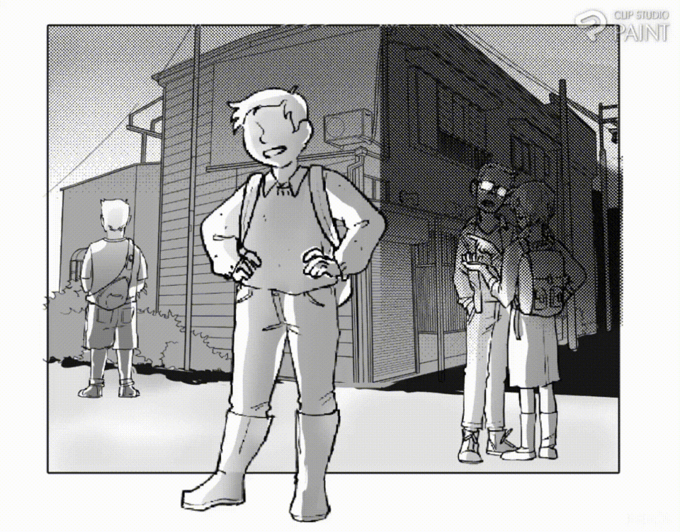
And also one can use tone to give our Foreground composition a better expression in depth as well.
Take the below two image for example,
both have similar expression but the one on the right has depth added to through the use of Tone meanwhile the one on the left does not have anything depth at all.
🔸🔸🔸
One can achieve this on CLIP STUDIO PAINT by first creating the foreground scene,
🔸🔸🔸
On the Left side of the canvas, create a new Raster layer> set the blending mode to [Multiply]> enable the [tone effect] while also selecting a darker color value.
And moving onto the right side of the canvas> select the [Foreground to transparent] sub tool in the [Selected sub tool] to draw a darkening gradient from the left side to the middle.
🔸🔸🔸
With the above process done, depth has been added to the manga scene giving the scene a dramatic expression.
🔸🔸🔸
4] Tone used to focus viewers attention on main character
Common technique in manga and comics to create a sense of depth and atmosphere by using a light, dot-like screen tone around the character's edges to mimic the mist of a Fading effect directing the eyes of the viewers toward the main character in the scene making the other characters in the scene less define.
Say for Example:
Imagine a character standing in a standing in the mist of a crowd as shown in the two image below,
the character in Left side manga scene has no screen tone or fading effect added to it making the scene have depth and a center of focus.
________…
Whereas for that of the right side manga image, all the have fading effect added to their edges give them depth, meanwhile for the main character which I want the viewers eyes to be directed towards was also added a screen tone effect to the edges to center viewers focus on the main character.
🔸🔸🔸
To achieve the above mentioned in CLIP STUDIO PAINT, place the different characters in the manga scene,
🔸🔸🔸
If you want to make use of the manga material are used for the people there below is the link.
🔗🔗🔗
After the characters has been properly lead in this manga scene, go on to add some fading effects to the edges of the characters using the [noise sub tool] located in the [selected sub tool] on another created layer,
🔸🔸🔸
On the left side of the canvas, create a new layer set that layer [tone effect], select a white color value whereas on the left side of the canvas, select the [noise sub tool] to add the tone effect to the edge of the main character.
🔸🔸🔸
And with the above process done we can now easily see are main character amongst the crowd due to the presence of tone effect on the around the edges of the character.
🔸🔸🔸
5] Tone added to background effects
Often times tools are added to effect used on the background for the purpose of beautifying and reducing much Focus on the background directing the eyes of the viewers to the character, most time it also tells the emotion the character is feeling at the moment.
🔸🔸🔸
Now, the second concept I would like for us is known as FOCUS LINE and SPEEDLINE which is not only used by mangaka's Along but also west Europe comic makers as well.
◾The term FOCUS LINE and SPEED LINES: What are they [?]
SPEEDLINES are a visual effect used to convey speed and motion in art, animation, and design. They are often represented as diagonal lines that converge towards a point, creating a sense of dynamism and energy.
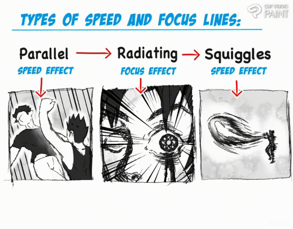
• Where can I locate the Focus line and speedline effects in Clip Studio Paint
To be able to locate both the focus line and speed line you need to do just do the following;
Start by clicking on the [window] button >select both the [tool] and [sub tool] options,
🔸🔸🔸
Among the selected sub tool is the location of this [speed lines] which in its dashboard we will notice the following;
▪️ scattered speed lines,
▪️ dark speed lines,
▪️Gloom speed lines,
▪️Rain speed lines.
🔸🔸🔸
And alongside is locate the focus line dashboard which have the following;
▪️ Scattered focus lines,
▪️ Dark focus lines (curved),
▪️ Dense focus lines
▪️ Brightness focus lines
▪️ Burst focus lines.
🔸🔸🔸
• Way to which speedline can be used in manga
Speed lines are often been used by mangaka's to relay the following to viewers;
1] Speed lines is often used to show Character in [Motion ]
In Manga comics or comic in general, motion lines (also known as movement lines, action lines, speed lines, or zip ribbons or speed lines) are the abstract lines that appear behind a moving object or person, parallel to its direction of movement, to make it appear as if it is moving quickly.
🔸🔸🔸
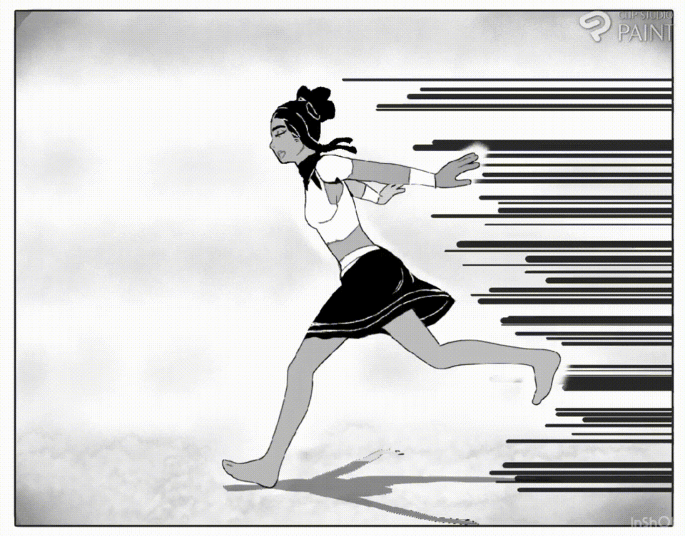
Speed lines often used by mangaka's appear in this three format as follows;
Horizontal - Diagonal - Vertical
Speed Lines.
🔸🔸🔸
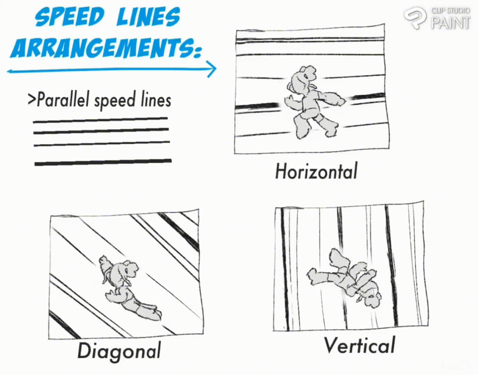
Hence,
▪️With the use of the Horizontal lines,
Tells the viewers that the character is running.
▪️And the of the Diagonal lines,
Tells the viewers that the character is flying.
▪️Meanwhile lastly the Vertical lines,
Tells the viewers that the character is falling.
2] Speed lines is used to show Character [Emotions]
Speed lines are used to show the character’s energetic mood. Backgrounds vary based on context. Most of the time, they are easily understandable.
Sometimes these backgrounds are animated to further show what the characters are thinking or feeling.
Take for example,
When some people are irritated or angry veins tend to pop out as their blood pressure increases. Often on their forehead and hands and some speed lines are added to the background horizontally to show the increase in emotion.
🔸🔸🔸
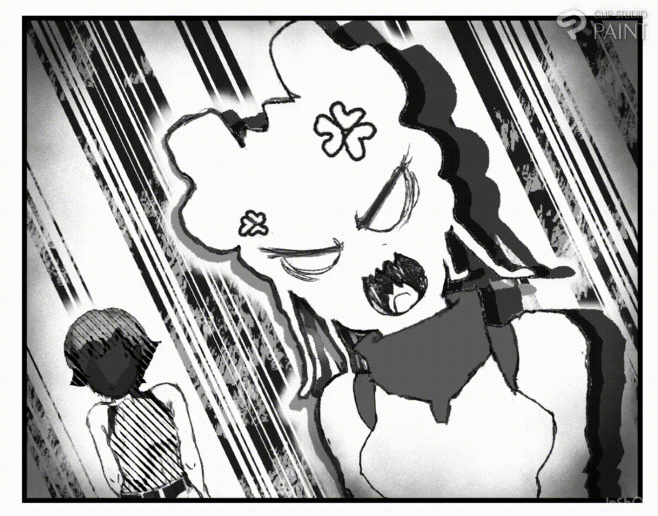
Whereas, some other times SPEEDLINES add to show Character shock
Also, speed lines are often added to the background of a scene to show awkwardness, depression, or sadness.
🔸🔸🔸
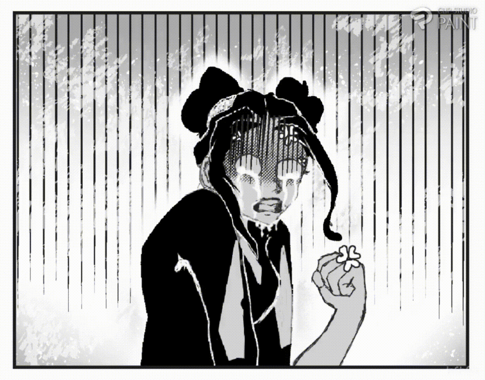
Using lines to shows shock to the point of death ( know as “scared to death.”), and feeling sick in the stomach.even tiredness Horizontal lines can mean the character’s attention is grabbed by something.
🔸🔸🔸
Using this symbol is very situational. Similar to backgrounds these lines and color fills represent the thoughts and emotions the character is feeling.
3] Speed lines is used to intensify dramatic action
If you as a newbie would ask can speed lines be used to make intensify dramatic scene, I will say to you…SURE! While speed lines are primarily used to show movement and speed, they can also be used to enhance a character's actions or events happening to the character.
🔸🔸🔸
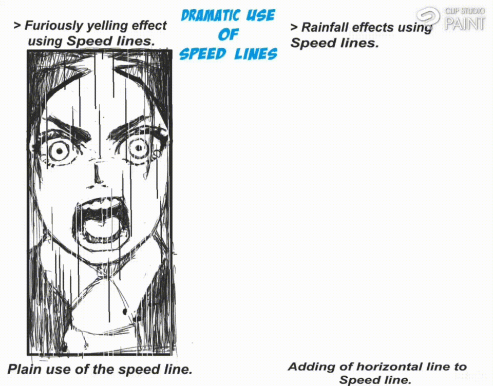
Mangaka's over the years also use speed lines also to represent when a character is yelling at the top of his/her voice or even raindrops in scene.
For the two above image the speed line are used is [Gloom speed line] and if you can notice or one of the two is an effect added to its horizontally that is to representing the splash effect when the Rain drops on the character.
If you may be wondering the settings I used the for the above manga panel, the settings is located below
Note:
Also that when you are placing the speed line or focus line or any effect for that manner on a manga panel, base on the background color used you can either make it the speed Line white or black.
🔸🔸🔸
The information I have shows that speed lines can be used to character's dramatizing determination, high spirit, argumentative or combative mood.
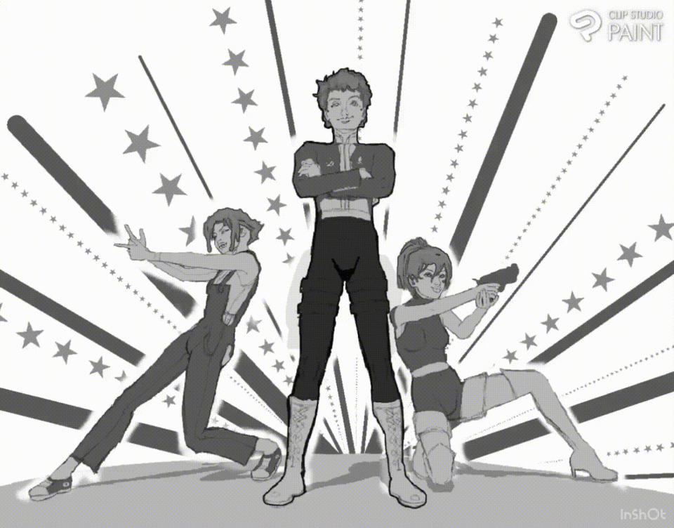
To achieve the Super Hero Background effect simple use the [Dark focus lines (curved)] Sub tool, add to sets of the speed lines, change the shape application of one of them to a [Star] shape (this can be done in the brush shape located in the [Sub tool detailed setting]).
🔸🔸🔸
• Way to which Focus lines can be used in CSP for manga
Focus lines are often been used by mangaka's to relay the following to viewers;
1] Focus lines is often used to center/direct the eyes of viewers
Focus lines are a powerful tool in visual storytelling.
They are often used to:
▪️ Direct the viewer's eye to a specific point of interest within an image.
▪️ Create a sense of depth and perspective.
▪️ Emphasize a character's focus or intention.
Take for example,
A female character standing at the center with different other characters charging at her.
🔸🔸🔸
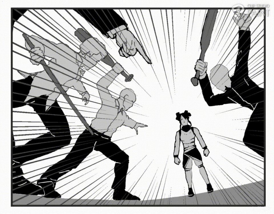
By strategically placing focus lines, artists can guide the viewer's attention and create a more engaging and impactful.
2] Focus lines is often used to show Character intensity
Focus lines are a great way to visually represent a character's intensity.
They can be used to show:
▪️ Concentration: Focus lines radiating from a character's eyes can emphasize their intense focus on a task or goal.
▪️Determination: They can create a sense of unwavering resolve and strength.
▪️ Anger or Frustration: Focus lines can also be used to depict a character's pent-up emotions, adding to the intensity of the scene.
🔸🔸🔸
And for the last aspect I would like for us to look at I called the combo event.
The Combos event : Use of both Tone and Focus lines
Some person new to manga creation may come to ask can one make use of both the speed lines and focus lines in manga,
Yes, you can definitely use both speed lines and focus lines in manga! They are often used together to emphasize action, movement, and emotions.
Like take for example
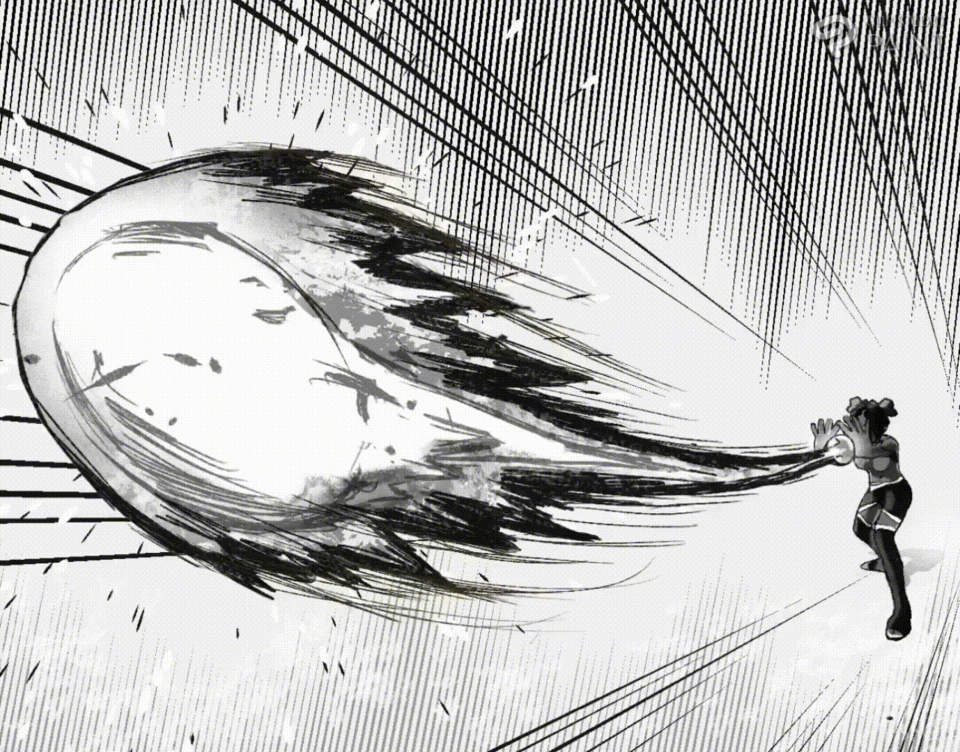
The manga scene both have the speed lines [Gloom] used, showing the intensity of the energy ball as it move away from the character,
Meanwhile the focus lines [dense focus lines] used shows the direction to which the energy ball is coming from and where it is heading towards.
🔸🔸🔸
• Why should I use Focus line in my manga [?]
▪️Focus lines are a great way to guide the reader's eye and emphasize important moments in your manga.
▪️They can also add dynamic energy and visual interest to your artwork.
• Why should I use speedline in my manga [?]
▪️ Speedlines are a great way to emphasize action, movement, and emotions in your manga.
▪️ They can help guide the reader's eye and create a sense of dynamic energy.
💥 The above illustration practical application:~
And with that said, today's tutorial illustration is concluded.
Conclusion
** Thanks to everyone, who patiently when through this article, I hope you were able to learn one or more tips to better your manga creation, also try and repeat the above process one at a time yourself, for practice makes perfect. I would like to know you thought, please do leave a comment and I will reply as soon as I see them, so for now I bid you Ado….** byeee


Commentaire