❖ Clip Studio Paint x Instagram Webtoon ❖
I've seen lots of tutorial here focusing on tips & tricks to create a webtoon vertically.
Obviously because it's what most of the people need to learn and start making their own digital comics nowadays and the very common format is vertical scroll reading style, which is meant specifically for smartphones.
So, what's the deal about webtoon via Instagram?
I am focusing on making a tutorial for those who seek a knowledge and understanding to design their own content through and as a comic.
Whether you're looking for something absurd to brighten up your lock-down or you're looking for something too deep to get you thinking about your place in the universe, Instagram is also a 'home' for you, fellow fantastic artists to create some of the most unique and exciting comics available online.
Vertical -VS- Horizontal Reading Format

Popular image sharing app Instagram introduced Carousel about two years ago long before Covid-19 outbreak. Carousel allowing users to add up to 10 images or videos in a single post. Which, naturally, brings the idea of the posts being able to tell a narrative story as pics could be connected by theme of start to finish of an event or location, from a daily life of a celebrity down to info-graphics about current pandemic.
With the veritable cornucopia of art and comics being created and made available across the web and even popular on social media such as Instagram, alternatively from others which teach 'How to do webtoon' in a comprehensive mainstream way, it can be an interesting topic to teach which techniques are actually and equally worth a shot to create our simple 10 slides as a horizontal reading format webcomic using Clip Studio Paint and post it online through your social media account!
I've recently discovered the world of Instagram comics, and my only thought is: where has this been all my life?! I'll admit it—Instagram is probably my favorite social media, and I'm always looking for an excuse to add some adorable goodness to my feed and search for new trends and information.
As a self note: last but not least before we start, publish comics to Instagram regularly, and you should notice them and see they will grow (not just followers but also your confidence and talents!) then we can be part of those creative individuals who share informative contents, positive stories, not hoax and stressful dramas because of pandemic crisis.
My background history as webcomic researcher, writer, and also artist:
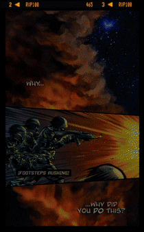
Animated gif above is an intro to my unpublished webtoon from 3 years ago. It's because I had no time, no team, and not enough resources back then while I took my master degree in Taiwan - I released some episodes only for my Professors to see the concept of my thesis about 'Vigilante Themed Webcomic - Creating Social Movement by Challenging the Readers Perspective', I had to wrap up my dream of becoming a professional webtoon artist since I wasn't able to maintain my daily life after I lost my scholarship.
Fast forward to 2020, I begin to realize my potential to become webtoon artist still lying dormant somewhere in my heart and I promise myself to focus on what I can do right now with my fiance, Grace.

Currently we make a fun and relaxing webtoon series about daily life, sheer hope, motivational words from Bible, proverbs or famous people quotes - even informative topic to help others with Clip Studio Paint.
Animated gif above is one of a few webtoon examples that I made with Grace as my colorist especially for this tutorial and can be found in my Instagram page below:
Thank you very much for your love and support, Grace!
This month, she's using her #workfromhome time to create comprehensive tutorial about Chinese painting with her thematic idea about fighting against Covid-19, below is one of her doodle to share with her coworkers who also working from home and if you're interested to see more of her tutorial, you can check with the link I provide:
K I S S
So most likely this is your first time doing webtoon (vertically or horizontally) or you've been a webtoon artist before; you're always going to come across obstacles. Afraid not; you're going to learn lots of things along the way although you might stumble upon something. All you gotta do, try not to think too much nor not expecting too much, and not giving up too early.
The first common issue for us, the artists, or even the story writers (and as for me, the tutorial maker): what will the story or content tells about?
My solution; KISS = Keep It So Simple. The simpler you keep it, the better it will be.
To make it simple it means you will need this one element: Flow.
The story or content is easy to read and follow on mobile devices whether you're doing it vertically or horizontally - but for this tutorial, it's a horizontal or swipe left mechanism will be our main concern.
You might think it's easier to make swipe left comics rather than vertical scrolling format, but doing a bunch of illustrations with a continuous plan for reader's engagement might get you a little struggle. Creating vertical webtoon might seem easy at first but- believe me; it's a longer tedious journey, you will eventually face multitude troubles to be consistent and persistence.
So why don't we take a small baby step instead as a practice?
[ I ] Panel or Slide arrangement
Lay out panels horizontally. Here's my trick to do the 10 slides of Carousel, actually from animated gif below, it's only 4 slides total. But I think you'll be able to do 10 slides by yourself - practice to do so and start creating your own Instagram-able comic.
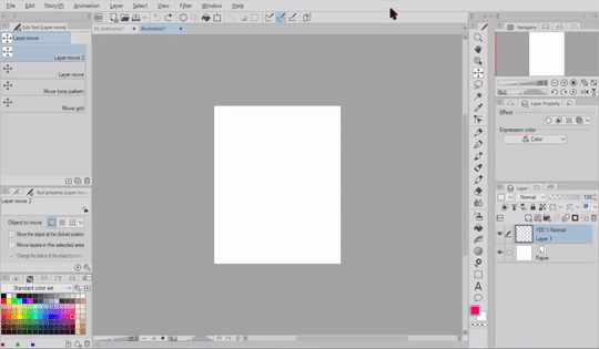
Explanations below will help you to understand better. Animated gif above has been sped up for 3 times in order to make the size of the gif smaller and can be uploaded here.
( 1 ) Actually I start with a new document, 300 dpi for resolution (so I will be able to print for it later purpose) with this following dimension to keep in mind:
H (height): 1350 pixel
W (width): 1080 pixel.
( 2 ) Here's the most important part, you need to make a new layer, choose any bright color (I use red) then hold [ Alt ] button then press [ Backspace ] to fill the canvas automatically. Trick will be continued on step 4.
( 3 ) Edit -> Change Canvas Size. From this stage, I'd like you to think mathematically for a second. Now [ 1080 ] pixels is your width, in order to make it longer, you can drag the side of canvas manually but it would be better and fit perfectly if you just type [ 2160 ] into the Width box. Because it's 1080 x 2 = 2160.
( 4 ) Now if you have the layer with red color (or any other bright colors you had), just simply copy [ Ctrl + C ] and paste [ Ctrl + V ] and get another Layer 1 Copy then with [ Ctrl + I ] you will get the inverted color. Move the green color and zoom in to see whether the red and green colors separated exactly side by side!
( 5 ) After you get all of 4 different colors side by side continuously, you can drag the layers into one folder to manage the layers easily for later use.
Q: But why start with [ 1080 x 1350 ] instead of [ 10800 x 1350 ] pixels?
A: If you start a document with 10800 pixels, you wont get the 1080 pixels color separation that will help you for cropping the image later. Because to easily crop images, please take an example gif below.
[ II ] Crop & Export panels

If you already have your 10 slides ready to be cropped, here's my trick for you:
( 1 ) Find your red/green layer that you fill with the solid color.
( 2 ) Hold down [ Ctrl ] button and [ Left click ] to the layer. It will bring a selection screen.
( 3 ) Choose the [ Crop ] and then click OK.
( 4 ) File -> Export (Single Layer) -> choose either .jpg or anything you wish.
( 5 ) Give the name to your image. And you're done!
! Attention !
You have to press [ Ctrl + Z ] to undo your last action (crop) and get back the 10 slides again. After that do the same from step ( 1 ) to ( 5 ) to the rest of the layers.
It's only 10 slides, so manually do that as a repetitive task won't be too much trouble. I have my own trick that will do faster crop with Photoshop, but I don't know if it's allowed to share it here; since it's not Celcys software.
3C = Carousel Comic Creation
Here's my Carousel Comic Creation recommendations:
The carousel format allows you to showcase up to 10 images or videos within one page, each with its own 'canvas' to create, comic artists tend to say 'panel' instead. With more creative space within the panel, you can highlight continuous daily life (or we call it slice of life) stories, showcase specific details about any situation, drama, or even handy tips. You can tell a story about your relationship that develops across each page in the carousel.
/// A powerful way of getting your story or webcomic told.
Image and motion comic recommendations:
Minimum numbers of slide is 2 and the maximum is 10 slides.
Image file type: jpg or png (animated gif will not work)
Image maximum file size: 30MB
Video file type: mp4 or .mov with maximum file size 4GB
Video length: up to 60 seconds
Recommended resolution is at least 1080×1080 px
Carousel ratio: 1:1
Text: two rows of text will display. However images that have more than 20% text may experience reduced delivery.
Technical Requirements:
Minimum image width in pixels: 500
Minimum video width in pixels: 500
Aspect ratio tolerance: 1%
Minimum image and video ratio: 4:5
Maximum image and video ratio: 1.91:1
Minimum video duration is 60 seconds and maximum is 2200
Maximum number of hashtags in text: 30
- 4 panels comic -

As you can see from animated gif above, there are a total of 4 slides with simple background colors made with only using [ Tapered Watercolor ] and [ Rough Wash] then carefully brushed for blurry edges with [ Wet Bleed Blender ] to make a unique and stylish artworks. I had the idea from 4koma comic panels and decide to make one based on the Bible verse because later on, I'd like to print the artwork to sell on my church bazaar (but cancelled due to pandemic).
- Diary Carousel -
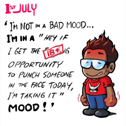
10 slides dedicated to show how emotionally broken I was.
If you notice from animated gif above, only the cover image that I had a little time to color, the rest of it; I've been using [ Tappered Pen ] and a bit of [ G-Pen ] to add some details. Those images done within less than an hour; a quick desperate comic or let's call it the Diary Carousel to express my broken heart after a fight with my lovely Grace back in July 2019.
My point is:
1. Create an emotional pieces based on your true story.
2. Not necessarily needs to quote from Bible or anything, but if you feel like it; go ahead find some motivational words out there, share good & positive vibes only!
Because as I stated before; it's supposed to be a positive webcomic or webtoon - although you might be in a troubled heart - spread warmth message, not trashy words. This world full of desperate situations already.
If you're interested for a merchandise, even your simple illustrations for the webtoon can be printed into a card - even for me; a magnet fridge like what I did below.
Text -VS- Handwriting
I'm not against using Text tool, but with this chapter; I'd like you to think about which one will be a practical way to deliver a message, with or without balloon text through your comic.
Obviously it has pros & cons when we try to put words into our comic panel and because I used to do everything without Text tool, I feel more freedom to use my own handwriting for every images I had.
Below is the proof I try to 'trace' my own handwriting composition with Text tool, and it's kind of dissatisfy for me personally - although I use [ Blambot Pro ] font, mostly designed as far as I know for popular western comics.
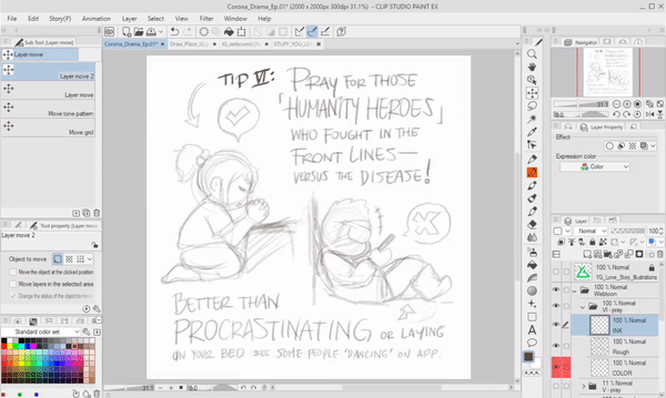
To break down what I 'hate' from using Text tool:
1. You need to carefully use font, some of the fonts might be considered not really good for display, even [ Blambot Pro ] has it weakness for the alphabet 'P' which looks like a 'D'.
2. When you stretch the font (without using Shift key) to make it looks taller or we call it 'condensed' font by force, you'll notice that it's destroying the beautiful aesthetically type - even worse consistent design of it.
3. Time consuming. Yes, you might argue with me, if I had a typo while typing or missing some words, then it's easier to just retype the sentence, right? But think again; how many steps you need to adjust and (personal experience) be perfectionist about it?
Now, below will be the comparison and also some explanations:
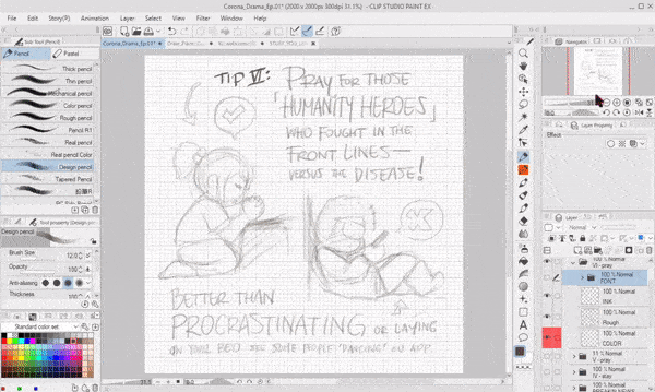
To tell what I love with handwriting and [ Pen ] tool:
1. Be uniquely you. I use my own modified [ Calligraphy ] Pen tool to suit the angle. Using fonts might seems faster and neat. But then, in terms of finding your very own style; handwriting adds value and dynamic - even emotion - into your comic.
What if I had crabbed handwriting? Here's my pro tip for you:
2. Use [ Grid ] because my handwriting can be messy too although some people (including my fiance) told that my handwriting already neat; so in Clip Studio Paint, using Grid is a necessity!
To do that; on the Menu bar, choose [ View ] -> [ Grid ]
3. Less time consuming + freedom. Practice your handwriting alongside with flexibility of position; big or small, tall or short - think those 'words' into graphics! And the way you write is the same beautiful way to draw alphabets! You can even trace any font and modify them a bit while tracing and say it's your handwriting, right?
Tips: everything can be easily moved, scaled, even reposition by [ Lasso ] tool and transform with [ Ctrl + T ] or Mac [ Cmd + T ].
Grid will help you to see whether your handwriting was not perfectly balance (see the 'Versus the Disease' sentence) using Lasso tool then transform will fix that eventually.
Keep Layout Consistently
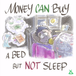
Gif above is an example of good balance 'Money can buy' text that still in the same position - but as you can see the bottom text composition is a bit off. Actually it's because I wish to create an expressive message with the same title about 'money can buy'.
This is my tips to keep some parts of your comic remain consistent inside Clip Studio Paint. If you're a designer, you might have an itch if you see something misplace even for a bit or with less balance into the composition or layout of any design.
Here's some tips how to do it:
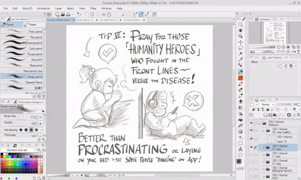
When we're talking about webcomic or comic composition in general, we might want to produce well-balanced image moreover if it's an informative story-telling like the one I'm making right now about 'Handy Tips to Protect You From Covid-19'.
From animated gif above, you can see I keep on 'tracing' some parts of the previous drawn page. Because the words position somehow in a good and well balanced composition; I keep on drafting (sketch) with a new layer and make my previous layer around 20-30% Opacity.
Remember that [ Grid ] is always important no matter what, if you had an excuse that it's distracting eyes, you can easily hide or turn it off later.
For the images itself, I try to keep every elements intact, but avoid tangents.
Tangent is the straight line that "just touches" other lines at that point. So I'm avoiding the graphic elements that will "touch" the words. In order to make the graphics not too close with each others, I use [ Lasso ] tool then move it around with [ Move ] tool, sometimes I need to make it smaller to create space or room so the final image will not too much complicated.
Tips & Informative Webcomic
Instagram can be one of many medium from social media to spread fastest news - because everybody suddenly become a writer, a journalist, an "influencer".
Any kind of news, whether a valid one - but also lots of false information or we call it hoax. As an artist and also a visual art teacher and designer; I try to make use of my Instagram account as a place to spread positivity and share my knowledge to my students.
Using webtoon or webcomic always one of my strategy to make an engagement to the classroom inside my presentation slides; the biggest audience will be my grade 8 students.
When talking about specific topic about human history of love and affection, even I create a comic about prehistoric lesson of man chasing his girl as an introduction to the class.

Instagram carousels are a great tool for storytelling. But learning how to use Instagram carousel for effective storytelling is truly an art in and of itself. Media publishers often use the feature to accompany articles, or as a story all on its own.
Doing an informative webcomic seems less stressful than a continuous story - because it has the same principle with comic strips, daily or weekly; it doesn't even matter as long as you post regularly. But if you don't feel like it, that's fine. There will be no strict rules over the way you post but I keep trying to enhance my artistic venture and content making every day.
That's why, in order to get better engagement from your audiences or readers; you need to:
1. Knowledge / Info.
2. Entertainment / Fun.
3. Problem solving.
4. Positive vibe.
Q: Why knowledge?
A: Do you love Instagram as much as I do? Unlike most social networks, which can be fun but can also be frustrating, Instagram is a go-to stress reliever for me. If you add knowledge to the post, you'll getting more attention (but some people stick to selfies) - I'm not against selfie, but if it's too much; what's the point? Yes, the make-up could inspire me, but what else?
Q: Fun?
A: Everybody loves to be entertained, right? Even me. I love to see dancing corgi or sneezing bunny. So placing a little fun pictures, cute and expressive characters, even meme stories, will always getting more likes than sad ones.
Q: Umm... I have no problem. Thanks, I guess?
A: Problem solving is not for everybody, but everybody got an issue or two. If you put some solution into your comic even if it's not meant to be a full scale tutorial, tips or tricks can brighten up a day for someone. You don't believe me? See your discover page. There's plenty of design experts, aspiring artists - trying to teach everyone else something.
Q: Positive vibe?
A: You don't need to question this, seriously. Or do you love to see the world burn?
To summarize everything for creating informative Instagram-able webcomic or webtoon, here's 7 things I (still) learn throughout my personal experience:
1. It takes time. Eventually you'll spent more time on getting the idea than actual creation.
2. Ideas can be anywhere - so always bring a notes with you. Even notes app can do.
3. Morning inspiration had better way to bloom than you need to stay awake so late.
4. Mindfulness means you have positive thinking while making your content.
5. Share your ideas to get some feedback or insights before publish or post.
6. Dare to post encourages you need to create something: NOW-!
7. Keep it consistent. Learn new things along the way, but post frequently.
No Balloon No Frame No Problem
Balloon text is part of every webtoon as well as frame and borders, no doubt about that - but as for me, I mostly drawn my own version of 'balloon' because my current Instagram comic will be consistently using no balloon and no frame at all to indicate that I had my own preferred comic style-as an excuse of 'just being lazy'.
I found my own way to make a frame & balloon but it might not suits you, this is just my techniques to speed up my creation.
Below is my personal tips to any creative artists out there who still need to use balloon or frame but without spending too much time to cultivate text, as well as comic frames.
[ Vector Frame ]
First, you can create your own comic dimension. As I stated from the start; we'd like to keep on making a swipe left webtoon. So I start my document with 1080 x 1080 for Width & Height.
300 Resolution isn't absolutely necessary if you just wish to upload on Instagram or webcomic series. As for me, sometimes I print them out to be a merchandise so 300 is an absolute for me. You can always Register to preset if you think it's useful for future release. Just check the Resolution and Paper color if I were you.
Next, please find Sub tool [ Figure ] to be able create our frame. I choose [ Direct drawing ] tool then pick [ Rectangle ] as my frame design.
Once again, I will not discuss about using actual [ Frame ] from Clip Studio Paint because other tutorials already focus onto that matter. And what I am doing here is completely focus on speed and efficiency. Editing on comic frames usually will take you a lot of time.
Now please see carefully the settings I had above for the Tool property of the selected Sub Tool Figure for the [ Rectangle ] so you will have what I wish to teach you.
Check Roundness of corner, I choose 10 but you can play with that later to see the difference.
Choose Line/Fill in the middle. It has Line but no fill.
Besides Brush Size there is a little button to make your Line attributes different in both looks and style. Check the [ Random ] option and you'll get the messy or unstructured version of line and also play along with the [ Minimum value ] to see the variety of randomize Line drawing. I choose 20 so it's kind of stable.
Now turn on (check) the Aspect type and here you can choose between by percentage or pixel dimensions. I choose pixel type and type 1000 for W and H.
Before getting excited to create your own frame or border, please choose [ New vector layer ] first rather than [ Raster] layer! So later on, you still have the ability to adjust the line weight, thickness, and everything in between!
As you can see on my image above, I [ Left click ] on the canvas and with the selected W & H for 1000 pixels; I got the exact square. But the position is somewhat off (not in the center).
To fix that, simply use Tool -> [ Operation ] and choose [ Object ]. When you click on the vector layer, it's automatically has the blue lines which can be useful as the guide-box when you're doing an editing or adjusting later.
Last but not least, here's what I'm doing to fix the center. By zooming into enough and proper scale for my eyes, I can meticulously adjust the top-left blue lines to somehow fill the edge of canvas with nudge (using directional arrow on my keyboard) and do the same for the bottom-right. Now you have the perfectly center and rounded square!
Actually I prefer to draw everything by myself, even for the frame, the narrator, the balloon text trails. You can see from my example below. I use simple drawing style for the frame and also text 'trails' or 'tails' to point who's talking without drawing balloon text.
Handy Tips to Protect You from Covid-19
This closing chapter is our dedication (me and my fiance: Grace) to contribute ourselves not just for showing empathy to what's happening to the world but also a gratitude to the medics. A little webtoon about how to deal against Covid-19 outbreak. You can simply read that as a vertical scrolling exclusively here - of course in my Instagram, you need to swipe left.
Reduced air pollution in China during the quarantine is estimated to have saved 77,000 lives (source @forbes). People are coming together online to support each other, and to learn if they can't physically. I feel for those who lost loved ones during this crisis, or lost their job/business. I really do. But we have to be honest with ourselves, there is one beneficiary to less human activity, and it's really clear who it is.
The planet.
You might be thinking, but Fu, how does online education save the planet?
Well, indirectly. Here's my (incomplete) list:
smaller schools and facilities needed
less travel pollution
less paper needed
more knowledge worldwide ➔ increases awareness about our planet and resources.
The reform of education has already started. School were just ignorant. Now everyone knows it's possible. After this enemy is gone, we will have to rethink how we rebuild our society.
And before anyone attacks me: I empathize with those who suffer, with those who lost someone. This ideology is not about ignoring them. But more about just a thought that I had that maybe, their suffering isn't for nothing. It may be for a better future. They may be the ones who are saving this planet and humanity.
Everything is connected to everything. This is a crucial moment in human history. Will we re-think what the word “human” means?
What would you create for your comic content? Is it a series of every day life? Fun and comical way of telling romantic story? Tips & tricks for digital or traditional drawing?
It's very interesting to hear back from you. Hope my tutorial brings something good and different into the table of webtoon and webcomic creators. Which in hope to release some artist's burdens whether she or he needs to start from something.
: Afterword :
Thank you very much for looking into my tutorial. We pray for your safety and well being as well wherever you might be in this planet Earth. God bless and protect you, fellow artists and... Human.




コメント