Hand Gestures and Simplifying the Hand!
Introduction to Hand Gestures
Hey everyone! I'm Leriisa, a hobbyist artist. I want to go over the process of giving life, energy and flow into your hands so that you can unstiffen those poses and enhance your hand drawing skills greatly!
And although many of the drawing improvements does come down to multitudes of blood, sweat and tears (or cough, PRACTISE), there are many useful tips and tricks that can benefit anyone who would like to come to love drawing hands because let's face it, hands are unique and versatile and we always wonder how some of our godly art friends seem to have all the beautiful hand poses and expressions!
So let's follow my tutorial step by step from foundational form to expressive gesture!
Structure of the Hand
While I will be covering the fun part - gesture of hands in later in my tutorial, I do think proportions and construction are the nuts the bolts of making hands look real while retaining a natural, flowy feel.
The average proportions of the hand are simple, a 1:1 ratio between the length of the palm and fingers. In a relaxed pose, the fingers will fan out slightly, forming an arch, with the middle finger being the longest. The thumb pokes out from a triangular insertion on the side of the palm. The thumb will extend past the palm in the neutral position!
When in doubt, block it out! For added structure, I like to start with a slightly curved upwards square block for the palm and a glove or mitten (or, if you're hungry, an icy pole shape) for the fingers.
Its okay to treat the hand like a toy hand with different parts to make it easier to draw. I find that separating the parts in a concrete way helps me not come up with any squiggly fingers or jelly looking palms.
Creating Flow Using Simplified Shapes
Naturally, the fingers spread out like a fan, not like a mitten, so we can use such to simplify and think in terms of primitive shapes. It's usually very difficult to draw the hand from our heads, but fun to draw loose shapes!
And then it is easier to render out each finger, refine edges and add wrinkles because our 'wire frame' has already been established.
People like to gesture using their hands differently. To portray mood, we can use SPACING between fingers, such as bunching the middle and third finger together, to create an aesthetic look (especially for females), pointing the pinky finger far out, or any combinations you can think of!
I suggest anyone who wants to improve their hand poses and expressions to study photo references and other inspirational artists' stylised hands. You can try to place a fan shape between the fingers to find out their favourite poses! After all, the best way to practise is from real life and the best masters / professional artists.
Notice how the index finger is naturally the leader of the pack and the first finger to open, as well as the last finger to close when we grip our hands. In many hand poses, it is the most straight finger.
I also like to create a pentagon shape to directly map out the placement of fingers and find the gesture in the overall pose.
How to Show Force?
Force is crucial to show how much pressure is being exerted into a hand pose.
For example, knuckles in a lightly held fist form a straight line, whereas force would create an arch in the curled fingers. I would also add more wrinkles to show the compression of skin. In addition, in a pose where fingers are jammed flat against the surface, such as on a model who is using her arm to support her body, harsher and stronger angles are created between the palm and fingers, creating a "L" shape.
Having a mixture of bent and straight fingers creates a dynamic and action focused pose (such as scissor hand pose, pointing), rather than naturally fanning of fingers seen in a relaxed hand.
Much like creating liveliness in a gesture drawing, we can also keep in mind that hands can be exaggerated through twist, pinch, stretch motions. Creases on the palms will also follow this motion, like a 'line of action'.
The first hand shows pinch, the second shows stretch and a little bit of pinch. The third hand also shows pinch and the forth hand depicts the good old 'twist'. You can tell that there is a twisting motion occurring between the fingers because both the front and back of the hand is visible.
Foreshortening and Overlaps
This section is about how to integrate poses in perspective, which would require an understanding of how a primitive volume, the cylinder, can be manipulated in space. We can use the gradual increasing length of the finger sections and 'overlaps' to showcase that one volume is closer and in front of another volume.
Please note that this is definitely not easy to master, nor am I the most skilled in this area!
Perspective of cylinders and ellipses can be learnt through videos online, or art books.
It is very helpful to draw circles or rubber band contours around each finger to help you think in 3D form, assisting you to not fall into a trap of a flat looking pose.
One also cannot understate the importance of overlap, which is when an edge of one volume intercepts our ability to see another volume behind it or further away from our vision. For example, we can see all of the first car lined in a car park, but only partially for the rest of the cars behind it.
Think of a hand reaching out towards you. The angles and width of the circles (ellipses) will change in relation to its distance.
The finger nails also wrap around the fingers and are especially affected in a 'flattening' way, in foreshortened poses.
In addition, the fingers aren't really cylinders with no change in angle all the way through, they can be like 'banana' shapes and you can see both the top and bottom of the hand at the same time, which is definitely confusing to draw at first.
While our fingers can't bend back too much, the flexibility of our thumb cannot be underestimated! You can literally hook something with its profound bending abilities.
I like to use rotated ovals or rounded triangles to start a pose that is heavily foreshortened. Then, I will draw the thumb, and finally, join the fingers back to the palm, using rounded line weight to emphasize the base of fingers, where light cannot reach.
Posing the Hand with Objects and Items
When drawing hands holding objects, it is important to create a sense of the hand conforming around the item, if the palm is supporting it. We don't want it to look like that phone is ready to slip out any moment and be cracked! If the character is holding something using just their thumb and index finger, you can spread the other fingers out, bunching them to create an elegant or quirky look.
Shape language can still be used for appeal, the hand of a female tends to form a triangle shape, whereas for males, it is more rectangular or square and their fingers are also more thick.
Showing force is easy! Forced fingers can have a lot of sideways mobility. In other words, depending on grip strength, the fingers can form a diagonal angle with whatever object it is holding, rather than staying perpendicular.
There will be a side-ways 'push pull' motion going on. Since diagonal lines naturally give an image or composition a sense of dynamic action, it also makes hands look more natural and interesting.
Putting the Process Together in CSP
Lastly, I will be showing you my complete process and tools to layout a hand drawing in Clip Studio Paint and although it isn't entirely related to hand 'gesture', I will also share my painting and coloring timelapse. Thank you so much for reading up to now!
>>> Blocking out the rough shapes
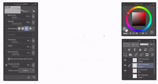
I usually start with simple shapes, block out the palm and draw the main angles and positions of the fingers. I will use a faint gray, large size pencil to make sure I don't delve into details.
The pencil I am using is created by professional artist Redjuice and available for free in Clip Studio Assets. You can download it here >>>
>>> Outline / line art
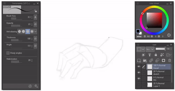
I lower my opacity of my sketch layer to around 20%, and create a new line art layer on top. Now, I will select a pen and add the details, refine edges etc. Depending on complexity, I may add one more sketch layer before this step.
>>> Color fill
Make the rough sketch invisible. For the coloring step, I create a layer below the line art layer. Then I choose a color that is easy to see, such as a saturated pink. You can use any consistent, full opacity pen to draw around the edges of the hand and then fill the hand using the ' Fill tool', just make sure you've covered all the gaps!
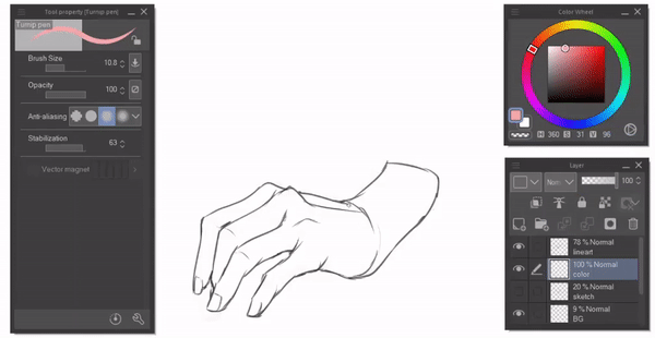
We can use CSP's preserve transparent pixel tool to paint only in the pixels that we've already painted. I then use the fill tool with a slightly desaturated peach skin tone.
>>> Gradient
Using a soft airbrush (default one), I will carefully add darker saturated pinks to the nails and tips of the fingers, knuckles and surrounding areas. These areas tend to be warmer in tone compared to the rest of the hands.

Now, I'm changing the color of my line art. Finally no dreary blacks! Preserving the opacity of pixels in my line art layer, I can change and even make gradient colors in my line art. I'm setting the layer mode to 'multiply' for a greater effect.
>>> Rendering to the main light source
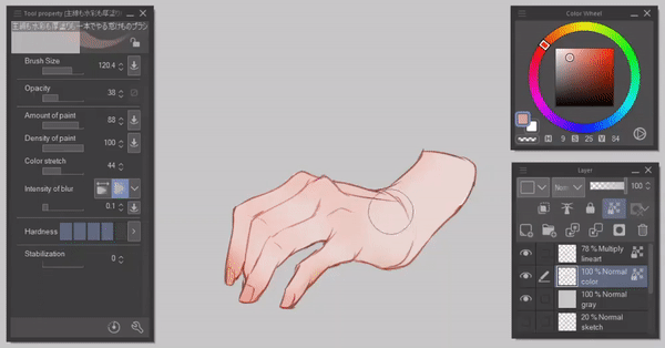
I am using a watercolor brush, set at a low opacity to block out the major volumes that are unreachable by the main front light, such as the back of the hand. I use less saturated colors here.
>>> Shadows and painting the darks
Using a thinner painting brush and a darker skin tone brush for the shadows, I will add darker values to the planes of the fingers and palms facing away from the light, to create a sense of depth. Make sure to use the clipping tool over the base colors so that any brush strokes won't reach outside what you've already painted underneath!
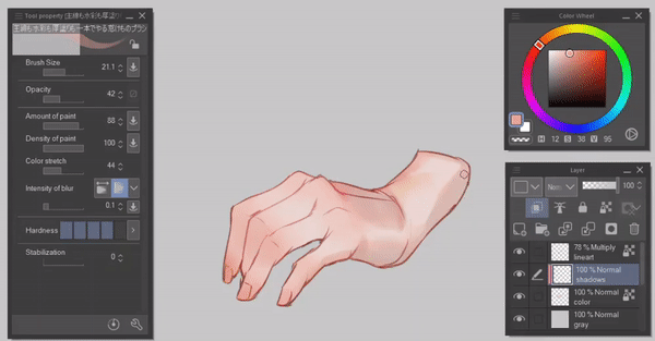
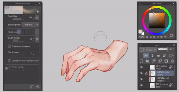
>>> Bringing some lights back
So I made some parts too dark, but its all good. An additional step here, I've decided to make some major areas lighter using the soft airbrush and a very light skin tone, setting the layer mode to Overlay.
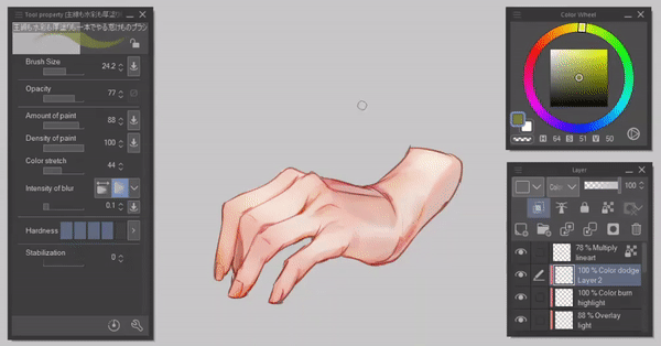
>>> Highlights and backlighting
To make the painting more interesting, I will use a secondary light source coming from the back of the hand, away from the viewer. Setting the layer mode to 'color dodge', I use a yellow-green color for the light. I then bring light into the planes that are facing towards this light source.
Then I render some more and...
. . . DONE !! :)
Thank you !
Woaahhh, you've made it to the end of my hand drawing tutorial, congrats! ٩(。•́‿•̀。)۶
Thank you so much for your attention and time, I hope that I have rekindled a light in you that makes you want to draw more hand poses and expressions and hopefully you've found my process for hands helpful!
This is the first in depth tutorial that I've attempted to make, and with CSP. I was worried about how daunting a making a tutorial seemed, especially about anatomy, but I really enjoyed the process! Plus hands are one of my favourite things to draw, so I've so grateful to have this opportunity to share with you guys the ideas and knowledge I've collated so far.
I'd greatly appreciate your support if you liked my content! (´。• ᵕ •。`) ♡
I'd be glad to hear out your suggestions in the comments below.
You can check out my stuff at @leriisa on Insta.
- Leriisa




コメント