
Understanding body volume
Before choosing colors, it's important we address shading. Even if you're not using the grayscale method* it's vital to keep the volume in mind in order to know where to apply contrasting or soft shadows.
*Grayscale method is when you finish a monochrome painting and only then color it. Staying in monochrome colors helps keep track of the volume.
I'm not gonna linger on this for too long and shade several body types, but whatever character you're doing, you should be able to tell which parts should be highlighted and which parts shouldn't. An exercise that could help is drawing circles or a net around body parts, visualising the estimated volume.
If you know what's protrusive and what's not, you'll also be able to apply complex lighting.
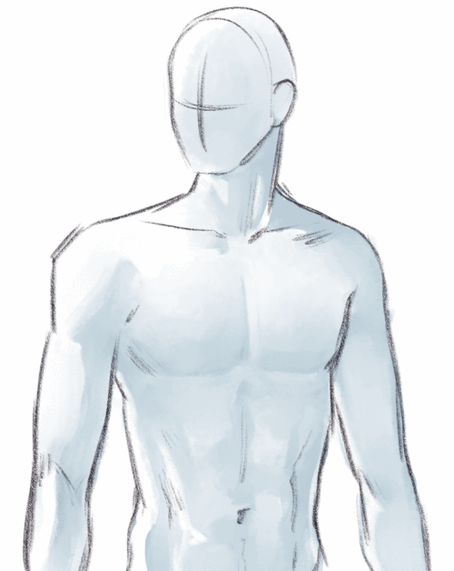
Conveying volume
As for the shading technique: you can do whatever's best for you, skip this part and go straight to coloring, but before that I would like to share some tips that would be helpful for drawing humans overall, no matter what color the skin is.
1. You should be able paint both soft and hard shadows.
Hard-edge shadows can be appled when the object has a hard edge or when the light is so bright the cast shadow becomes very sharp. Human bodies are mostly soft, but if you're drawing something like muscles, hard edges will help you in adding definition.
What I like doing is drawing general shadows first with a hard brush, and then touching them up with a softer brush, where necessary.
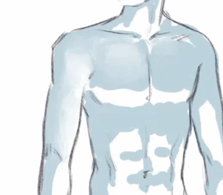
2. It's the edge of the protruding part that's dark, not the area that comes after
This is a tricky detail, that, once you master it, will improve your shading greatly. Whenever you're drawing chest, pecks, or anything else like that, keep in mind that the area behind the prominent part will be lighter.
3. As a touch-up, you can use airbrush shadow on the edges
This technique should be applied carefully and touch only the utmost outside, but if used correctly, it'll make your drawing “pop” more.
Shading the face
Face structure is very complex, and shading it can be a chore. There is, however, a very quick method that'll get your face from stylized to semi-realistic pretty quick.
First, identify the areas that are definetily intrusive. Usually that's the area under the brows, under the nose, under the lower lip and the upper lip. You can use a hard brush for shading those. A small streak on the eyeballs can make eyes appear more expressive and deep.
Then, with a soft brush, outline the cheeks. Add highlights, and here you go, shaded face with the light source somewhere up above. It's the combination of different shadow «textures» that adds nuance to the drawing and makes it more realistic.
Shading the face: details
Just like there are different body types, there are different faces too. Nuances in shading will convey these differences, so you should keep the actual form in mind and shade accordingly.
For example, there is a difference between monolid eyes, hooded eyes and eyes with double eyelids…
…Pointy noses and round noses…
…And soft round cheeks and prominent cheekbones.
Shading: conclusion
Now we're finally done with shading and can proceed to coloring. Knowing the shading principles, all we have to deal with now is how to choose the right palette and how different skin tones might interact with light.
Keep in mind that no colors recommendations are set in stone, since skin is somewhat reflective and its color might depend on the environment's palette and the nature of light source.
Painting pale skin
Pale skin is the most reflective type. It holds little to no color of its own, and you can mix it with colder hues, anything from purple to green. Even if you're painting lively pink skin, you can still drop hints of blueshness here and there, since thin pale skin makes the veins more visible.
For shading, I choose bright warm hues, if I want the skin to be rosy, or pale beige hues if I want the skin to have a cold undertone.
In both cases I don't shy away from using colors that aren't usually associated with human skin, such as green or blue. However I apply them fairly softly, so in the end they don't stand out, but compliment the whole palette. For example, if you pick a green color and use it with lowered opacity, it will still appear green in contrast to warm colors nearby, but if you eyedrop it, it will actually be brown-ish, thus not looking weird in the illustration as a whole.
Blood is more visible under pale skin, so such areas like fingertips, lips, nipples are going to be pink.
If you have a bright light source and a colorful background, a fitting finishing touch could be painting with a soft brush on top of the pale skin, to make it look shiny.
And that's how you get painted pale skin!
Painting medium light skin
Medium skin is still quite reflective, and can absorb a lot of the environment's light, but it has its own base color. That's why we can use warm, brown colors more confidently, even if the overall lighting is neutral.
Don't forget about highlights, but be careful with them. Remember that they should be on the areas that get most of the light, such as: tip of the nose, shoulders, muscles, etc.
If you lighten the skin too much, you'll lose it's original color and, likely, volume too. Keep in mind that besides shades and highlights you also have the base color, or the mid-tone.
Note that nipples aren't going to have that bubblegum pink color. Instead of that, pick a darker color, something closer to brown (or whatever's the base color).
To make the painting more picturesque, we can still add some blue hints. Choose deep hues for shadows and pastels for highlights. I recommend purple or blue colors.
With that, medium light skin is finished!
Painting dark skin
Dark skin is a hard case, but only because there aren't many tutorials on painting it. Let's try to avoid common misconseptions and paint, looking at real-life dark-skin models. Sure, darkest tones absorb most of the light, but it can still look bright and colorful.
This is why, when picking colors for dark skin, you should try to avoid ashy, grey colors. Unless you're painting an undead or a vampire, of course.
In this case, highlights might appear too dark to you on their own, but they'll shine compared to the overall tone, so pick deep colors freely. If the base color is warm, try picking light brown, yellow hues. In case of a cold undertone, use purple or pale velvet hues.
Don't forget about the shadows: and even though they might get borderline black, some reflected light is still possible, especially in a well-lit environment.
Actually, if the light is strong enough, you can add additional stroke of pastel highlight. Make it centered and dense, to save the original base color. I also advise to choose a textured brush, anything from a spray airbrush to a soft pencil brush will do. This will make your skin appear more rendered and realistic.
Remember that the darker the skin, the starker the contrast between the overall tone and palm color! The inner side of hands and feet doesn't produce melanin, so even if the skin is otherwise very dark, these areas will remain light.
The lower lip can also have a lighter color, although the exact hue can vary from warm brown to pastel rose.
And thats's how you paint dark skin.
Color correction
Are you finishing your illustration, but something seems off, or the skintone doesn't look right? Try some of these touch-ups.
The overlay method
To make skin more saturated and colorful, create a new overlay layer, clip it to the layer below and paint over softly with bright warm colors. Adjust the opacity as you see fit.
The color balance correction layer
This is the easiest way to change the skin's undertone or the illustration's color palette overall.
To create a color balance correction layer, right-click on any layer and go to New Correction Layer → Color balance.
You can also find it in the menu above:
Go to Layer → New Correction Layer → Color balance.
That is how you create any correction layers, including Gradient maps and Tone curves.
To edit color balance, simply move around the marks. You can edit the lightest and the darkest parts separately, or disregard that and stay in the «half tone» tab.
The tone curve correction layer
Tone curve is especially useful if you find your painting too dark, or too light.
To make the shadows more striking, try lowering the left part of the curve.
To lower the contrast, move around the curve dots so it's more or less horizontal.
Another interesting trick is to turn the curve into a roller coaster. Then you can lower the layer's opacity or make it overlay, so it only gives your painting an interesting texture or color palette.
Gradient maps
To customize a gradient map, click on the little v-mark and choose a color. You can move the marks around to change the tone balance.
To import a new set that you've downloaded, click on the little wrench icon. All the downloaded materials will appear in a new window.
Gradient maps are useful in many ways. There are sets created specifically for skin that you can use, there are colorful sets you can use to brighten up your painting, and there are sets you can use for unusual or unnatural lighting. Try out and see if that's what's going to give your painting a fresher look.
That is all, I hope this was helpful! Thank you for reading!
All the images used were made by me.
この投稿を「いいね!」したユーザー


コメント