How to Level- up the Line art of your art work using CSP
Intro
Today article is title:
How to effectively draw the line art of an image.
*****
Hello everyone. I bid welcome to both all new (beginners) and old users, I am so happy to be able to share the ways I draw my lines to the world, my name is Daniel but I can be located on any social as Ado_draw;
---------------------------------
Before I start proper, I will like to point that for you to get better at something like line art or anything for that matter, one need dedication, practice and most importantly patience which do believe we tend to for issues with but I will like for everyone to put those above mentioned on as we go through today's tutorial article right now, if you are a new CSP users (beginners) I bid you all welcome And I will like to point out that today's tutorial is mostly for you but there are also incentive or ingredients which I research out and add which old user can also learn from, so bid you both CSP old and new users to keep reading on.
---------------------------------*
I will like for us to look at the world of issues frontier which new and older digital artist faces, be it as it may for those of us old users and those new users as a common frontier, and this frontier which tend to be a world of issues to old and new user alike which is known as "Line art".
---------------------------------
Right. if your new to the world of digital art you may have heard or come across the word ( Line art ) and this questions may have run through you head and raises some questions like " what is Line art? ", " why is it that I always hear that word Line art is it that important? " and " why is implementing ( drawing ) Line art such a problem? ", But before I answer those questions, I will like to say this " why not Line art! ", firstly let's start by understanding this term:
---------------------------------*
What is Line art?
" Line art is the act of creating an illustration using basic strokes of varying weights and angles that demonstrate form and depth ".
---------------------------------
And Line art are usually drawn after the process called rough sketch' is done. The rough sketch process help artist define the idea in the mind bring it to realization and it also function as the first full visual ‘ prototype ' while the line art can be said to be the subject ‘ blue print’.
---------------------------------*
Digital drawing process tend to start from [ rough sketch process - Line art process - rendering process]. Now, the rough sketch is a quickly Rough drawing process and without much concern for composition or even aesthetics, whereas that of the drawing of the Line art solely demands concentration and accuracy with also needful frequent practice which do help in the sharping of ones line work.
---------------------------------**
So let's get to see why Line art is so much of a problem and why it is so much important to be knowledgeable on it,
---------------------------------
For the second question,
I will like for us to know that Line art are mostly made reference about or talked about as artist do draw, cause line art are very important basic second foundation artist use to build in structure onto the subject, as beginners (or as artist baby's), it is advisable one build up his/her knowledge on the various ways to effectively drawing line art for the line work not to look ‘ rough or hair ' but instead ‘ clean ' which do help on the long run.
---------------------------------*
For the third question,
when one starts to draw as beginners (artist baby's) we tend to think that Line art or line work is just straight up drawing different line strokes randomly, yes I do agree with you when you may say line art are strokes but they are not just strokes along, line art tends to convey emotions, weight, depth, light and shadow regions and more.
---------------------------------*
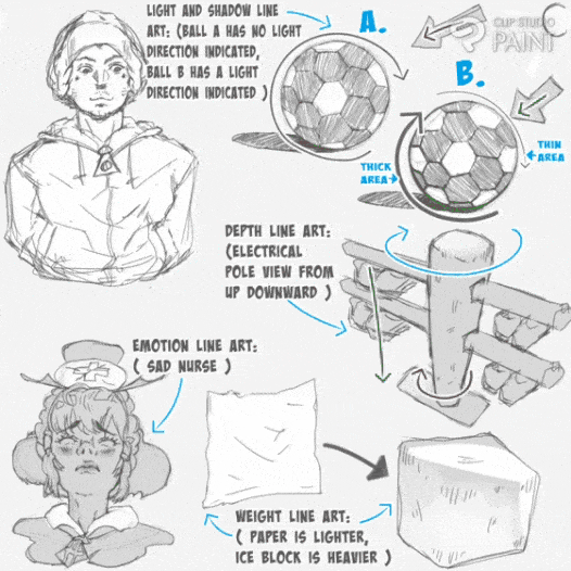
So as an artist especially one who just started digital drawing using CSP, get your self used to drawing line art by doing researches and going through article such as today's, do some more and more practice along also with the various concepts of effectively drawing Line art as I will try to cover few of them.
---------------------------------
Moving on to the main courses of today's tutorial,
1. What kind of Layer do CSP user use for drawing their 'Line art'? ( R/V )
Clip Studio Paint [ CSP ] tend to have several sets of layer which when created has different uses and functionality. One can create the following types of layers (Raster Layer, Vector Layer, 3D Layer and among others) but because for today's tutorial we are just looking on how one can draw line art effectively,
---------------------------------
We can only make use of that of the Raster' or Vector' Layer.
---------------------------------
a. Draw using Raster Layer:
In CSP and other digital drawing apps or software, Raster Layer is set as their 'default Layer', which when one create or open a canvas for the first time.
---------------------------------*
The process I will be mentioning below may not be of much use to old users but I am mentioning this solely for new CSP user, I will like to point out that the two ways which one can locate the Raster Layer' is doing the two following processes:
1. The complex way of creating raster Layer,
2. The simplest we to create the raster Layer,
---------------------------------
1. The complex way of creating raster Layer,
Firstly involves one clicking on the [menu] indicated (A) on the top left corner of the canvas > select [Layer] indicated (B) > [New Raster Layer] indicated (C), doing this will create a New Raster Layer.
---------------------------------
Or you can try out the second instead of click on [New Raster Layer] indicated (C), just click on [New Layer] indicated (D) > a page with the multiple layer setting will then appear, at the top of it is the [New Raster Layer] as shown below.
---------------------------------**
2. The simplest we to create the raster Layer,
On the [palette bar] indicated (A) below, click on the [Layer icon] indicated (B), a mini page will appear indicated (C), above it we can locate the Raster Layer icon indicated (D) which when selected create a [New raster layer] indicated (E) as shown below.
---------------------------------**
The new raster layer will be created after selecting the raster layer option as the created layer can be seen above the formal selected layer in the [Layer] palette.
---------------------------------**
And when used, Raster Layer tends to make things easy to fill in with different sets of colours, apply filters and other effects onto it, also if anyone drawn object is magnified is tend to have a more blurry edges while when shrink it tend to loss it pixel and become dense when we look art it as shown below.
-------------------------------—**
b. Draw using vector layer:
Vector layers are useful for creating artwork that needs to be scaled without losing quality, such as logos, icons, and detailed line art.
---------------------------------
1. For the complex,
The vector layer can be create through following the above mentioned process in the raster layer while in the [menu] indicated (A) > [Layer] indicated (B) > [New Raster Layer] indicated (C), doing this will create a New Vector Layer as shown below.
---------------------------------**
2. For the simple,
On the [palette bar] indicated (A) below, click on the [Layer icon] indicated (B), a mini page will appear indicated (C), above it we can locate the vector Layer icon indicated (D) which when selected create a [New Vector layer] indicated (E).
---------------------------------**
The new vector layer will be created after selecting the vector layer option as the created layer can be seen above the formal selected layer in the [Layer] palette.
---------------------------------**
Also Vector Layer' make it easier to modify line art & do not lose resolution by transforming the line art using transformation tool, unlike that of raster layer that may affect both the circle and square shape cause they are on the same layer, vector layer then to identify the different shapes as strokes and when they are expanded the both expand differently as shown in the below image.
---------------------------------**
You can use vector tools, such as the Pen and Shape tools, to create and edit paths on a vector layer. Vector layers allow for precise control over anchor points, curves, and lines, making it easy to create smooth and clean illustrations.
---------------------------------**
Unlike raster layers, which are made up of pixels, when an object line art after drawing is reduce or shrink into small size with the transformation tool, the line art of the object will appear to reduce in weight and start to look blurry for raster Layer’
---------------------------------
But vector layers are composed of mathematical equations that define shapes, allowing for infinite scalability without loss of quality, As shown also in the below image.
---------------------------------**
So if you want to draw Line art that you may adjust it size later on, I advise you make use of vecter layer' but if not then you raster layer'.
2. How do I choose a suitable brush from CSP multiple sub tool brushes?
On this aspect as a beginner or new user who just started using clips studio paint (CSP) for the first time, getting confronted with some many brushes may seem very intimidating which in turn may cause one to start wondering or asking him/her self
" which brush is very effective in drawing line art?, what are the ways to choose the set of sub tool brush out of CSP multiple sub tool brushes?, how do I reset my brushes to draw perfect and effectively good Line? ".
---------------------------------*
So Let's tackle each of the thoughts one at a time starting with the first;
• Which brush is very effective in drawing line art?
I will like to point out to beginners that CSP is a standard studio for digital works such as artwork, logo design and more, CSP is part of the best ones yet which have been used by various artists, designers, animation movie making and more, for either designing, digital drawing and movie making.
---------------------------------*
CSP as standard studio with multiple sets of tools, settings and more. So for beginners when the open CSP for the first time, they tend to find choosing a brush to be complicated basically because of the multiple style of sub tool brushes that are available such as Soft, hard, texture, tilting style of appearance which is represented in (pen sub tool) name A to F as display below.
---------------------------------**
Now in appearance, most of the pen brushes have a smooth appearance. The speed of your stroke sometimes do change or influence the smoothness, so if you find out that your line art is not smooth or clean that should just be based on how fast you draw your strokes.
---------------------------------**
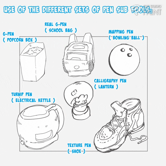
Also those above mentioned multiple style of sub tool brushes can be see in that of (pencil Sub tools) but unlike pen this sets of sub tools tends appear noisy, rigid and sometimes their tip randomly displace as shown below.
---------------------------------**
Similar to that of the pen sub tool; in appearance, pencil Sub tools has a rough appearance and Also some of the pencil brushes have a change in opacity depending on how hard you press,
---------------------------------**

Locating either the (pen and pencil Sub tools) can be done by first opening CSP canvas, when in the canvas click on any of the sub tool on the [edit bar], a page will appear with different set icon options whereas we will see that of the [pencil and pen sub tool] which we can make use of.
---------------------------------**
Moving to the next question;
• • What are the ways to choose the set of sub tool brush out of CSP multiple sub tool brushes?
CSP has multiple sets of Sub tool brushes which may make beginners anxious and they may start searching for the perfect and effective sub brushes that they can use to make their work look good, but I have this to say as this tends to be what many artist such as my former self do think that drawing effectively clearer or accurately is base on the brush you use but I will like to point out that it's not through.
---------------------------------*
Yes we tend to use brushes to draw but it doesn't determine the accuracy and effectiveness of the line art please allow me to say that " it is all in mindset ". What the multiple set of ( sub tool brushes ) does is the give the work different style or set of looks, Take using of the pen sub tool brush for line work which tends give the drawn subject a noisy look and softer appearance while the use of the pencil sub tool brush tends to give the work a kind of hardness appearance.
---------------------------------**
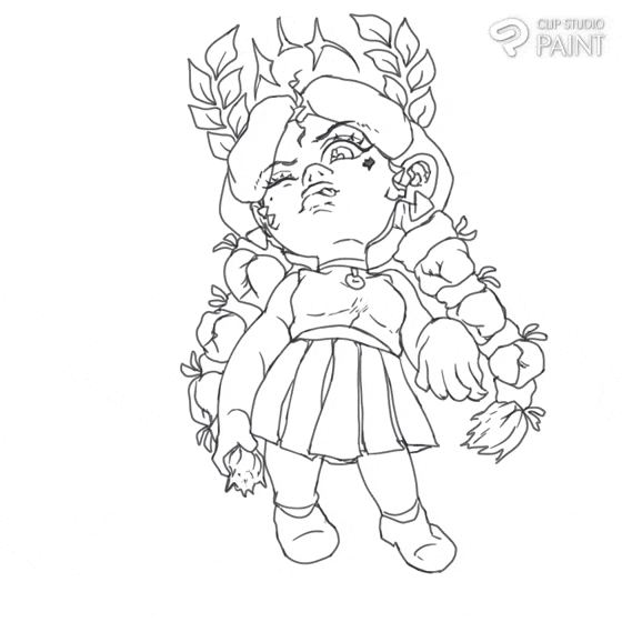
Note:
The pen sub tool I am mostly use is the G-pen
While that of the pen sub tool is the pencil.
As I did mention above I don't often move to the next;
••• how do I reset my brushes to draw perfect and effectively good Line?
Seeing as we have gone through what line art is all about, I believe at this point so many of us want to know which set is good to use or ok to go with. Let's look at the ways to choose the set of sub tool brush out of CSP multiple sub tool brushes and also how to get to this various sub tool brushes which I will be showing,
---------------------------------
The little tricks I have learnt over the year which I myself use to set some setting of my sub tool brushes ( be it pencil or pen or any other brush tools ) is as follows:
---------------------------—----
a. Use of already made brushes ( default sub tools )
Firstly, I will like to advise those using CSP for the first time (beginners) to avoid trying to set the various sub tool brushes but instead just use them as they are, in their default settings, which tends to make things less stressful and quicker for sure, take the various subject images drawn below with the various default sub tools.
---------------------------------*
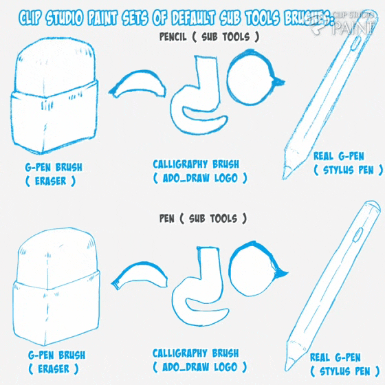
b. Use of downloaded brushes ( downloaded sub tools )
But as you grow and begin wondering how you can further improve your sub tool material, you can try one of the two way I am going to mention in the below section,
---------------------------------
The first ways which the modified brush can be reach, is to get the set or kind of sub tool brush you want from CSP assets store which links are located in the studio ( be it app or software ) for the different devices such as system, laptop and android devices as shown below.
---------------------------------**
Also here are some sample of brushes I downloaded from the site,
---------------------------------*
Using this downloaded sub tool to draw the various line art below, if we take a closer look at each of them the tend to be unique in their own way.
---------------------------------**
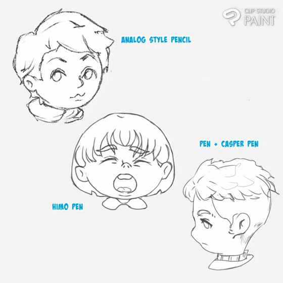
c. Resetting of brushes ( recreation of sub tools )
Another way to get modified brush, is for one to tinker with some of the brushes settings and reset it, which to do so one need start by firstly, setting a goal on what kind of results you hope to achieve after doing the setting and the next is deciding on the sub tool you will like to reset.
-------------------------------—*
Now for the practical aspect, I will be briefly resetting the following sets of sub tool ( pen and pencil Sub tool brushes ). My goal for this various sub tool brushes is to reset one to be less dense and having a noise appearance which will be done on the ( pencil Sub tool ), while for the second to be slightly dense and harding edges which can overlap which will be done on the ( pen sub tool ).
------------------------------—-
With the goal setting out of the way, one can now start the setting process by creating a new canvas, while in the canvas click on any of the [ sub tools ] on the edit bar click on that if either the [ pen ] or the [ pencil ].
click on the [ tools property: sub setting icon ] on the [ pallette bar ] > a mini dashboard, on the mini dashboard [select the ] [ detail edit sub tool the icon that look like a spanner ] with the all the setting options will be displayed, but out of all this settings, we will be working with the following:
------------------------------—-*
- -Brushsize.
- -Brushopacity.
- -Brushhardness/soft/anti-aliasing.
-2- brush size.
- -watercoloredges.
- -Brushstabilization
(accuracy adjustment) options.
+ \-Startingandending.
i. Brush size:
Select either the [ pen or pencil Sub tools ], click on the setting icon on the [ pallette bar ] below a mini dashboard will appear, on the mini dashboard there is an icon inform of spanner,
---------------------------------*
Click on it, a new page with the [ brush size ] will appear, click on the arrow at the right side of the brush size bar, a page will the ( pressure, tilt, velocity and random options ) will appear, I then set the pressure, tilt, velocity.
---------------------------------**
And the brush size I make use of is ranging from 4% to 6%.
ii. Brush opacity:
After that of the [ brush size ], Click on the greater than icon on the top corner, the [ ink page ] will appear, click on the arrow at the right side of the brush size bar, a page will the ( pressure, tilt, velocity and random options ) will appear, I then set only the pressure option.
---------------------------------**
iii. Brush hardness/soft/anti-aliasing:
Using this method above, when we are in the page, I will juy set it to [ medium ].
---------------------------------**
iv. 2- brush size:
Using this method above, when we are in the [ 2 - brush size ] page, if it is enable, I will just disable it the [ dual brush ],
---------------------------------**
I disable this option to be able to access the next setting.
v. Watercolor:
Using this method above, when we are in the watercolor page,
If the watercolor is disabled, click on it to enable it, then I set the [ opacity ] to 10% while while leaving the [ darkness ] at 0%, and also enable the [ process after brush stroke ]
---------------------------------**
After I enable the [ process after brush stroke ] the option will be made accessable, I will then make the [ blur with ] options to 20%.
---------------------------------**
I mostly use this watercolor edge setting to feathery and hard edge effect onto my line creating sub tool.
---------------------------------**
vi. Sub tools ( brush ) accuracy adjustment ( stabilization ):
Using this method above, when we are in the [ correction page ], we can then set the [ stabilization ] to 10% or less cause I for we not to get lazy when we draw our line strokes and to best better ourselves we need to be leave the [ stabilization ] setting at a less percentage.
---------------------------------**
vi. Starting and ending:
Using this method above, when we are in the [ starting and ending ] page, if they [ starting, ending and starting and ending by speed ] is enable, I will just disable them all.
---------------------------------**
3. Concepts or logic to drawing good, clean and effective Line art.
At this point, as you step into the world of art (as a beginner) I do advise one reset his/her mind and decide on the step you want to take to help you improve and learning of Lineart cause for Line art to be good, clean and effective in appearance, you need to build up your knowledge on the concepts guiding the drawing of line.
---------------------------------*
For the mindset you may cultivate toward the drawing of your line art tends to affect or influence the way the final results of our art will appear, because when at the point of drawing our line work our mind set if it's unstable or blank or void of line art understanding (meaning we having no knowledge on drawing line art), it tend to flows or show into the Line work making the lines wobbly or ziggy or hair in appearance as shown below, flow with me here.
-------------------------------—*
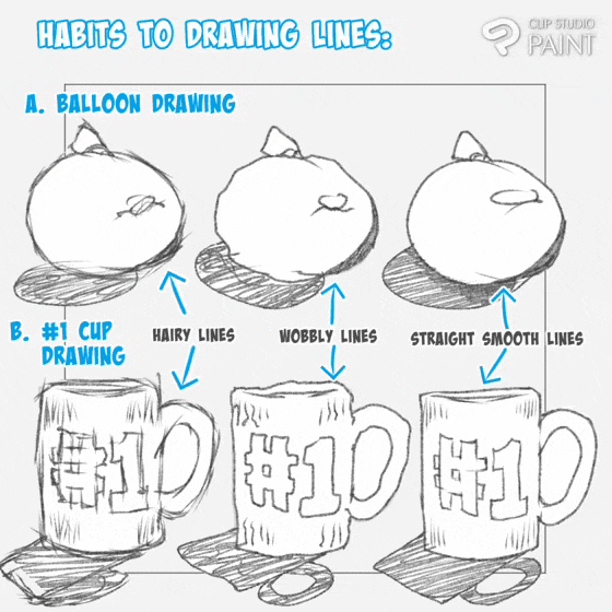
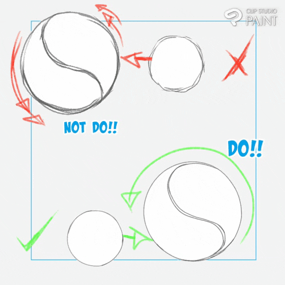
I will like to raise some few concepts I make use of when I draw my line art which tend to work for me and I do believe it can work for you as well.
1. Understanding of true Lines definition.
When we talk of line art we are plainly talking or dealing with basic lines,
Line is one of the seven main elements of art (the others are color, shape, form, texture, value, and space) and you may hear people refer to the six types of lines:
• Vertical lines
• Horizontal lines
• Diagonal lines
• Curvy lines
• Zigzag lines
• wobbly lines
---------------------------------**
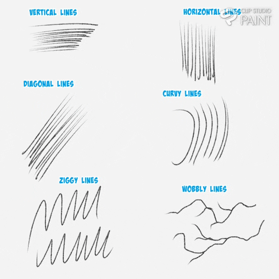
Every line drawing is made up of at least one of these components above, with distinctions and variations made by changing the following;
Length, width, weight, texture, and style of the lines
To create your unique line drawings.
2. Build up Line art and drawing with confidence.
Line art build up normal involves how pressure is issued onto the line work which if consider in the aspect of drawing of our subject and the story we want it to tell the viewers, say we make our line slimmer it tend to tell the viewers that the subject is light in weight while if thick or dense tell that the subject is big in weight. And a line art have both the highly and slightly dense lines tells the viewers the angly which light is illuminated from.
---------------------------------**
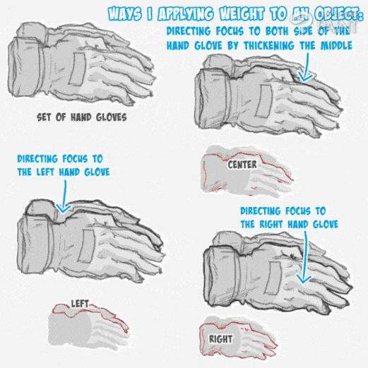
And if expression further onto our subjects help artist indicated what the he/she want the viewers to focus on like say we have two hand gloves with one lapping on to the other, if we want the one in front to be the point of emphasis or focus, all we need do is thicken the out line so as to draw the focus of the viewer more to the particular one as shown below.
---------------------------------*
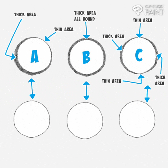
And things I will like to point out is that Line thickness or depth of the line can be added to the out lines of subject, say we have two characters [ A and B ],
• Character A has it line thickness added to the inside Line art of the character with the outside line art of the character is draw with thinner line.
• Character B has it line thickness added to the outer line art of the character with the inside line art of the character is draw with thinner line.
---------------------------------*
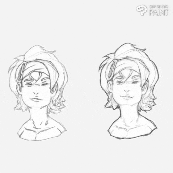
To get better at the above mentioned, we need to frequently practice the line art build up, we may not get it the first time but if we continue we tend to get more and more better in doing so till it later becomes part of us,
---------------------------------
It's true, those are ways which lines are drawn but building ones confidence with frequent practice of lines is also very important cause if you believe you can draw the line art, it will in turn tend to make the line art strokes more straight and stable causing your hands will be firm and tends not to shake or create Line a kind of wobbly or cross section lines which I do believe ones mindset also plays an important role.
---------------------------------
So on this aspect, I will like to point out to beginners that to better build up your line quality is by understanding yourself and knowing where you are good at like say if you are left handed your strokes tend to flow accurately and easy when drawing from the right to the left side and vise versa for those who are right hand.
--------------------------—-----**
To better know where one is good at drawing strokes, try draw a quick straight lines in all three directions ( X, Y, and Z axis ) up downward as indicated (A), also try that of the vise versa down upward indicated (B).
---------------------------------**

As you’re learning how to create line art, start with the most basic element: the straight line. Practice holding your pen or pencil at different angles and pushing into your canvas with varying degrees of firmness to see how the weight can alter the thickness of the line you’re creating and last try curving you strokes In all direction while you draw them to see how which angle you are good at drawing towards.
---------------------------------**
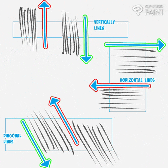
Then lastly, try drawing a continue lines and curve them in different directions to see which direction is easy for you, also as you draw use you entire hand not your wrist cause if you use you wrist your lines may come out bad.
---------------------------------**
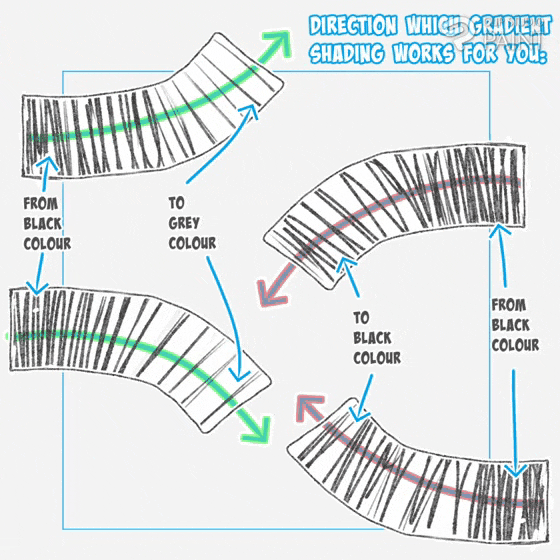
Also feel free to turn you device to the position that is suitable for the effective drawing of the lines. If we properly practice the above mentioned, we will see that our confidence in drawing of lines will improve drastically.
Now onto the next part.
3. Developing yourself by practicing from simple to complex
Once you have perfected your straight and curvy lines drawing, you can move on to practicing different simple shapes that will likely form the foundation of your drawings and cover all six main line types.
---------------------------------**
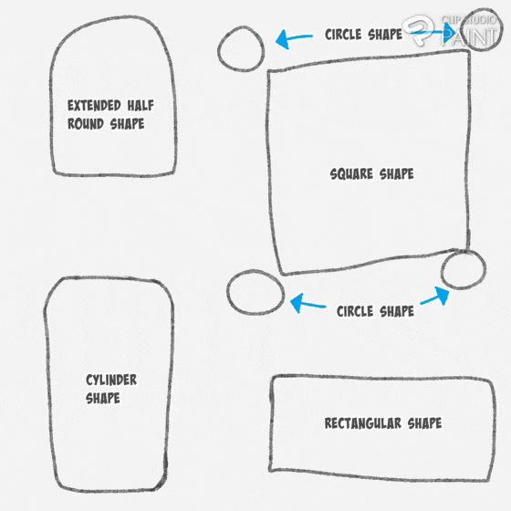
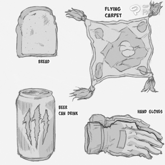
When you feel confident that you can work on some cool complex line drawings of your own, object drawing, logo designs, and character drawing are a good place to start as these are easy to break down into specific shapes rather than trying to conceptualize and draw the entire finished subject at once.
( I use the above basic shapes to guide the drawing of the object as shown below ).
---------------------------------**
With the proper and effective way of drawing line art mentioned, one can now move on to learning the various components to which line art effect on a subject.
4. Component 1: Defining of distance through adding of valve to line art ( determine of lengths)
Implementing of line art through valve toning is a way of manipulating space between objects, which is one key element in art that determine where an object is place or position on the plain at a point in time with the distance between the various subjects. This aspects of a compositing helps artist use line art to show the length of distance of an object to the viewers through valve variations of of the object line art as shown below.
---------------------------------**
Notice: how the value of the line art of the basketball 🏀 is all round the same and it doesn't show the length of distance between the four balls, meanwhile that of the baseball ⚾ tends to show the distance between the four sets of balls which is because of the value variations between them four.
5. Component 2: Defining of light and shadow using Line art
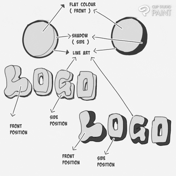
Add of some weight to you lines tends to also defines you work take a subject like the below logo and ball, adding dark black colour to the where we see a cast shadows far from the light source, it gives the the direction of the light with out even the adding of colours.
---------------------------------**
Also when we tend to design a logo the above mentioned process help in improve the appearance of the Logo.
---------------------------------**
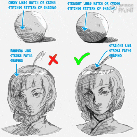
One can also add shadows to the subject by using lines as well such as straight hatch lines (also known as cross stitches pattern) or we can just add straight diagonal lines as done on the right and avoid do the one's on the left which lines are draw randomly and curvy.
---------------------------------**
Also when a dark black colour is added to the points of intercept or crossing point it helps bring out the line work as shown in the below ( super fly panda lineart ),
---------------------------------**
Note: that it is also advisable to always apply the above mentioned process at all time as it help enclosed your line work, so that when ever you want to select it will be easy
Furthermore, we can add dark black colour to the ambient area where are area that avoids the stark shadows created by direct lights as also shown in the below ( super fly panda lineart, the ball and the female character ).
---------------------------------**
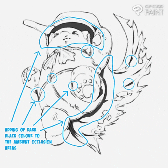
This usually helps artist know where to position the light source, their highlights and their shadows.
---------------------------------**
Collection of the different image used.
---------------------------------**
Next is how to add thickness and thinness to show where the light source is positioned. This aspect can be seen in the two below balls image, withe the one by the left showing the their is no light shining on it, and the one on the right show that light is shining on it from the top right corner,
---------------------------------**
Hence, for expression of that of the right image can be use when representing light source position, say we have our light source position by the left,
---------------------------------**
Or from above,
---------------------------------**
Or in the middle.
---------------------------------**
We tend to see in all the above images that the shadows are represented behind the back with thicker lines and the part closer to the light source and opposite to the thicker lines will be represented with thinner lines.
6. Conveying or expressing emotional feeling through lines art
Line can be use to express the Emotion of our characters, which is a state which a person experience what his/her is feel at the point in time. Artist usually show the what the character or subject is feeling at that point in time with line, like anger, love, irritation, and more.
---------------------------------
Drawing of Anger expression
Anger or fury expression can be represented on a character face in the following ways:
---------------------------------
• The first expression of anger tend to express by drawing a four small curvy lines on the forehead of the character face.
• Or we can just secondly express the anger line in three or four sets of curvy lines on the either the four head or chicks of the character face.
Drawing of love expression
Love expression can be represented on a character face in the following ways:
---------------------------------
• The first expression of love is express by drawing different sets of small lines on the chicks and nose of the character face.
• The second expression of love is express by drawing different sets of small lines on the chicks and in the eyes of the character face.
Drawing of irritation and boredom expression
• Boredom expression are express by drawing different sets of snake-like lines on the forehead of the character face.
• Irritation expression are express by drawing also different sets of straight lines on the forehead of the character face or out side.
Combine emotional expression using lines
As shown below, we can see the love and anger expression added to the face of the character.
So note that we can add different emotional expression to give our character a very unique and expressive appearance.
---------------------------------**
Most times artist tend to show viewers where characters are bruise using lines such as hatch lines or cross section lines.
---------------------------------**
Keep in mind the various line art concepts.
-----------------------------—--
4. Practical aspect 1 ( drawing of manga character in a dramatic scene )
Now to conclude today's tutorial, I will like to show the ways I represent the above mentioned concepts and their various components on the drawing of manga scene and regular concept character scene.
---------------------------------
Using steps, I will be showing how to draw manga character in a dramatic scene.
Step 1: Draw the line art of the character and the Rock landscape.
---------------------------------
Step 2: select the character and add a grey colour to in on a separate layer.
---------------------------------
Step 3: create another layer, add dark black colour to the hairs, cloth and shoes of the character and also add some hatch lines shadings to the sky of the background.
---------------------------------
Step 4: add a dot effect and some speed lines with a lighter color added onto the character's cloth.
--------------------------—-----**
With that done, we are done with drawing of the manga character in a dramatic scene as shown below.
---------------------------------**
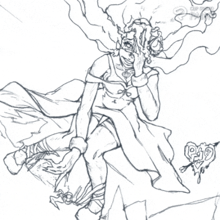
On to the next.
5. Practical aspect 2 ( drawing of regular concept character scene )
Also, I will be dividing this aspect into steps
Step 1: The rough sketch
Draw a quick Structural rough sketch of the character you want to draw which for me solely for today's tutorial, I rough sketch a boxing female character in a dynamic or dramatic pose.
---------------------------------**
Set the rough sketch layer colour to blue and reduce the opacity to 25% or can just straight up reduce the opacity to 25% so that the saturation of the rough sketch will not affect us when we are drawing the line art, leaving the layer black.
---------------------------------**
Note the you can find the [ colour layer change ] in the top right corner of the [ layer ] which is located on the [ palette bar ] below the canvas.
Step 2: The primary line art
Draw the primary line art of the characters
---------------------------------**
Step 3: The secondary line art
Draw the secondary line art of the character, add some line effect ( inform of hatch lines ) which tend to indicate the bruise the character endure for the short exchange of punch between her and her opponent.
---------------------------------**
Step 4: Show the light and shadow areas
Also using what we learned above about lines on how the weight of the line art tells viewers the light and position, I implement that to the lines of this character using the [ adjust line art width tool ] increase outer lines of the character showing the light and shadow areas of the concepts character.
---------------------------------**
Note: that in order for the work to look good artist sometimes draw twice or more just as I did above.
Step 5: Add the flat base colors
Add some flat base colour and highlights to the character,
---------------------------------**
Step 6: Final rendering of details
Finish up by adding more detail rendering, such as black and white colour gradient, with an emotional expression effect onto the character forehead and some arrow added to the background. And the last thing I do is give my work a name and design my art name onto the image.
---------------------------------**
With the done bring today's tutorial to a close.

Bonus image
I will like to know your thoughts towards a character which rough sketch is visible, I do see some artist do this, and they say it do add some composition to the image, what do you think?!!


コメント