
Hi, it's Nadia!
In this tutorial I want to show how I do the digital painting that looks like oil painting. I'll explain the process (also, I've done the speeddrawing if you want to see it!) of this dragonfly fairy, but first I do few examples on how I color and what brush I use.
Pencil brush
I've duplicated and then edited the "Design pencil" brush by clicking the key button on the right bottom.
Original settings:
Mine settings:
(I've also changed the opacity and density, but you can modify it as you prefer!)
Quick tips
Tips 1:
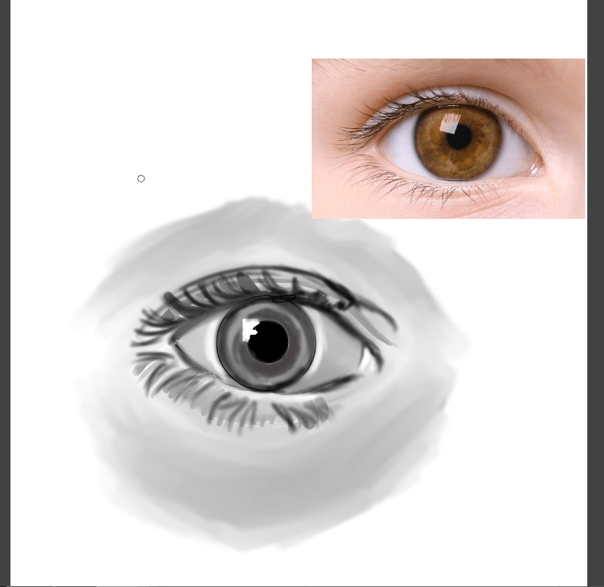
When creating oil painting digitally you should avoid to use perfect instruments (1) but use directly the pencil brush for make shapes (2)
Here I've done shadows. In (1) I've used a soft brush, while in (2) I've used the pencil brush
Then I've added reflected light on bottom left:
And lastly I've added light on top right:
As you can see they are really different by just using different brushes! ^^
Tips 2:
I suggest you to set the tip of the pencil with pressure so if you draw lightly, the line is thin (1), while if you draw heavily the line is thick (2)
When I draw close objects I draw lightly so they are like focused, while for making far away objects I draw heavily (I use the "click" of the "mouse" so I don't make too pressure on the tablet!) and they seem unfocused, as I did in the dragonfly fairy illustration.
Illustration: sketch and flat color
First I've done a quick sketch, then I've done a better sketch (I don't do the ink because I fix it later wit color!)
You can see the pose has changed. I don't usually do just a sketch, actually I've to make a lot to finally find one that I like! (in the video you can see that it take me a lot of time for the sketches!)
1- I put a quick flat gray;
2- And then I choose a flat color for the base;
3- I use different layer to put colors. I color with the pencil brush (not with the "fill" tool!! If you color them just like in traditional way, it will looks better!! ^^ ) and I clip them on the flat layer below.
4- So as you can see it looks like oil painting! And there is no worry that there are empty spaces, because there is the full flat layer below!!
Note: I use few colors, you can see that they are the same in more places, because so it looks better! ^^ (I show them in the video!)
Lastly I duplicate the folder and I merge the layers so flat color are all in one layer, but I also have a backup folder in case I need it.
For merge layers you can:
- right click on the folder and click "Merge selected layer"
or
- by clicking on the bar above Layer > Merge selected layer
Illustration: preparing canvas and coloring shadows
I post it now so you can see all the palette. I usually create a palette layer above all layer so I keep it for color the I use for shadows or light. I add color during the coloring process, I don't decide them first. Also beacuse I change them sometimes!
Then I also create a layer above all, fill with black and I set it to "color" so I can see the all canvas in grey scale. This is useful so I can see if I did light and shadows correctly.
So first I create a layer set in "multiply" and I create a mask using the selection of the color and them I click the mask button here:
I add shadow with a blue color always with the pencil brush:
Then I add second shadows. I create a new layer set in "multiply" and I use color similar to the one where I do the shadow. So where is green I add green shadows, brown I use a brown etc...
Illustration: Lights
I create a new layer in "overlay"and I add few light with an orange/yellow color
I create a new layer in set "Add glow" (I lower a bit the opacity) and I use a blu color to add few lights
I create a "normal" layer and I pick a brighter color than where I want to add lights. I also fix skin and other part wher the "sketch" make it to grey.
I create a new "normal" layer and I add rim light with a blue/green color.
For adding rim lights, I choose the part where is shadows, so it looks like brighter!
And as you can see, in some part is thin the line, while in some part is thick. This is because I follow the shapes so it seems more realistic!
I create a new "normal" and I add a bright color of the rim light to make it pop out even more!
And this is finished! Now I copy this file and I save it as a new file. I do this so I've backup files, like with the layers!
Illustration: Background
IMPORTANT NOTE: these layers are not in order I've drawn. That's because while drawing background like this, I add layers according to the things and objects I add! So please, if you want to see it better, please consider to watch the speedpainting I've posted. I'm sorry that it's really fast (but you can change the speed setting on youtube to 0.25) because this illustration took me few days to terminate (the complete illustration was about 4 hours, but I had to take screen and everything so I did few hours per day!)
I'll explain how I've done it, but I'm sorry that it may seem a bit confusing.
In the new file I merge all the layers, so I've the finished colored fairy all in one layer
First I do a quick sketch of the background. It dowsn't need to be perfect, it's just an idea, in fact I change it a bit later! ^^
I add a background color in a "normal"layer
Those three selected layers are set in "normal" and in these layers I follow the sketch I've done. I add colors according to the palette of the canvas.
As you can see it seems unfocused because I've used the pencil brush really large and I don't go on doing details.
I'm sorry, I add light and shadows directly, I don't have a method here.
What can I say that maybe could help, is that you should use the black layer set in "color" so you can check if your light is bright!
I hide the sketch layer, because now I don't need it anymore.
I add others details, at the bottom of the layers so they seem far away.
Actually I think I did this later, but I tell you now. These two layers (one in "overlay" and one in "normal") were just to add a bit of blue in the sky
In these to "normal" layer I added other details like a bit of brown on the left branch and a bit of red (like for flowers) in the background
I added a bit of green in "multiply" because I thought it had no deep.
I add a bit of blue in a new layer set in "Add glow"
I've added a "multiply" layer fill all with a blue color and I've used a mask to erase some part.
With 2 "overlay" layer I've added some lights.
With the first one I've added even more blue on the leaves.
With the second one, I've added orange lights.
As you can see I've lowered a bit the opacity, but you can adjust it as you prefer!
Laslty I've added a bit of mist.
I've used the same pencil brush, I've scribbled down white waves and then I've blurred all the layer by going to:
Filter > Blur > Gaussian Blur > (it opens a window, you can select the "Stenght" you desire) > OK
Then I've thought it was too light so I've added even more mist with the same technique
As you can see the opacity is low. That's because doing so, some part becaomes almost transparent, that it's like the realistic mist!! ^^
I've lastly added mi signature, and it's done!
Quick summary for the background:
I merge all the layers so the finished color of the character is all in one layer
Under the character layer, I do a quick sketch of the background
I add flat colors, and I also think about lights and shadows (all in normal layers)
I then adjust shadows with "multiply" layers
And I adjust lights with "overlay" and "add glow" layers
Link to the video speedpainting
Thank you for reading, I hope this is helpful!
이 게시물에 '좋아요!'를 누른 사용자


댓글