TIPS TO MAKE YOUR WEBCOMIC PROCESS EASIER!
I started drawing comics recently and it usually takes quite a long time to get through, so I found some ways to make the drawing process faster and I’ll share them with you!
Lineart
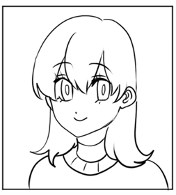
Firstly I recommend you use Vector layers for your line art instead of raster layers!

The reason for that is that you can easily modify your lines after drawing them.
It’s really useful for making the lines thinner or thicker and erasing lines that get in the way.
A variety of tools come with vector layers to allow you to change any line to your liking , so they are really good for lineart!
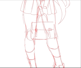
You can also use rulers to trace complicated shapes:
There’s lot of rulers with different functions so if you have the time i recommend you check this tutorial that talks about rulers more specifically:
One thing I use often to go faster is the curve tool.
I use it when i need to line-art a simple shape :

You can also change the curve tool priorities to make it look like the pen you use for line-art so that it doesn’t look out of place ; and that makes it a really helpful tool.
To do that you just have to register your pen in the assets in the brush shape setting and then go to your curve tool and change its brush shape.
Coloring
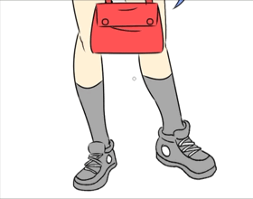
Again , a really useful tool to color faster is the bucket tool!

This really saves a lot of time instead of manually coloring with a pen.
Next to the bucket tool is a pen-like bucket tool that allows you to fill in parts that you missed with the bucket tool:

I recommend you get this tool from the assets as well , it really speeds up the coloring process at the start:
—
USE BLENDING MODES!
Blending modes are incredibly useful for shading and lighting!
It’s something a digital artist should take the time to discover and experiment with as it saves a lot of time.
The most commonly used blending modes are probably the multiply mode and the glow dodge mode.
The multiply mode is used often for shading whereas the color dodge for lighting.
If you’re unfamiliar with blending modes and want to look more into them , I’ve got a tutorial on them:
When making a comic i recommend you use blending modes to shade and do lighting to save you a lot of time.
As you can see form the picture above , depending on the scene you're drawing you’re going to want the shading/lighting that fits best the situation, it’s important that you then try multiple light sources to know if you’re going to go for a dramatic or simple shading.
—MAKE YOUR CHARACTERS MATCH WITH THE BACKGROUND
When you have characters in a scene you have to make sure they fit in the environment or otherwise it’d look awkward.
See the picture above? These two characters are in a scene where it’s nighttime but they look like they are colored for a day time scene.
To avoid that all you have to do is pick the color of the sky in the background and paint it all over them in multiply mode:
If the characters end up looking too dark you can decrease the opacity of the multiply layer a bit.
Though as you can see there’s a light source coming from behind from the sun that’s about to dip.
You need to pick the light source color and draw it to the sides of the characters in the Glow dodge mode , but not all the way since the light comes from behind.
And that’s what you end up with . Now the characters fit better in their environment.
You can do something similar to this;
Perhaps if you’ve already drawn the character and the background but forgot that it was supposed to be nighttime.
All you’d have to do then is the clip one multiply layer to the background and one to the character.
Draw the appropriate nighttime colors on the two layers and set them to multiply.
And now the atmosphere has changed!
— AUTO-COLORIZE TOOL
Next , i want to show you the auto-colorize tool that’s really nice for establishing the base colors.
Here I’ve drawn a character on a vector layer and i Set it as reference layer.
On a different layer below i roughly put some colors where i wanted them.
I then go to Edit>Colorize(Technology preview)>Use hint image and colorize
It then colors my drawing for me, since the skin looks a bit wrong i easily retouch it myself and add the details:
I also use this for coloring backgrounds:
After finishing the line-art and setting it to reference layer i put base colors down on a layer below without detailing it.
After it auto-colors for me I go ahead and refine the drawing myself:
This auto-colorize tool is really good for putting base colors rapidly instead of filling it yourself, it also gives your drawing a watercolor-like effect.
— MAKE COLOR PALETTES AND REFERENCE SHEETS FOR YOUR CHARACTERS
Making character reference sheets for you characters is really great as you can check them out whenever you have a doubt when drawing them ,; for exemple checking if your character has a mole under the right or left eye.
This is a fairly simple character sheet but some people like to have different angles of their characters too.
Clip Studio has a Color palette window that allows you to make palettes for your characters , so keep the window open when drawing your comic so that you pick the correct colors for your characters every time.
I like to have multiple characters in one palette but some people make an individual palette for each character. You organize your palettes the way it fits you better!
— BALANCE LINEART AND SHADING
Depending on your style you may use techniques to have your drawings look more dynamic and lively.
From what I’ve noticed this plays between the line-art’s color and the shading’s color.
1-Bland Shading/Bland Lineart
2-Colorful Shading/Bland Lineart
3- Bland Shading/Colorful Lineart
4-Colorful Shading/Colorful Lineart
I personally like to have both the Line-art and shading colorful but it depends on your preferences.
3D and Backgrounds
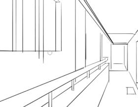
If you’re having a hard time drawing backgrounds you can use 3D assets and the perspective ruler to help you out.
Once again , I have a more detailed tutorial on backgrounds right here if needed:
Anyways , when using 3D i often have a hard time adjusting the perspective so I usually pair this tool from the assets to figure it out:
This tool is also helpful for visualizing the scene and then using the perspective ruler on it.
But usually I put it down first before importing the main 3D models.
So I put it down first and rotate it to match the perspective angle I want.
I then drag the 3D asset in the scene and it’ll fit automatically the perspective i set up previously.
I then go to Layer>Lt conversion of layer
And it will turn the 3D image into line-art.
To clear up the lines I go to Filter> Adjust line width
And it will get rid of the unnecessary dust.
Keep in mind that if you don’t have the EX version of Clip studio you can still makes 3D backgrounds look good without the LT conversion but it will often take longer and need more efforts so if you have the chance to get The EX version I recommend you get it!
Here’s what it’d look like without the LT conversion lines:
If you don’t have the EX version using the Artistic Filter by going to Filter>Effect>Artistic might work out for you!
This is what it looks like WITH the LT conversion line-art:
Anyways, after changing the line’s color and adding the shading i’m ready to add in the 3D character models.
With the 3D models i also imported poses that you can find in the assets!
As you can see they also directly adjust to the current perspective.
I then draw my characters on top of the 3D models:
And I finish by matching their shading and line color to these of the background:
And that’s the result!
Here’s another example of what a scene using 3D models looks like :
—USE IMAGE MATERIALS/LAYER TEMPLATES
Along with 3D assets you can use Image materials from the assets;
Don’t hesitate to re-use them especially if they’re common ones like the sky . In this case you can re-use the sky but use gradients on it to change the way it looks:
These are already made for you so you don’t need to go trough the trouble of drawing them yourself.
—USE PICTURES AS REFERENCES FOR BACKGROUNDS
I show it in my other tutorial as well but with the help of the perspective ruler you can use it on backgrounds:
Just align the ruler to the photo and then draw the line art, make sure your pen has the Enable snapping option on.
Then you just need to color it:
Use materials from the assets
There’s a whole library of assets in Clip Studio so make sure to take advantage of it, in it are a lot of tool that can make your life easier.
— USE AUTO ACTIONS OR MAKE THEM YOURSELF
Auto actions are a blessing!
They’re one of the main thing that can speed up your comic process.
You can either download some or make some yourself, they’re really easy to make and save a LOT of time.
These are only a few but there are a lot more , you’re bound to find some that fit your working style!
—USE SPECIAL BRUSHES
This is self-explanatory but basically a lot of artists put custom brushes on the assets , and using these will speed up a lot of your work.
Thanks for reading!
I hope that helped you !
If you wanna see more of my art You can check my instagram account:
I see you next time!💖


댓글