
Introduction
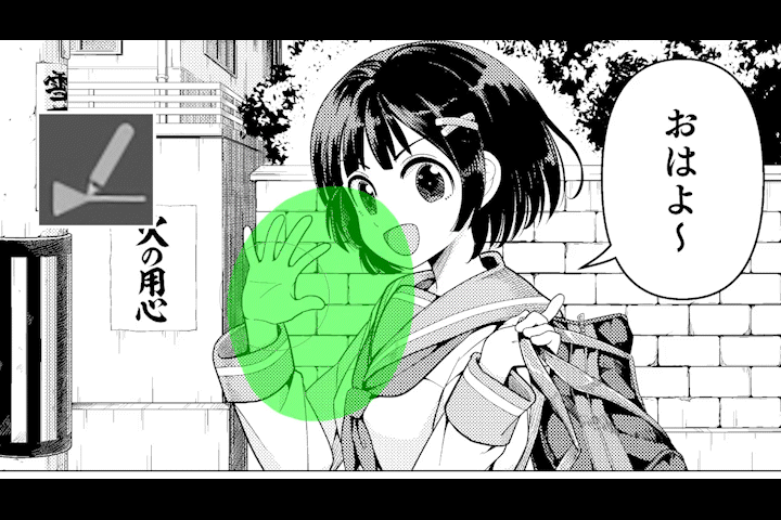
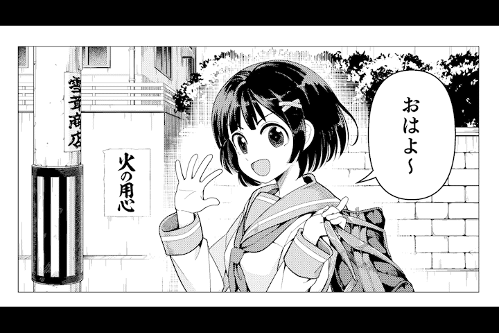
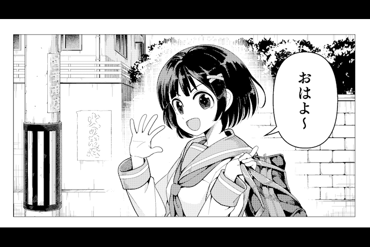
Now then, let's take a look at this panel.
It is a situation where a female student is saying "good morning" on the way to school in the morning.
You can see that the character is a little buried in the background and it is hard to see.
The black leaves and hair overlap and it's hard to see, the line thickness of the bricks doesn't differ from the line thickness of the character, and the boundary between the character and the background is vague and difficult to distinguish.
This time, I would like to introduce some ways to finish the manga that complement the characters while adding and correcting this panel.
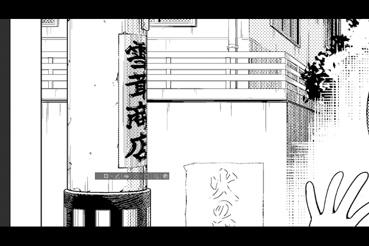
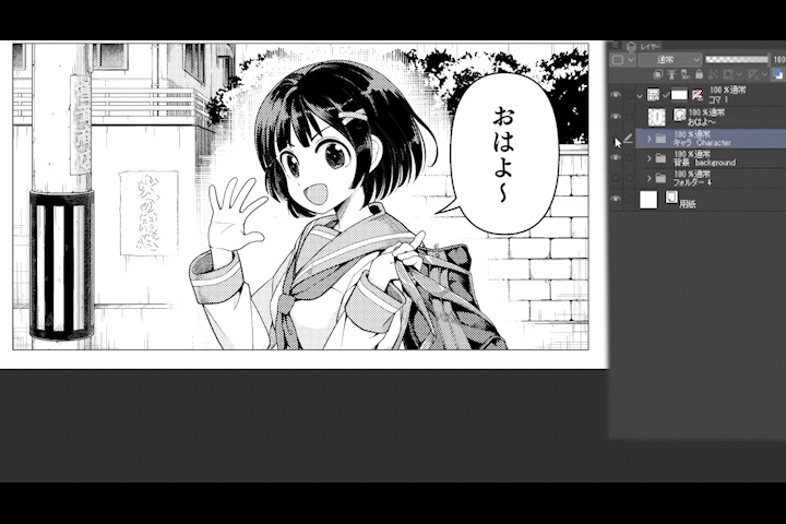
By the way, I use the following materials for bricks.
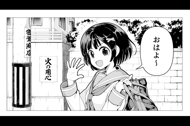
Create a space around the character without drawing the background.
It's hard to see if the leaves and the black hair overlap, so I don't draw the leaves around the character's hair to create a space. Before I start drawing the background, I want to be careful.
Characters and backgrounds are easier to distinguish.
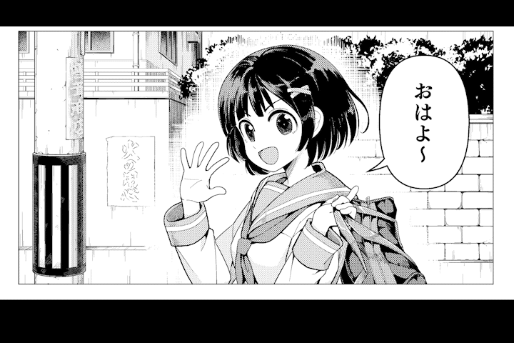
A comparison of the two is as follows.

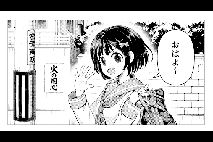
Make the thickness of the background line thinner than the character line.
It is easier to distinguish between the background and the characters if the thickness of the background lines is different from the thickness of the character lines.
Brick lines like this panel should be drawn with thin lines when drawing the background.

You can change the thickness of the background lines later with the [Correct line width tool].
In this way, it can also be used with raster layers.
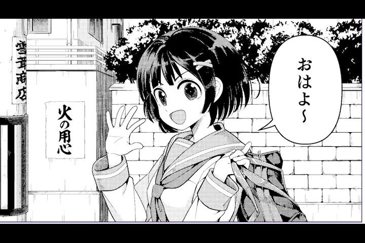
Thicken the lines of the character.
Earlier, I thinned the lines in the background.
Now make the character's lines thicker, and increase the difference in thickness from the background lines.
I enclose the character with a selection area and thicken the outline with [Border] from the [Edit] menu.
However, the lines around the hair are in the way, so erase them with an eraser.

Outline the character with white lines.
As before, enclose the character with a selection area, set the drawing color to white, and draw a white line on the outline using [Border] from the [Edit] menu.
This will improve your character's visibility.
Draw white between the character and the background.
Use a gauze brush to draw white between the character and the background.
It is an easy process because there is no need to add or modify the background.
Draw white hatching between the character and the background.

The Speed line brush is a brush that can draw many lines at once and can be snapped to the parallel line ruler, making it ideal for drawing hatching.
Use this streamline brush to draw white hatching between the character and the background.
You can draw a more natural impression than drawing with gauze.
First, create a vector layer, place a parallel line ruler horizontally, and draw white hatching.
Next, create another vector layer, place a parallel line ruler vertically and overlap the hatching.
This hatching is drawn on a vector layer, so you can adjust the lines one by one or in groups.
You can freely change the parameters with the [Line width correction tool] and [Object tool].
For details, please refer to the previous TIPS.
Decrease the visibility of characters in the background.
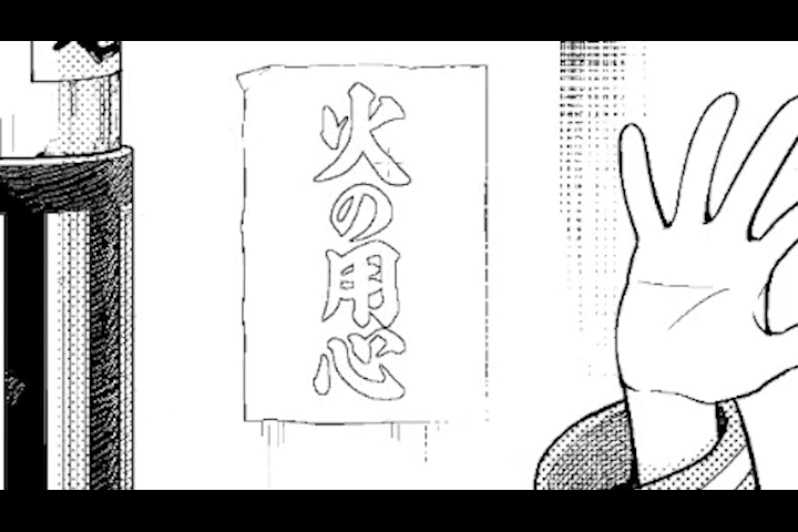
There is another problem with this panel. The visibility of the characters written on the background is high.
This is the part covered in red.
The letter of the slogan about fire prevention on the center left of the screen and the letter of the store name written on the telephone pole.
Letters combine high visibility with priority in thought processing.
This significantly deprives the reader of the comic's characters and dialogue.
Therefore, it is necessary to perform processing to reduce the visibility by destroying the characters in the background.
Here are some ways to do it.
Lighten the black of the letters with white hatching.
Scrape off the black of the letters with white hatching to make them lighter.
By weakening the black, the impression and presence of the letters fade, and they blend in with the background.
Remove the edges of the letters and scrape them off.
Create a new layer, click the thumbnail of the character layer while holding down [Ctrl] to make a selection, and use [Edit] menu [Border removal] to create a border character.
Erase the intersections, tips, and middle parts of long lines until the letters are barely readable.
If you break the letters so that they cannot be recognized as letters, they blend well with the background.
How to make text white and combine with halftone
First, under the letters, draw hatching to create a base for the halftone.
Next, change the text to white with [Filter]-[Invert Gradation] from the [Edit] menu.
At the end, I add a little bit of partial writing to give the feeling that the letters are written.
In any method, the important thing is to reduce the contrast of the letters and reduce the visibility.

Darkens areas away from the character.
Now let's consider the balance of shadows for the entire panel.
A balance of luminosity that makes the character shine in the spotlight can make the character stand out.
It is not good if the area away from the character has the same brightness as the area around the character.
It is better to make a difference in brightness, even if only a little.
The bottom of both ends of the panel is a little bright, so I added hatching to reduce the brightness.
This created a difference in brightness between the surroundings of the character, making it easier to focus the line of sight on the character.
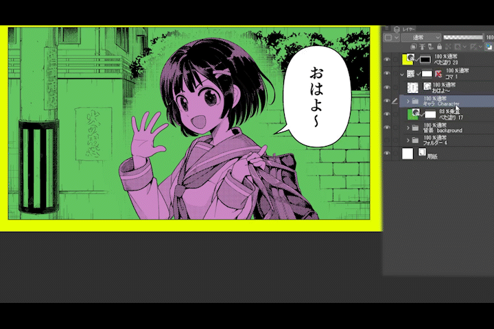
Place the character on the panel.
By placing the character folder with the white background on top of the panel layer, you can get the effect of the character popping out.
This technique is called "Buchi-nuki". It comes from a Japanese word meaning something like "through a partition."

It looks like this when color-coded for easy understanding.
at the end
What I wanted to convey the most this time is that each line makes a difference in how easy it is to see and read the manga.
If the manga is difficult to read, readers will leave before they finish reading it.
It means that you won't be able to read it until you get to the fun of the story.
Please refer to the techniques and viewpoints introduced in this article, and take a close look at professional manga to see how they are finished, and use them to draw your own manga.
Remember that even a single line can affect readability.
Users who liked this post


Comment