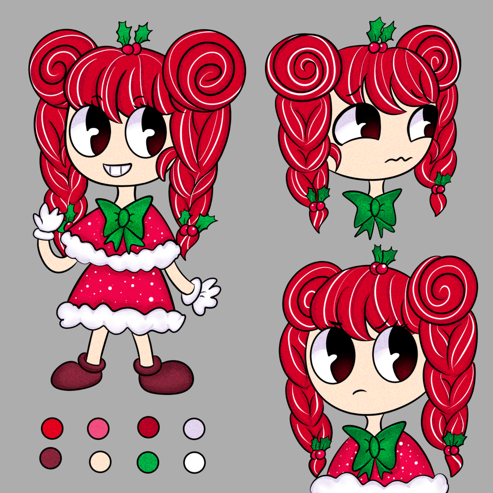
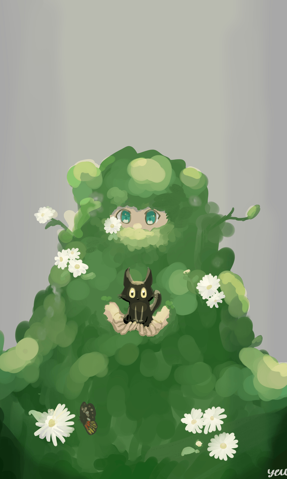
Chibi Painting Tutorial
Intro
I love to see Chibi artwork, it looks cute and appealing. I never practiced it heavily, so I am happy with my results. I will show you some of my process, so maybe you could learn something as well!
Chibis are caricature style. The most important distinction is usually the proportions. The head is very big and the character is usually 2-3 heads tall. A lot of it is not realistic, but it still uses construction and perspective. I will try to show you examples of how to use clip studio paint to draw them.
You can also check out my video for more comentary and timelapse if you like.
Body Proportions
The body should be a lot smaller than the head. I drew three different characters to show that you can improvise and you do not have to follow the rule exactly. My final character has slightly different proportions. Rules are more for guidance and if you get stuck, but if it looks right you should keep it the way it is.
These are sketches I made to show that different Chibi characters can have different proportions and still look cute.
A - standard chibi character that has two heads. I like to push for bigger arms and legs in that case. It helps with gestures and showing cartoon looks.
B - I used more anatomy proportions and set the height to 2.5 heads. You can add more details to arms and legs and define the face more. Focus on the chin and cheeks. They usually give the most impression for your head and face of the character. The shape should follow more or less a real skull. It is good practice to follow real anatomy when drawing.
Z - I ended up with 3 heads and added a circle in between. There is a rib cage, belly for rotation and hips for better 3D construction.
As you can see you can exxagarate and add details to make your chibi more realistic or more cartoony. It does not have to look all the same, so have fun.
Face
The face and clothing are the most fun you can have with your chibi. I decided to get a head base that I will use to practice different eyes and mouths to help you get inspired. Always look for references and see what other artists are doing with their art.
As long as it makes sense you can draw it. There are not that many chibi drawings that side view or a complicated angle. It becomes a question of cuteness and aesthetics.
Generally, you want your eyes to be low and apart enough so that a third eye that can fit in between. As you can see I did not follow that rule exactly, but it allowed me to make some interesting eyes. It is the main part that the person will look first, so it is important to make it look right.
Also faces have very big foreheads, so make sure you put your eyes low.
Here are some mouths. For fun, I decided to remove the eyes and draw just the mouth to see what I will end up with. Keep in mind for emotion and that when you open the mouth it needs to follow the construction.
This is what I ended up with for sketching. I learned a lot and small sketches let you focus on more volume of work without being overwhelmed in rendering. I think doing these when you start out if very important. My favorite one is defenitely the middle bottom one.
Hands
I also recommend working on my hands the most. Eyes and hands usually draw a lot of attention. I start with a simple circle and keep building on top of that. Keep in mind that fingers are just very thing cilinders.
You can see that I draw through my objects to make sure I have volume and construction. Some basic shading will help you see them in 3D and focus on the form. After you done you can clean up the line art and make it look amazing.
Final Chibi Drawing
After some sketching and practicing I decided to draw a full on Chibi Illustration. I decided to find a 3D character in clip studio paint asset store in order to get something to work with.
This is the one I used. I really like it because it was simple and the proportions worked for me. I ended up making the hand a lot shorter though.
I used this 3D model to pose it and get the basic form.
Here is the pose. I wanted to go with something simple so that I can draw more and add more clothing to it. The model also has eye placement and volume that help to make it look 3 dimensional. This is especially great if you have low energy and want to draw something easy. It is not great for learning, but it gives me a lot of energy when I do 3D.
I lowered the opacity for the 3D model and drew some anatomy on top. I changed a few things to my liking. After that I decided to keep adding color and clothing.
As you can see I added clothing and some makeup elements. I really like how the hair clip turned out. There is nothing crazy that I use for my brushes. I simple do watercolor brush or ink with low opacity.
Later I create a clipping mask and use a big airbrush to get some basic colors in. I used color mode so that it does not affect my values. Then I go into multiply layer and keep building on top. Sometimes doing a black and white filter to check if it looks good.
Adding more contrast and adding more details to the drawing. I keep my colors limited and making sure they make sense. There is not a lot after this because it is mostly just rendering. You can see it in the video that I posted :)
This is my final drawing. Let me know what you think and see the video if you have any questions. I hope you learned something and happy painting.
My social media links:


Comentario