
Hey guys in this tutorial i'm going to share 6 tips on drawing a fantasy background. I'm gonna share tips on how you can make a fantasy background even just from a normal background and some ideas on how you can be creative with your fantasy world and what are the things that add that magic to your background so lets start.
ADDING GLOW:
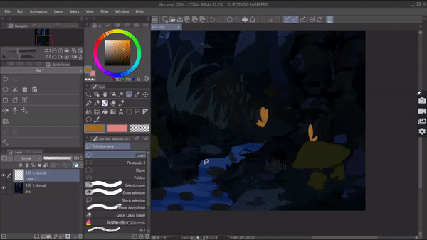
One of the easiest tips I could give when drawing a background is to add a glow element into the background. What screams fantasy and magic more than a glowing element. Especially when you’re drawing the background scenario in a dark place. Adding a glow element like a glowing flower or glowing stones or if your background takes place in water, ocean then glowing jellyfish will really bring out that fantasy theme. If you find it hard to be imaginate to create a fantasy world , you can just draw a normal background with nothing fiction or creative and just by adding glowing elements in the normal background you can twist it into a fantasy world. Since there isn't much that glows naturally in the real world so when you draw a glow element in your background the audience will find it easy to understand the fantasy theme and story.
You can add these glow elements on random things that do not contribute to the story of the illustration but just to uplift that fantasy theme or you can add these glow effects on things that do contribute a importance in the story.
If you tryna depict a story through your fantasy illustration you can still use this glow effect according to your advantage.for example: let's say i want to draw a fantasy background the character is following something .
In this case we can draw the path of the character walking with glowing stones to show the audience that something magical is leading him the way.
Another example would be that by drawing glowing butterflies in my background I can create this fantasy yet a bit romantic background for my characters.
Just like that we can just the glow effect not only to push that fantasy theme but also contribute to the story
Now that you know how well you can use this glow effect in your background. Let's talk about how to create these glow effects.
It’s super easy. First choose the element or creature that you wanna add the glow to. Create a layer above it and set its blending mode as add glow and choose a saturated color of choice then we color it. Now we’re gonna take an air brush soft and outline the edges to give that glowing effect . and that's it.
SIZE DIFFERENCE
Another One of the easiest tips I can give to portray and draw any fantasy world is by exaggerating the size. This is a common trick that you can see in a lot of fantasy illustrations especially in fairytale type of stories.something about seeing things that are 3x - 5x times bigger than they normally are creates this “ no way this is real '' kind of idea that's what makes this a fantasy and something beyond laws of nature .looks so unreal to be true that people thing its a fantasy.
Even if you're someone struggling with creating a fantasy world which needs a lot of imagination and creativity. This is the simple tip to easily make your fantasy background. Exaggerate the size. For example: here I have a mushroom from a normal world which looks small compared to the human. While this is a mushroom from fantasy land which is 5x bigger than a human . This is what I mean by size exaggeration . exaggerating the size of something will automatically depict a fantasy theme.
Ofcourse mushrooms are just an example ,this can be applied to anything like plants , fish , goldfish, flowers etc.
Most of the time try to exaggerate things that are considered smaller in size compared to human in real life

Note: when drawing these types of fantasy backgrounds always try to add a character because without them . it will be hard for the audience to see the exaggeration and everything will look normal. But as soon as we add our character the audience will see the size difference and will be able to identify the fantasy theme in the illustration.
CHANGE OF COLOR PALETTE
My third tip would be to change your regular color palette .The colors you choose play a huge role in drawing a background. When you have a proper color palette it's very easy to make your background go from normal to fantasy. Especially even if you don't have a creative mind to build this fantasy world, this tip will help you draw a fantasy without anything magical in it.
To put it simply, we know what the colors of different things are, like apples are red , grass is green , but if we see an apple in purple it looks unreal and fictitious. That's exactly what I mean by changing the color palette. Changing the color from normal to something unusual makes a great fantasy color.
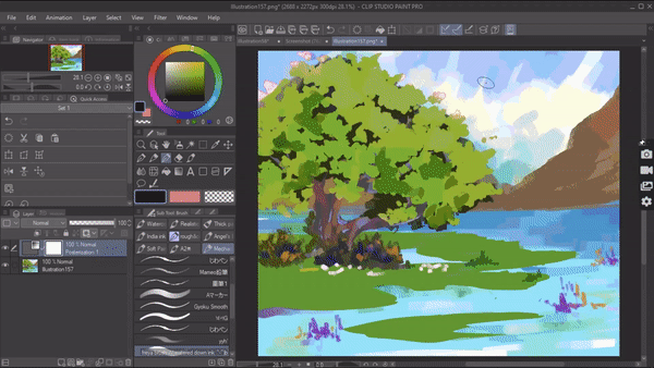
To give you an example in the background, let's say I want a background where there is a lake , a tree and a mountain at the back . Now I draw it , now you might be thinking this looks normal, nothing fantasy about it.
But as soon as I change its color palette. Now if you look at it. It looks magical,fantasy themed, it looks ethereal and beautiful. And all I did was change the normal color to something unreal.
You can even take the advantage of changing colors according to your fantasy theme. Because certain colors convey certain things and moods. Like above I have used a pastel color palette to create a fairy tale themed fantasy but if your fantasy background theme is horror you can use colors like red. To give you an example I have this forest background looks normal but how can we make this into a fantasy background but with the horror theme.
By changing its sky color into something unusual which in this case is gonna be red. Now if you look at the illustration it looks unsettling and has that fantasy horror theme in it.
Now this whole tip of color changing completely relies on your color skill but if you're a beginner and it's hard for you to color in a different color palette these tricks might help you with your fantasy background. For that ,make sure you have your background colored normally how you do it. now go to [menu] layer > new correction layer> posterization. Increase the slider then click on ok .

then again go to [menu] layer >new correction layer> tone curve . in the tone curve box in the left top you have this drop down from which to choose a color. Adjust and play around with the tone curve.
then change the blending mode of the tone curve layer to " color' this will you results like this
ARCHITECTURALLY IMPOSSIBLE:
When you draw buildings in your fantasy illustration like ancient ruins or a castle it does look like a fantasy world but not entirely since these ruins and castles can be seen in the real world too. So What can we do to push that fantasy theme more?
If You're drawing a fantasy world which induces buildings and houses, here's a tip that you can do to make this into a fantasy. Draw these buildings architecturally impossible to be built at least in the normal world and choose an illogical location.
When I say architecturally impossible I mean drawing buildings with crazy and gravitationally unlikely structure. Which in the real world just can not be built. For example ; an upside down building , a mushroom shaped skyscraper.
And another thing is to choose a location which just sounds unreal
For example: a floating island , top of a hill / mountain.
This kind of building is quite easy to draw too . start from deciding what's the location where the building stands like the edge of a waterfall ,or a floating mountain . Then decide on the type of building you are drawing a residential building or a castle or industrial building.
I'm choosing to draw a castle on top of a floating island.
Start by drawing location, then start sketching the building now when sketching the building try to structure the building in a way that it looks architecturally impossible but at the same time stick with your fantasy theme if you have one like cyberpunk or sci fi etc, try to implement those themes in your building .
Then I'm gonna color my illustration when we’re done .
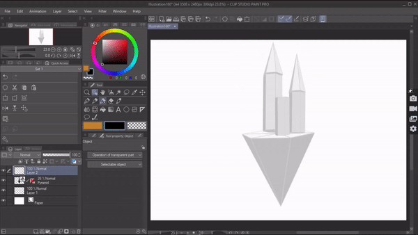
Or if you’re someone who struggles with perspective and finds it hard to draw buildings. Try using the 3d primitives available in clip studio paint . you can find them in materials windows under 3d.
. Click on the shape that you want to drag and drop them on to your canvas. With these available controls you can move it, resize it or even modify its length and breath. Using this you can construct a basic foundation of your building . then set it in your preferred prescription
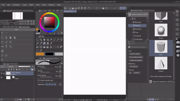
and you can lower the opacity of the layer and start sketching in a new layer.
LIGHT :
This is a very basic tip but this is what makes a fantasy world look ethereal .There is something about light that is magical in itself. Light adds that ethereal brightness to any background which is very necessary in a fantasy illustration. No matter how creatively we draw buildings and backgrounds of our fantasy world it will look dull and lifeless but the moment we add that light it gives the illustration that ethereal glow and gives the whole illustration a more dramatic view, if you want fantasy in your illustration you need light.
Not only that, we can even draw these lights statistically to push a certain narrative\ story. For example let's say : I'm creating an illustration where the character is looking at a magical cave in a forest.
In this scenario drawing a light hitting that hidden cave which highlights the cave to the audience and gives that cave a magical dramatic lighting and shows them that this is the destiny the character was looking for.
Not only that, if you’re fantasy illustration has a character who is a fair or angel we can also draw the background in a way that light hits the character which makes them look more ethereally beautiful
And these lights can be created very easily , starting from creating a new layer on top of all the layers [ cave] and setting the layers blending mode to “ color dodge”. Now choose from which direction your light source is gonna hit. Then start drawing the lights. And that's it .

SPACE FOR CHARACTER :
One of the tips I really hope people have at the back of their minds when drawing fantasy backgrounds is to remember to leave a space for the character. While drawing backgrounds, especially fantasy backgrounds there's a lot going on , with all these fantasy elements , sometimes it's crowded and filled . so when you finally draw your character in this background. The background steals the attention and this is why we should plan a little bit before because ultimately the character[protagonist] should be highlighted and be the main focus.
It's good to plan your fantasy background in a way that there is enough attention towards the background but as well as towards the character.
There are so many ways you can achieve this . one of the ways being the opposite effect.
The opposite effect is the contrasting color which is achieved when opposite-[in color wheel] elements are arranged together. like in this case light and dark.Light and dark are considered Strong tonal valves. The viewer's eyes are naturally drawn to areas where opposite colors are contrasted.
To give you a basic example: If you look at this piece, the character stands out because the character is drawn in dark values
and in contrast, the background has light values which accentuate the character’s silhouette but also gives focus to the background. So when we look at this piece we know exactly where to look and who the main character is while giving enough attention to our background.
These same values can be switched, for example, you can make the background with dark values and draw the character in light value. And it will give 50-50 focus to both character and background.
This is a very easy technique once you understand it, it’s all about planning the placement and framing it properly. Even though I gave you a very basic example, the same concept of contrast can be used in complicated backgrounds and perspectives. If you’re a beginner, start by practicing in grayscale so that you know how different values work and eventually move to colors.
Another way to make your character Stand out is by placing them in The center and drawing a background around them. This method is pretty straight forward. A central interest is the part of The picture or a Subject that Attracts the mind and is an attention-getter. But here's how we can make sure both character and background get that 50-50 attention. Use a canvas that is vertically longer. Now draw whatever fantasy background you want and then place your character in the bottom middle. This will let your background shine and the character will also get its attention.
more examples
there are more ways that you can construct your illustration in a way that both character and background get Equal attention, but I mention all of those the article will never end.
So that is all the tips that i wanted to share thank you for reading
この投稿を「いいね!」したユーザー


コメント