
Hello and welcome to another tutorial! This time, I will focus on some of the ways you can handle and optimize the way you color comics or webtoons. I will cover topics that deal with both the theoretical and technical side of things. The latter of which - as usual - will be focusing on the tools available in Clip Studio Paint. Let’s get started!
If you want to view a video version of this tutorial, you can find it here:
Tip #1: Plan Your Characters’ Color Palettes
We’re starting from the ground up - with the design of your characters! One thing that every visual story benefits from is having character designs with well thought out color palettes. These can help make character designs easily recognizable.
I’ve defined four guidelines for planning your characters’ color palettes: Contrast, Clarity, Cohesion, and Context. These all work together and need to be considered holistically.
CONTRAST - You’ll want the main colors of your design to be easily distinguishable from one another. For example, if I were to give my character Dodger a shirt that’s closer to his fur color and pants that are closer to his shirt color, then his design would both become less legible and less memorable.
Likewise, it makes sense to always choose contrasting colors for individual parts of a character that are located next to each other. In this example, I gave Dodger’s shoes the same color as his pants. It just kind of blends together, even with the lineart clearly separating these elements.
This does not mean that you can’t use pastel or desaturated colors in your designs. But again, the contrast and values between each color are important. Here’s a quick pastel version of Dodger to illustrate my point. Pay attention especially to how the distinction between the green and blue are clear in the color palette next to the characters.
CLARITY - Another word you could use for this guideline would be simplicity. Let’s look at Dottie, a character that’s made up of more colors than Dodger.
The thing is - the biggest shapes in her design are still limited to three colors. Any shape where the other colors show up is visually smaller. I’ve also tried to reuse colors where it makes sense. For example, the dark rims on her shirt are the same color as her shoes. Her neckerchief is the same color as the wadded up parts of her pants. Additionally, none of these bonus colors are complete opposites of the three main colors. There’s darker and more vivid shades of purple. And even the desaturated orange and beige feel like variations on that basic orange.
Here’s an example of a design that would NOT have clarity:
While the green hair or the pink shoes might be memorable on their own, the overall design of the character isn’t, because it’s confusing to look at. There are too many colors that try to catch your attention and they all don’t really fit together in an easily readable way. I want to clarify - it’s not wrong to use a lot of colors in your design! But it’s important to ensure that it’s clear what the main colors of a character's design are and that there’s a sense of cohesion.
For example, let’s try to use every color in the rainbow on Dottie, but let’s actually order them in the order of the rainbow, and simplify things a bit. This already looks better, and hopefully this serves as a quick example of how you can create colorful characters while still retaining visual clarity.
Before we move on to the next guideline, I want to mention a nice side effect of picking a limited amount of colors for your characters, especially your main characters. Keep in mind that in a comic, you will be drawing and coloring these characters over and over again! The fewer colors you have to use during this process, the faster it will be! Trust me, you’re going to thank yourself for keeping things simple.
COHESION - This is a similar point to Clarity. If you plan on making a comic that shows characters in a variety of different outfits, it can make sense to try and think of an extended color palette for them. The thing is, most people don’t always dress in one or two specific colors. However, there usually are some colors that people generally avoid and I would suggest trying to think of what those would be for your characters.
For example, here’s my character Sammy. You’ll find her wearing anything from girly colors like pink and baby blue to blacks and greys. However, it’s highly unlikely that you’ll find anything ranging from orange to bright green in her wardrobe. That alone also makes her a nice visual contrast to Dodger’s design.
Which brings me to my last guideline…
CONTEXT - To illustrate this guideline, let’s look at this simplified color palette of a character.
Someone might be able to give you a guess for what character these blobs of color are supposed to represent. But the interpretations could vary.
However, keep in mind that any character will always exist within a shared context - of other characters or maybe even their surroundings. So let’s try to do that here.
Now that we have that shared context present, suddenly there is no more ambiguity! Provided you are already familiar with the characters, it’s clear what characters the colors in this example are supposed to represent - even if I’m completely disregarding the shape and proportions of these designs.
So, when defining a color palette for a single character, make sure to always keep the overall context in mind. Ask yourself questions like, “Are the different characters distinguishable enough from one another?”, “Should these characters have a similar palette to communicate the fact they’re related to one another?” or “Should I work with opposing palettes to communicate a certain narrative?”
Tip #2: Utilize the Color Set and Sub View Menus
Let’s take a break from theory and switch over to the technical side! Now that you have a color palette picked out for your character, it’s time to make it easily accessible for yourself when creating your comic pages. I do this with two specific features in Clip Studio Paint: the Color Set and Sub View menus.
We’ll look at the COLOR SET menu first! If you do not have it activated in your current workspace, simply go to “Window > Color Set” to activate it.
The main components of this window are a drop down button, that can contain a list of various color sets, and the actual list of colors within that set.
Your window might look slightly different, as you can select different ways that the colors are displayed. You can choose these by clicking the little menu bar icon on the top left and going to the “View” option.
In my example, I am using “List medium”. I find this useful because I can type in the name of each color. This is especially useful if some colors are similar and hard to distinguish at first.
To add a new color, select the color in your color wheel first, then press the little Paint Drop + icon. The color will be added to your currently selected Color Set. You can now reorder it, rename it, or delete it.
It makes sense to create a Color Set for each recurring character in your comic! You can do so by clicking the little wrench icon up top, which opens up this window:
If you click “Add new settings”, you will get a template Color Set that is full of “empty” colors. I personally prefer not having those, so I’ve deleted them and instead duplicate existing color sets, reworking them afterwards.
Next, we’ll look at the SUB VIEW menu! If you do not have this active, you can find it under “Window > Sub View”.
Here you can load reference images that you can pick colors from. This is useful if you made a reference sheet of your comic character, or even just want to load in previous pages where minor characters show up that don’t have reference sheets. To load an image, simply click the folder icon in the bottom, and select any reference images you might want.
You can select multiple ones at once, and then cycle through them. If you are done with a reference, you can “delete it”. No worries, this only removes it from the Sub View menu. It does not delete the actual file.
You can also zoom in and out, move through the image, or even rotate and mirror images. I personally like having the “Switch to eyedropper automatically” option selected. It’s the icon in the bottom right corner above the “Delete” icon. Although I now need to hold down the spacebar to move around the currently loaded image, this also lets me immediately pick up any color just by clicking, without using any additional shortcuts. It’s a fair tradeoff to me!
Tip #3: Know the Advantages of the Fill Bucket
Let’s move on to another technical tip. Once we have our color palette, we don’t want to waste a lot of time trying to color the characters. Luckily, Clip Studio Paint’s version of the fill bucket tool has a bunch of unique features that help us achieve this.
For starters, let’s make note of the distinction between the two Sub tools - “Refer only to editing layer” and “Refer other layers”. Their names are pretty self explanatory. Since we want to retain flexibility in editing our lineart, we’ll make a new layer to color our artwork beneath the lineart layer. This means that we will need to use the “Refer other layers” version of the Fill Bucket if we want to color in the lineart.
Will the “Refer only to editing layer” option ever be useful? Sure! I personally like to use it if I’m working with lineless artwork on a single layer. Sometimes I’ll even use it to adjust finished colors of a piece with lineless artwork.
But let’s look at the Tool properties. These are almost the same for both variations of the tool.
First, “Apply to connected pixels only”. When the option is active, the fill bucket works as you might be used to it working. It’s gonna fill the area you’re currently clicking in, such as Dodger’s head.
However, when the option is deactivated, the tool will look for ANY other instances of that particular color you just clicked on the currently active layer - and it will fill them as well.
This is a very powerful tool and I often toggle this on and off. I tend to deactivate it after I’ve colored a character with their basic palette, but then later want to use an adjusted palette - for example to depict the characters in a night time setting. This makes it very convenient and fast to adjust things.
“Close gap” is a very important option and you may need to adjust it on the go, depending on the artwork you’re trying to color.
As you can see in the example, a high sensitivity value may detect gaps where there are none. However, if your lineart is of a loose and carefree style, having this same setting can be very invaluable and save you the trouble of having to manually close gaps before being able to use the fill tool.
Next, “Color margin”. This option determines what the sensitivity for detecting a “new” color is. When you’re working with simple, flat colors, like I am in my comic, it makes sense to leave this at a low value like 3. However, when you’re recoloring something that already has shading baked into it, you might want to experiment with higher values to save time.
Next, “Area scaling”. This is another wonderful and amazing feature that the Fill Bucket tool is not guaranteed to have in other software. I pretty much ALWAYS have this activated when coloring lineart. Only when recoloring things do I deactivate it.
So what does it do? Let’s turn it off and color Dodger’s face here. Now, zoom in.
Do you notice the weird, gray edge around Dodger’s nose? This is because the software detects the anti-aliased pixels of the lineart and only fills the space up to them. Which leaves these transparent pixels to be overlaid over the blank background. Before I used Clip Studio Paint, I would manually paint over the edges of the lineart to fix this. But with the “Area scaling” activated, this problem is solved automatically!
If we turn the opacity of the lineart layer lower, we can see the effect of this option illustrated very clearly:
Now, you may have noticed that you can select different values for the “Area scaling”, as well as different “Scaling modes”, and you might be wondering which one to pick.
The value of the “Area scaling” will depend on the resolution of the image you are working with, as well as the size of the area you’re trying to fill. If the value is set too high, you may experience the color extending even beyond the lineart itself.
Which “Scaling Mode” works best will be determined by your style of artwork or the type of drawing. I usually use the “Round” option, but I would encourage you to simply experiment and find what works best for you!
Next, we have the option to determine which layers are referred to when using the fill tool. Turning this off is basically the same thing as using the “Refer only to editing layer” Sub Tool. As for which option to pick, I always leave it at “All Layers”.
However, you could also limit the options by using either Reference Layers, Selected Layers or Layers sharing the same Folder as your currently active Layer. I can see either of these options being useful if you have multiple overlapping linearts active (such as the lineart for a background and character) but only want to fill specific lineart without first hiding other lineart.
“Fill up to vector path” is an option I rarely use. Theoretically, it can save you the effort of having to pick a value for the “Area scaling” option by automatically filling the color to the middle of a vector path. For this to work, you need to have drawn your lineart with a vector layer, which I recommend.
The issue for me with this option is that it’s much more picky about what a closed shape is. It’s very likely that you might have to set the “Close gap” option to the highest possible value for it to fill a shape that would normally appear closed. Slightly open lineart is completely out of the question with this option.
“Opacity” simply determines the transparency of the color you’re filling a space with.
“Anti-aliasing” gives your color fill a smooth shape. I would recommend always leaving this on, unless you’re trying to achieve a pixelated look.
Finally, now that we’ve examined all the options of the Fill Tool, I want to get into a feature that’s also an immense time saver. You can fill things simply by clicking and dragging. When you have lineart of something like Dottie’s sweater rim here, this is an absolute game changer.
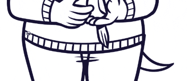
Simply click, drag your cursor over the entire section that needs to be filled, and let go again. In other software you would have to individually click every single square. This, to me, is one of the reasons why Clip Studio Paint has become so essential to my comic creation process!
Tip #4: Start with a “Color Sketch”
Let’s move over to theory again; and let’s also switch from characters to backgrounds.
When coloring a new scene where I’m not sure what kind of colors I want for it, I like to create a “Color Sketch”. I do this by creating a single layer for the color and then slowly blocking the color in with big brushes. I use big brushes so that I’m not tempted to work in details. When I’m creating a Color Sketch, I want to focus on the overall feel of a scene and determine a color palette from that. If I start thinking about details, it’s hard to achieve that goal.
Once I’ve laid down basic colors, I often move on to try and adjust them with tools like the tonal curve, or the hue and saturation sliders (all of which can be found under “Edit > Tonal Correction”). I simply experiment and mess around until I roughly have something that I’m going for.
Sometimes, I also load in reference images in the Sub View menu and use those as inspiration.
Once I’ve arrived at colors that match the vibe I’m going for, I can start to finalize things. Personally, I like to start “fresh”. This means that I’ll save the color sketch as a separate jpg file, load it in the Sub View menu and then pick specific colors from it to neatly fill the lineart with. After this, I start adding in shading, glow effects and the like.
One thing to keep in mind when making Color Sketches is that I would recommend you do them for establishing shots - panels that show the surroundings in the clearest way possible. Take the example panel from this section. In my comic, there were a few panels in that same scene that showed up even before this panel. However, this one panel showed the overall surroundings and lighting conditions in the clearest, most comprehensive way.
This is why I decided to start with coloring this panel first. Now that I have the basic colors determined, I can refer to this finished panel in other panels that depict less of the surroundings.
The advantage of this is that you’re able to view the scene holistically. If you were to start with picking the colors in a close up shot of the characters, you might struggle to retain these colors once you draw in more of the scene later. So it always makes sense to define the scene first.
Tip #5: Convey Emotion with Colors
We’re leading into this one straight from the previous tip. Because the advantage of having a specific look for a scene is that you can always break out of these colors to achieve a surprising or emotional effect. I like to do this for extreme reactions from characters. Here is one example.
In the establishing shot for this scene, I set the kitchen up to have a bright, teal tone.
Then, later, I often break it up, like here for example:
By coloring that one background in an entirely different color, it makes Dodger’s reaction seem a lot more extreme and emotional. Likewise, by using a darker version of the basic color palette of the scene, I bring the bottom left panel immediately back to reality and also make the situation seem serious and threatening.
A nice side effect of doing this is that you will make your comic more interesting and varied to look at, even as one scene may play out in the same location for multiple pages.
Tip #6: Color Lineart to Create Depth
One thing I like to do to make my comics read clearly is to use a different lineart color on my characters than I do on my backgrounds. This ensures that even if there are complex, detailed backgrounds, they won’t distract the readers from the focus of the action - which usually are the characters.
Of course, if a character is interacting with something in the background, I won’t color it differently. Think of it like a camera lens, but instead of things getting out of focus, they become a lighter color the further an element is.
Let’s look at how to achieve this from a technical perspective. To color the lineart of an entire layer in Clip Studio Paint, go to the Layer Property window and select the Layer Color option. Now, you can click the big color field that opened up below the option to choose a color. Alternatively, you can pick a color using other methods (such as the Color Set or Sub View menus) and then click the “Fill Bucket” icon to set it as the current Layer Color.
If you want to pick a different color for specific parts of the lineart, I like to achieve this by making a new layer above the lineart layer and clipping it to the layer below. This means that anything I draw won’t show up anywhere where there isn’t already a drawing on the layer below.
Sometimes, I use multiple clipped layers during this process. I tend to do this if I color all of the lineart, with various sections that I might want to adjust in color during the finetuning process. Having individual layers per section keeps things manageable, as I can lock each layer’s transparency and then easily make adjustments.
Another way you can color lineart is by selecting specific parts of the lineart with the Object tool. This will only work if you use Vector Layers. To get started, click a single vector path. You may now add more to your selection by holding down “Shift” as you click other paths. Alternatively, you can click and drag to select multiple vector paths at once. You may have to activate the option for this first. You will find it in the Tool Property window, under the drop down menu “Operation of transparent part” and placing a checkmark in the “Select area by dragging” option. You can select entire paths or individual control points.
Once you have the lineart selected that you want to color, you can now select a new “Main color” in the Tool Property window.
Personally, I find this method to be more work than the previous method, but in some cases it can be useful and save us time. For example, let’s imagine we draw a criss-cross pattern for a character's clothing. We later decide we want the horizontal lines blue and the vertical lines red. If we were to paint these lines manually, this could be rather time intensive. However, with the object tool we can quickly select all the horizontal lines, then cut them and paste them on a new layer. Now we can use the Layer Color option to color them.

Tip #7: Use Shading Sparingly
My final tip comes with a huge “YOUR MILEAGE MAY VARY” sign. You might be going for a detailed, elaborate, or realistic look in your comic. In that case, this might not be a very relevant tip! However, if you have a comic similar to mine that features a bright, cartoony visual style, you can save a lot of time by deciding not to shade everything. In addition to that, if you don’t use shading all the time, then it can be a much more powerful tool to communicate certain things in your comic.
I generally use shading to convey four different things: Depth, Contact, Intensity and Specific Lighting.
Let’s look at these in detail.
First, CONVEYING DEPTH. For example, I might have a character in the foreground and another character in the distance. To heighten that sense of distance and depth, I tend to give the character in the foreground shading to visually set them apart from the other character.
Second, CONVEYING CONTACT. If I want to communicate the fact that a character is anchored to a location, touching an item or anything along those lines, I may use shading to do so. This can be as simple as a drop shadow on the floor, or it can be a shadow cast from an item that’s being pushed into a character.
Third, CONVEYING INTENSITY. Since my comic usually isn’t shaded, suddenly having shading can make some scenes really stand out. This can give dramatic scenes an even more dramatic feeling. Likewise, if your comic is mostly shaded, you could achieve the same thing by suddenly having NO shading.
Fourth, CONVEYING SPECIFIC LIGHTING. Sometimes, I might want to convey a specific light source being present in a scene, like say, a flashlight. In these cases, I usually utilize shading throughout an entire scene, over multiple panels, as you can see in this example. Pay attention to how I now use a lack of shading to set apart the “dramatic” panel.
The End
That’s it! I hope these tips helped you figure out some new ways to think about color in your comic, or taught you new methods to use in Clip Studio Paint. If you have any questions about the things I discussed in this video, feel free to leave a comment! I’m always happy to help.
Also, if you enjoyed the art in this tutorial, why not check out my comic? :)
この投稿を「いいね!」したユーザー


コメント